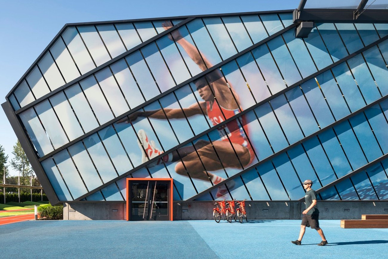
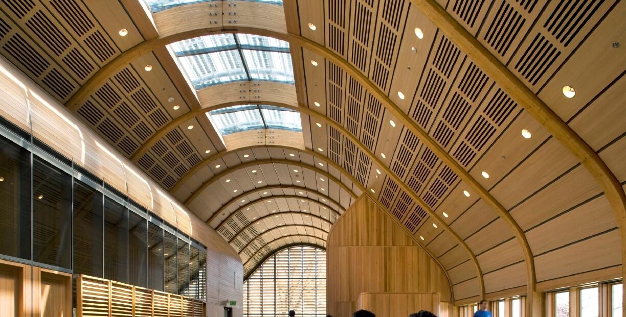
SRG Partnership’s design for the LA Garage on the Nike World Headquarters looks, feels, and acts like no other parking structure on earth.
It’s four stories and 409,000 square feet of space, and designed not just to reinforce the Nike brand, but to serve its employees and their offspring.
Located on the Nike campus in Beaverton, Ore., the parking deck’s next to a daycare center, with pickups and drop-offs during mornings and afternoons. “The outdoor zone between our building and the adjacent one was to be separate, as a place to bring people together, and an amenity space for kids to play,” says Jeff Yrazabal, principal-in-charge at SRG. “It creates experiences for employees – sports, movement, and activity.”
The client asked SRG how it would take an oft-abused building type and turn it into design opportunity. “It was exciting – and it was not a building type that we had a lot of experience in,” he says. “They asked that we bring a fresh perspective and be innovative with the solution.”
That early conversation led to two priorities. “First, they care about the employee experience, at every corner of campus and beyond – even with a parking structure,” he says. “They wanted to have it work and flow properly to get in and out easily – a functional experience that would flow well.”
Then there was the the challenge of not looking like a parking structure. “We didn’t want to see cars from the exterior, and daylight was a big topic,” he says. “So we thought about how to shift and model and carve a pretty massive structure in a way to bring light in.”
They achieved that by breaking the mass down into 60-foot modules and manipulating them to reflect movement and dynamism. “That’s what drove the design,” he says. “The panels let dappled light in and break down the scale of the building in the way it’s laid out.”
There’s a below-grade component too, to limit the structure’s imposition on the human experience. Detailing in the façade brings the building down to a personal scale, while aiding air circulation. “We thought about how to screen the cars but also how to naturally ventilate it and bring in air,” he says. “The panels themselves are positioned in a way to offset them from one another, and they’re perforated for air flow, but that also breaks down the scale of the long façade.”
The architects even considered the view from above. “Many of the facilities growing up around it look down on it, so we undulated the roof and used skylights to create movement and dynamism,” he says.
Movement and dynamism are part of the Nike brand’s mantra, and SRG worked overtime to incorporate them into every aspect of the parking garage, inside and out.
But just as important, the structure enables new experiences for all, while it safely places ingress/egress on one side and an open activity area on the other. “The big idea was to focus on ideas for everyone on campus and create a people place – for daycare users it’s a way to get kids outside, and it’s also for employee events, campus-wide,” he says.
In the end, it’s a building that reaches beyond its function. It tells its own story – and empowers workers and their children to do the same.
For more, go here.
[slideshow id=2297]


