A 1987 painting by Robert Overby ignited the imaginations of Jessica Shaw and the client who showed it to her.
It’s called “Computer Whiz” and it hangs in TriBeca’s Andrew Kreps Gallery. And Shaw’s design for an eighth-floor, five- bedroom apartment at 81st and Broadway, in a building by Robert A.M. Stern Architects, owes much to Overby’s bright, bold work in oil on canvas.
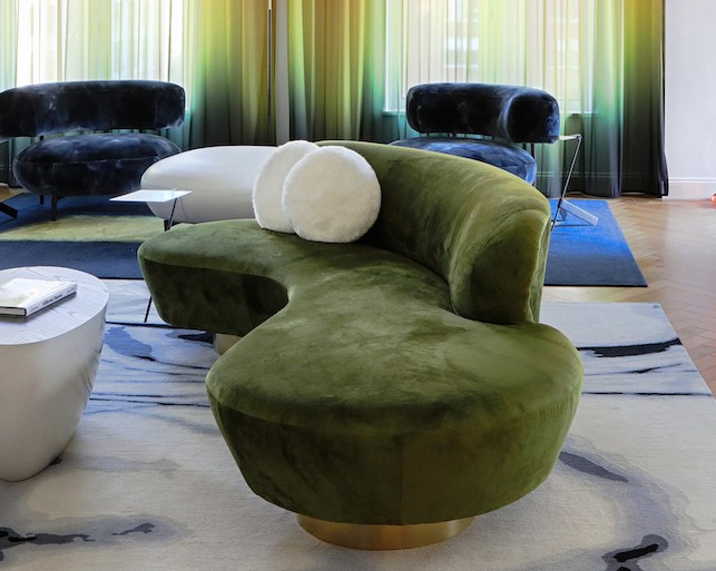
“All the colors come from the boldness of that painting – it drove the whole design,” the design director with The Turett Collaborative says. “Aside from places where we went crazy with wallpapers, its black and white with colors layered on top of that.”
The concept was to use the painting as springboard for the look and feel of this home for a family of four. “It’s eclectic and high-energy and also refined,” she says. “They like to entertain and host dinner parties – and they have colorful personalities.”
The designer and her client, Mara Kanner, worked hand-in-glove to collaborate on the home’s look and feel. “She knew the things she liked but not how to orchestrate it – to put it all together,” she says. “It’s a nice mix between contemporary things and traditional, and where we couldn’t find what we wanted, we made it ourselves – with local artisans.”
The entire project was designed as the building was under construction – so that when it was finished, client and designer walked in with completed drawings in hand. That meant all of it – soup to nuts.
“The assignment was to design everything in the space – including all of the furnishings, and we really took pride in how the floor plan would work best for them,” she says. “We programmed the space, worked with the building department to get all the necessary approval, and did the space design and interior décor, the lighting, tabletops and bed linens.”
A Canadian native, Shaw began collaborating with Turett architects back in the mid-’90s, when TriBeca lofts were the hottest item in town. One result is that she looks at the space first, with fixtures, furnishings and fabrics a close second.
“I’ve always had an affinity for architecture – my point of view started with the space rather than the decorative side,” she says. “Now, more and more I’m working with the decorative details, but I’m influenced by the architecture as well.”
It’s a client-pleasing approach to interior design, especially for Kanner’s Upper West Side apartment. “Based on one piece of artwork we sent for inspiration, Jessica created a chic, colorful, sexy city home where vibrant primary colors, rich textures, and beautiful furniture form reign,” she says.
Here we have a surefire recipe for success: Start with architecture from Bob Stern, add inspiration from a 1987 post-minimalist painter, and bring in a space-and-color conscious interior designer – and you’ll have a winner every time.
For more, go here.
[slideshow id=2279]


