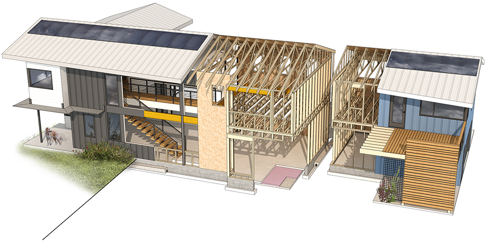
A new Urban Courtyard project in Durham, designed by BuildSense, is a model of respect.
It was designed for a couple – he’s a musician and she’s a professor at Duke University.
Its site’s within easy walking distance of the Duke campus, so that took care of the professor’s commuting needs. But besides a new home, Szymanski also designed an additional dwelling unit with a music studio at ground level for his musician client – and rentable space above for visiting professors.
The couple had hoped to renovate and add on to an existing cinderblock structure on site, but abandoned that idea almost immediately. “When we opened it up we found asbestos,” Szymanski says. “We had to remediate the site and take it down.”
The design sets a new tone for their neighborhood that’s in transition, while drawing on precedents around it. “They wanted something that would be a good start to the development of property in that area,” Szymanski says.
The home with its long gable roof, may respect its neighbors, but it doesn’t mimic. “The three next to them area all two stories, and this one is too, but with open living area downstairs and bedrooms above,” he says.
So it’s grounded in the neighborhood and influenced by other forms there, but it’s also modern, light, and open because of an abundance of windows. “There are large expanses of glass out into the courtyard but the glazing on the front façade is filtered by the vertical supports and the solar shade,” he says. “There are layers that create dappled light inside and options for the kind of light they want to be surrounded by.”
The site is bounded by streets on three sides, which drove the part of the home’s and ADU’s design. “First you get the forms right for the client, and then make the best use of city ordinances,” he says. “And we worked hard on the relationships between buildings where the windows were and walkways were.”
He made sure the home’s deck does not overlook the ADU space – so it respects both renters and owners. “There’s a screen wall at the front so if the couple is in the front yard they’re not visible to renters or guests, like visiting professors,” he says.
Szymanski’s material palette outside is fairly basic. Low maintenance was important to his clients, so he used Hardie panels and a standing seam roof. The ADU is a combination of wood and standing seam metal siding panels, and the architect broke it up to give it some shadow lines and additional texture.
“There’s blue siding on the ADU, like the colorful houses in the neighborhood,” he says. “But it has some identity of its own – it’s blue with a deck of horizontal wood that has views of downtown.”
The main home’s width addresses scale and proportion, because the architect broke up its façade with a solar shield. And it was built slab-on-grade, to bring it down to the scale of others around it.
“That kept us to the height of neighboring buildings, and then there’s the lines of porches running throughout neighboring homes,” he says. “There’s a grow wall in metal mesh for the ADU to keep it roughly lined up with the neighborhood and the main house.”
What the architects have done here is create a modern version of what’s already in the neighborhood – one that’s meant to inspire others. “It works now and will work in the future,” he says. “There are some respectful teardowns and substantial renovations here.”
But this one sets a modern tone.
For more, go here.
[slideshow id=2340]

