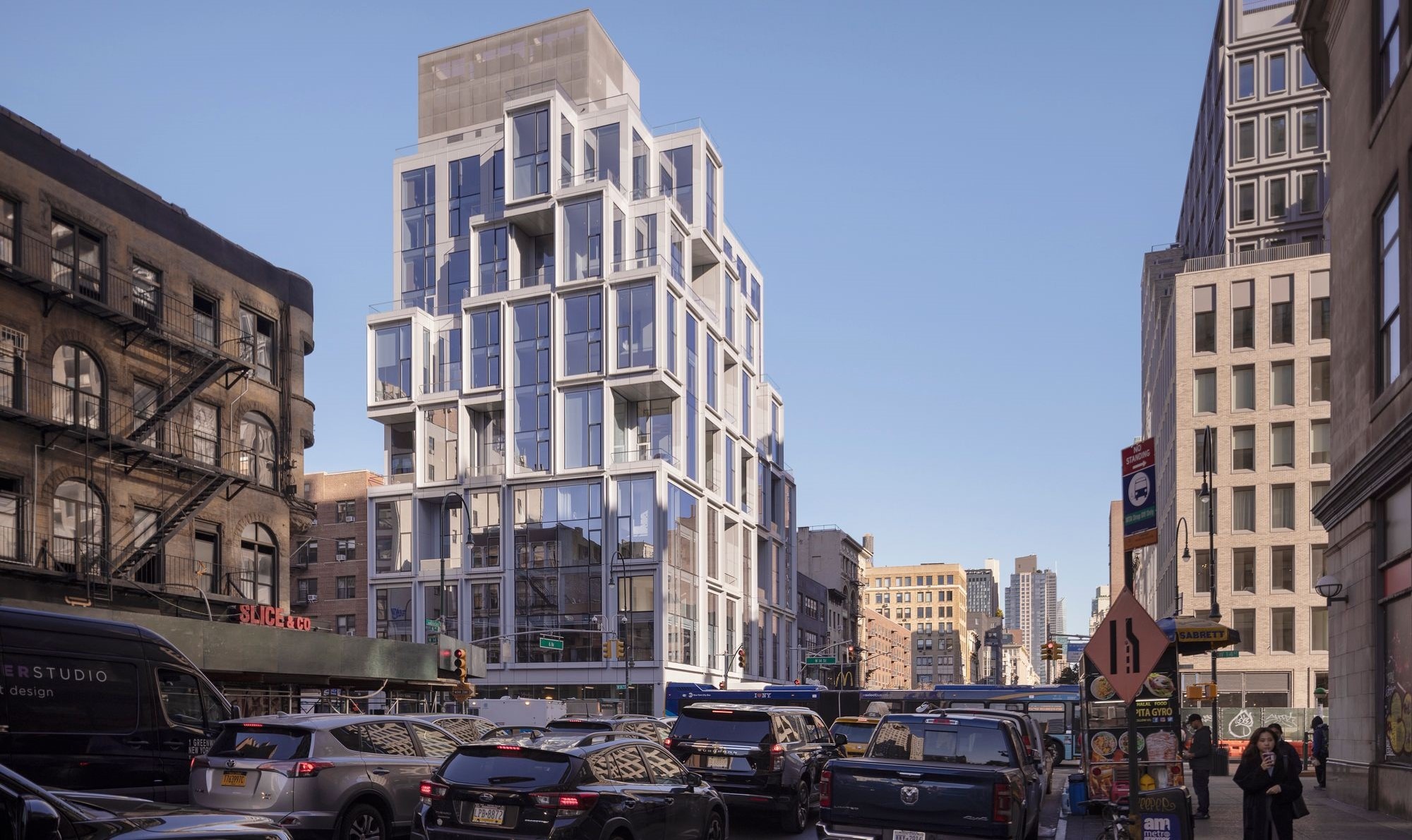
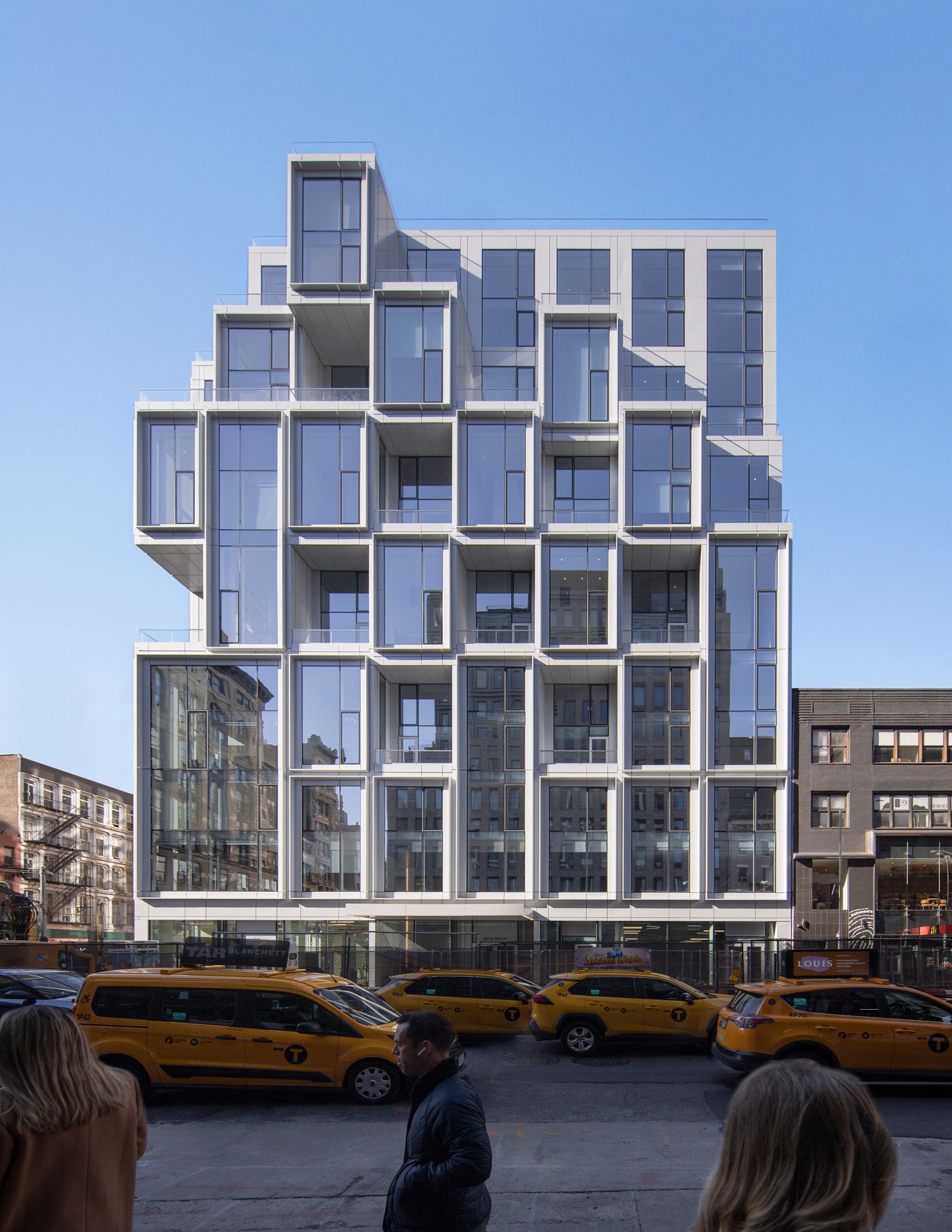
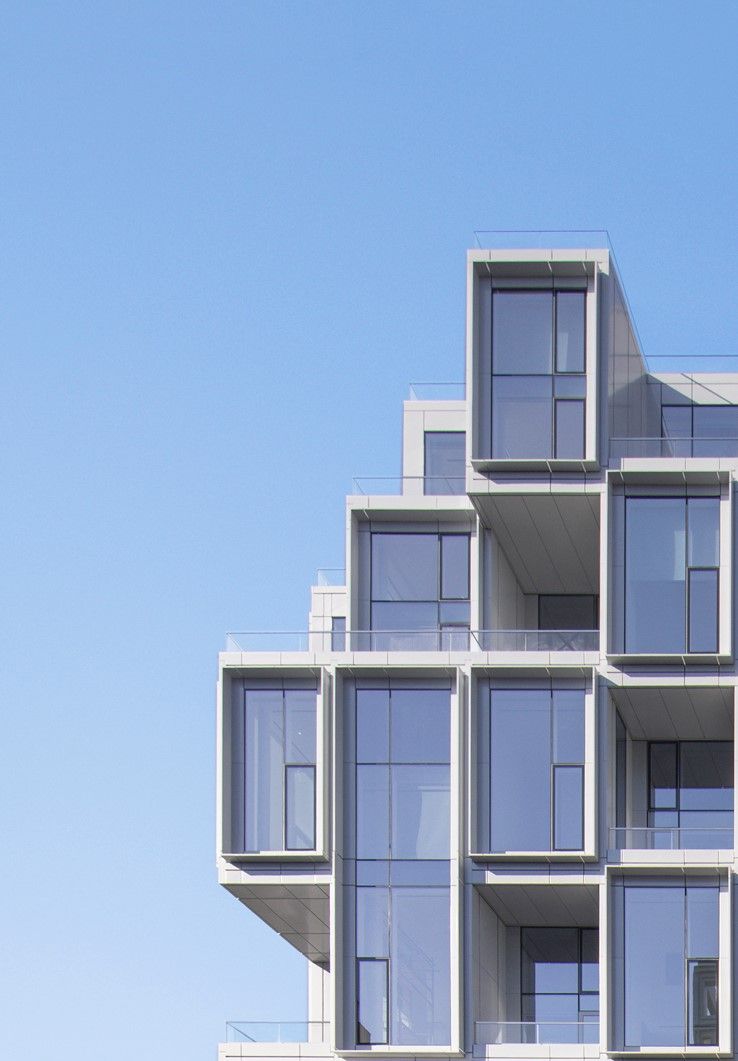
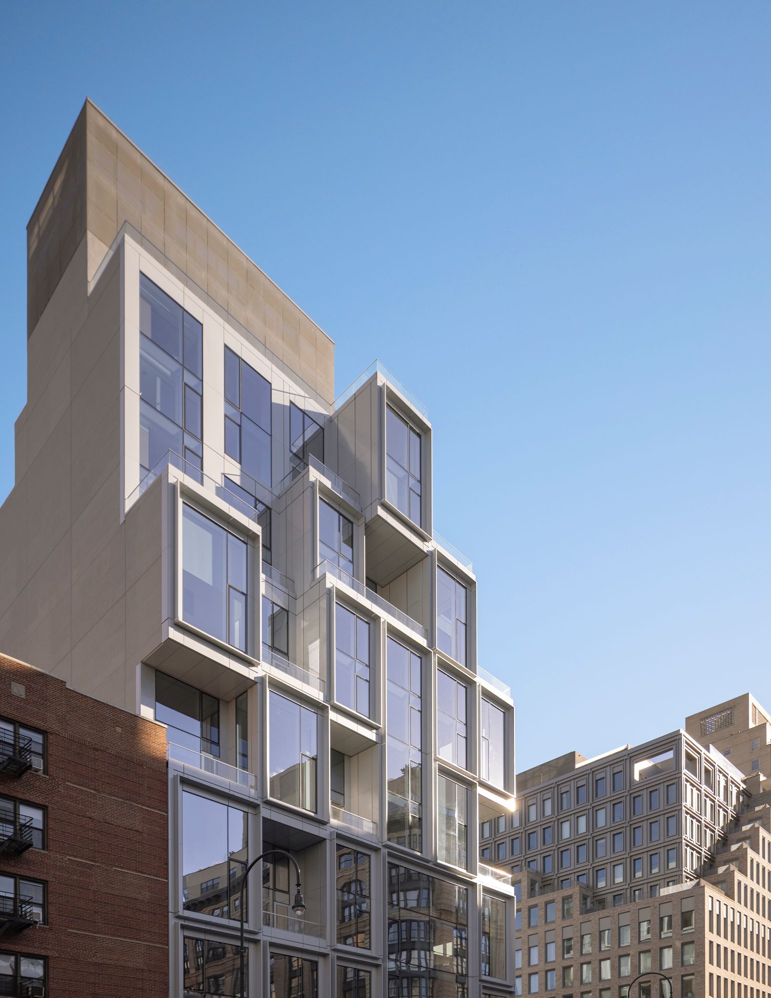
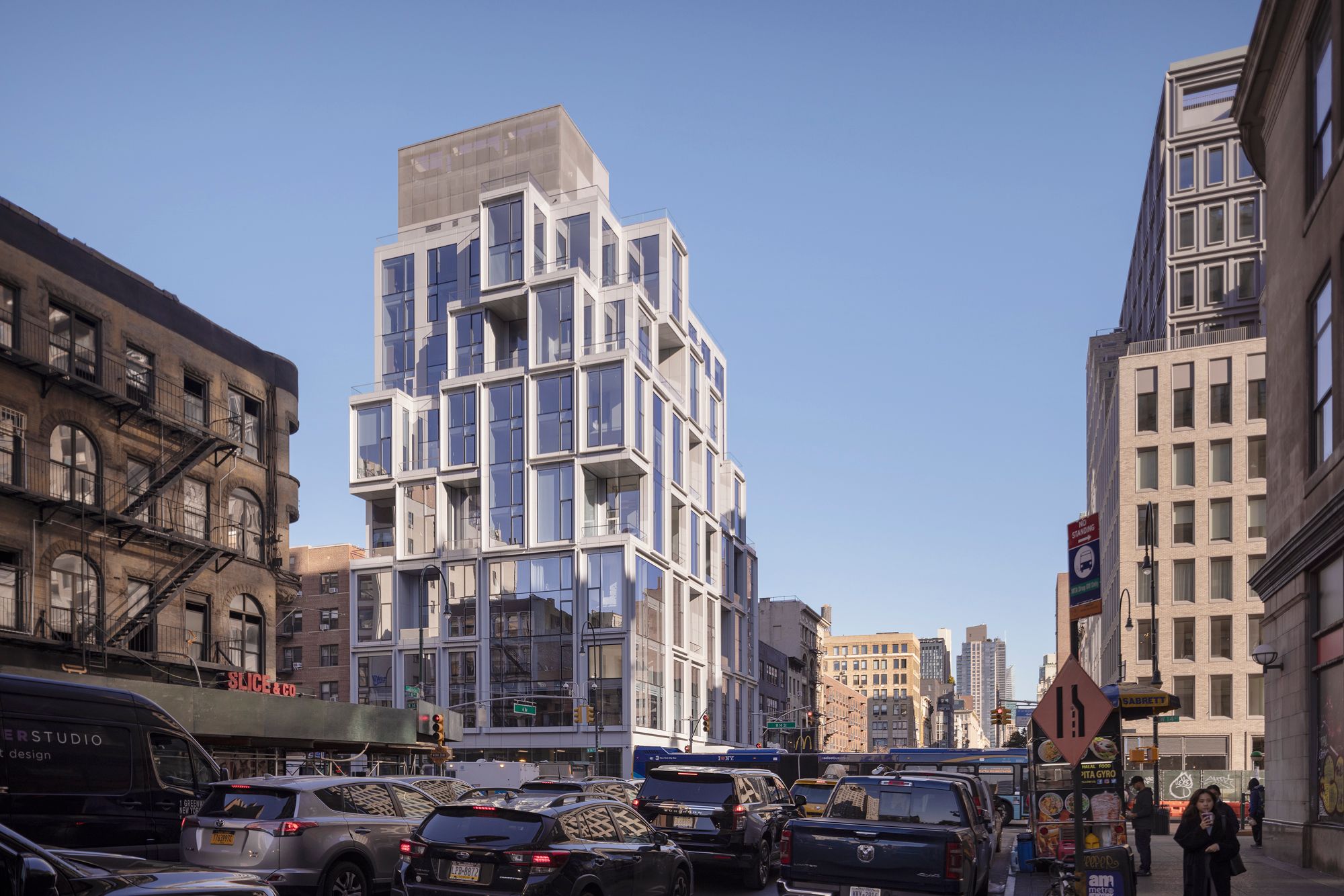
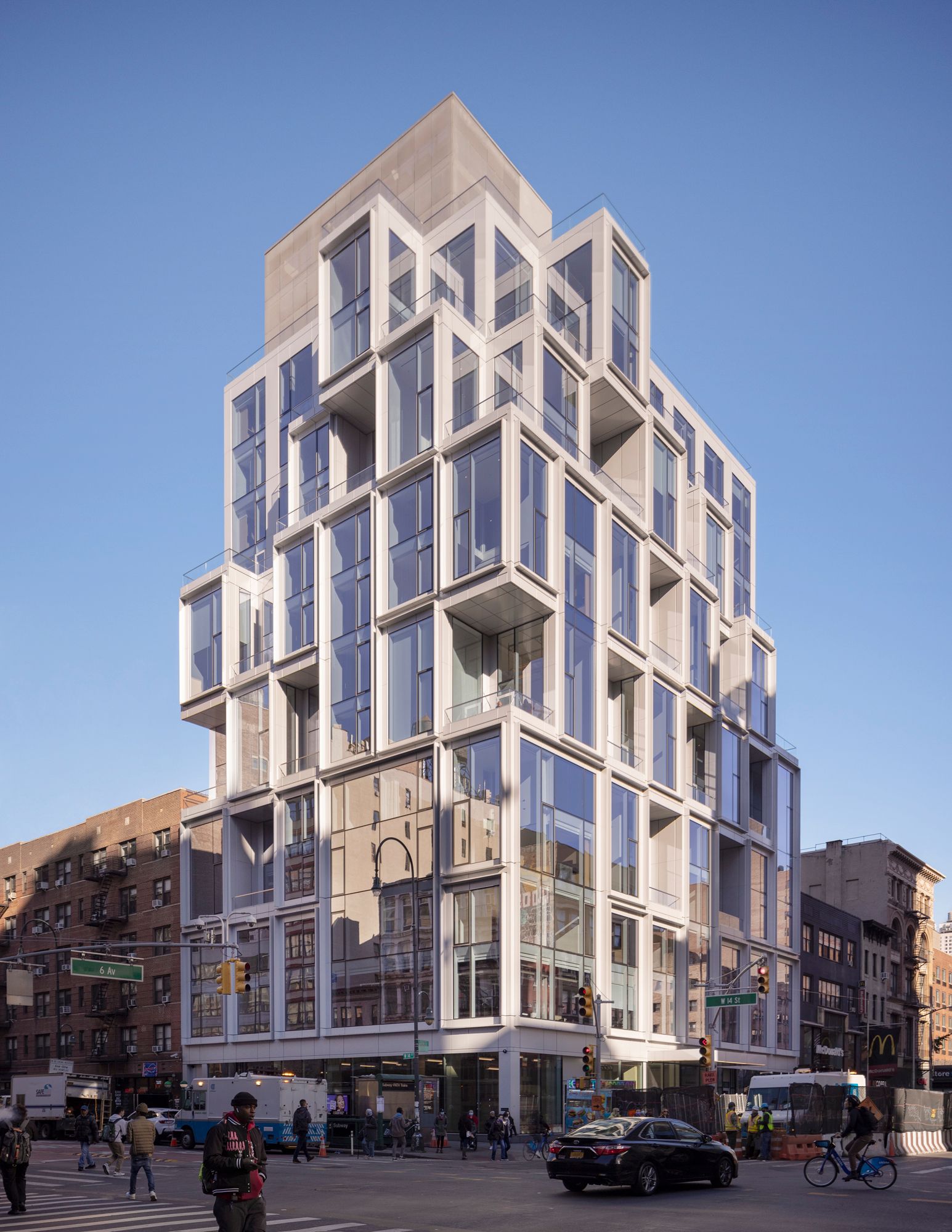
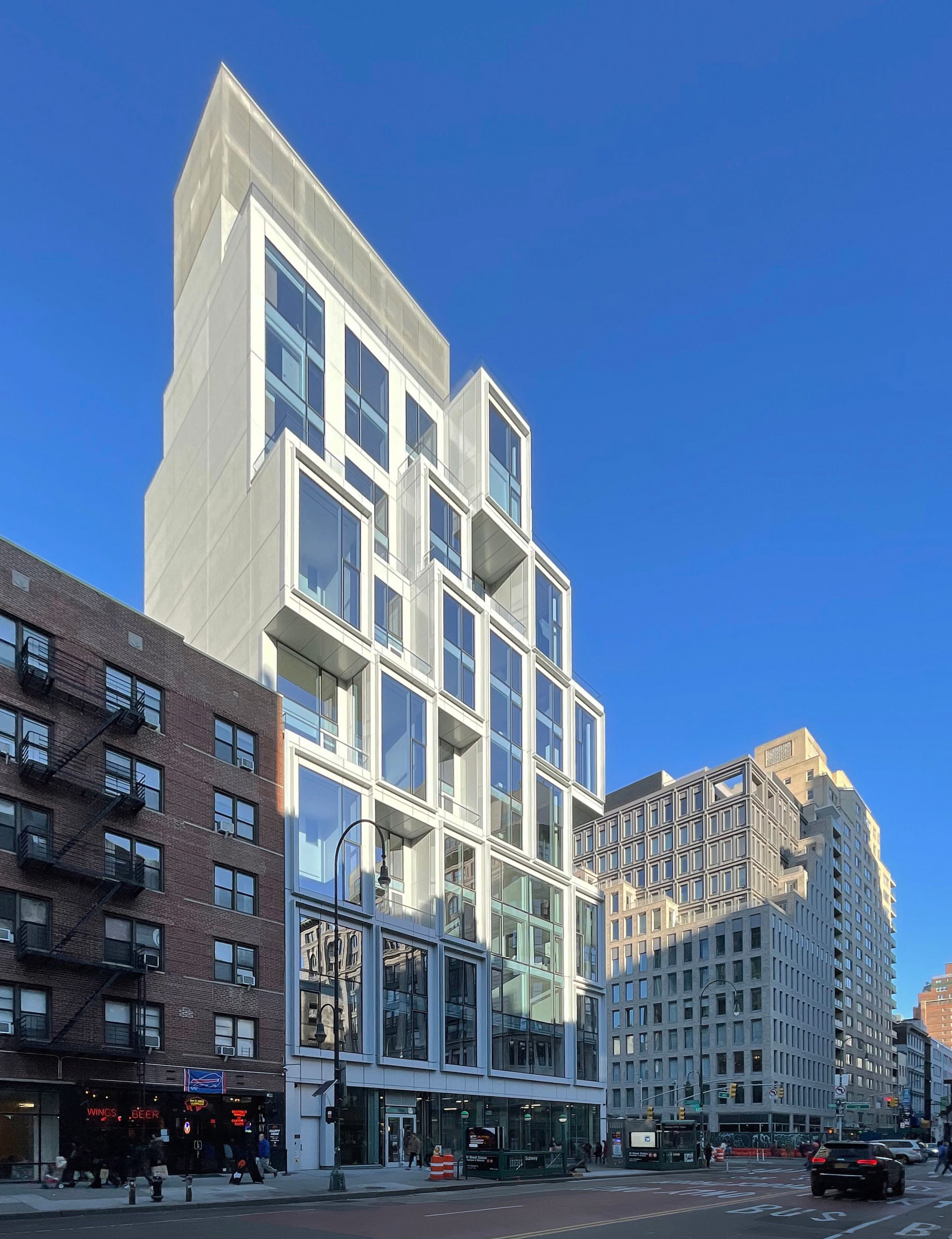
In New York City, the modern facade for ODA’s new 101 West 14th Street highlights the firm’s signature design: geometry that creates a sense of lightness, airiness and depth. It’s a building that grounds its corner with pattern repetition, for a natural, soothing effect. Its oversized, 18-foot glass panels were fabricated in Italy’s Veneto region, and their installation was the largest hoist operation in New York at the time. Last week, A+A interviewed ODA founder Eran Chen via email about the project
Some background on the project?
101 West 14th Street is a boutique residential building at the intersection of New York City’s most desirable residential neighborhoods: Greenwich Village, West Village, Union Square and Chelsea. We designed the architecture for the building, which rises 13 stories and features 44 residences that embrace indoor-outdoor living.
The client?
Gemini Rosemont Development is the developer of 101 West 14th Street.
The assignment?
With 101 West 14th Street, our client wanted a boutique, luxury condominium building that might attract international buyers looking for a unique place to live while in New York. Because the condos here would likely not be their first or only home, we wanted to design something memorable – something that would stand out. The result is a one-of-a-kind jewel box that will anchor this re-emerging neighborhood.
Your design intent?
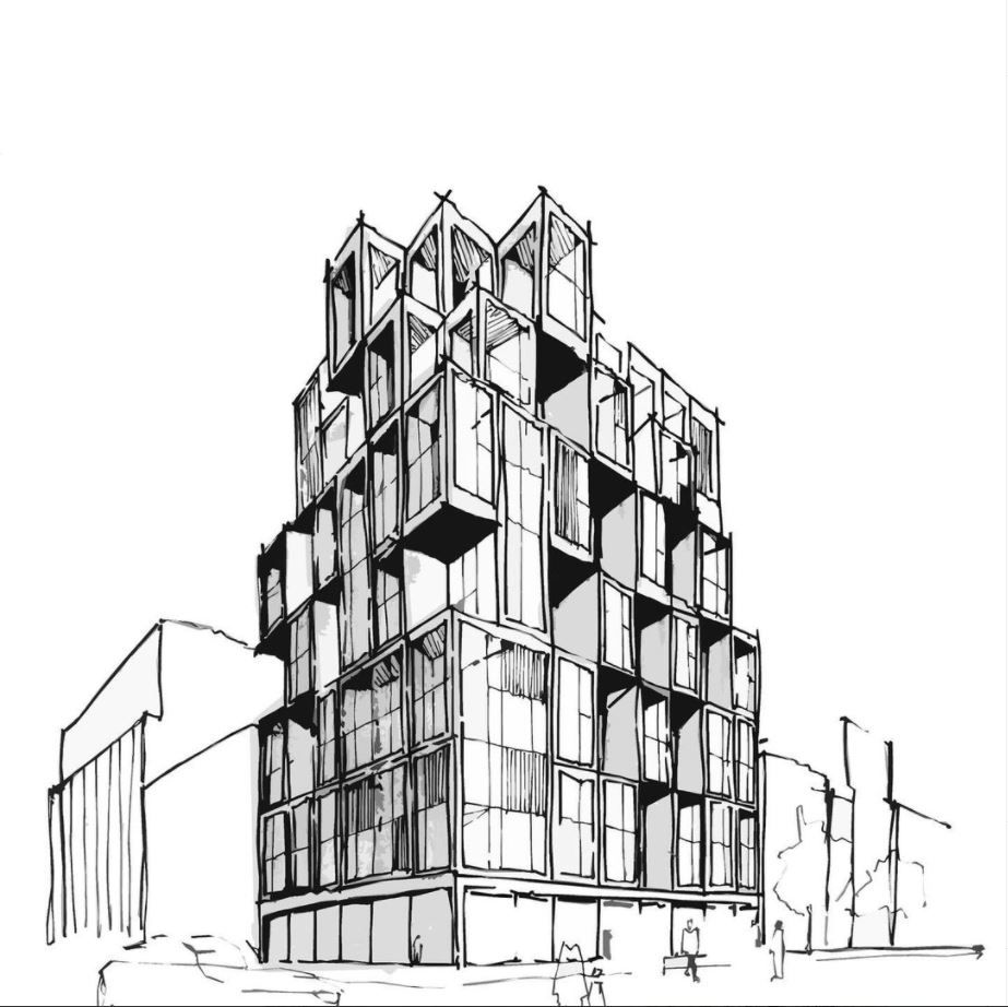
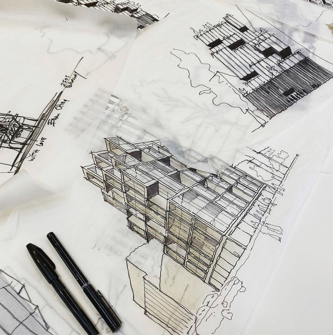
Our first intent was to ground the bustling intersection and provide breathing room for passersby. You’ll notice throughout ODA’s portfolio that we often play with pattern, depth and fractal geometry. This type of pattern repetition works on many different scales. Just as we view them in nature, patterns are equations for our brains that innately make sense.
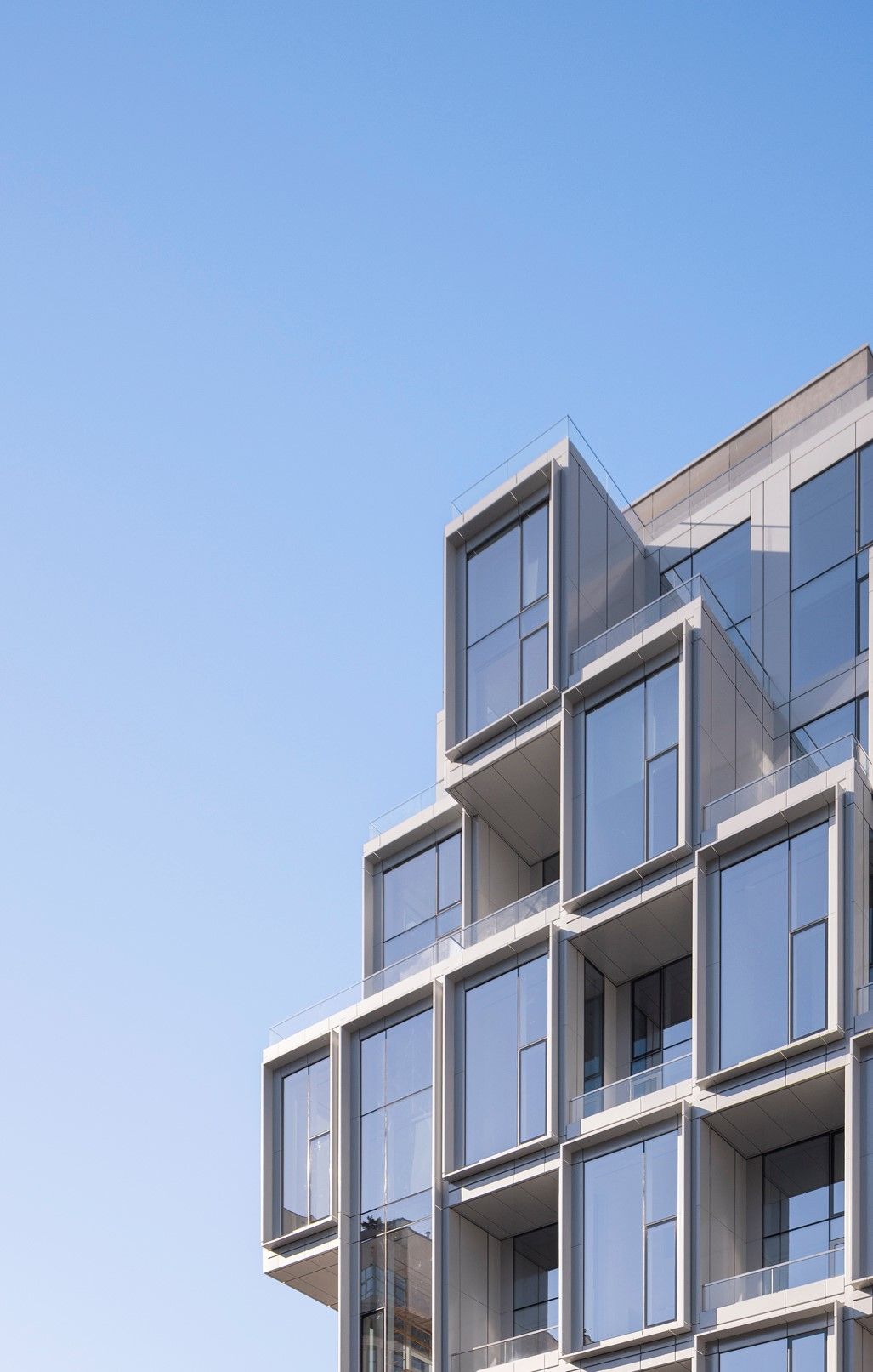
We wanted this project to be a true indoor-outdoor living experience for its residents. While still maintaining privacy, the floor-to-ceiling glass walls offer residents a stronger connection to views of the city. Most homes also feature terraces that are fully covered due to the geometric façade, which makes the outdoor living spaces feel like they’re a part of the interiors.
How did the site drive the design?
The corner of 14th Street and 6th Avenue serves as a crossroads for New York City’s most sought-after residential neighborhoods. In designing 101 West 14th Street, we wanted to anchor this intersection and make it more than a place for passersby. We wanted to create a striking façade with visual intrigue that would ground the intersection and serve as a future landmark for the neighborhood, one that will fuel more residential development and make 14th Street into its own residential corridor.
Material palette?
The façade is composed of 18-foot glass panels from Italy’s Province of Treviso. We wanted the façade to be modern and transparent so that residents felt connected to the city landscape. The glass is also triple-paned to ensure residents will not hear the street noise.
Scale and proportion?
In an urban hotspot like New York City, we measure quality of living in volume, not in floor area. We have less square footage to work with in this city, so we chose to bring 101 West 14th Street residents more breathing room with a vertical living experience. The 18-foot floor-to-ceiling glass walls allow residents to enjoy double-height living rooms, a complete rarity in New York City.
How does it relate to its context?
At the old Tiffany building on Union Square West, we took an industrial building and reimagined it with a new glass façade. We wanted to do something similar a few blocks away at 101 West 14th Street. These two buildings are meant to be icons in the neighborhood. We built 101 West 14th Street not to blend in with existing architecture, but to stand out and shape an entirely new future for the 14th Street corridor.
For more, go here.

