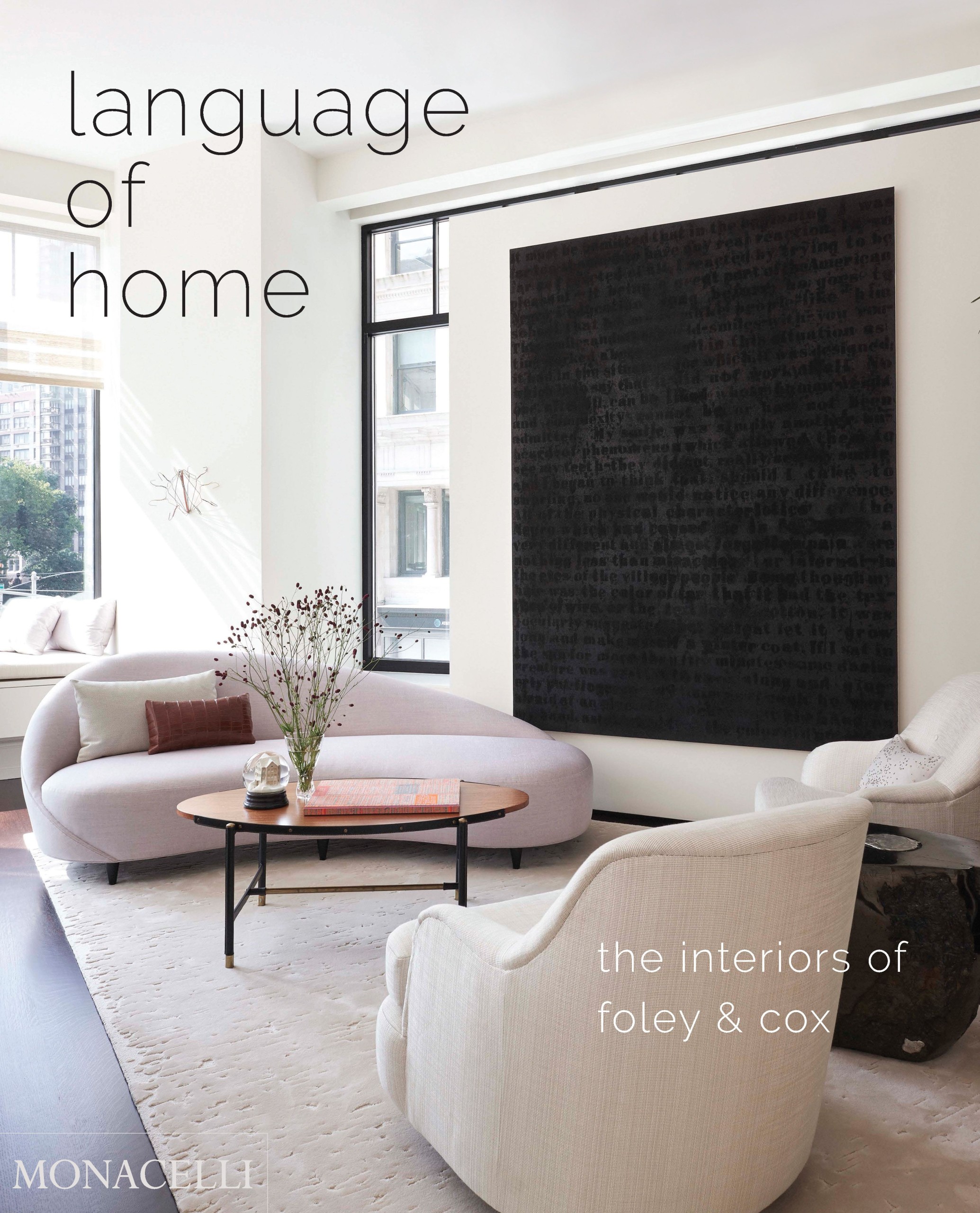
After practicing for 20 years, the interior design firm of foley & cox has published its first monograph.
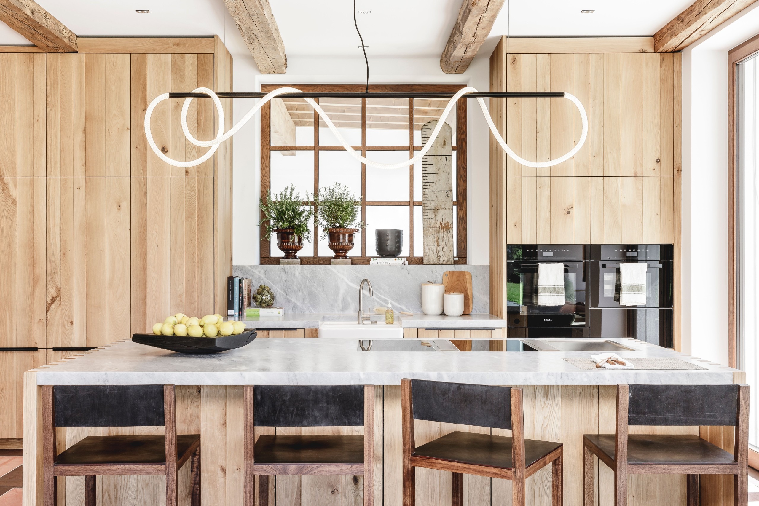
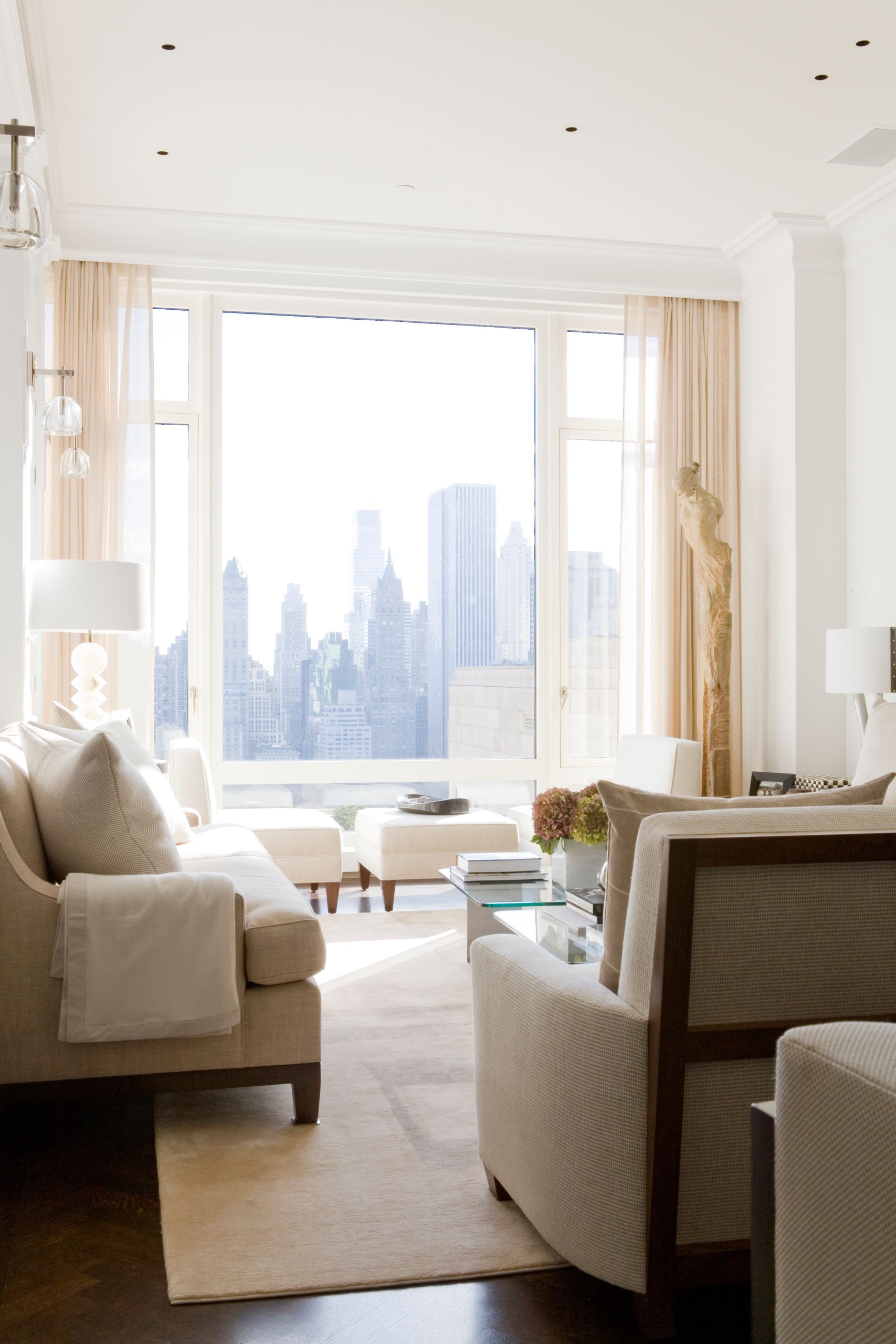
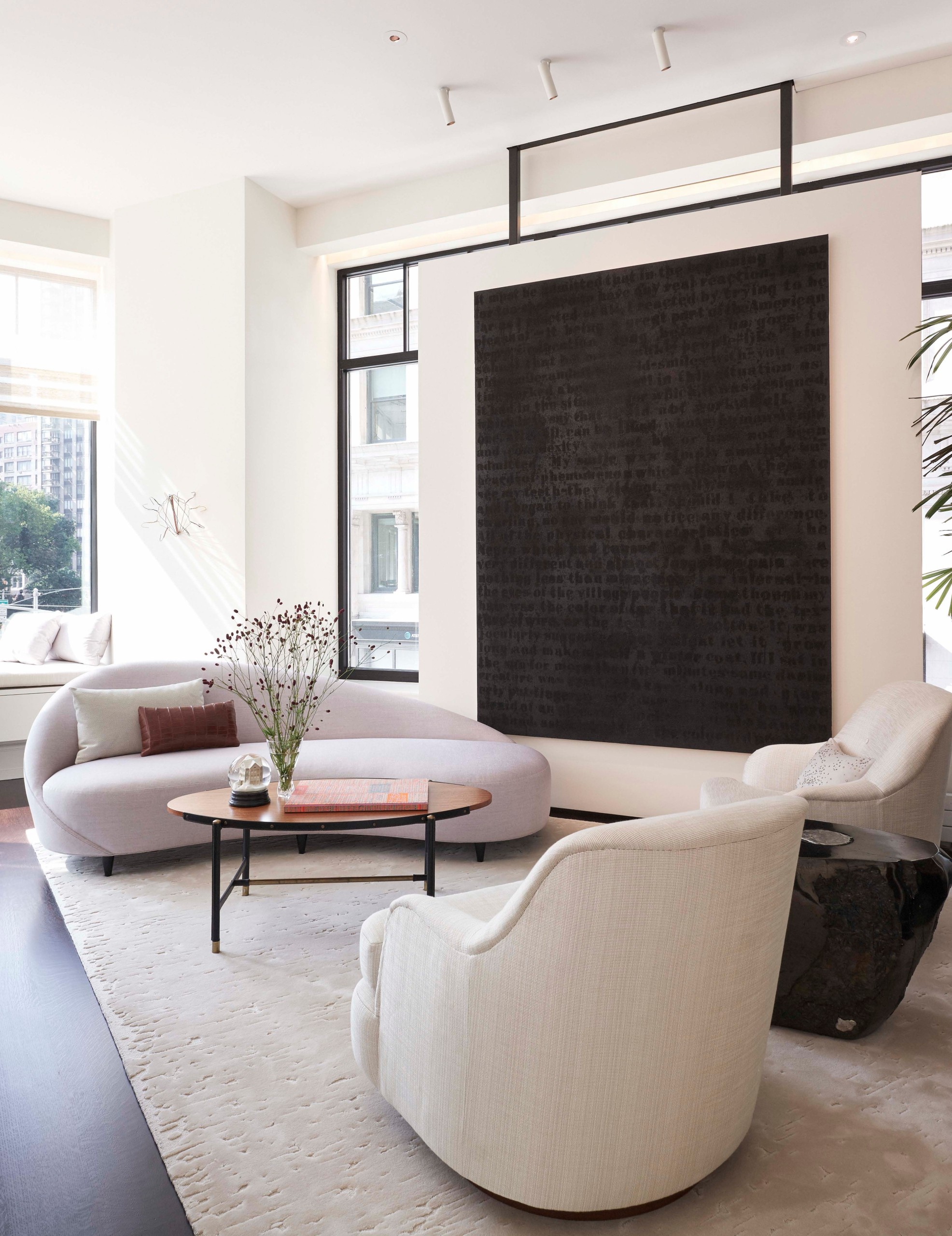
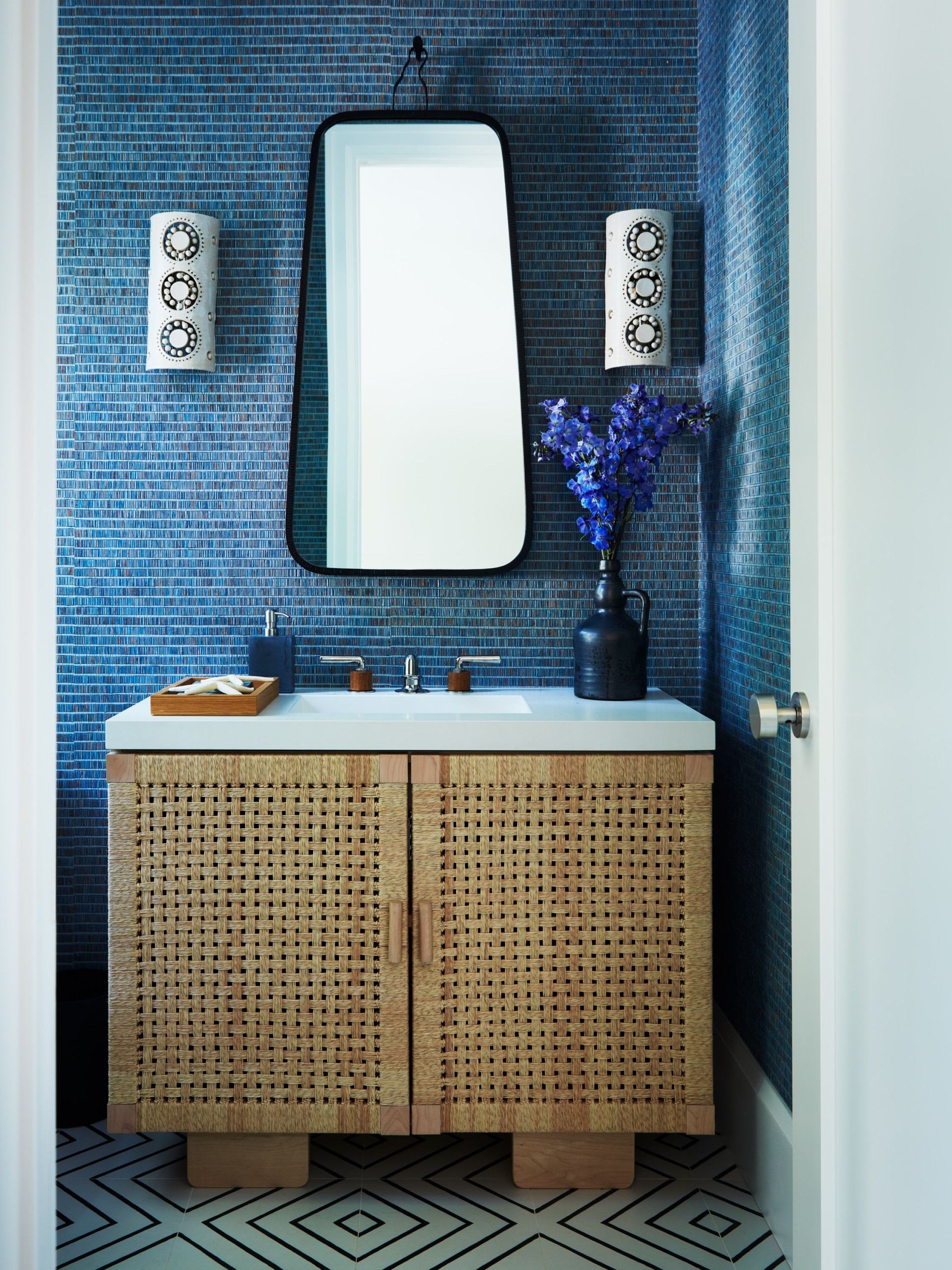
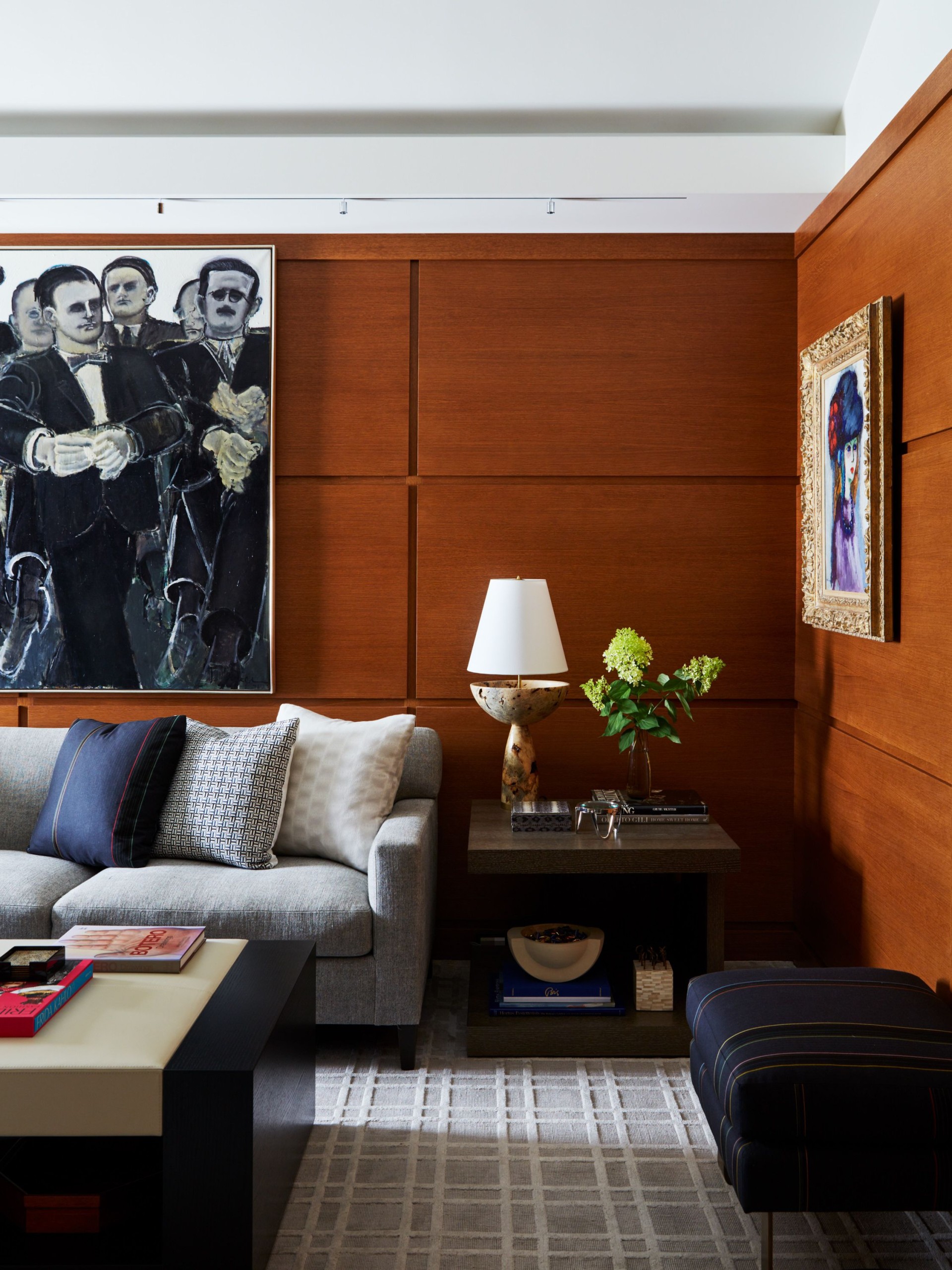
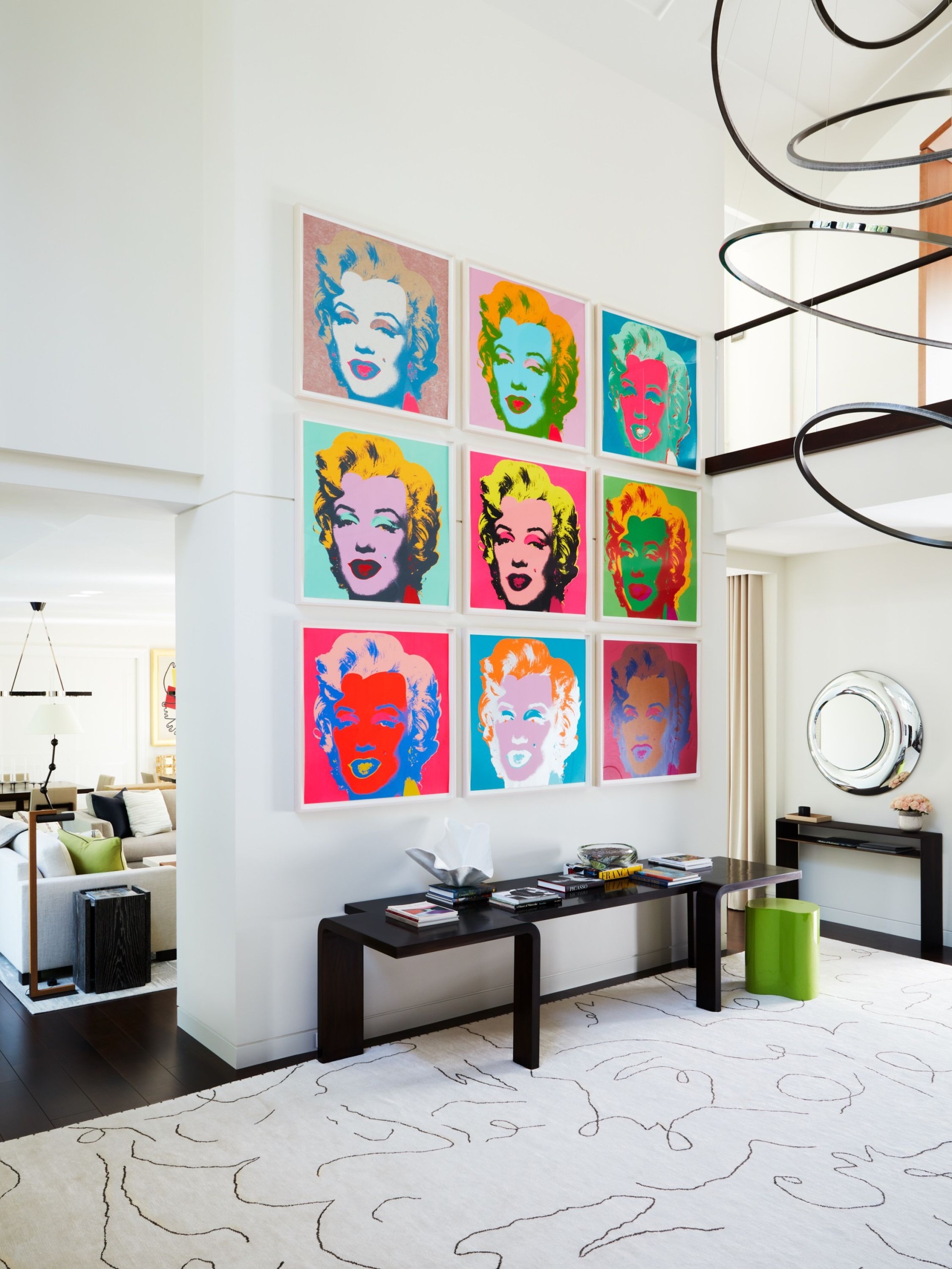
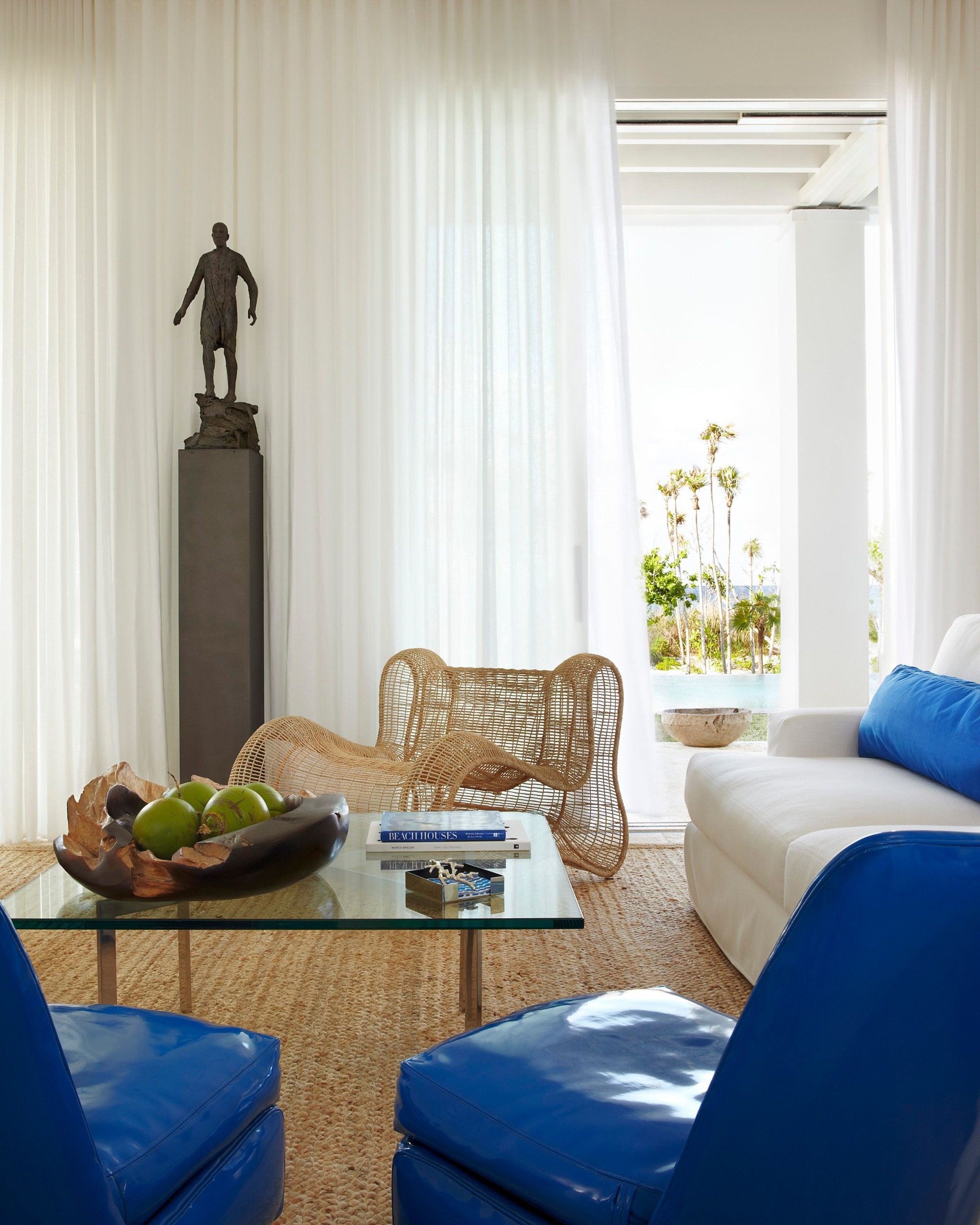
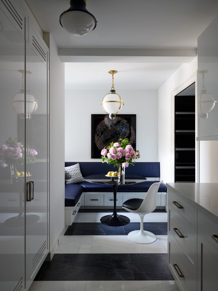
It’s called “language of home,” and it’s 248 pages of sumptuous – if stripped-down – residential interiors across the globe.
The 10-person firm is based in New York, and its clients are concentrated there, as well as in New Jersey and Connecticut. But they go where their clients take them – including the Bahamas, Hawaii, Morocco, Moscow and London.
For years, they’ve basically worked below the radar with a tight circle of clients, with the majority of their work coming to the by repeat or referral. Now, though, they’ve gone public.
“We wanted to share our story and aesthetic principles, and pictures really are worth a thousand words,” says Michael Cox, principal in the firm. “And we wanted to celebrate the relationships we’ve cultivated with the architects and clients we’ve collaborated with.”
He says his clients don’t own the company, but they are running the company. “They’re highly successful and focused with a clear idea of who they are and how they want to live,” he says. “They partner with us to articulate that – they’re experts in their industry and rely on us to interpret their visions into their homes.”
The firm’s mission is to create sanctuary and evoke delight, and make it approachable. They want to make their designs a reflection of the person and the home rather than the firm. And they eschew the trendy. “We strive toward timeless and enduring design,” he says. “We’re designing for generations – for an extended period of time.”
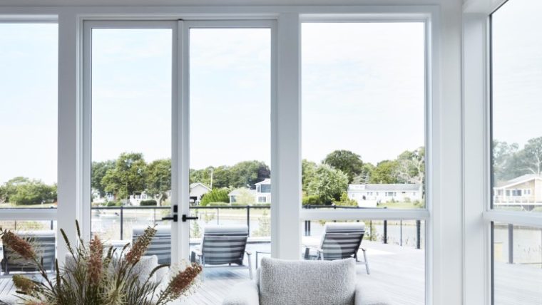
They start any design with the site, which Cox calls fundamental. “We take that into consideration before the design starts,” he says. “The locale gives a sense of place for indigenous materials, or skills like an artist’s, that are part of the vernacular of the space.”
Their material palette is natural and real, like wool versus rayon, and earthy materials like stone, wood, and iron. “There’s a natural authenticity that’s evocative of making it belong where it was in the world,” he says.
They’ll create a clean, neutral backdrop that allows clients’ preferences for art to enter the space, sometimes adding patterns and layers with warmth, whimsey, and joy. “Then we step back and say: ‘What’s unnecessary?’” he says. “And we’ll pull it back a little – it’s a process.”
They take the concept of scale and proportion seriously, overlapping with an architect and working with the synergy of the inherent dynamic. But there are times when they’ll play with it too – like blowing up the crown molding or baseboard for a surprising update to a classic environment.
“Light fixtures are one of our signatures – a sculptural element to add art on a different plane than on a wall,” he says. “It can be a surprisingly large or small light fixture for a sense of joy. It’s fresh and reinterpreted classicism.”
The result is a kind of layered minimalism that’s been curated with care.
For more, go here.

