Photographer Paul Clemence’s sense of timing has always been pretty much impeccable.
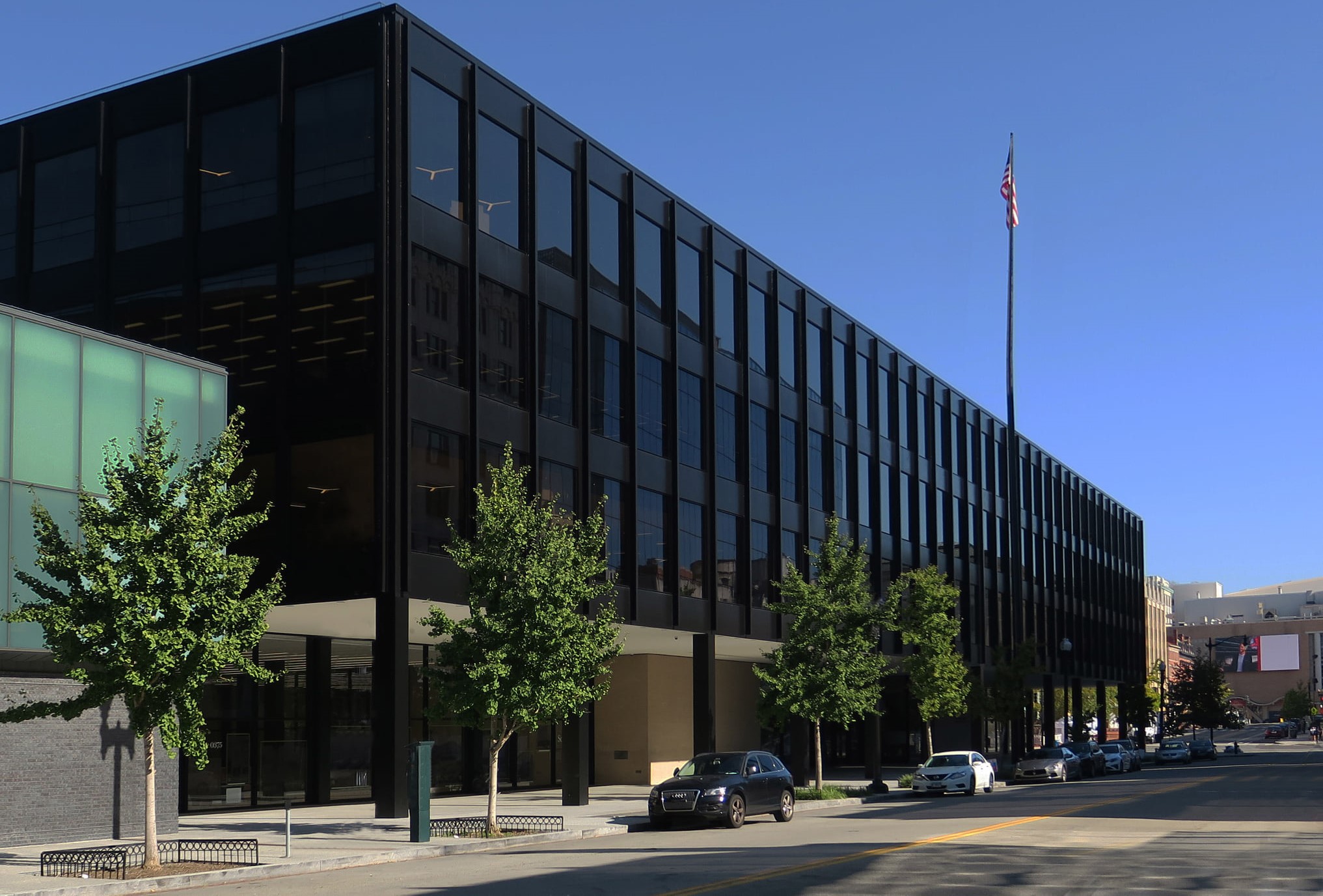
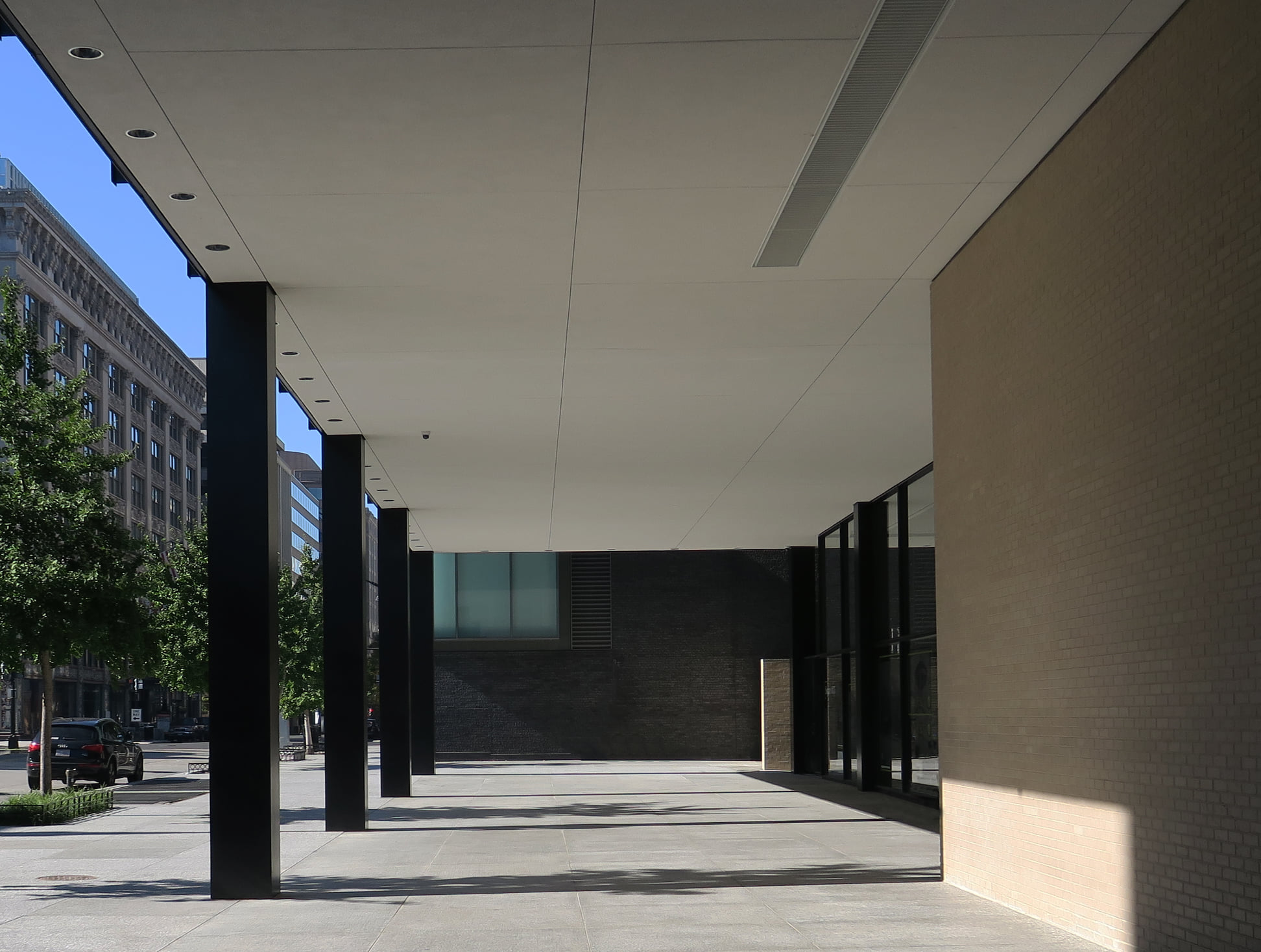
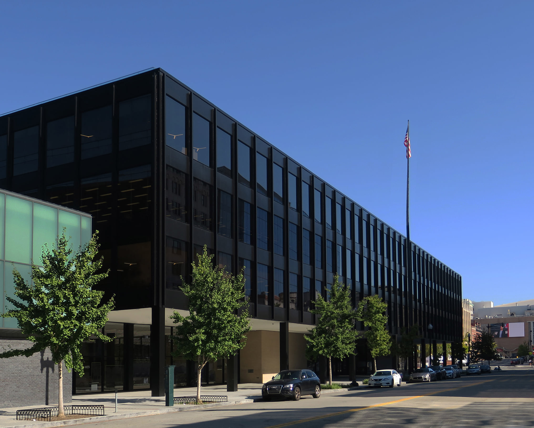
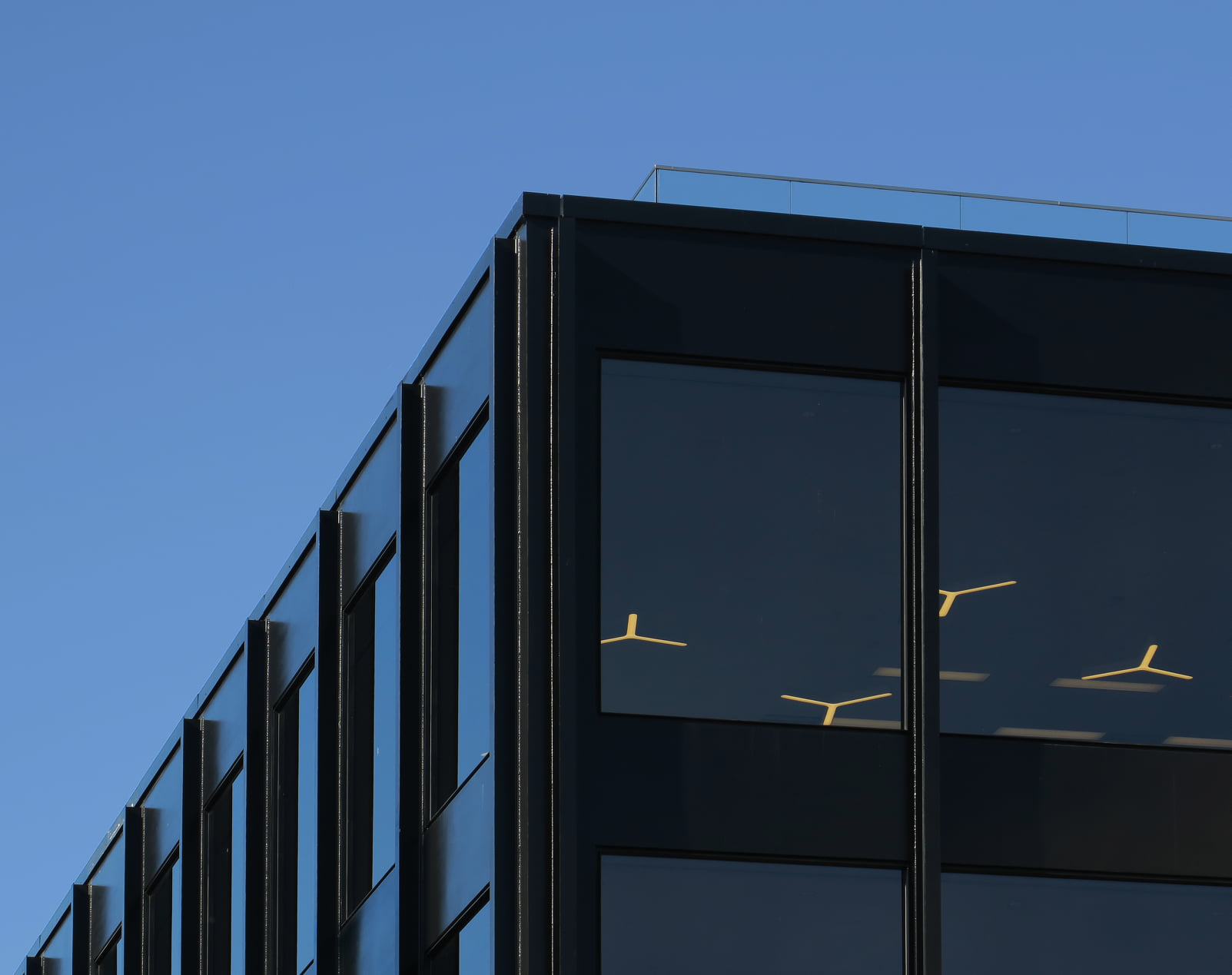
In Washington, D.C. in 2021, he spent hours shooting one of Mies van der Rohe’s final projects.
The Martin Luther King Jr. Library at 901 G Street NW was completed in 1972 and designed mostly as a book-lending library, with little space for community activities – and lots for offices.
That began to change in 2012 when Durham-based Phil Freelon was asked to re-imagine the building for the 21st century. “He was commissioned to do a study of the library and generate some excitement about the feasibility it being saved,” says Richard Reyes-Gavilan, the library’s executive director. “At the time there was some support for closing it and making it part of another development some blocks north.”
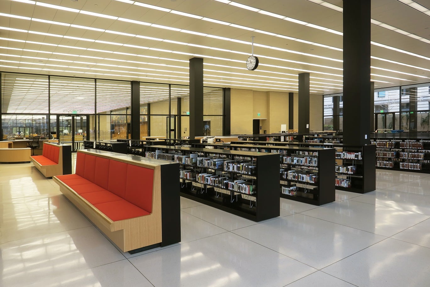
Symbolically important as the first major structure in D.C. to be named after Martin Luther King Jr., the library was landmarked in 2007. In 2021, a new library opened after three and a half years of redesign at the hands of two firms: Dutch architects at Mecanoo and local designers at Martinez & Johnson (now part of OTJ).
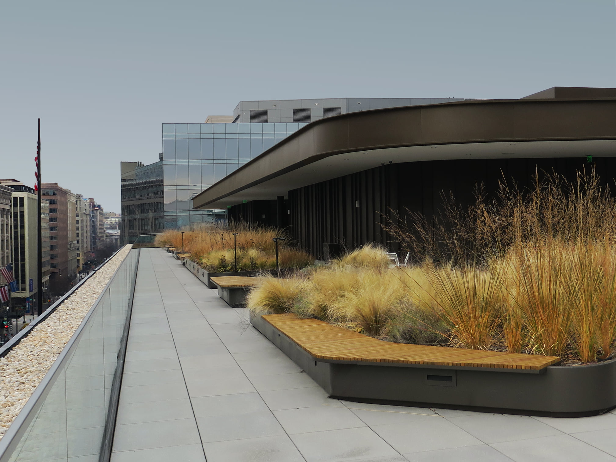
Already a big building at 400,000 square feet, now it offers 500,000 square feet of usable space. “It has grown because we added a pop-up to the original roof,” he says. “And the growth is in the modernization – we gutted a lot of the original building, converting it from office space to public space.”
Mies did two kinds of buildings, Reyes-Gavilan asserts. “There were skyscrapers like Seagram or Lakeshore, or one-story,” he says. “The MLK Jr. Library is like four one-story buildings on top of each other – and within, there are a lot of unnecessary hidden spaces.”
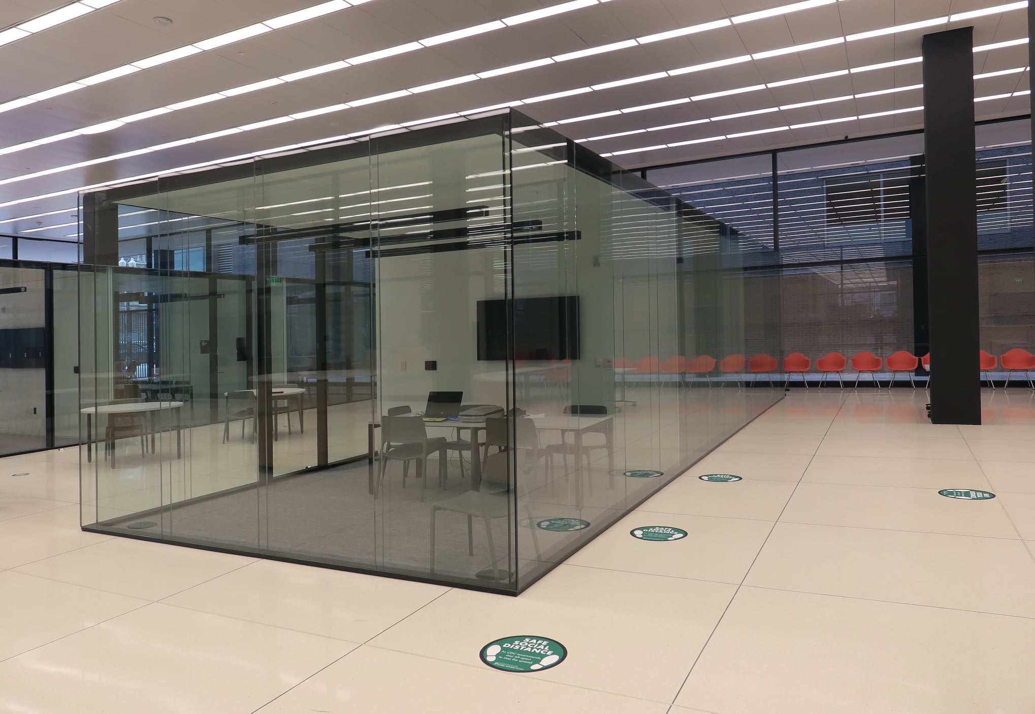
Originally, each floor was composed of a large area of opaque office space built into the center, separated from the public. “There were brick walls that were not structural,” he says. “They were not historically protected so we could knock them out and provide great views inside the building.”
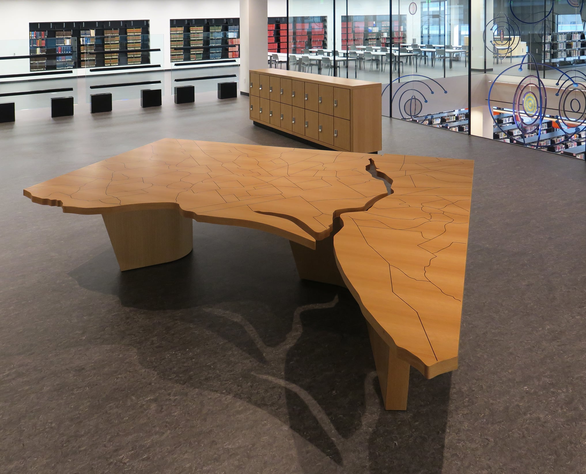
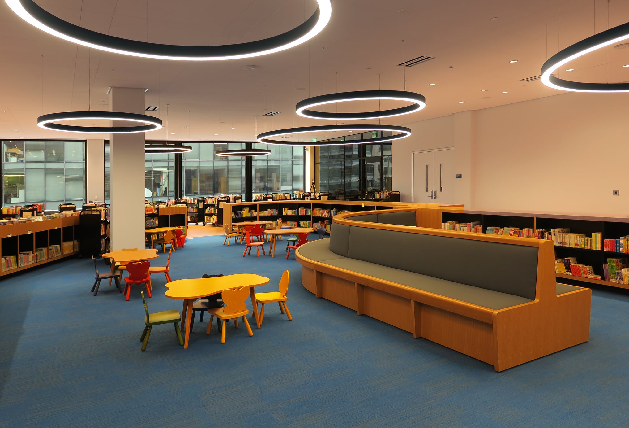
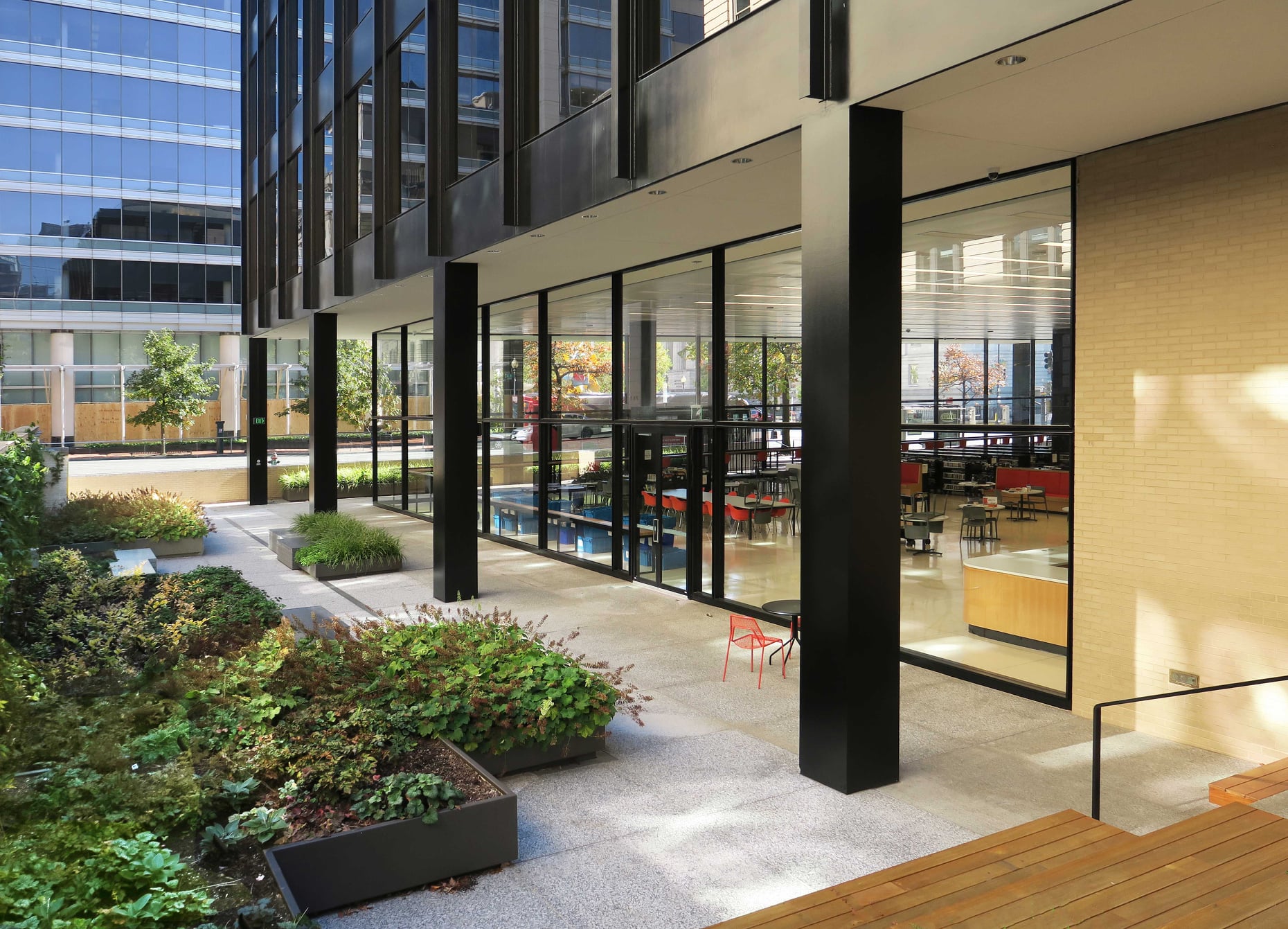
Once the walls were gone, the architects were free to create connectivity between programs and add destinations inside the building. “Now there’s a real dynamic space between the second and third floor – and a children’s slide,” he says. “There’s a 300-screen auditorium connected to the outdoors – and a reading garden where you could go out and eat a sandwich if you wanted to.”
The big idea was to breathe new relevance into a building that was heavily used but basically unloved by D.C. citizens – though its namesake garnered tremendous respect. “We wanted to create a building that residents could be proud of and love – to create something that is not a federal property or a Smithsonian museum,” he says.
Now the library honors Dr. King and his aspirations – with transparency. “We think we did that well, with the amount of natural light, exhibit spaces, and a real semblance of possibilities we didn’t have before,” he says.
And today, on Martin Luther King Jr. Day, we have proof of that – framed by photographer Clemence’s keen eye and strong sense of timing.

