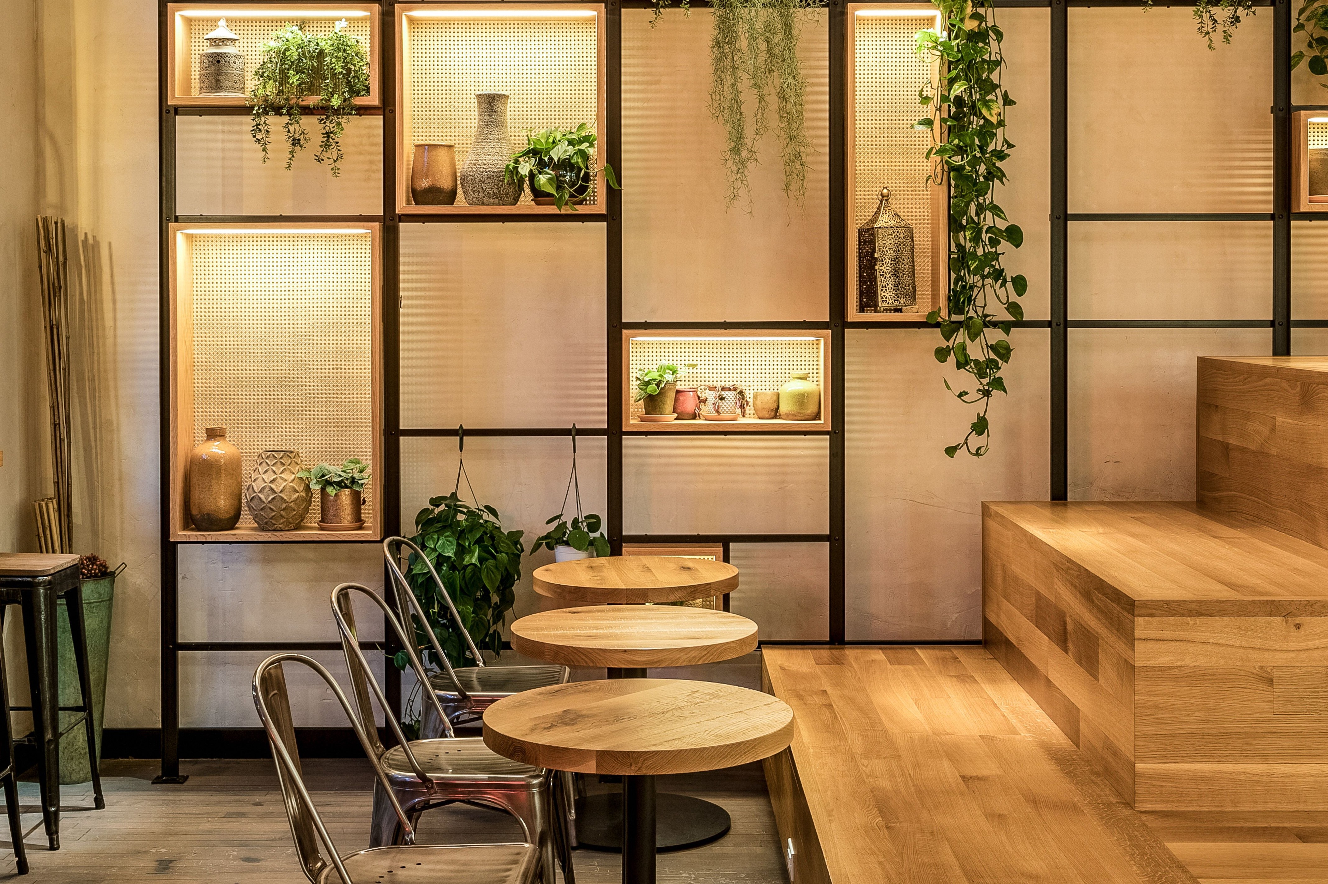
Mint Kitchen on University Place in downtown Manhattan doesn’t shout at you with elaborate materials or bright colors.
No – it whispers to you instead, with glass, tiles, timber, concrete and metal.
“It’s about using humble materials and creating space by layering details on,” says Jun Aizaki of CRÈME Architecture and design. “That’s what their food is about too – it’s that and also nicely proportioned.”
His clients are from Israel, and Mint Kitchen is their first venture as restaurateurs. Not to worry, though – they brought a chef with them. “He’s well known in Tel Aviv,” he says. “He takes care of the menu.”
Aizaki took care of the interiors, dealing with the dichotomy of a restaurant that’s meant to be fast and convenient, but also a space where people will linger and want to come back. “Those two are almost conflicting,” he says.
A graduate of Pratt Institute, Aizaki has designed more than a handful of restaurants in Manhattan. Here, he did his homework. “We found a lot from researching the cultures of places in and around Tel Aviv, and doing our usual digging and research,” he says. “That’s where the material palette came from.”
The new restaurant is 2,300 square feet, and seats 40. “The clients wanted an airy, Mediterranean/Israeli, fast/casual concept in a space that captures what their brand is about: healthy, convenient, inviting and homey,” he says. “They wanted a neighborhood place where anyone could go anytime, and feel cozy.”
The big idea? Comfort, whether the customer’s in a hurry, or ready to settle in. “We tried to respond to what the owners wanted, and to reflect the healthy cuisine, Israel and the culture, and be approachable, very green and light and airy,” he says. “We really pushed it a little.”
They did that without a pushy effect. Here, warm and relaxed is more like it.
For more, go here.
[slideshow id=2018]


