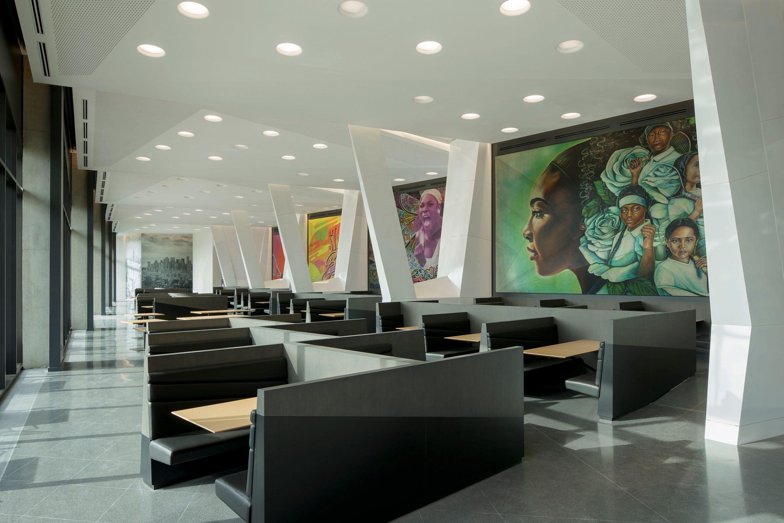
Serena Williams may be evolving away from tennis after this year’s U.S. Open, but her name and image will live on for a long, long time at Nike’s World Headquarters.
The Serena Williams Building, designed by a team from Portland, Oregon-based Skylab Architecture, is the largest on campus – at one million square feet.
It’s currently the workplace for 2,260 employees in Beaverton, Oregon. “Nike was looking to reorganize and bring all its designers together in one building, as well as its consumer lab, and mockup space for retail development,” says Susan Barnes, Skylab’s project director. “There were complex programming pieces to it.”
Started in 2014, the project was completed just in time for the pandemic in 2020. But working from home has worked out well for the company, Barnes says. “The building is an open studio – we succeeded in giving them the flexibility they needed,” she says.
Anchored by a twelve-story tower, the building marks the epicenter of campus. It’s LEED platinum-certified, with sustainable design features like energy efficient mechanical systems, photovoltaic panels on the roofs, a rainwater capture-and-reuse system, regional and recycled materials and FSC certified wood products.
Still, it’s a huge building for a couple of thousand employees “So, communication was important,” she says. “And it has very human scale to it for being so large.”
It’s also open to its environment. Courtyards, gardens, plazas and a sunken tennis court break down the scale of the building and provide informal outdoor spaces for work, recreation and relaxation. Natural light floods the workspaces along each bar from glazing on two sides and skylights above communicating stairs.
“Work spaces have sight lines to nature on each floor, with daylighting,” she says. “Each floor has an outdoor garden that anyone in the building can access.”
The building consists of four parts: An underground parking garage and loading dock; a merchandising center for prototype retail spaces; integrated design studios for multiple product categories; and the12-story tower with shared amenities for the entire campus.
Integral to the design is the concept of flow — a fluid design strategy that’s both efficient and enlightened. It facilitates unexpected connections and possibilities, among designers and between disparate parts of the business. “We created a variety of scales of gathering spaces to foster identity and connectivity, both indoor and outdoor,” she says. “The building is organized around a principle that all designers for each brand within the business occupy a single level, while the services stack vertically between levels.”
In a first for Nike, products can move from sketch to prototype to final design to retail fixture all under one roof.
Its site once contained a parking lot and an access road to an adjacent building, all next to a wetland that the campus had turned away from. “For us, regenerative design involves working with nature as an active partner towards both respectful site design and intelligent construction with responsible systems and materials,” she says.
To better connect to the natural landscape, the architects buried the existing access road, along with all parking and loading to minimize the visual presence of cars and trucks. Each of the building’s distinct bars, or wings, cascade to the south and feature inhabitable, interlacing green roof terraces that overlook the wetland.
Sustainable, accessible to nature, and dedicated to cutting-edge product design, it’s a fitting, state-of-the-art tribute to the greatest woman tennis player of all time.
For more, go here.
[slideshow id=2473]

