I recently penned a feature article for Period Homes magazine on Washington, D.C.-based Hill & Hurtt Architects’ successful conversion of a Bethesda developer-designed home into an understated and luxurious residence. Their clients were savvy enough to call in landscape designer Patricia Miller and interior designer Paul Corrie to complete the transformation. A+A is pleased to post the feature here today:
A 1990s suburban house in Bethesda, Maryland. has turned the corner from bland to beautiful. That’s because a team of clients, architects, interior designers, and landscape architects collaborated on rethinking the developer-designed home.
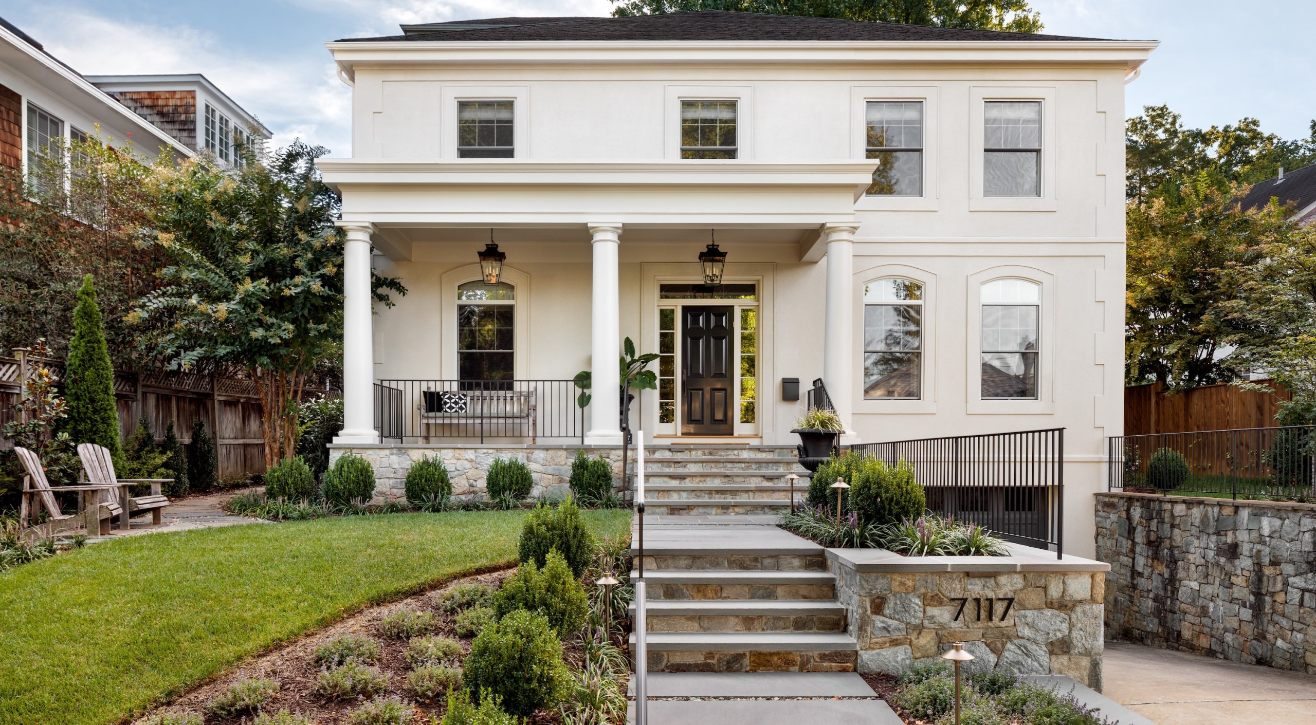
For starters, the site offered no connection from front door to street. And to enter it meant climbing a series of steps from the double-wide driveway below. “It had a strange entry configuration,” says Eric Hurtt, principal and partner in Hill & Hurtt Architects of Washington, D.C. “A pedestrian had to descend the driveway in order to ‘find’ the stair to the front door.”
The clients, a couple from New York City, approached Hurtt for ideas about how to address both issues—and more. “They saw the bones of it,” he says. “They wanted to make it a house that didn’t so much stand out, but fit in.” The house is located in one of Bethesda’s older neighborhoods, near downtown. The homes around it date to the 1930s and ‘40s, though some are more recent. But this one just didn’t relate to its surroundings.
Hurtt reconfigured its entry by removing a broken pediment over the front door and adding an off-center, Georgian-style porch. He eliminated a cantilevered porch stoop and seven feet of driveway beneath it. “The driveway was narrowed, and that allowed the porch to extend across and become the primary entry, rather than secondary,” he says.
The clients called in Patricia Miller, landscape designer at the Montgomery County firm that bears her name. They asked her to redesign the entire exterior, starting at the new front porch, and create a procession down an eight-foot grade to the street. She also tackled the home’s two sides and backyard. “Each area had its own challenges,” Miller says.
Drainage was a priority. Miller created a cascading system of French drains under a path of irregular flagstones on the home’s left side, then continued the drains down to the street. “I’m always thinking about function and aesthetics,” she says.
The function here was to deal first with surface water and mud. Between the flagstones on that meandering path, she added three-quarter-inch Delaware river stones so water can percolate down below the joints. For aesthetics, she embellished the left side with lush plantings. “It was a fabulous environment for ferns and textural plants,” she says.
New steps and landings open up to what she calls a kind of syncopation. “Design is choreographing movement through space,” she says. “To achieve that, I had to build a tall retaining wall, and had it stop and turn itself into the steps on the walkway.”
She created a series of eight-foot-wide steps below the porch, then transitioned them down to a narrower walkway and stairs. She planted boxwoods between the retaining wall and walkway. To the left of the front porch, her meandering path leads to a seating area laid in more of the irregular flagstones, with river stones laid in their joints, too. Elsewhere she used a more formally configured flagstone. “The thermal flagstone is so elegant,” she says.
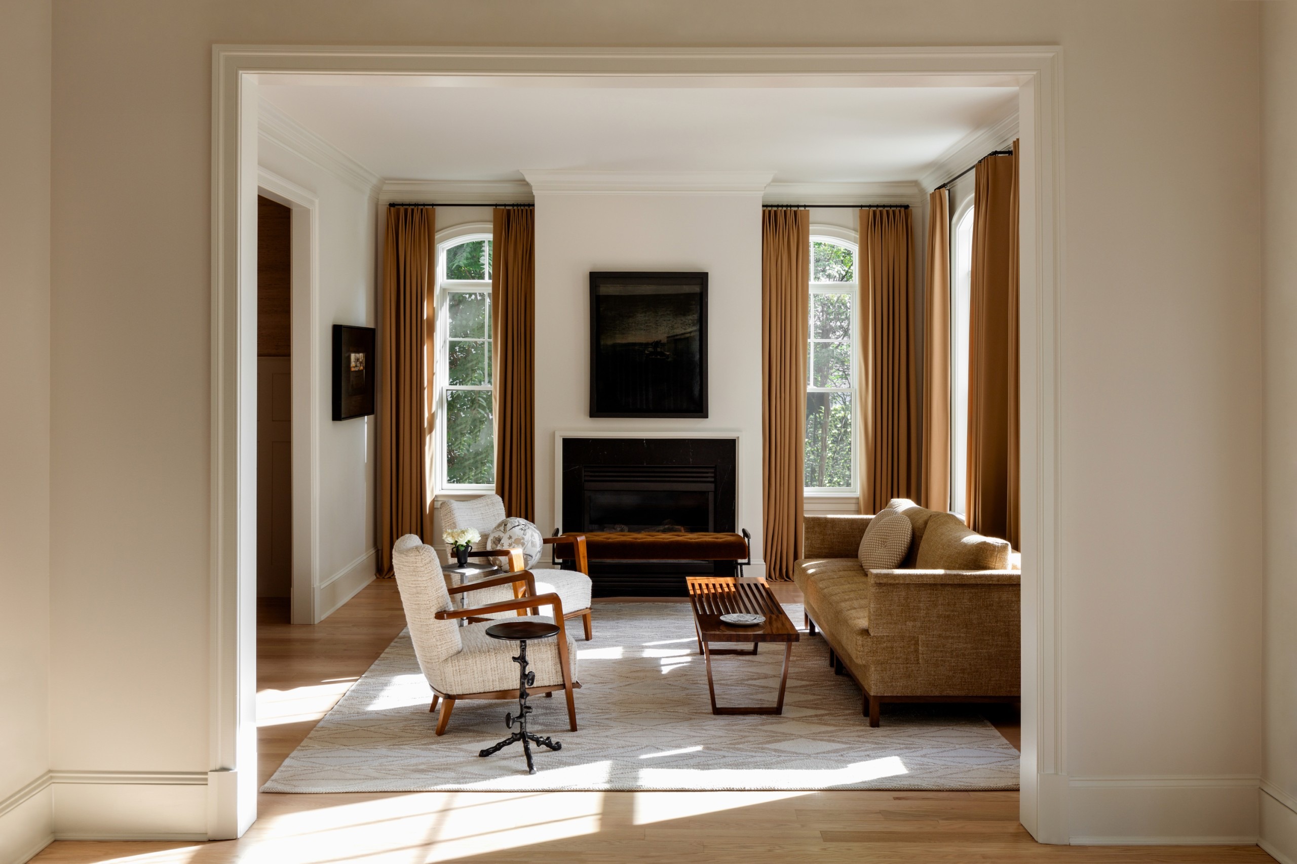
Inside, Hurtt’s primary goal was to increase connections throughout the home—through the interior spaces and out to the garden. From front to back lay a wide center hall, living room, dining room, kitchen, and family room, all cut off from one another. “They were open to the center hall, but there was not much sharing of space,” he says.
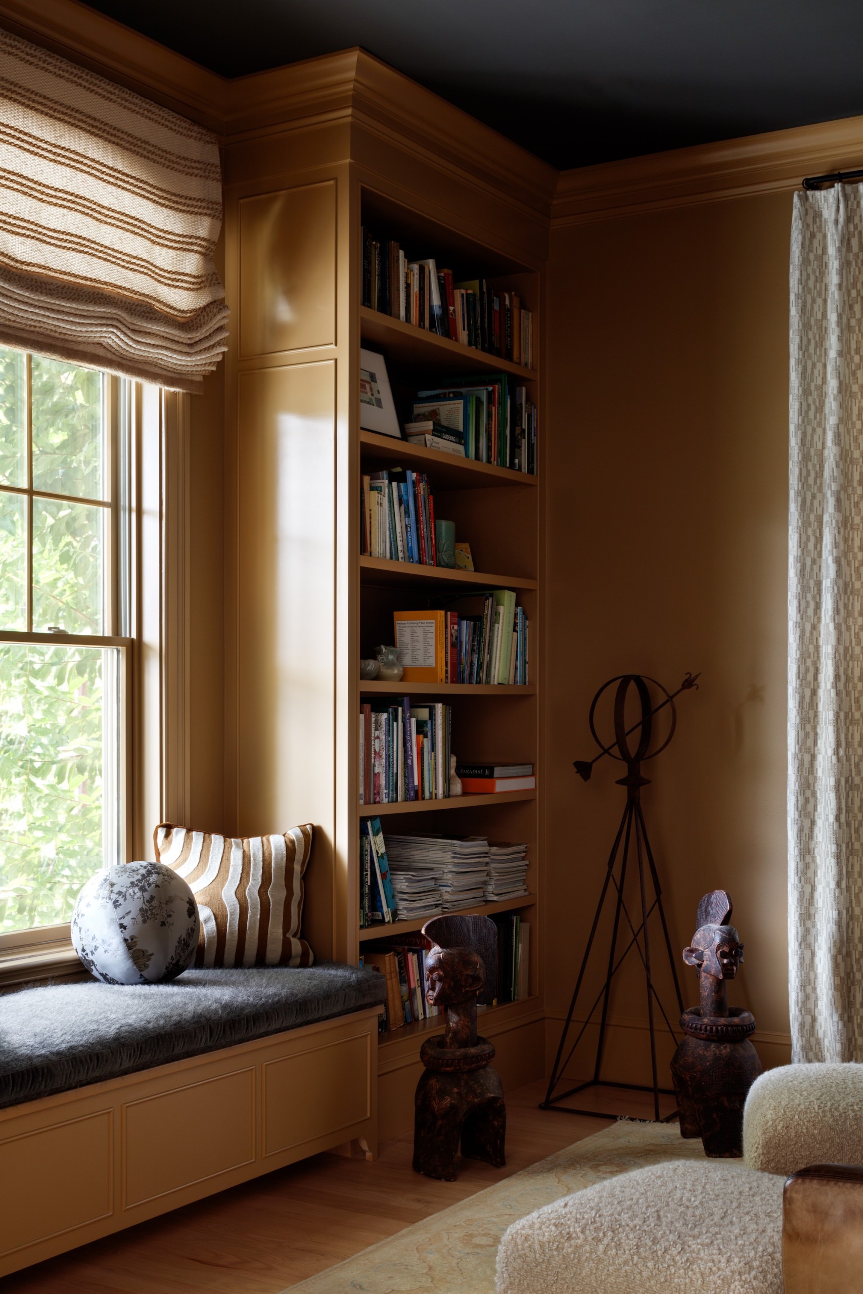
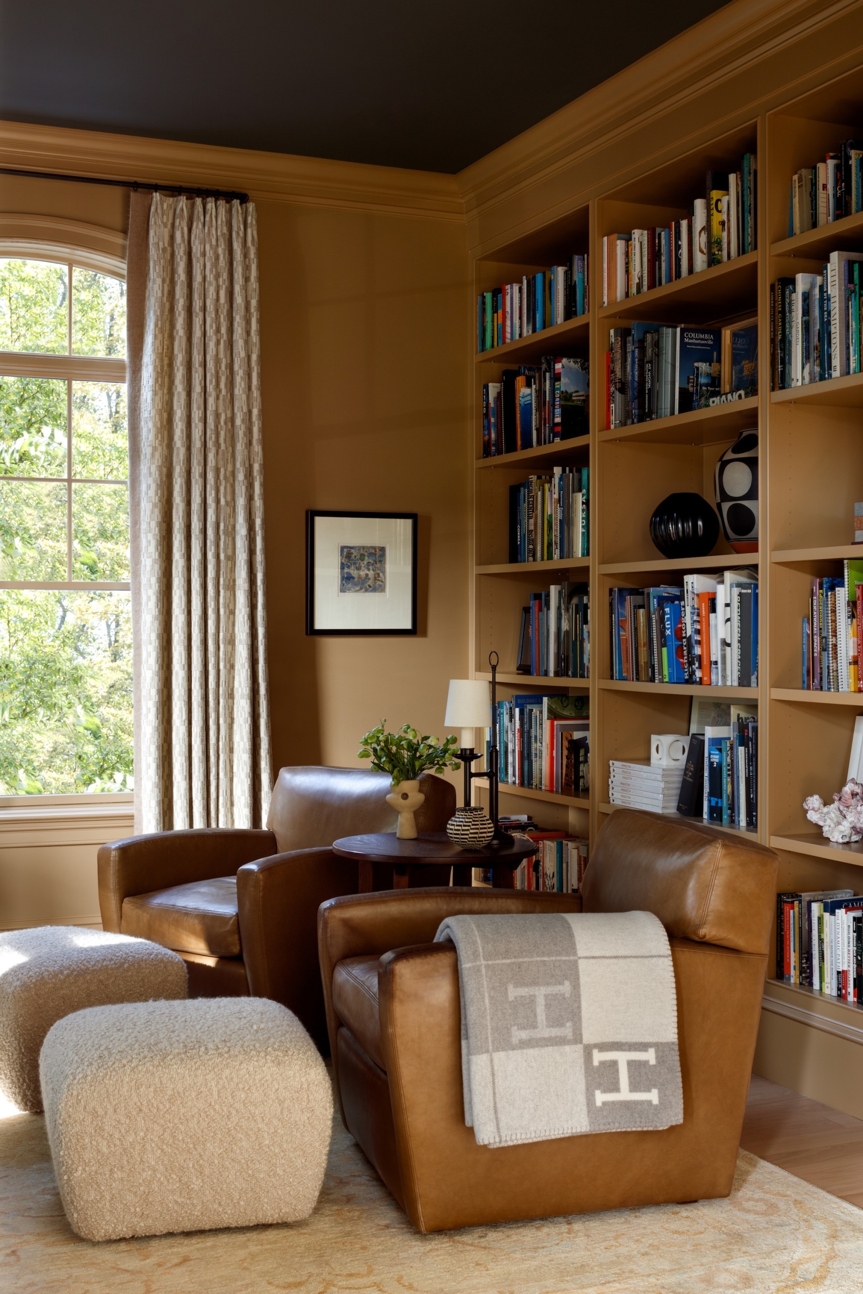
He worked to make sense of the relationships between those rooms—how their scale worked together—and render the home more livable. He opened parts of the house to the backyard and allowed natural light in. He scaled the trim down, then built a new library with floor-to-ceiling bookshelves and a window seat.
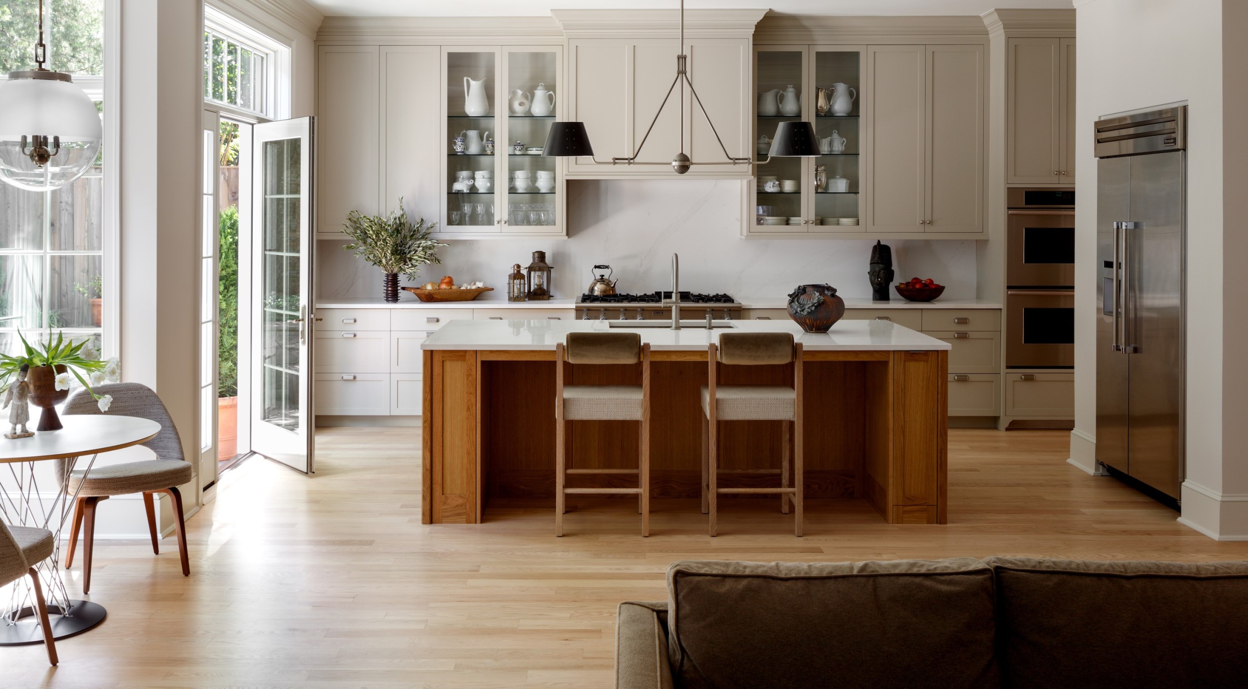
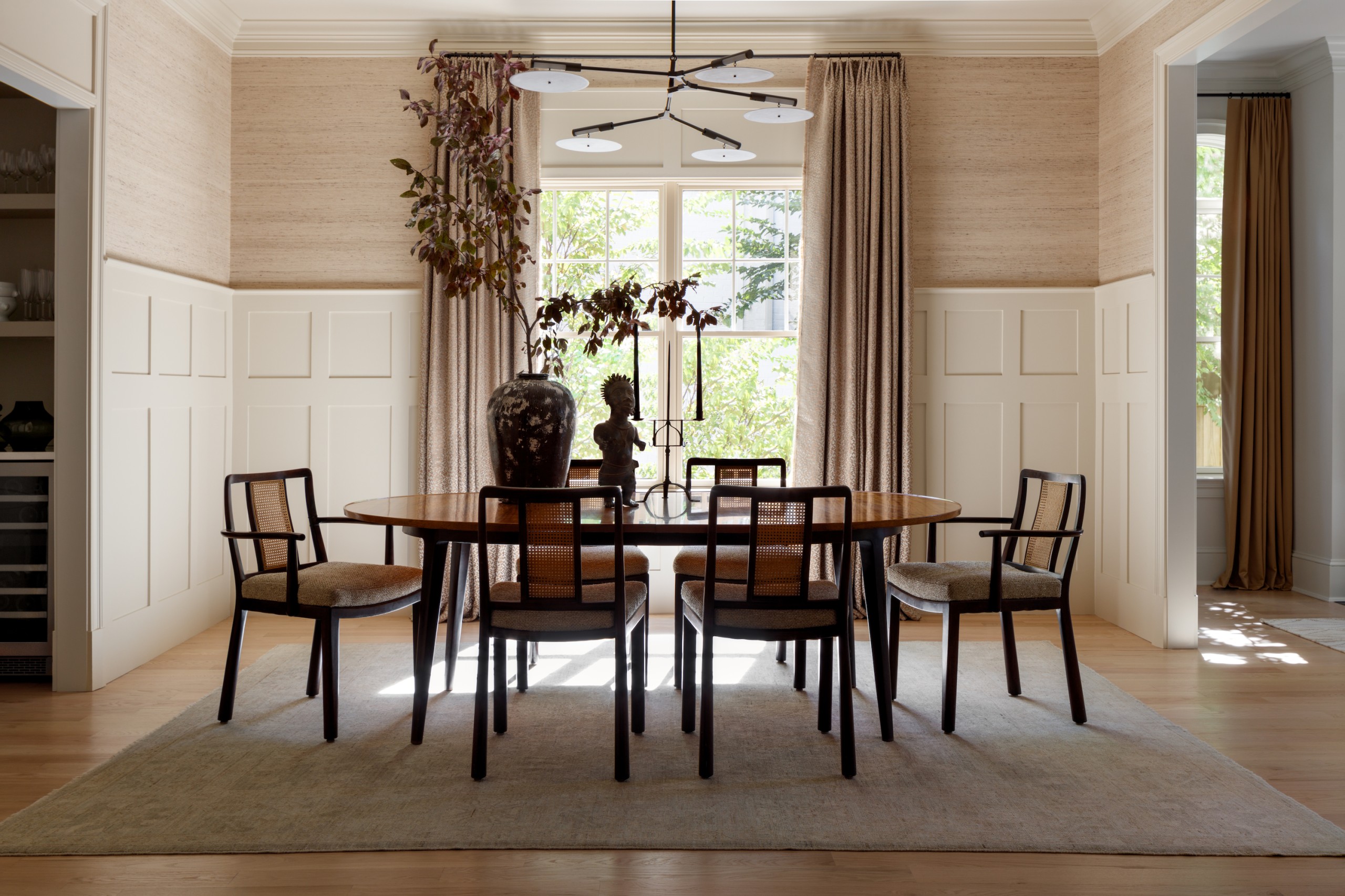
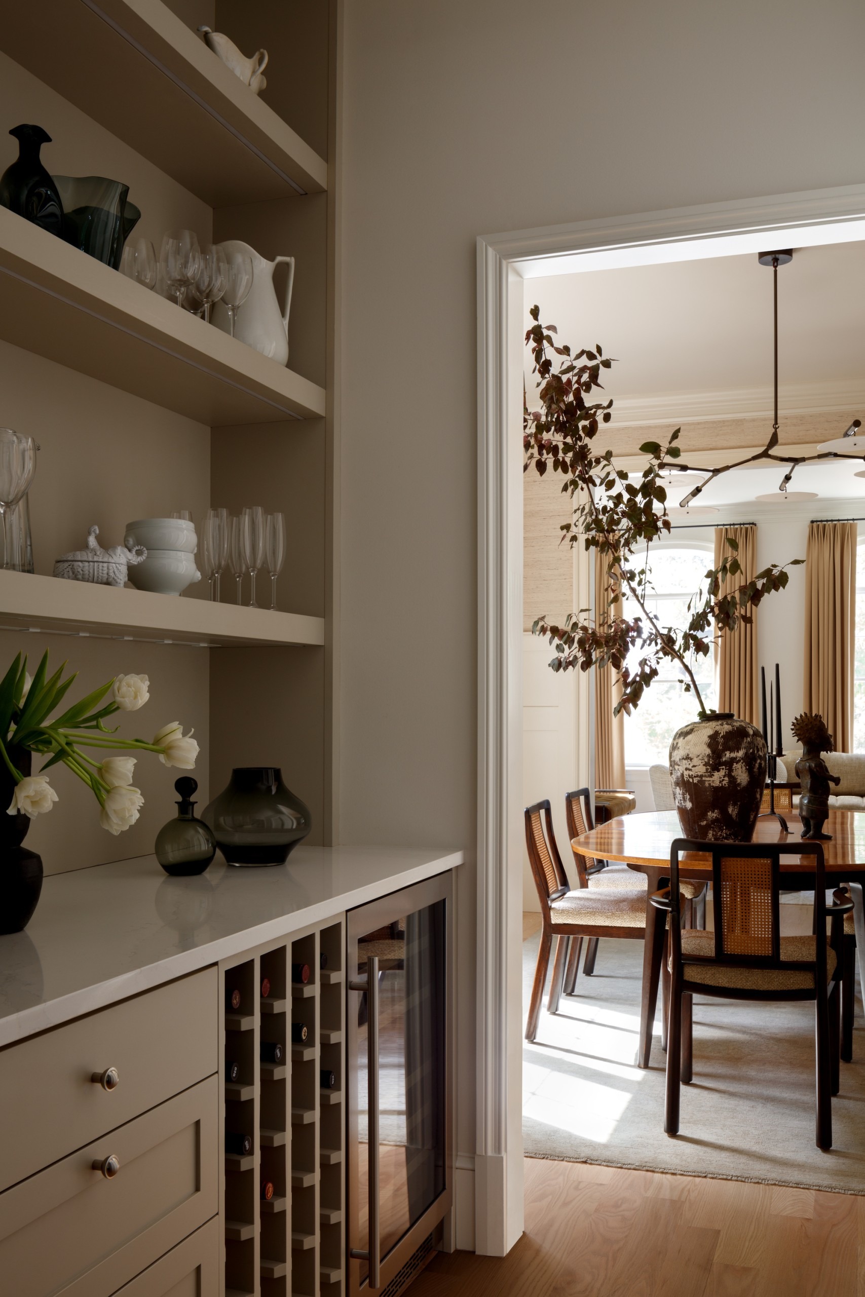
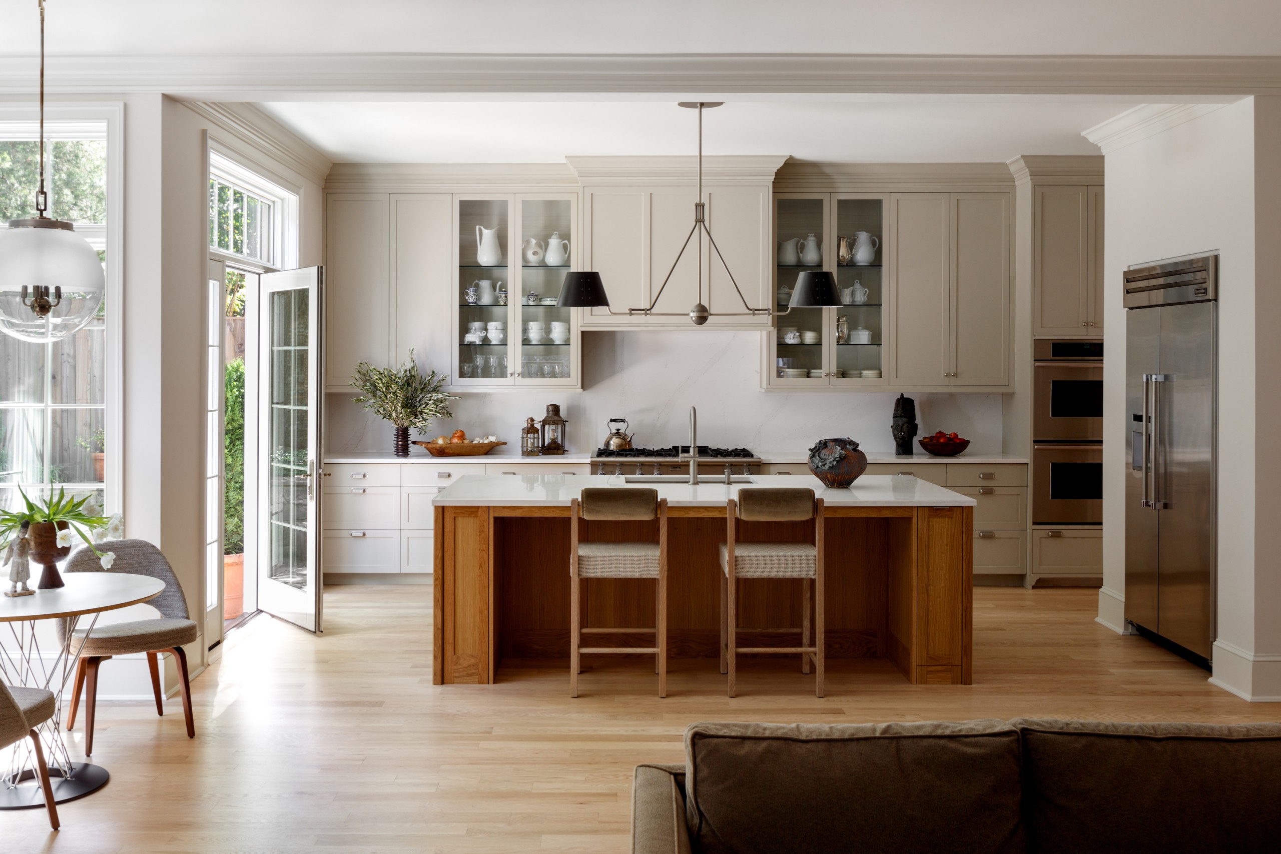
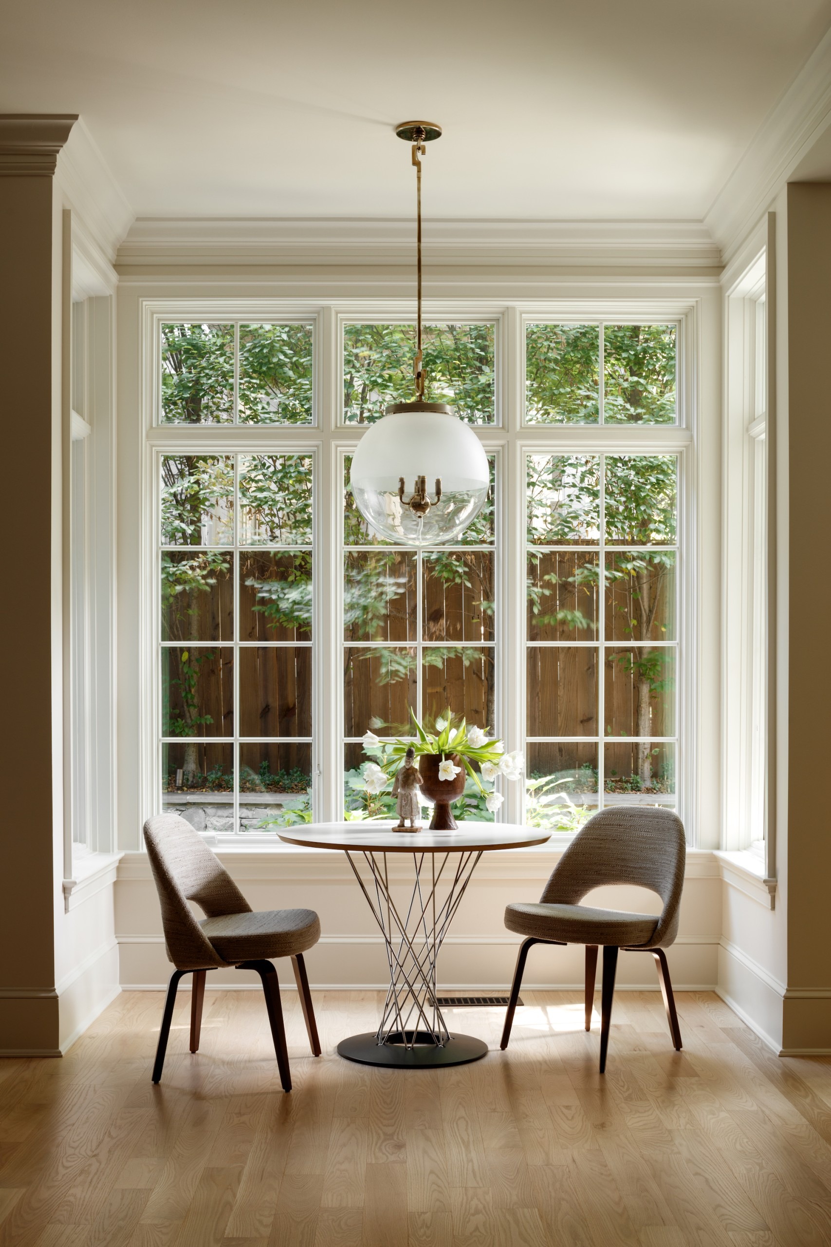
Hurtt also overhauled detailing for fireplaces in the family and living rooms with new stone surrounds and wood trim, and added paneling in the dining room. Next, he redesigned cabinetry in the butler’s pantry and kitchen, adding new windows and a transom to a breakfast nook there, and lowered the window sills, so that the feeling is of being “in” the garden.
With about 75 percent of the architect’s’ work done, the clients called on interior designer Paul Corrie of Washington, D.C. to help with the renovation and design the spaces. “It’s 7,000 square feet for two people and a dog,” quips Corrie. “It’s such an enormous house—you have to be aware of that size and be mindful of what you put in a space and how to use it.”
The couple brought with them a collection of art and a number of family heirlooms and midcentury antiques. Some of their artwork is modern, abstract, and photographic; Corrie’s task was to define the nature of the art and where it would be placed. “It can’t go just anywhere,” he says. “It has to have a relationship to its environment.”
In the dining room, he delivered a fresh, modern look and feel to the couple’s early 20th-century dining room table and chairs. “I reupholstered the chairs in a textured fabric, and juxtaposed a Shaker-style feel with a contemporary chandelier,” he says.
Now the home’s interiors have a gentlemanly feel. “They’re not big pattern guys, so when I did inject patterns it was done in a very subtle manner,” he says. “There are masculine tones throughout.”
The clients and Hurtt collaborated on connecting the kitchen to a reconfigured backyard. At a kitchen wall’s bump-out, they added French doors, sidelights, and a transom. Outside, Miller repeated her irregular flagstone and river-stone joints, then added a boxwood garden and transplanted an oakleaf hydrangea already on site. “It’s up-lighted so at night you see this specimen shrub highlighted against a 28-inch-high, stone wall,” she says.
Hurtt says his design intent was to give the home a distinct personality—to make it into what it could be, instead of what it was.
That’s precisely what this talented team achieved, individually and together.
For more, go here.

