Ever the optimist, when Heather Asker was asked Tuesday how she was, she had a chipper response.
“Better than good!,” exclaimed the merchandising and marketing manager at Bella Notte Linens.
Maybe that’s because she’s in beautiful San Francisco. Maybe it’s because she wasn’t about to endure the East Coast’s first major storm of the year. Or maybe it’s because she’s got a spiffy new product line to boast about.
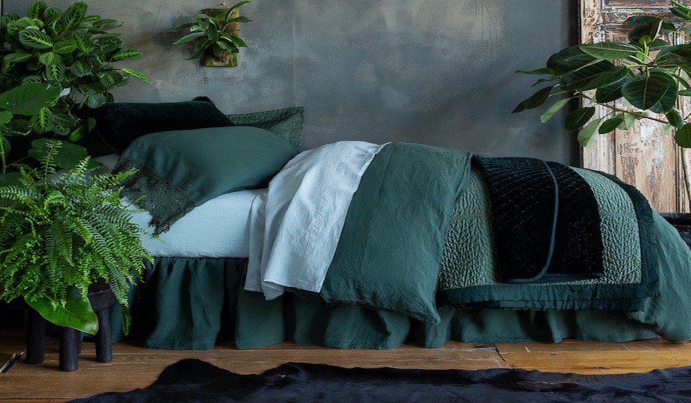
We were on the phone to talk over Bella Notte’s new collection, Cirillo. It’s 600-thead-count, cotton sateen and 100-percent cotton fill. “We chose the name because we wanted something fitting of the collection,” she says. “It’s a little more masculine, and it means masterful and lordly.”
Well, maybe – if masterful means deep greens, French lavenders, gentle ripples and puckers in between. And if lordly means easily playing with color and texture and sheen, then sure – she’s right.
But the natural world was an inspiration also. “I want to say nature played a big role in the curve and ripple and the wave-like pattern,” she says. “It reflects the feeling of when you’re in a deep forest or inside the ripple of ocean waves – it brings nature into the luxury of a space.”
The Bella Notte team wanted top-of-bed and accent pieces with a little bit of color for eye-catching, dark and mannish tones. “You’d be able to incorporate them into any space and gently accent them, or be statement pieces,” she says. “They’re really versatile that way.”
But the target market is anyone and everyone. Cirillo’s been developed intentionally and dreamily to touch all of the company’s product lines – living pieces, bedding pieces and baby blankets, in all 18 of its. colors. “The color can be subtle or dramatic,” she says. “It creates something that complements the rest of the line – it can be versatile in the bedroom or the nursery.”
That means the full spectrum, from white to Corvino black and Bella Notte’s two new colors, French lavender and juniper. “They make it a little more cohesive, more rooted, and timeless – versatile shades to fit into any design,” she says. “They’re soft and subtle for the children’s room, with a calming sense that lavenders do – and the juniper’s not too yellow and not too blue.”
In other words, it’s all better than good.
For more, go here.
 Bella Notte Winter 2024 Mattine Guest Towel


