A midcentury modern indoor pool in San Francisco’s Mission District lies at the heart of a newly redesigned community center there.
It was originally designed in the sixties by architect William Merchant, who’d first been mentored by Bernard Maybeck but turned to the International Style later in his career.
Now it’s stepped up to meet the 21st century with a renovation of its 18,600 square foot natatorium. and the addition of a new 3,400 square-foot clubhouse and connecting entry lobby.
The new design was a collaborative venture between TEF Design and Paulett Taggart Architects. It’s meant to meet all the needs of the Mission District, a popular neighborhood in rapid transition. Young families are moving into its heart. To the south is a public housing project occupied by African Americans. And multigenerational Latinix families are being pushed to its edges, where the pool and clubhouse are located.
That’s a wide range of constituencies to cover. “We were asked to create a facility that would no longer be a pool, but the Garfield Center – and take care of the needs of this diverse population,” says Alyosha Verzhbinsky, principal at TEF Design. “The neighborhood’s not dangerous but it’s not safe either, so the center is a refuge from that environment.”
The former facility consisted of a 33-yard-long pool and antiquated locker rooms that users had to walk through to get to the pool. One wall was a concrete frame. Another was completely glazed And one more was partially glazed. None of that made for great acoustics – and the glazing had been replaced with plastic over time, so views were obscured.
“A portion of the project was to bring the facility up to current standards,” he says. “It was a wholesale renovation, with new glass walls and new locker rooms – it was straightforward and very necessary.”
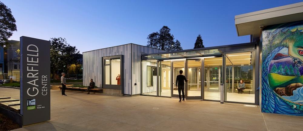
The architects demolished a 1960s building that sat at a different elevation from the pool and didn’t connect to much of anything. “It created a kind of no man’s land, had no identity and no useful square footage,” he says. “So we created a straightforward building that would be identifiable and welcoming.”
They accomplished that with a parti that called for a simple glass structure that connected the new building to the existing pool, a 30-foot gap between the two. “You go right to the pool and left to the other facilities,” he says. “A glass lobby opens up to the interior courtyard – it’s welcoming and not standoffish in any way.”
Even the restrooms were thoroughly thought through. “They can be accessed within the building when it’s open, from the inside,” he says. “And when it’s closed, they’re open from the outside.”
They explored an architectural approach with simple detailing and undecorated boxes that are slightly twisted. The plan is a modern rectangle, and that shape is modified as well. “It’s sloping, so the entry side is lower and the opposite side is taller for a multi-purpose room,” he says. “There was a modest budget but enough to do something slightly out of order.”
Leaving the shell of the 33-yard-long swimming pool as is, they modified its uses to meet the needs of all. “We added a semi-permanent bulkhead for swim lanes 25 meters long, plus an area for aerobics for others,” he says. “Before it was for swimmers only, but now it’s for recreation and family-oriented activities as well. It opens up the building to all area constituents in the neighborhood.”
Art is a required component for buildings developed in the public realm, and this one was no different. A competition was launched to design a properly placed, site-specific work of art, and the architects were involved in the selection of the artist and the art’s placement.
“It’s a west-facing glass wall, one-third of it glazed with a 120-foot-long glass mural that was designed by an Oakland artist with connections in the Mission neighborhood,” he says. “The artist held workshops on site and installed it in the glass wall – and we collaborated tightly on it.”
Collaboration – with stakeholders, other architects, and local artists – is the touchstone for this project.
For more, go here.
[slideshow id=2432]


