Effective graphic design, says Archigrafika’s founder Michael Gerbino, is about communication.
And if it looks good, that helps too.
“It communicates in so many different ways,” says the adjunct professor at Pratt Institute, his alma mater. “If you’re in the subway looking for a train, it helps you – or if it’s an album cover for the Beatles it gives you joy to look at, while it tells you whose music it is.”
It might also announce a radical new idea – like John Lennon’s and Yoko Ono’s bold and striking billboard from 1969, plastered across 12 cities around the world.
“It said: ‘War is Over If You Want It’ in a simple typeface,” he says. “But it was a powerful graphic design communication – and it’s still effective today.”
Archigrafika’s new book, “Graphics for Architecture” explores how graphic design can be so closely associated with its environment that it becomes an integral part of it.
It looks at the firm’s work for corporate clients like Aon, Citibank, Pratt Institute, New York Foundling, Willis Towers Watson, St. Paul’s Chapel and Green-Wood Cemetery.
“I wanted to tell our story, and not just about our jobs with descriptions,” he says of the firm he founded in 2009. “I tried to make it a little personal about our journey, and to create awareness for the company.”
He also wanted to document Archigrafika’s work – believing that when it’s published, it takes on another life. “It’s a document of how we do our research and talks about the merits of the art and the artists,” he says. “I’m glad to have a record of some of our work – not all of it, but some of it.”
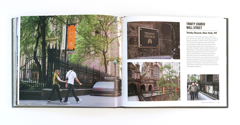
One of the firm’s more significant clients is Trinity Church, at Broadway and Wall Street in lower Manhattan. Its current structure dates from 1790, and it miraculously survived the destruction of the World Trade Center on Sept. 11, 2001.
The church maintains a large footprint in Manhattan, and manages real estate estimated to be worth about $6 billion. “It owns properties like St. Paul’s Chapel, St. Cornelius, and Trinity Cemetery,” he says. “Alexander Hamilton is buried there, and George Washington sat in a pew in St. Paul’s.”
As they redefine graphics for Trinity Church today, Archigrafika is striving to develop a look that feels like it belongs there. “There are the typeface and the background of stone working together,” he says. “There are bronze signs that are aged so they look indigenous to the building.”
That’s part of the firm’s design philosophy, where the graphic design complements the architecture – almost as though the architect designed it. “If they blend together, it works beautifully, like the gold leaf on a brownstone in Brooklyn, or a way-finding system in a subway or on a golf course,” he says. “If it’s not done correctly, it’s just awful – a plastic letter on a brownstone stands out in a bad way.”
He views graphic design as art form unto itself – and one that can expand the breadth of a company’s brand. “Louis Vuitton is a designer whose logo has become artwork,” he says. “And Burberry is graphic design that’s become art.”
Archigrafika develops wall graphics for clients like Willis Towers Watson in New York and Chicago, creating patterns that cover entire office walls. “We refer to it as artwork,” he says. “A lot of our clients commission us to do wall graphics that are exactly that.”
Modest about his own gifts, Gerbino insists he’s the least talented of the firm’s five designers. But he’s got the eye, all right – and he demonstrates that with his photographs of people and birds on his Instagram page.
Hawks are a favorite. “I live near Gramercy Park, and I looked up once and saw a hawk with a squirrel in his mouth while a black bird or crow was chasing him,” he says. “He dropped the squirrel and then sat up on a branch and waited for that squirrel to come back out – and I felt blessed.”
For all that, there’s still the practical side of living in New York – and the importance of graphic design there. As we talked by phone while he was driving, his car ground to a halt. “I’m stuck in traffic now,” he says. “And there’s a sign in front of me that says ‘Be Prepared to Stop.’”
And sure enough, he was.
For more, go here and here.
[slideshow id=2310]


