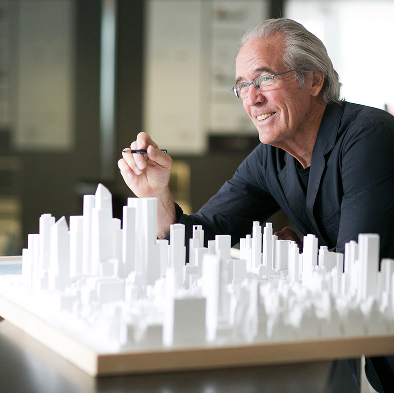
If there‘s one word to describe the direction of Bill Pedersen’s career in architecture, it’s up.
His new book from ORO Editions, “Gesture and Response,” documents 25 of his best-known projects – most of them reaching skyward.
Pedersen studied architecture and played hockey at the University of Minnesota, eventually giving up stick and rink for pencil and drafting table. He finished in 1961, then headed for MIT, graduating in 1963. In 1965, he was awarded the Rome Prize.
The guy is no slacker.
By the 1970s, he was working in I.M. Pei’s office as lead architect for the National Museum East Building in Washington, D.C. – two equilateral triangles on a trapezoidal site. “There’s an extraordinary balance there between the existing buildings and the National Mall,” he says.
In 1976 he was in New York, only to find a 70 percent unemployment rate for architects – but not for him. “I accepted Gene Kohn’s invitation to join him and Sheldon Fox,” he says. “We were doing commercial office buildings – from an urban perspective, they dominate the landscape.”
His first building at Kohn Pedersen Fox was for ABC Television. “Sheldon Fox had a close relationship with them – we did five or six buildings for them – they were not tall buildings, but they did contribute to the fabric of the West Side,” he says.
A flurry of tall buildings would follow in the late 1970s, well into the 1980s, and beyond. They would become the firm’s calling card. “They’re a point of departure for creating architecture,” he says. “Working with I.M. Pei on the National Gallery was a lovely experience, but the mass of construction and buildings that make up the essence and fabric of a city are commercial office buildings.”
So what do tall buildings need to accomplish? “Think in terms of most sustainable form of building, because building densely in the city, you take advantage of transportation and other opportunities,” he says. “They’re not simply commercialism but extremely important to the environment.”
The greatest forces influencing his designs in cities are the buildings surrounding them. “I compare them to iron filings around a magnet,” he says. “Building in an urban situation, you draw from the buildings around it and react to it.”
His 101-story Shanghai World Financial Center, completed in 2008, is a broad-shouldered, prism-shaped structure with an open aperture at its top. It combines a hotel above and offices below, and was named the Best Tall Building in the World in 2009 by the Council for Tall Buildings and Urban Habitat.
“It represents earth and heaven,” he says. “That’s what brought the building about, and also the elegance of its shape – how it meets the earth with a stone base, and an aperture that meets the sky at its highest point.”
At Hudson Yards in New York, he designed three buildings – No. 10, No. 30 and No. 20 – some of his favorites. “I was very specific about my designs there, and I might add that I’m very proud of those buildings,” he says. “I personally believe that No. 10 at the Shed is one of most exciting experiential spaces in New York City.”
Not all of his work is about looking up, though. Some of it is about sitting down – and being as comfortable as possible. Take, for example, his “LOOP de LOOP” chair.
“That chair represents my aspiration more than anything I’ve ever done,” he says. “It was totally an intention and a simple gesture to create all the elements of the chair – even the placement of the arm is part of the natural movement of the chair.”
It may be sculptural, but it meets the needs of the human body, he believes.
That’s true, too, of his buildings that stretch skyward – but favorably impact the way we live and work.
For more, go here.
[slideshow id=2346]


