San Francisco-based architect John Klopf may have built a reputation for restoring hundreds of Eichler homes, but his newest effort in Sonoma drew its inspiration from Europe.
More specifically, from the Barcelona Pavilion designed by Mies van der Rohe and Lilly Reich as the German Pavilion for the 1929 Barcelona International Exhibition.
“That pavilion is a series of outdoor spaces with some that are open and some indoors, but this takes it to different level with a blend of spaces,” Klopf says. “There are the outdoor spaces out by the pool, then some indoor under the roof, and all are connected to and protected from nature in a small pool house/guest house.”
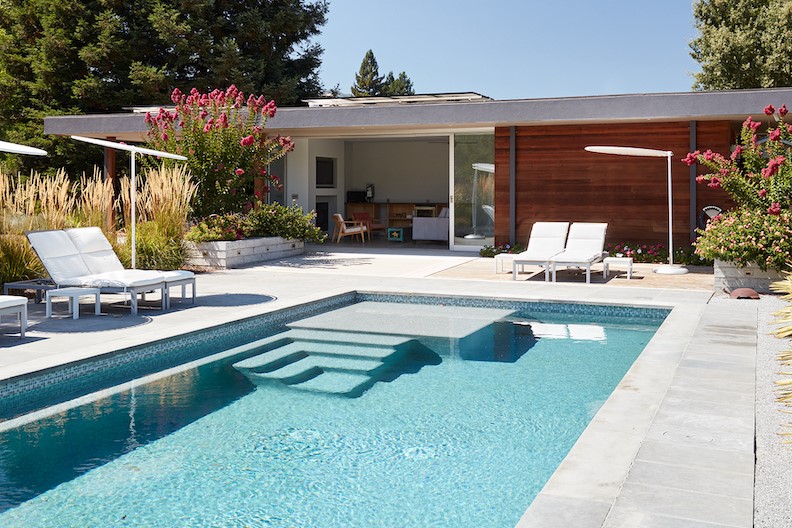
It’s a tiny, one-bedroom, one-bath affair with a wet bar, but no kitchen. It’s living room opens directly out to a swimming pool, which then connects via landscape to the original midcentury modern home on site. That site is an irregular shape, and the location of the pool is at an angle to the original home, so the main challenge lay in integrating that angle to the original house.
“We ended up using more voids like the patio and deck around the pool and at the main house, and then using the landscape in between leading to the house,” he says. “You don’t experience that sharp angle when walking it from the main house – it lets people flow from the main house to the pool.”
The pool house/guest house, three bays wide, is broken up into seven modules. “If you’re looking at it from the pool you see the first two,” he says. “The next three are the living room and the pool aligns with them, and the last two are the bedroom and bath and are more private behind a wall.”
As for context, the new structure aligns nicely with the existing midcentury modern. “The modules match the midcentury modern house, the glass wall concept matches the glass wall of the midcentury modern house, and the horizontal feeling of the roof with the overhang matches it,” he says.
Besides the aluminum-frame-and-glass sliding door that opens up a wall to create a huge indoor/outdoor, poolside space, the materials here are simplicity itself. “There’s wood siding like the original house – it’s a natural wood for a warm feel, Western Red Cedar,” he says. “And the roof’s underside is plywood – we specified stucco and the contractor saved some money with painted white plywood. It continues inside to the white drywall that’s the same color.”
The design has been in the back of the architect’s mind for years now, just percolating away until the right opportunity presented itself. Once it did, Klopf went all in.
“The golden section and the proportion and the way we designed it is alluring,” he says. “That and the modularity of it and the indoor/outdoor spaces – well, we just enjoyed that a lot.”
Think about it for a moment: Eichlers, Mies, and midcentury moderns.
What more could a 21st-century California architect look to for inspiration?
For more, go here.
[slideshow id=2319]
Photos by Mariko Reed

