As it turns out, there’s more than a little benefit to designing six million square feet of luxury residential space for New York developers.
Just ask interior designer Karen Asprea.
For starters, there’s the experience to be gained. And no small amount of profit, to be sure. But when she stepped out on her own in 2018, she was pleasantly surprised at one more turn of events.
The developers were asking her to design their private residences. “It was nice for me because they understand the industry and the construction process, so the projects run smoothly,” the 2006 Pratt graduate says. “They get it from a nuts-and-bolts perspective, compared to someone not in the development industry.”
Now the studio that bears her name is continuing to do commercial work for developers, but interiors for private homeowners as well. “It’s 50/50 between the two,” she says.
If it’s a commercial project, she works to make the design sensitive to its surroundings and the people who use it. “A lot of the products I use are layered, and in muted tones,” she says. “Lobbies and amenity spaces need a sense of calm because they’re larger than in a home, so it’s important to bring that human scale into those spaces.”
Timelessness, too, is a consideration. “I like to be thoughtful about how the building design maintains its relevance and it’s important that it not be time-stamped,” she says. “It has to be marketable – it can’t be heavy-handed or feature elements that are dated.”
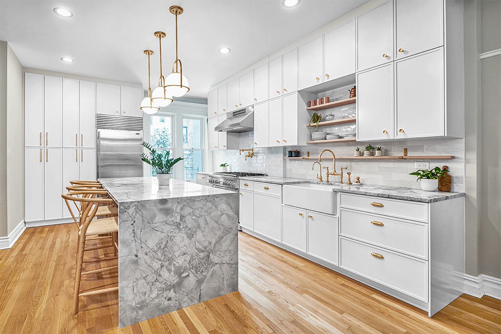
Her color and material palettes reflect a light touch – whites and creams, taupe and grays, limestone and marble. For one project, an existing pair of towers and one lobby, she’s marrying new construction with materials already in place.
“This lobby had a lot of limestone which I really like, and I was playing with it and adding to it,” she says. “The light color on the floors and walls existed, and needed one punch and that’s why you see the black marble in that desk – it’s a high contrast to what existed.”
The proper approach to scale and proportion are part of her process, too, though her clients might not always notice. “I want people to walk into a space I designed and feel comfortable – and not know why they feel comfortable,” she says. “It doesn’t jump out at you – you’re just comfortable.”
Context also plays a role, whether for new or existing spaces. For a penthouse in TriBeca, built in 2006 with lot of glass, the design she put together was contextual because she took into consideration the glass of the interior wall. “You can see how the architectural elements marry into the design of the building,” she says. “You don’t feel like you’re having two experiences – you feel like it’s one experience.”
It’s a process that yields spaces that are understated and elegant – as she and her studio strive to design their next six million square feet of space.
For more, go here.
[slideshow id=2330]


