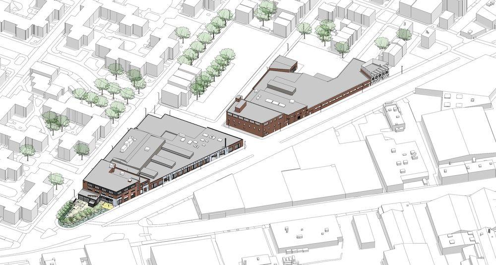
When National Development began to think about how to inject a sense of cool into two low-slung industrial buildings in the first phase of its Iron Works development in South Boston, they knew who to call:
Hacin + Associates, in the already-hip South End.
“They came to us because we’re not the firm that does the big, high-rise housing – we do more surgical placemaking throughout the city,” says David Hacin, partner in the firm that bears his name. “”We’ve been actively involved in changing neighborhoods like the Seaport.”
Hacin’s firm is composed of architectural designers, place-makers, and graphic designers. And they were precisely the experts needed in the first phase of the Iron Works’ development. “This is about how to do it inexpensively without losing its cool,” he says.
As Boston has developed over the past 10 to 15 years, the city’s center of gravity has shifted, and a once out-there Iron Works has become more central. National Development has been amassing a patchwork of sites for large-scale development there – no easy task because there so little land, and the Iron Works is on a peninsula.
“It’s kind of a forgotten area,” he says. “Its reputation is as being lower-scale industrial area, with carwashes, warehouses, and storage.”
Intensely interested in how to change the identity of this part of town, National Development bought these two buildings to kick off an upcoming era of more development nearby. “So it’s a bridge between the old neighborhood and a new one,” he says. “It’s about history and also what’s going to come.”
That means pioneering retailers that deliver people to the area, like a brewery, a beer garden, a bakery and a dumpling shop. “We developed them to attract the tenants they needed,” he says.
Project architect Matt Arnold and his team worked with the exterior facades as though they were canvases – with strong graphics, painted brick walls, and color blocking with different grays working with existing proportions.
“We used color to break up the building and make it more appealing and to stand out, and we identified one retailer from another and gave the streets character,” Arnold says. “It adds a vibrancy that wasn’t there before – it’s gone from being a warehouse to becoming a cool thing.”
Sixty percent of the ground level is single story, though at 20 feet tall, it offers appealing height inside. The original buildings had been closed up without much glass – and wasn’t open to the street. So the question was how to make the ground floor transparent, with windows, doors, and open spaces.
“We’re trying to make it all more pedestrian-friendly,” he says. “We also tried to get more light in the interior stairwells.”
Total square footage is 75,000, with retail called for on the ground and offices where the buildings rise three stories above. “There’s a landscape architect there, and a retailer has its corporate headquarters there,” he says. “There are all kind of creative office people in those spaces.”
National Development has an experience center on the third floor, so visitors can see the properties it owns, all awaiting future development. There’s a sizable parking lot behind one building. And a pickleball courts are on the way.
As predicted, the two buildings have become catalysts for cool, and will soon be packed with requisite restaurants and bars chock-full of character. “You can’t buy the patina of years of wear and tear,” he says. “The retailers love it.”
All in all, it’s adaptive re-use that’s aesthetically pleasing – and a magnet for new blood. “We like working in these odd little buildings, not the 300-foot-tall-buildings,” he says. “That’s where we find joy.”
It’s not slick, but it is earthy. It has no curtain walls, but it does generate plenty of light. Best of all, though, it’s got character – and a real sense of cool.
[slideshow id=2393]


