Frederick Tang Architecture is a small design firm based in Brooklyn. It works on townhouse renovations and apartment combinations as well as some smaller scale commercial and retail store work. The firm recently complete the renovation of an apartment overlooking the Brooklyn Museum. A+A interviewed them via email about the project:
The clients? The clients were a young couple, both in the arts and their two young daughters. They knew they wanted a pre-war building with a view in this particular neighborhood in Prospect Heights. Turner Towers is one of the largest co-ops on Eastern Parkway with fantastic views overlooking the city and the Brooklyn Museum. They found this apartment which was perfect but the layout didn’t work.
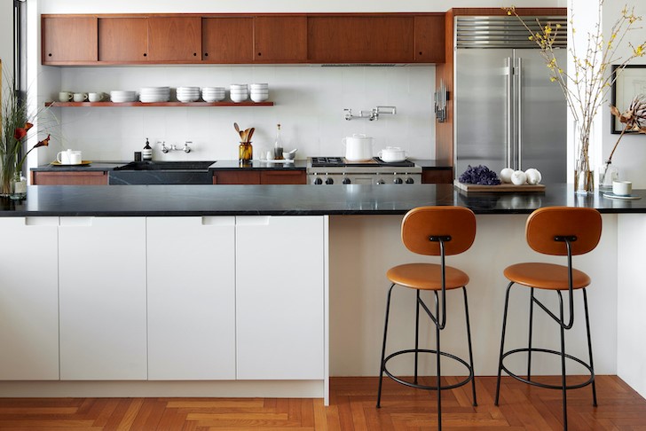
The assignment, and how did the existing space drive the design? The assignment was to reorganize the layout of the apartment and make it more functional for the family. The kitchen was tucked in the very back of the apartment. The family entertains a lot and the husband is a passionate cook who wants to be able to stay with his guests while cooking. Additionally the layout of the apartment was strange, a large over-sized dining room and a tiny service bathroom typical of these pre-war co-ops interrupted the flow from dining room to kitchen. We re-organized the floorplan and move the kitchen from the back up to the dining room so that it occupies a more central role in the apartment. We also turned the service bathroom so it didn’t take up a window and were then able to squeeze in a guest bedroom and desk area off of the utility area.
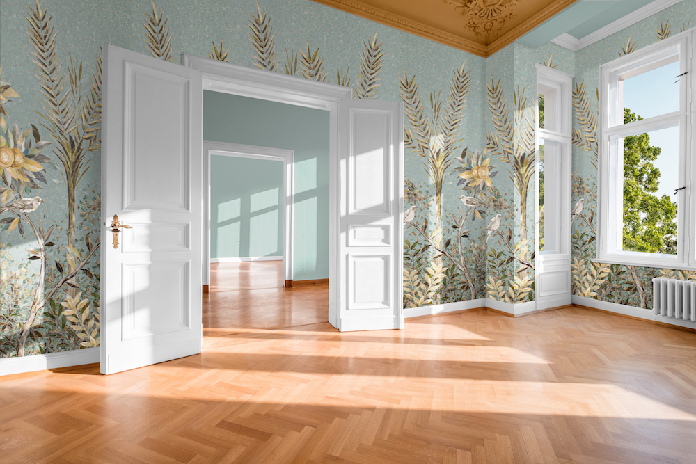
The design intent? We were really trying to maintain the pre-war vibes of the apartment — with the beautiful herringbone oak floor, substantial moldings, paneled doors, generously proportioned rooms, and large windows with great views. But we also wanted spaces to have personality and have some fun, like in the kids’ bathroom
The design inspiration and the materials? For the kitchen, we were really inspired by California Bay Area homes — really practical but layered and rich in materiality. We chose warm cherry for the kitchen cabinetry. The sliding doors along the upper shelves give it a mid-century vibe. The backsplash is cream cement tiles handmade so that they have some variation. For the new guest bath we wanted something dark and moody leaning into the fact that it didn’t have windows — so we used Moroccan zellig tiles on the counter in a deep blue with teal walls.
The challenges? Working on modern layouts in pre-war apartment is always a challenge. We have to figure out how to get recessed shower drains in the slab, and how to work within the co-op rules for plumbing and wet areas.
For more, go here.
[slideshow id=2236]


