Edward Hutchison is an alumnus of the Royal College of Art in Great Britain, a 1984 graduate of the Architectural Association in London and for a time, the only landscape architect in Lord Norman Foster’s office.
Now he’s an author – of a book about drawing for landscape architects.
Actually, he’s responsible for organizing a team to create that book, one that consisted of an artist, an archivist, a librarian, a publisher, a graphic designer, an academic and himself. They met monthly to brainstorm what that book should be.
“We decided to see whether one couldn’t celebrate the enjoyment of being a designer – and the artistic aspect of being creative,” he says. “What we did was look at all the books on design and drawing.”
They found one type it be all text, and very structured. “Another was all pictures – and that was a rather bad value –you look at the pictures once or twice but probably not that much,” he says. “The third was half pictures and half text, where designers realize they like to loo k at the pictures and then you have to cajole them to read the text.”
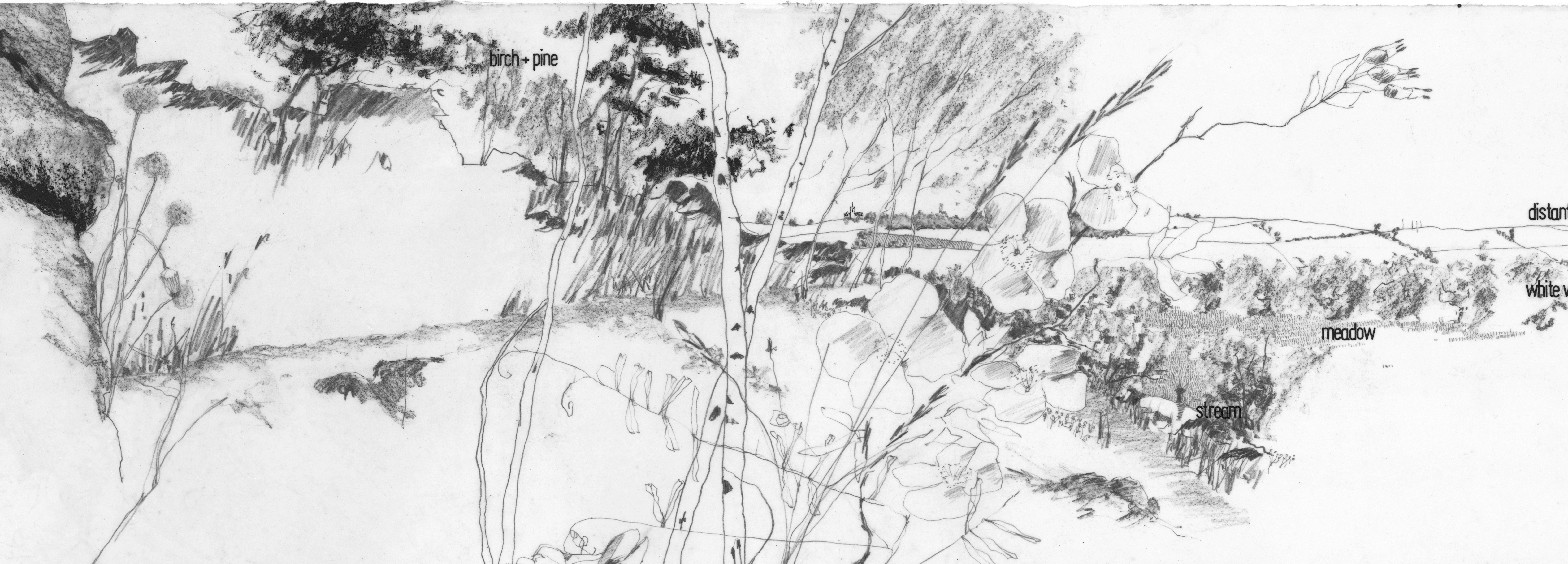
They elected to pursue the third type, with 513 illustrations in 240 pages. Drawing for Landscape Architecture: Sketch to Screen to Site argues for the importance of learning to “see by hand,” to visualize large-scale design plans and articulate them through drawing before turning to the digital tools that are so crucial to efficient and cost-effective building solutions.
It’s an enriched approach that makes for better design, happier clients, and more successful projects, its author says. And the collaborative process his team pursued has paid off in spades.
“I taped the meetings and I listened to tapes later, and to all the ideas that people put out during our brainstorming sessions have been incorporated into the book,” he says.
It’s not a “how-to” book by any means. Rather, it’s meant to illuminate the process of creation for landscape architects. “It was meant really to show the messy process of getting to a solution – and the enjoyment of that messy process,” he says. “It’s encourages landscape architects to get outside and get wet and have these grubby drawings, and not be picture perfect – though the final design might be.”
In other words – it’s the messy vitality of the mind working hand-in glove with the computer.
For more, go here.
[slideshow id=2037]


