How do you squeeze a 3,400-square-foot home into a lot that’s just 37 feet wide and 125 feet deep?
If you’re Andy Johnson, principal at DAJ Design in Louisville, Colo., you do it thoughtfully – with natural light and indoor/outdoor spaces.
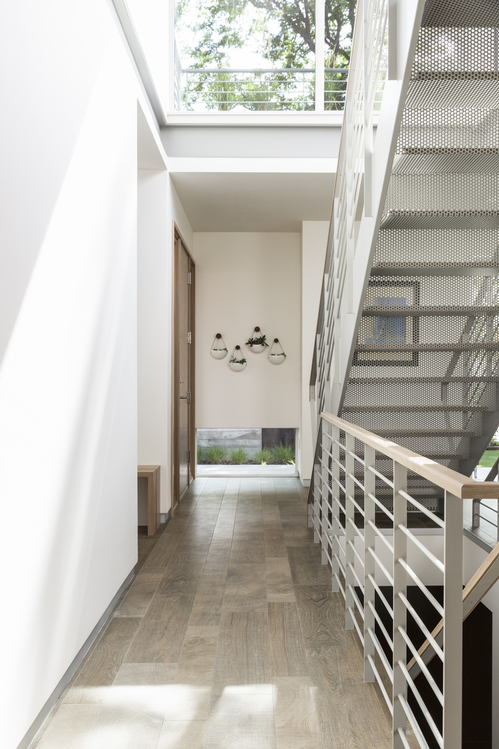
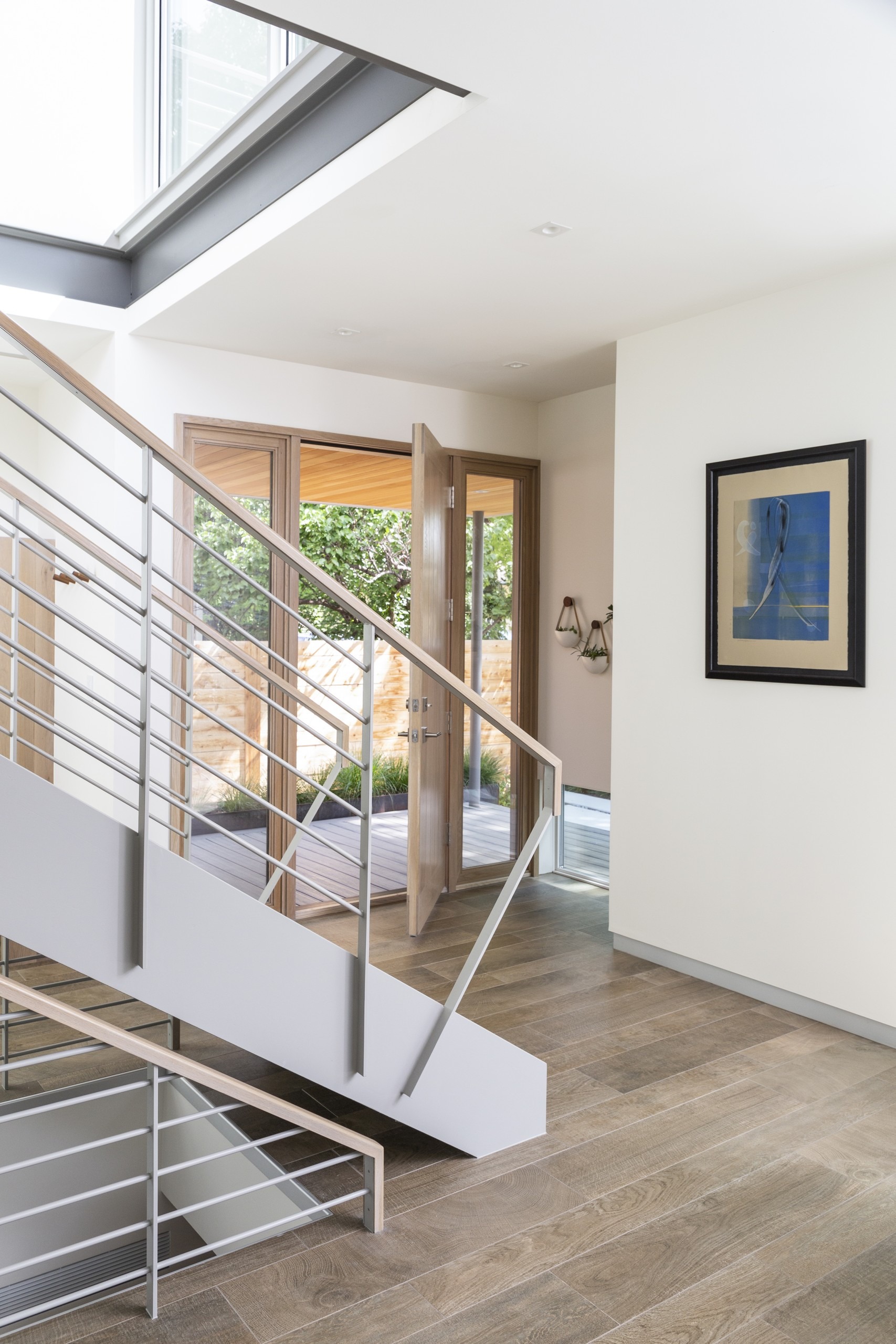
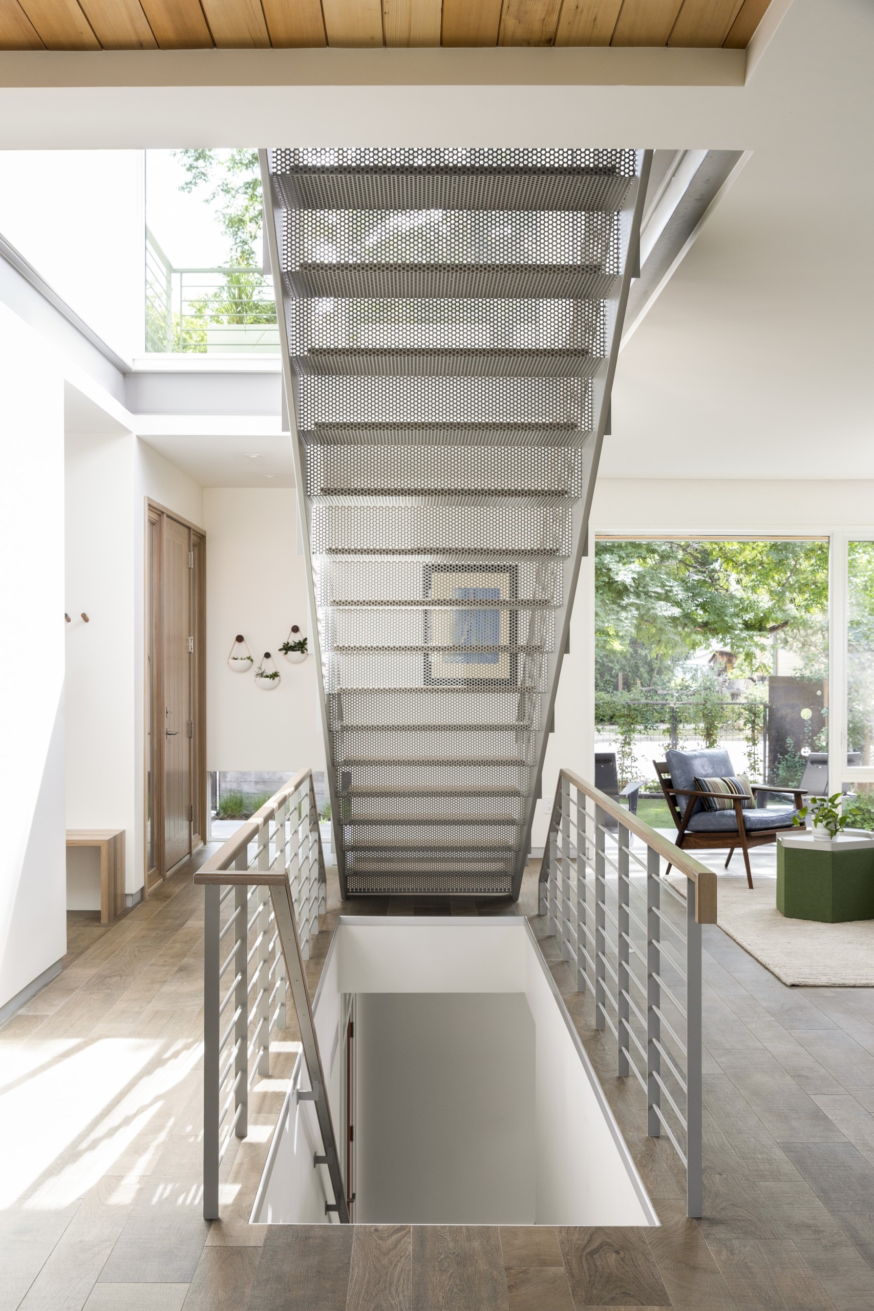
“One of the things we did do was bring light into the core of the house through a light well with a steel stair sculptural structure,” the architect says. “There’s lots of transparency through that significant object in the floor plan, one that’s useful and offers a filtering view through the stairs to all parts of house.”
He designed the home for a retired California couple who had two Colorado properties and decided to consolidate with a new home in Louisville’s Old Town. It’s an old mining community with simply-constructed homes. The architect took out an existing but failing bungalow – but kept a mature honey locust for shade, and used it as a starting point for a new landscape.
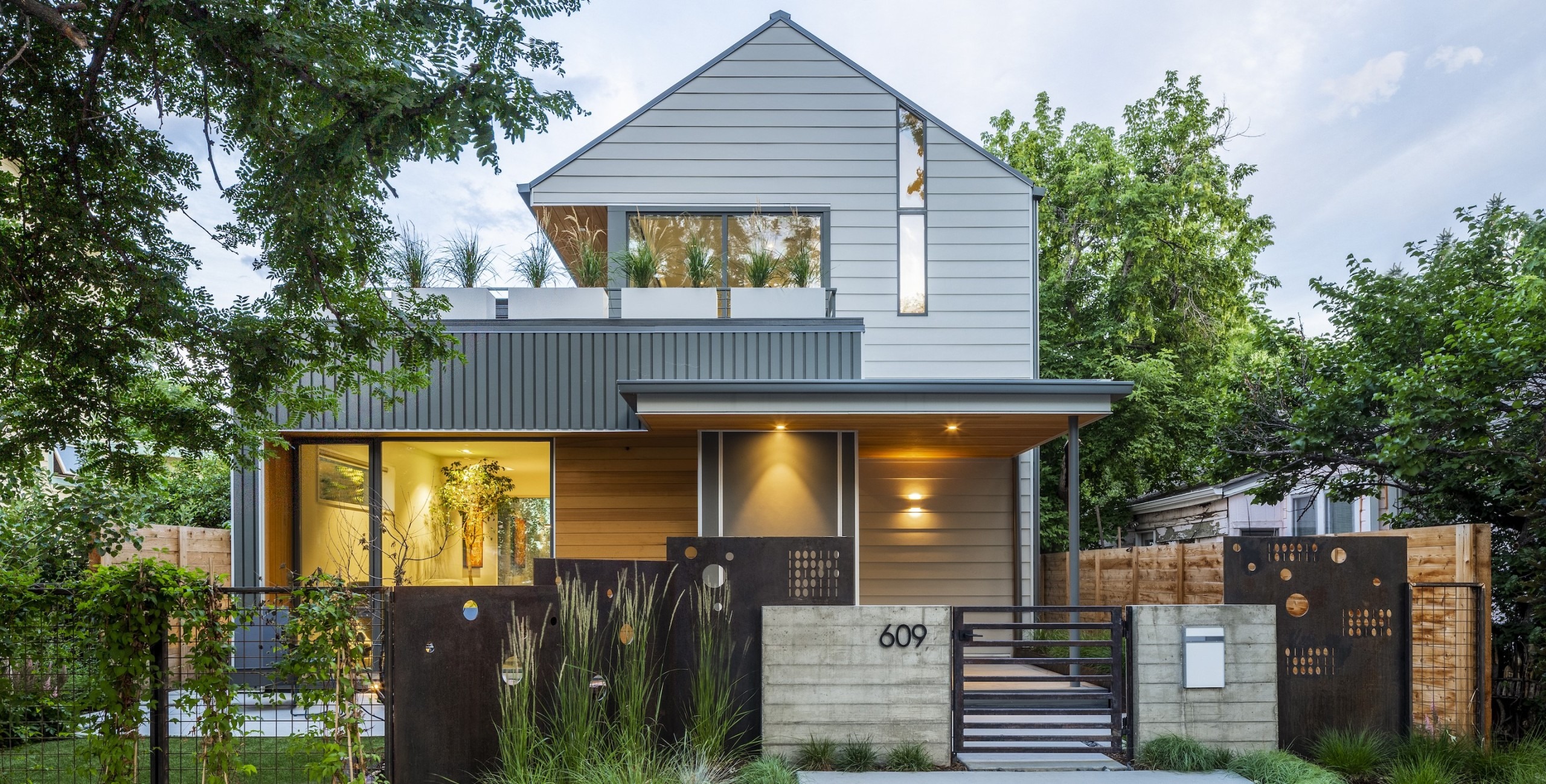
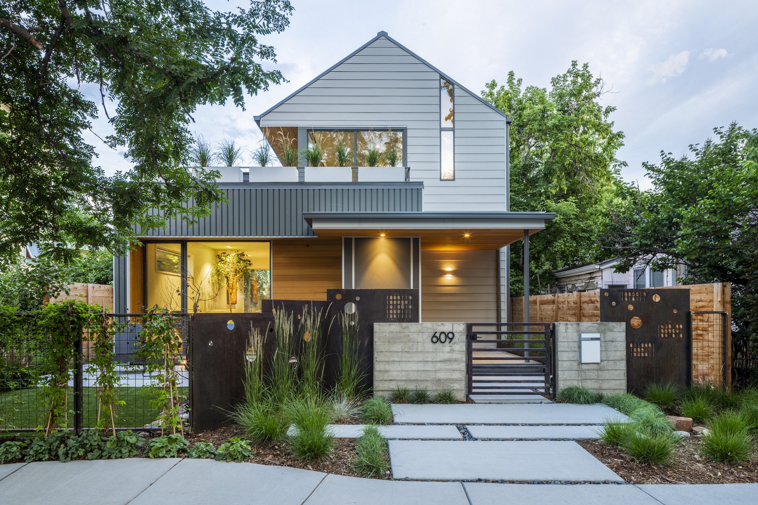
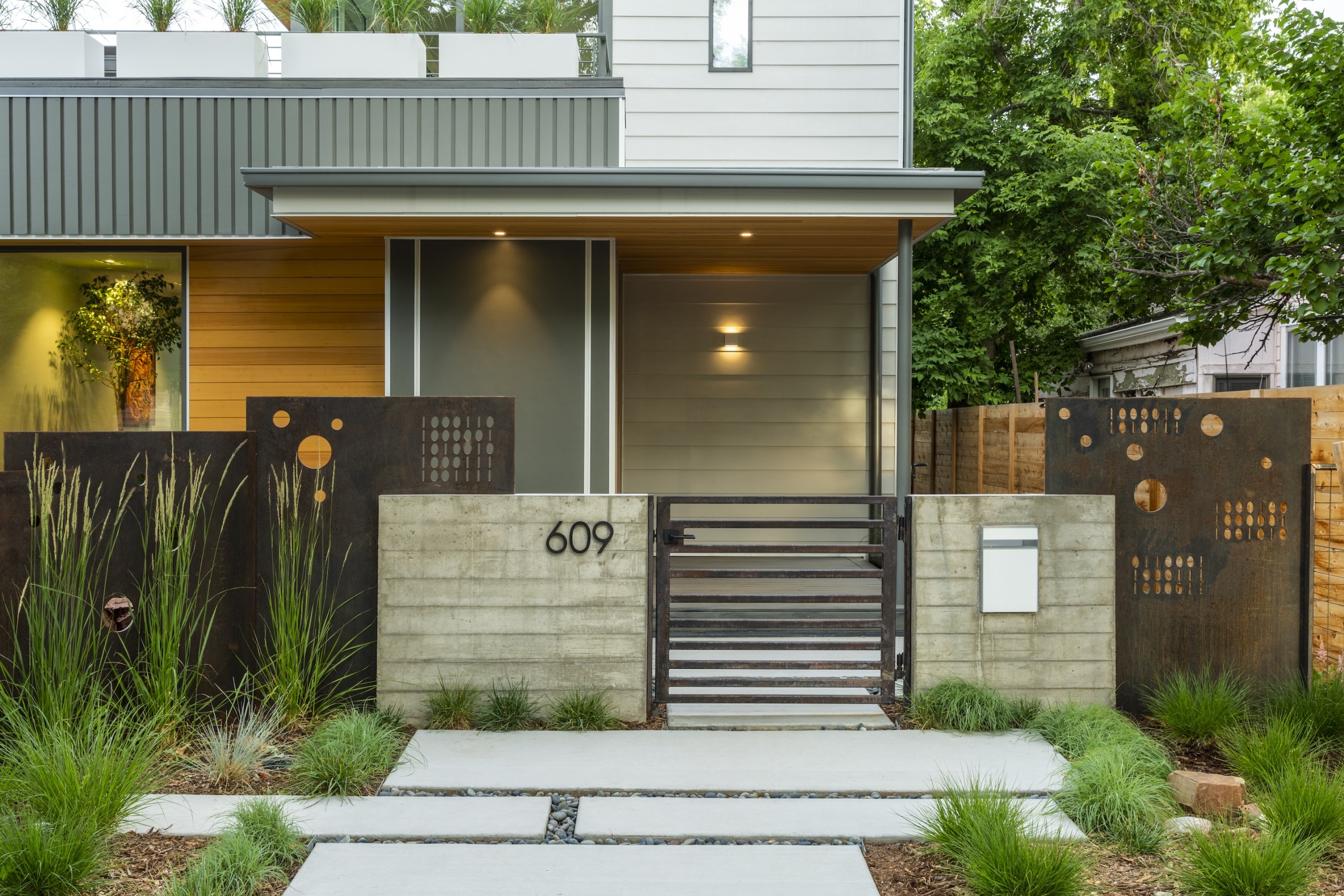
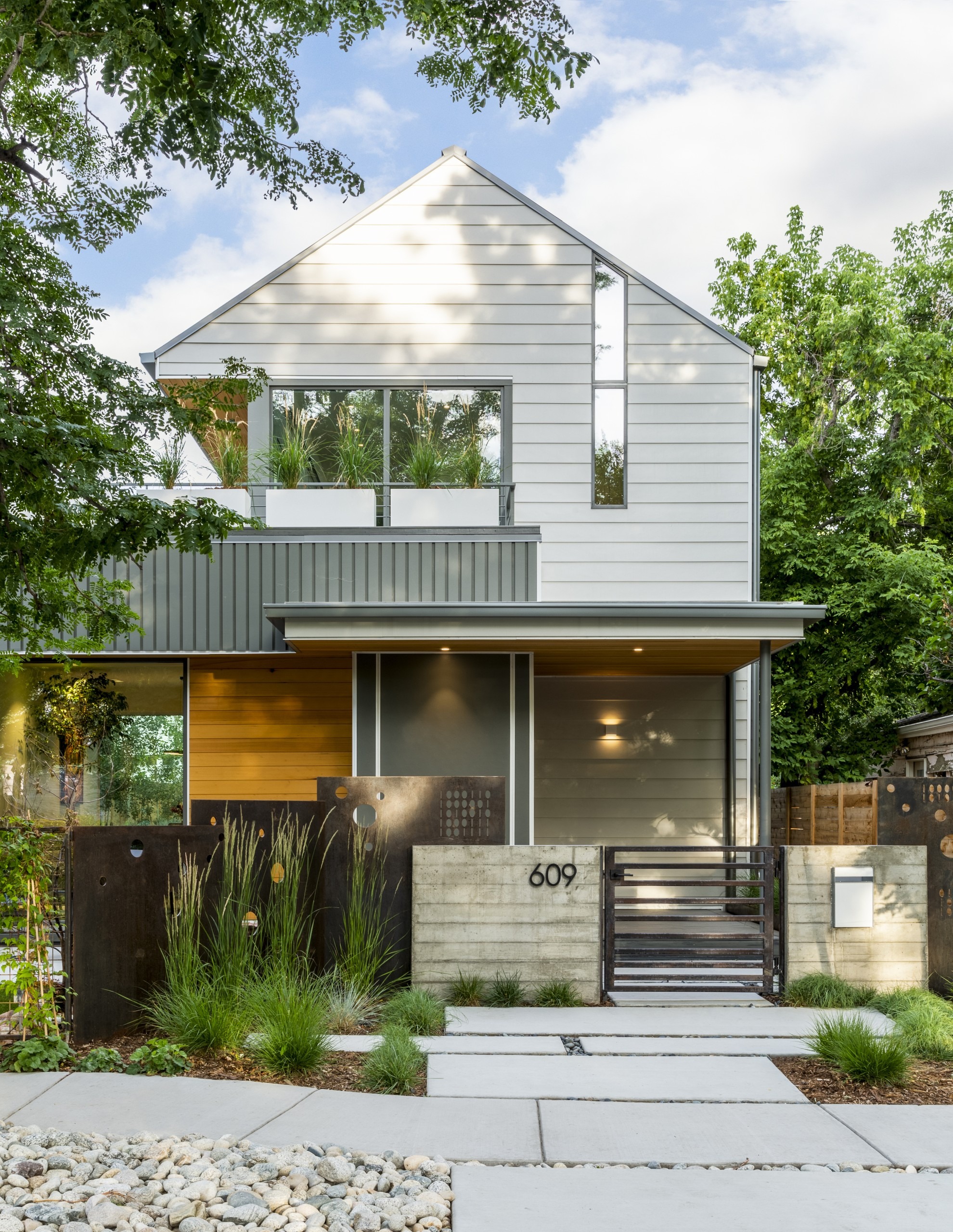
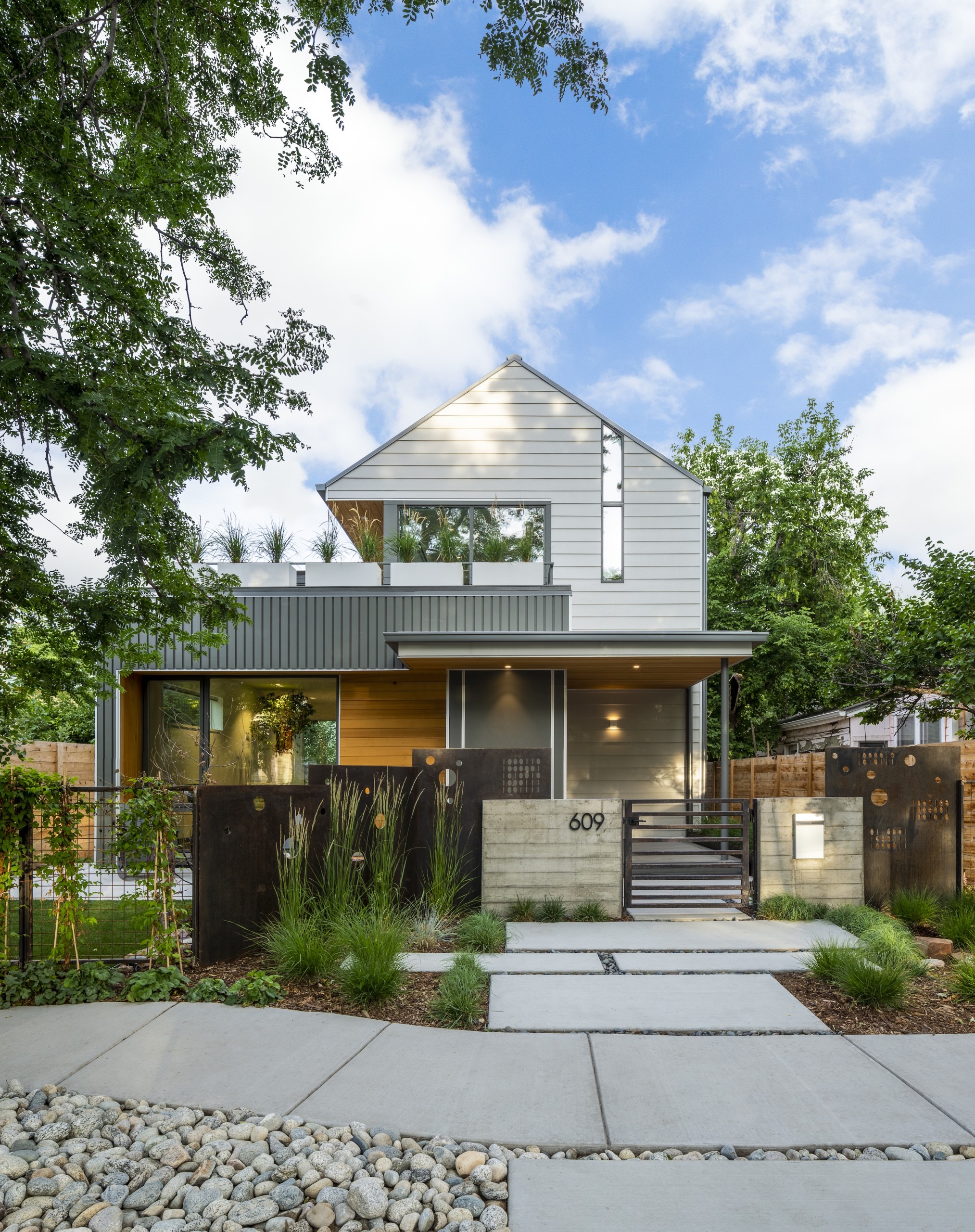
The look of the new home from the street is minimal – a deliberately deceptive gesture. “Most homes in Old Town have a one-story feel from the street, so here there’s a strong horizontal look on the front, and we stepped the two-story component back,” he says.
It’s a mere 24 feet wide, oriented on an east/west axis, with small street frontage. But it reaches back as far as possible. “The site was challenging, because the home wanted to occupy a lot of it,” he says. “There are a lot of two-way cantilevers to get the right square footage.”
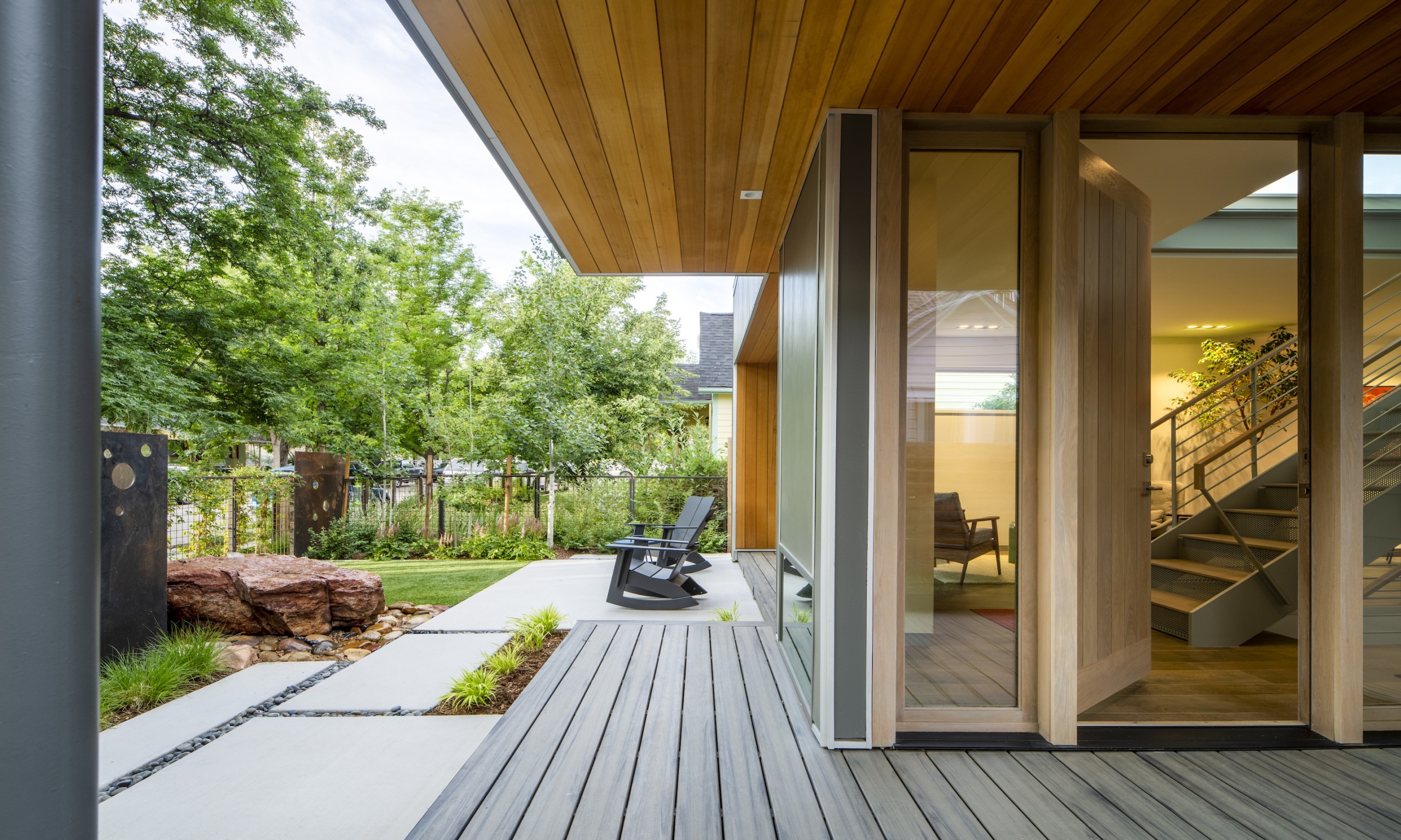
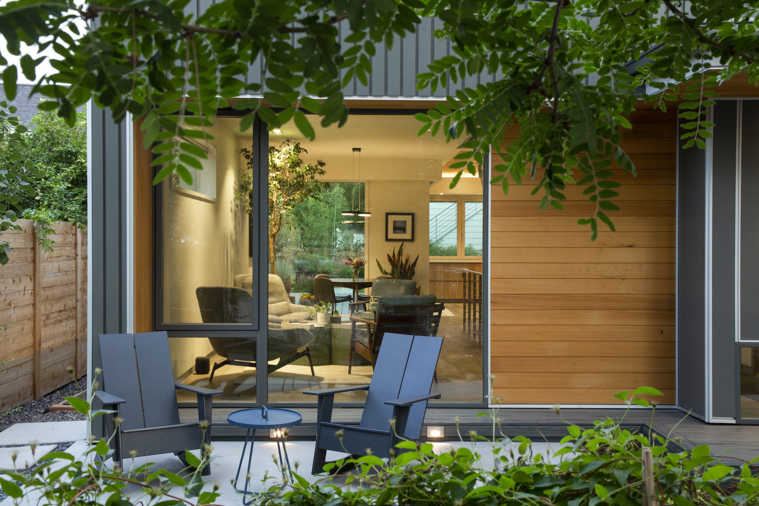
The cantilevered spaces cover outdoor areas so they feel like rooms – not like they’re outside but integrated instead. “You never have an overall sense of the exterior of the house – the lot and the cantilevered spaces don’t allow that,” he says. “The narrowness of the lot worked to our advantage.”
Normally, the architect says, he’d add a courtyard but here he didn’t have the room. So he took advantage of the placement of the home and its adjacent garage with bedroom above. “We used the space between the garage and the house as a courtyard,” he says.
Inside, the home feels spacious with its vaulted ceilings, but not too lofty. The architect took advantage of opportunities for indoor/outdoor rooms to coexist side by side. When he realized he didn’t have enough outdoor space, he added a rooftop deck. “You open the patio space up on top and outside,” he says.
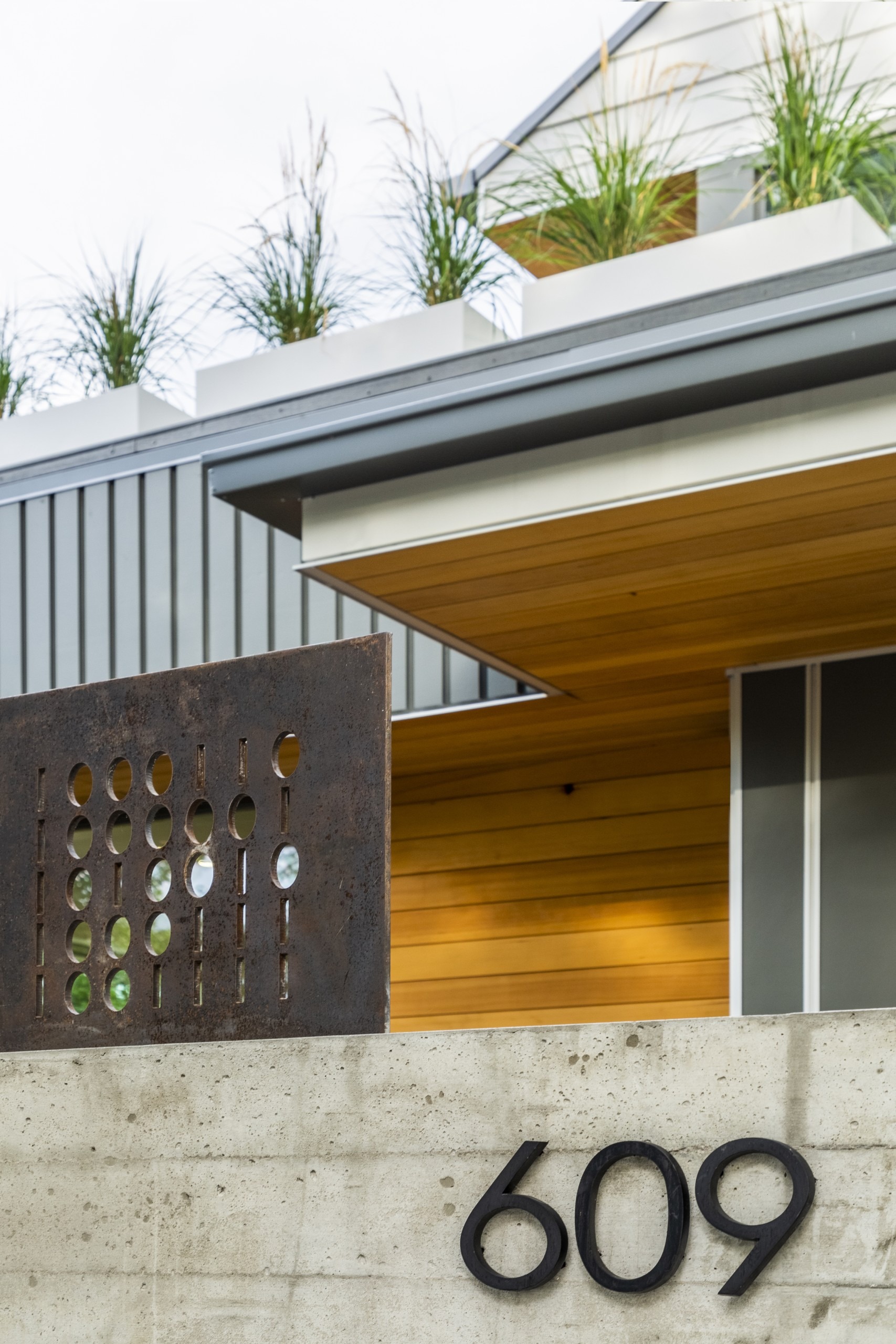
The structure’s made of wood frame and steel, with siding of cement board and clear-stained hemlock siding. “It has a white stain that’s watered down so it’s not so bright,” he says. “That blended the palette with other cement board surfaces.”.
The cement board is recessed board and batten, a different kind of look for the product. “There are a multitude of appearances and surfaces,” he says. “That’s important in Colorado – the sunlight is brutal on materials.”
And the home works well within its context. “The home next door was added onto and has a second floor,” he says. “And there are a lot of mature trees on this block, so there’s a lot of good coverage.”
But most impressive here is that there’s barely an unused square foot anywhere on the lot.
For more, go here.

