A recent online edition of Ocean Home magazine offered a feature I wrote about a home designed by architect Joseph Fournier and interior designer Christine Vroom. It’s in Hermosa Beach, Calif., and on a tiny lot with sweeping views of the ocean from the top floor – which totally drove the design. A+A is pleased to re-post it here today:
Third-floor views of the Pacific Ocean are the beating heart of a design for a new home in Hermosa Beach, Calif. Its architect, Joseph Fournier, reversed the home’s layout to take advantage of those sweeping vistas.
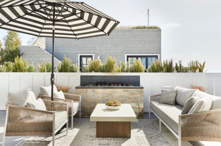
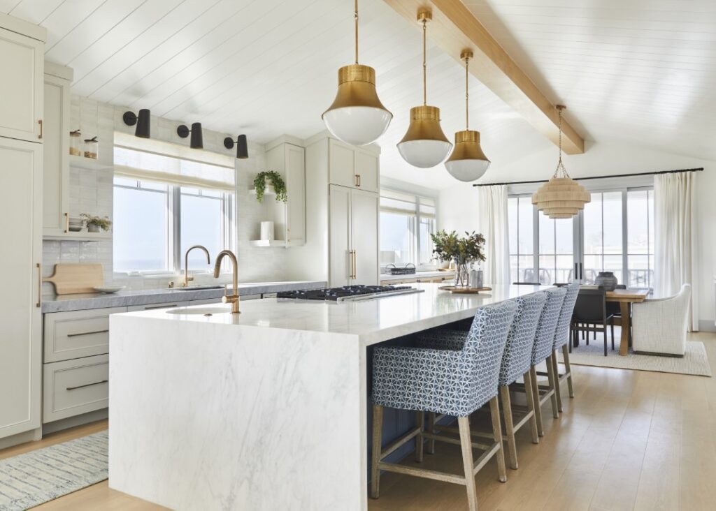
The main living area, dining area, and kitchen – plus two decks for soaking in sunsets, drinks in hand – are on the top floor. Five bedrooms with baths are on the second. The first is for mixed use, with a garage and a rec room that opens out for strolls to the beach two blocks west. “It’s 400 to 500 feet, and a one-minute walk,” the architect says.
Fournier teamed up with interior designer Christine Vroom to maximize space inside and out for their clients, a beach-loving couple with three children. Their lot was small – about 2,400 square feet – so the designers opened up every livable space in the 3,750-square-foot-home for multiple uses.
Fournier handled the macro vision, and Vroom the micro. And they did it with style. “Actually, we were trying to achieve a little more of an edgy coastal home and create a space with more of a non-traditional coastal-house feel,” Vroom says. “We wanted it to be bright and open and with a lot of different entertaining spaces.”
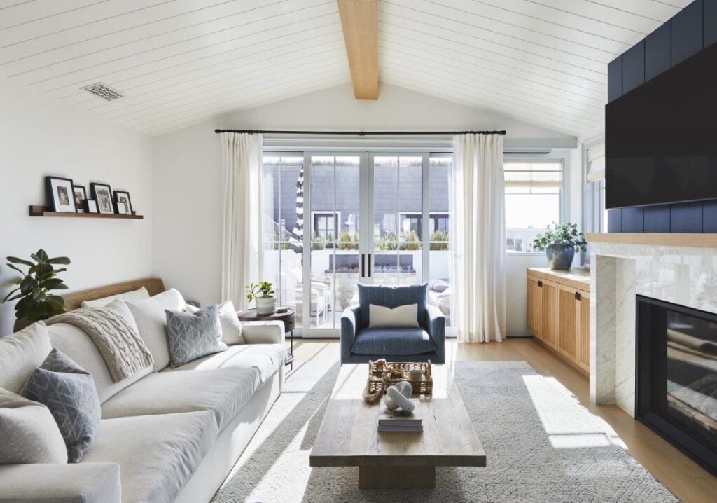
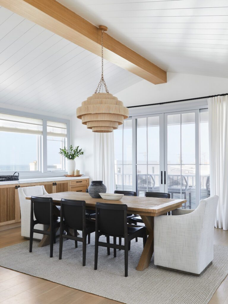
Ordinarily, Fournier might have placed a roof deck over the third floor, but here it would have exceeded height restrictions. So instead the architect created a gabled roof that’s unique to the neighborhood. “We used a vaulted ceiling,” he says.
That gave a soaring feel to the open plan on the upper level – with a floor-to-ceiling height of 13 feet. “The ceiling’s so high, you feel like there’s more space,” Vroom says.
There are four decks in total, with one off the primary suite, one on the ground level, and two at the front and rear of the third level, all to emphasize the outdoors. But the vistas aren’t limited to decks alone. “When you’re on the top level, the ocean view is from all the windows on the west side,” she says.
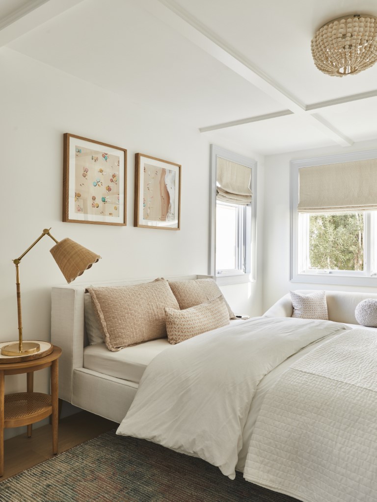
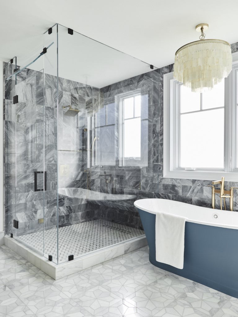
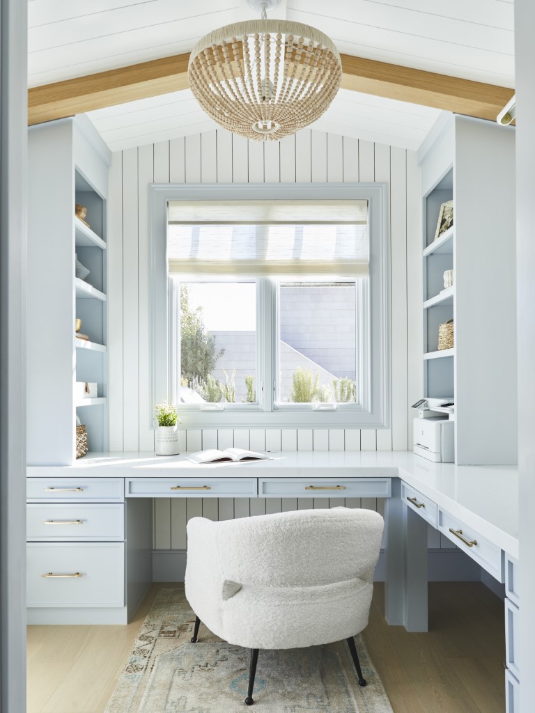
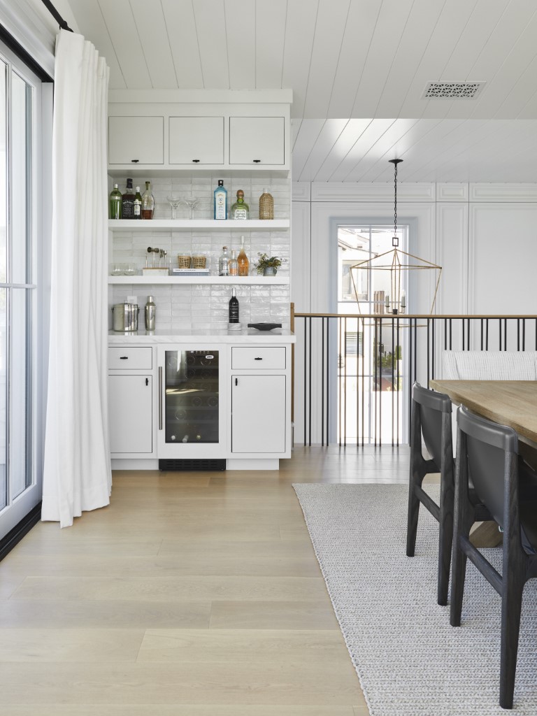
The interior designer didn’t want built-in cabinetry to interfere with the views. Instead, she used blue skies to influence the color of the cabinets – and everything else. “It’s a California coastal palette, with blues, taupes, whites, and some brown tones,” she says. “There are lots of different tones of blues – soft blues, gray blues, funky blues, and, in the primary bath suite, a denim-y blue.”
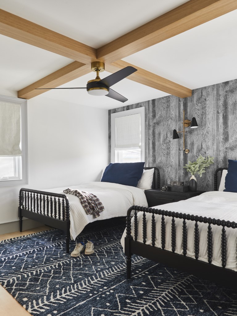
Seeking an expansive feel for the home’s private spaces, Fournier made adjustments where he could. On the second level, he sacrificed one bedroom to give more room to all others. “There are five bedrooms instead of six, to get some additional square footage in each,” he says.
Durability and low maintenance were key to Vroom’s material palette, her concessions to ocean breezes, sandy feet, and salt air. The designer used easily cleanable fabrics and rugs, along with marble slabs for countertops. Her furnishings, too, are basic and comfortable. “They’re like: ‘I just want to lie here and watch movies with the kids – to veg and lounge,’” she says.
Outside, where there’s a high fire risk, Fournier used Hardie siding and board and batten. There’s a standing seam metal roof, plus aluminum-clad windows and doors. “Being next to the ocean is brutal over time, so we chose materials without high maintenance issues,” he says.
If it sounds like the architect and interior designer are on the same wave length, that’s because this is not their first rodeo together. With developer Mike Levine of Levine Homes, they’ve teamed up on a number of homes. Here, Levine selected the lot, Fournier designed the home, and Vroom took on the interiors.
Often, the result is a home designed for a mass audience. But with this home the clients stepped up before it was finished. “A lot of times, because there is such a limited quantity of housing, especially new construction, they can be bought before they’re even built,” Fournier says.
That’s what happened here. “They bought it and I presented the design,” Vroom says. “Then we customized it for them, rather for than the general public.”
For this family of five, that means the best of all possible worlds.
For more, go here.


