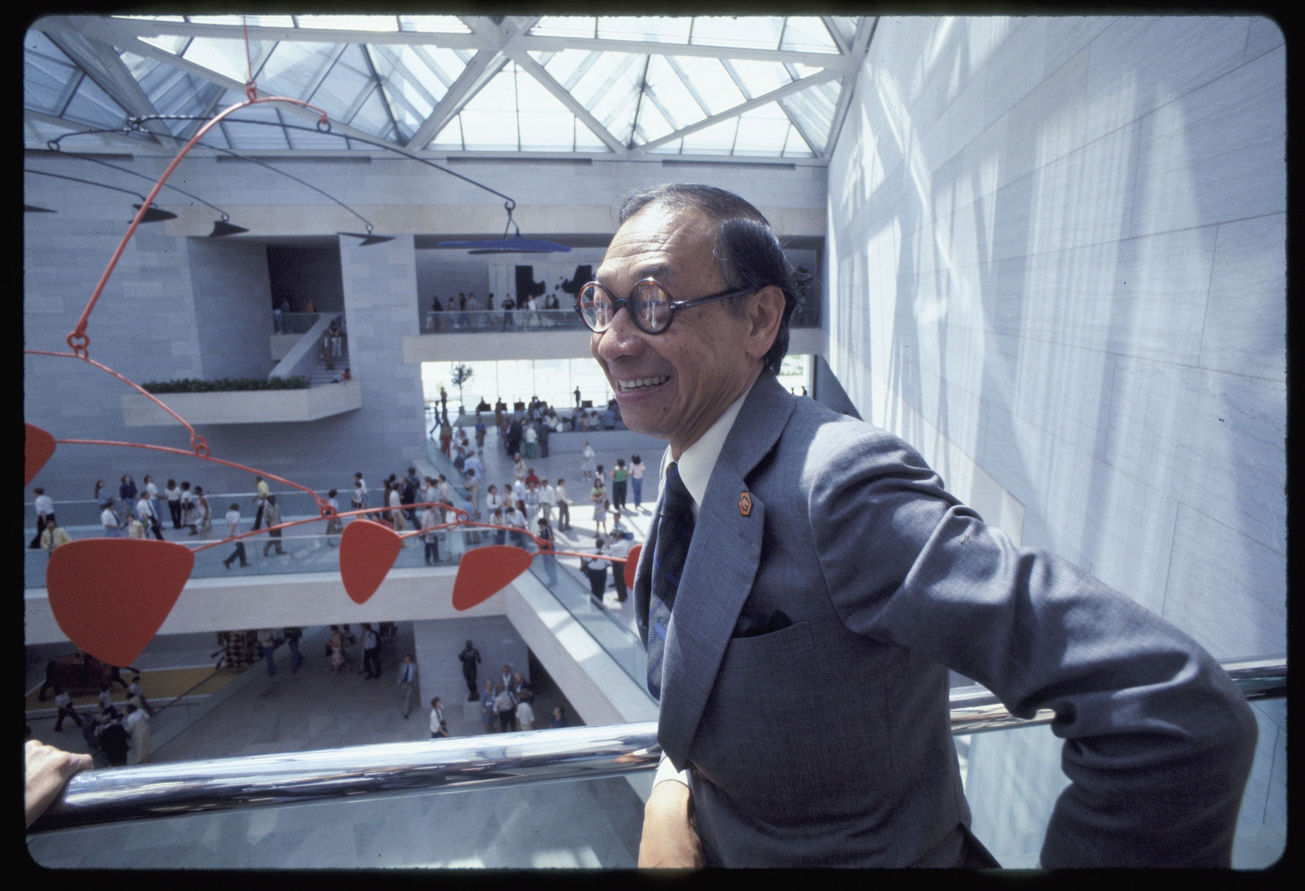
Today, Pritzker Prize-winning architect I. M. Pei turns 100, and one of his finest civic projects will be home to a celebration of his work. The recently renovated and expanded East Building of the National Gallery of Art in Washington, D.C. will honor him with a 3:30 P.M. talk about his legacy by Susan Wertheim, chief architect for the National Gallery of Art. She’ll be joined by Pei’s longtime associate, Perry Y. Chin, who worked on the renovation and expansion in consultation with Pei. A+A was fortunate enough to interview Ms. Wertheim by phone yesterday. Here we have Part Two of the interview about the evolution of Pei’s East Building:
The materials – why did he choose those that he did?
Pei was a master of architectural poured-in-place concrete. That was his medium – and it was excellent work. But it was Paul Mellon who said that this building had to be marble, so it was not an impeding material. Mellon thought that marble would be a more refined material. Still, there’s a lot of concrete in the building with a pigment of the pink marble.
What does the building achieve?
This building achieves what the architect, Mellon and J. Carter Brown wanted – to appeal to people of all ages. People come into it and they light up. It’s very light and airy. There’s interplay of light and space. Architecture is all about space-making, and the Calder mobile was commissioned specifically for the building – Carter Brown worked closely with Calder to develop that. It gives people a memorable place that they won’t forget – more today than when it opened. It has a nice dialog with the West Building and the works of art. In terms of the display of art, the building and the permanent collection are fully in synch. The way it’s been laid out after the redesign, everything just opens up much more.
Pei wanted people to go up the stairs – to go high and move around the atrium. Now, the way it’s laid out, it’s synchronized and symbiotic and accessible. With the new stairs it’s accessible at every level. There is a multitude of ways to go through the building. We have lot of visits from senior citizens and pre-schoolers who love modern art. They like the abstraction and don’t mind that it’s not figurative.
It was modern during a time of Post-modernism? How has it endured?
The West Building was designed from 1937-41 when the International Style was in full force – and we get this modern classical building from John Russell Pope. And Pei was doing a timeless modern building. He started in 1968, and then construction was from 1971 to 1978. Post-modernism at the time was coming from Venturi, Graves, and Charles Moore. Paul Goldberger has observed that this was so conservative when Post-modernism was going on. Pei was correcting some of the boxiness and coldness of modernism with warmth, and then trees inside. I think he’s really conservative when it comes to modernism. It’s a well tailored building. It’s very much contextual and solving a program in a geometrically challenging site. It’s a classic, timeless building, and we’re keeping it fresh.
Why should anyone care about this building?
They would care because this building talks with them and resonates with them. It’s an inspirational building. It’s a place that touches people’s souls. It’s not a religious space but if you’re not touched in the building, you will be in the collection. We have something for everyone. It’s a complement to the West Building.
For more, go here.
[slideshow id=1785]


