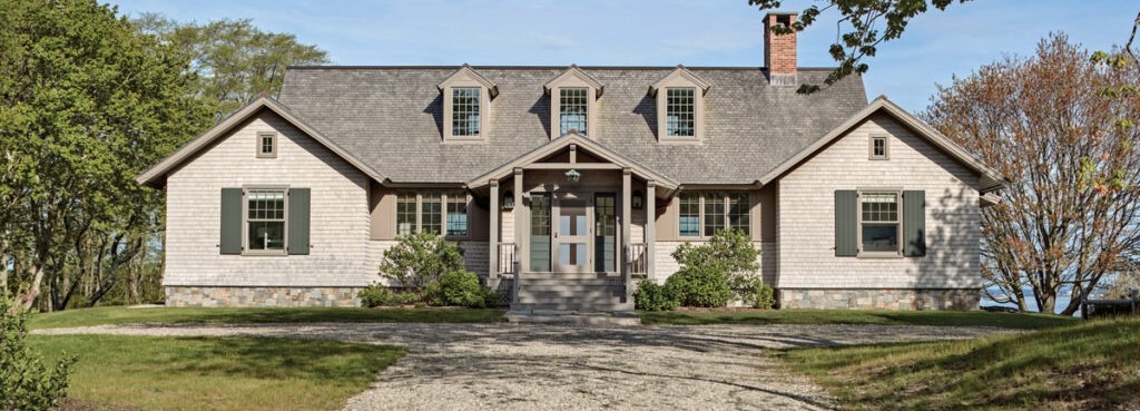
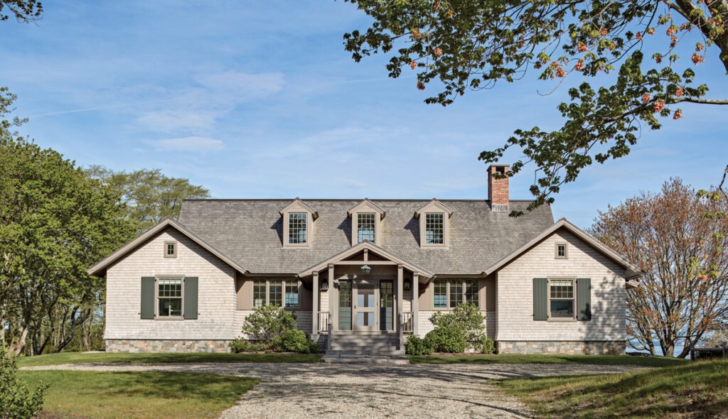
Jacob Albert, co-founder of Boston’s Albert Righter Tittmann Architects, took cues from the vernacular architecture of earlier summer homes on Fishers Island, which is at the eastern end of Long Island in New York. He chose to echo an example that is bungalow-like, with decorative rafters and a post-and-beam porch. “I tried to pick up on that, but still, this is a modern house for today’s living,” Albert says.
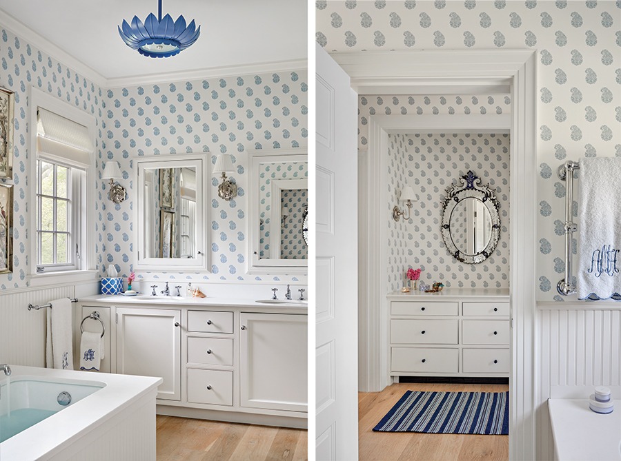
Interior designer Dorsey Miller looked to the periwinkle blues and white tones of Waugh’s maritime painting—and stitched them brightly across the interiors of the single-story home. The house is owned by her aunt, who’s also an interior designer, and Miller’s former employer.
“We wanted it to be light and fun and summery,” Dorsey Miller says. “My aunt handed me the reins. But it was fun to work together with someone I was related to, and had worked for.”
The cottage is sited on the water, on a three-and-a-half-acre lot where an “upside-down” house once stood. That is, the living quarters had been on the second floor, for views of the sound, with bedrooms below. But these clients, who had lived in the house for several years, missed having a direct connection between the main living spaces and the land. They resolved to start over.
“The question was how to get the good views and still be on the land,” Albert says. “We raised the level of the land and built a one-story house. It’s now almost at the same elevation as the upper floor of the two-story house had been.”
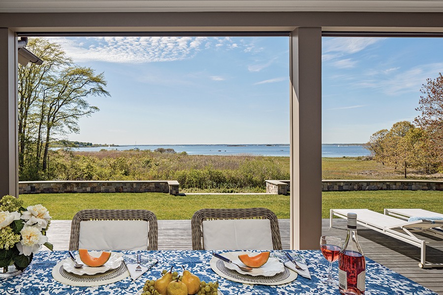
To capture that view, the builders brought in truckloads of fill, orche-strating a good relationship of house to water. “You go down from the living room to a covered porch, to a deck, to a grassy plateau—and then to the original grade,” Albert says. “It all seems very natural. No one visiting now would have any idea that all of these changes were made to the grade.”
Where the former driveway had run parallel to the old house, Albert laid out a new driveway that meanders around and finally turns to approach the new cottage on axis, which the symmetry of the house seemed to demand. “The symmetry is formal, but the language of the house is informal.”
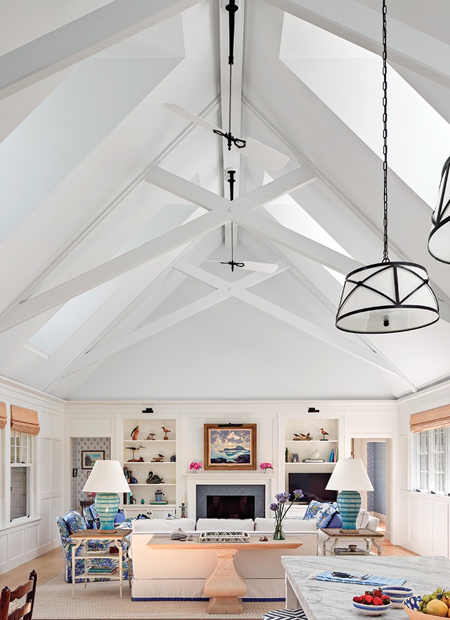
Because the 2,500-square-foot home is one room wide, you can see all the way through the house. All the main rooms have at least two exposures, and some have three, with windows open to views, breezes, and sunlight. Natural light pours through a series of upper-level dormers—into the combined living/dining/kitchen at the center of the house. Bedrooms are in side wings.
A long porch faces the water. “That’s where a lot of living is done in the summer,” Albert says. “When you have a porch that goes all the way across on the water side, you run the risk of making the living spaces dark. But those roof dormers bring in plenty of light,” he says.
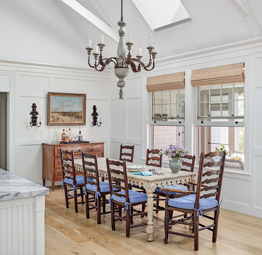
In the living area, the ceiling follows the roof slope, to a high ridge in the center. A painted wood wainscoting that incorporates built-in bookshelves wraps around the room and establishes an intimate scale. “You don’t have the feeling of a cavernous space,” Albert says.
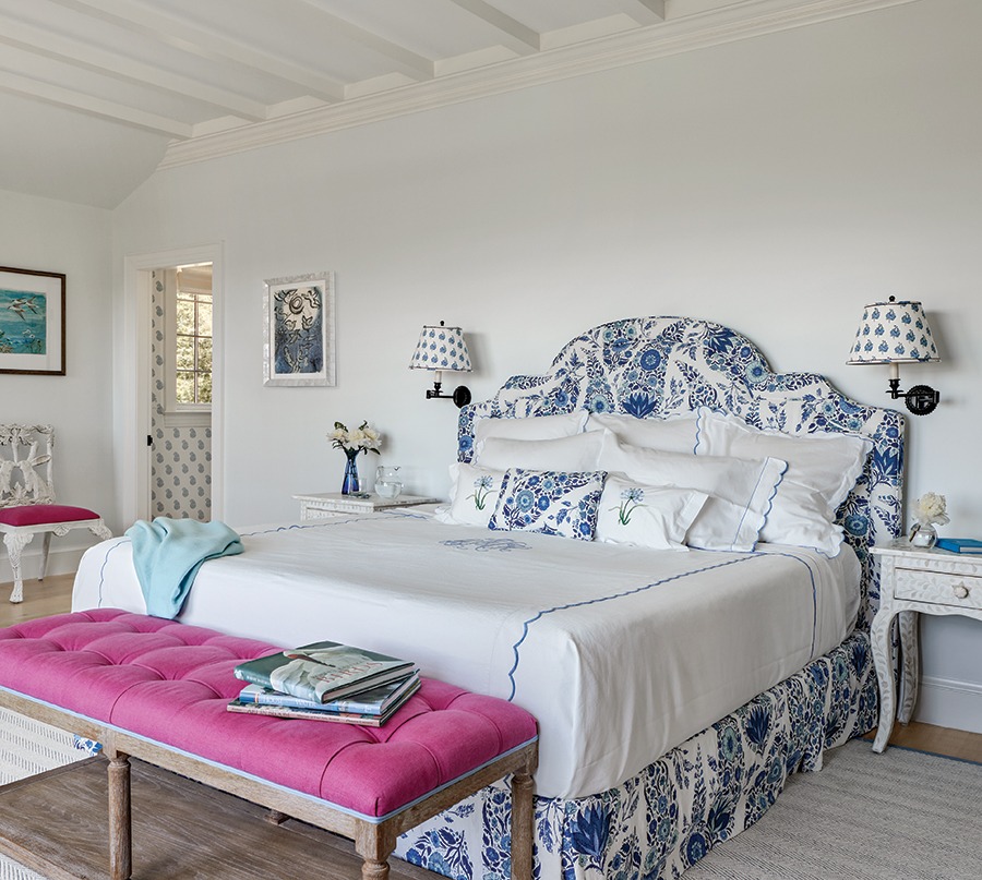
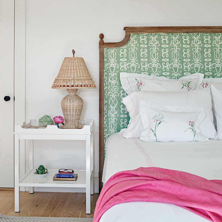
Miller and her aunt worked hard to create a light and summery series of spaces for entertaining—and for easy living. This is a seasonal house, after all. It may be insulated and heated for year-round living, but its prime time is during the warmer months.
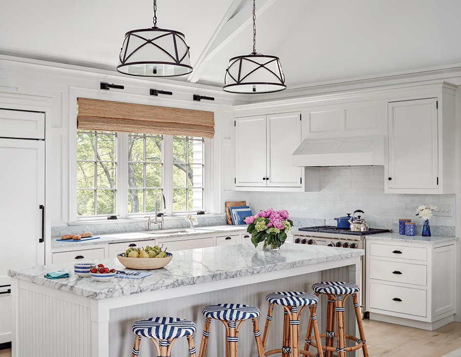
Thus the pops of blues and whites in almost every room. “The kitchen is light and bright with Carrara marble countertops and a glass-tile backsplash,” Miller says. “All the fixtures are New England fresh—and there’s a lot of Quadrille Fabrics and Raoul Textiles.”
The exterior is clad in white-cedar shingles treated with bleaching oil; the roof is Alaskan yellow cedar. Shutters are big and operable. “They close them when they go away in the fall,” Albert says.
That’s probably the most wistful time of the year at Sound Cottage.
For more, go here.

