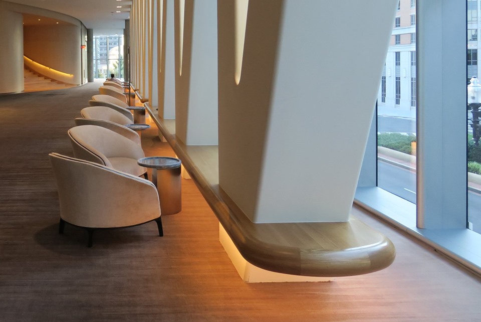
Interior designer Lauren Rottet, founding principal and president of Rottet Studio, recently completed interiors at the Hilton Conrad in Washington, D.C., by Pritzker Prize-winners Herzog & de Meuron. She calls it a classic representation of understated, stately power, reassurance and comfort from early America to now. Rottet studied the history and architectural forms of D.C. and reinterpreted them into a contemporary building to house the Conrad graciously. A + A interviewed her recently via email:
What was your assignment here?
When designing a hotel, Rottet Studio always examines the micro culture, the immediate surroundings of the property, and historical context/influences. In the case of the Conrad Washington, D.C., the influences of importance were the village, grid, open view corridors, points to gather and points to flow, rhythm, natural materials forming structure in a natural way with solidity and strength, comfort in natural warm materials, as well as the importance of natural materials such as stone, wood and forged metal from early America.
The Conrad Washington, DC was intent on creating a contemporary hotel to add to a neighborhood already bolstered by its proximity to several major historical monuments, award-winning restaurants, world-class shopping and cultural/entertainment venues including the Capital One Arena, and every major Metro line. There is also 30,000 square feet of high-end retail space below the hotel on the ground floor.
I felt, as did Hilton, that the Conrad Washington, D.C. represents the future of America rooted in the most significant historical context of our nation. I went to Williamsburg as a child and then as an adult stayed with my family in one of the historic homes over a Thanksgiving. The influences that linger in my mind are the feelings of true warmth, handmade craft, gathering and sharing of food and drink in a fun honest environment.
The Materiality?
The materials and visual memories are of natural wood, dark bronze and steel and natural leather all handmade or hand-forged in an honest Shaker-like manner. Wood representing meeting and dining venues, stone representing the solidity of town center, metal and glass representing points of craft made goods, storage and store. Village of amenities surrounded by transparent but encompassing architecture, open to view an amazingly enchanting maze garden.
Your inspiration?
We designed the interiors as a restrained, minimalist expression of purity of thought and design to complement the carefully conceived building.
How did the site drive the design?
Similar to any early American town, I began to think of Herzog & de Meuron’s building as the town and our interiors as the town square, reminiscent of historic early America, but intrinsically of today-contemporary. With open vistas to view corridors, the center of town holds artist-made furniture and objects, meant to pass through or sit and observe.”
The Bar for me became the ‘Arsenal’ where the town’s most precious and protected goods were held. Thus, there’s the round form and its visual prominence from the Atrium through the “curtains”. The wine racks behind the “Arsenal” bar are held up by bronze supports and leather straps. The way the bar is designed, it allows you to go into it and experience it as you do the arsenal in Williamsburg, but instead of ammunition, fine wines, liquors and cigars are held for your enjoyment. Handcrafted of wood, metal and glass showcasing the importance of the use of metal and the use of finely carved woods and specimen woods reclaimed. All natural joints – enclosing the precious liquors, wines and cigars like the Magazine of early America. An inner bar to experience the awe of being surrounded by luxury items imported from abroad and the best of local. The bartender becomes like the one at the Ritz Central Park NYC – everyone wants to be his best friend and confidant. Set up next to the window and watch the day go to night, sit by a warm fire and relax, take a drink out onto the garden – classic, minimal, handmade combined with luxury.”
The Restaurants are surrounded by textured wood grain walls as a representation of the historic wooden pubs and restaurants. The design is contemporary as it is void of decoration and true to its form, but traditional in that it is made of traditional natural materials constructed in an honest way. The hostess table is conceived to be a stone “carving table” that has been converted to a stand up greet and have a drink while you wait bar. The columns are exposed simple concrete structures that have been wrapped in metal at the base. The kitchen is open and honest and the guests can participate in the warmth of cooking and sharing it with your friends. Village dining hall. Watch the local chef prepare what is freshly available that day. It’s about the food, the drink and to company, the warmth of natural hand jointed wood and the glow of subtle twinkle lighting Only in DC and only at the Conrad – classic early America reinterpreted. Contemporary interpretation of village fine dining. Blue and white hand painted and sponged china, dark bronze open to view of garden transforming the mood from day to night. The rug design is influenced by the history and the culinary combination of the DC area from early American simple hearty food to the diverse international influences on the culinary environment in DC. The blue represents the Williamsburg early American china and the lower right hand corner represents the Middle Eastern influences. The reds and oranges represent the spices and curry from the Middle Eastern foods. The abstracted terrain represents an open canvas for diversity and influences from around the world.
For more, go here.
[slideshow id=2090]
Photography by Paul Clemence.


