The print and online editions of Ocean Home magazine now are running a feature article on a home designed by SDH Studio Architecture + Design, in collaboration with interior designers Alanna Kleiner and Adriana Grauer, on Sky Lake near Miami Beach. SDH was founded by Stephanie Halfen and her husband, Ricardo, in 2012 after they left Venezuela and settled in Miami. The firm has been highly successful since then, and is listed as one of Ocean Home’s 2023 Top Coastal Architects. A+A is pleased to re-post this feature here today:
By J. Michael Welton
Good things come, an old Chinese proverb says, in pairs. There’s the balance between yin and yang. The contrast of salt and pepper. And the possibilities of pen and paper.
Then there’s Stephanie Halfen of SDH Studio Architecture + Design and her husband, Ricardo, of Treo Construction (she’s an architect; he’s a builder) who teamed up for a new home overlooking Sky Lake in Florida. The interior design team? Alanna Kleiner and Adriana Grauer, dual principals in a firm they call AGSIA. The clients are a couple who share the Halfens’ Venezuelan background and are their close friends to boot.
Together they envisioned, designed, and built a home on a lot overlooking a rare freshwater lake, ten minutes from Miami Beach. “There are practically no lakes here, and when there is one, alligators are in it,” Ricardo says. “This one doesn’t connect to the ocean system or salt water: there’s no marine life, so people can swim there.”
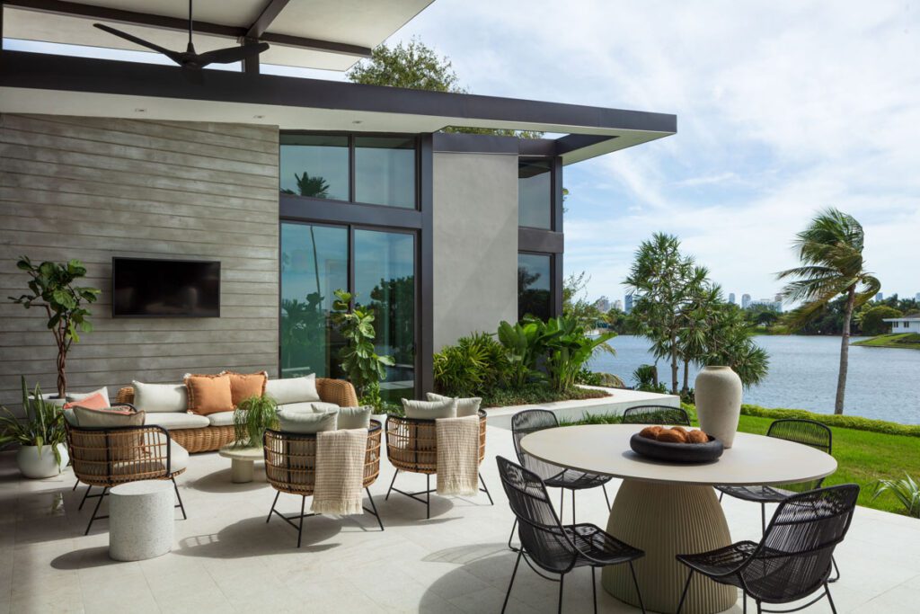
For this outdoorsy couple and their children, living outside was the raison d’etre for their new home. So their architect aimed to bring in views of the lake, integrate inside with outside, and blur their lines, but make it all functional too. That was no mean feat, given that the lot’s shaped like a trapezoid, and the prime view is off to the left.
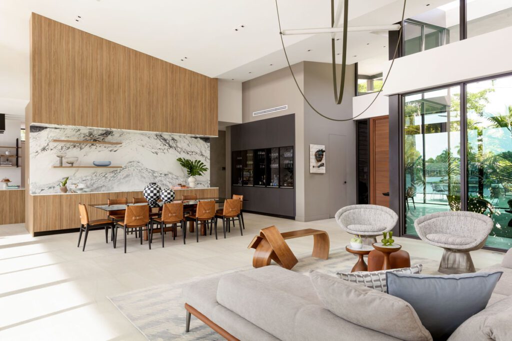
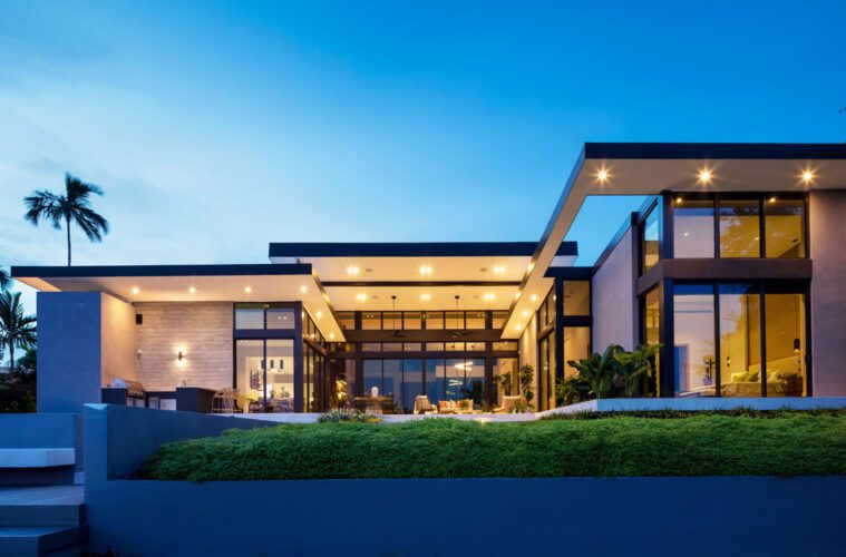
Stephanie designed one wing of the 4,100-square-foot home with privacy for its bedrooms in mind. Another wing is semiprivate, for the kitchen and family room. The center space is the heart of the home, designed for living and dining. “They’re continually walking around in it, for the views and the landscape,” Stephanie says. “It’s a house that’s very cozy, and at the same time open to the outside.”
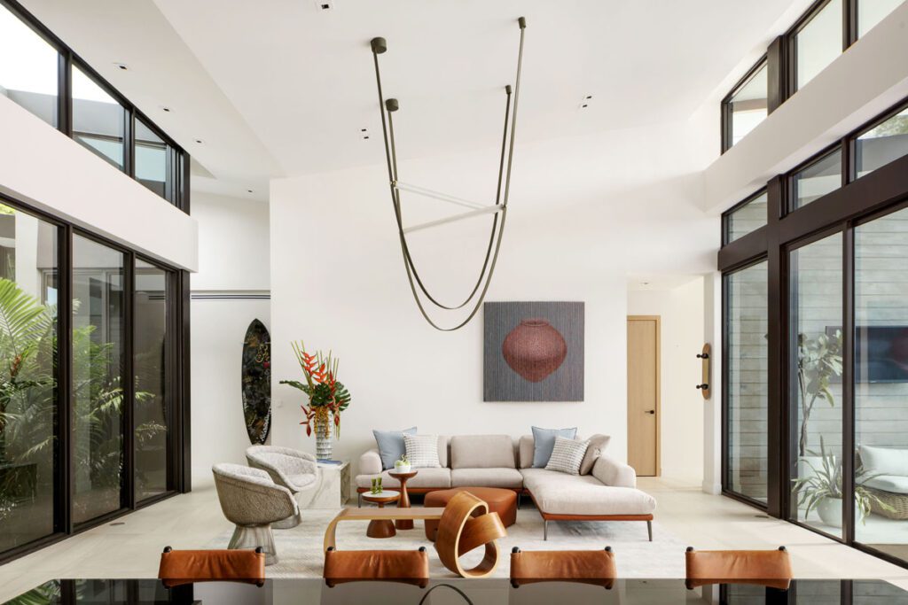
She achieved that with a center space that rises higher than the two wings, opening up to sky and water. She dropped down the rooflines for the kitchen and bedroom wings, for a more opaque effect. “The center is more impressive, but it’s cozier on the sides where the more intimate areas are,” she says.
Her design intent was to reinterpret the midcentury modern style, with flat, double-height rooflines that are slightly sloped but barely noticeable. What is noticeable is a malleable center space for entertaining and big gatherings. “They can open up the inside to the outside and meld them together,” Ricardo says. “And there’s the patio, pool, dock and lake. It all flows together well.”
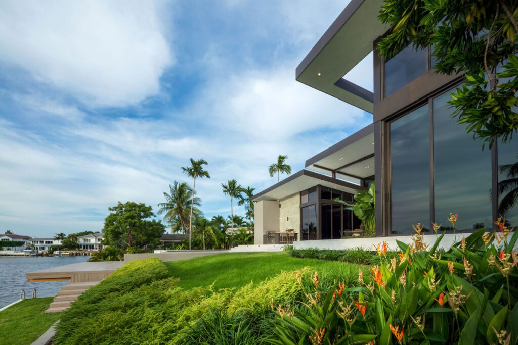
The drop down from house to lake is a steep 10 feet, so the architect and builder graded it and created descending sections on separate levels. The main approach to the home is on the street level; overlooking the lake at the rear is a lawn, then a pool and deck, and finally the lake.
The descent from house to lake is designed as an enjoyable passage, with five platforms along the way. “They make the transition smooth,” Stephanie says. “Then, when you’re in the lake, there’s a very nice feeling of going up and down the whole circulation.”
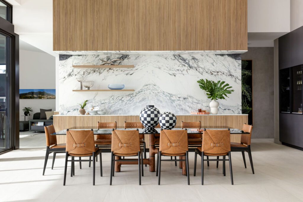
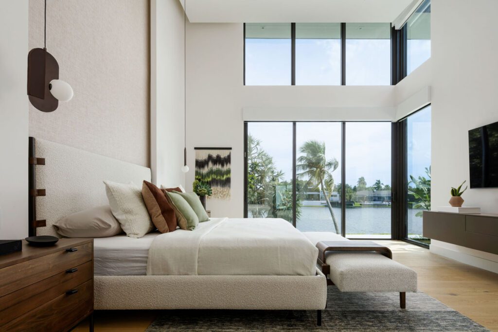
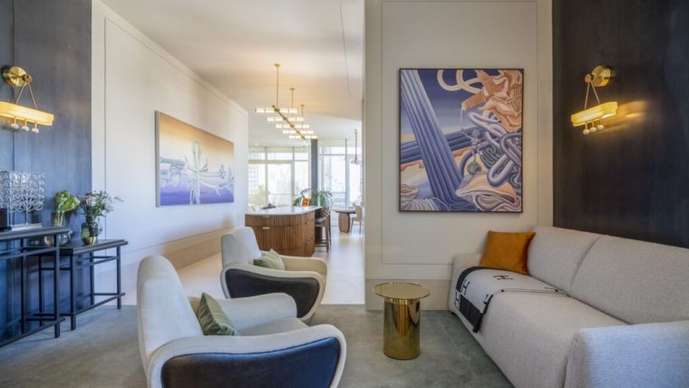
Inside, Kleiner and Grauer used restraint as they worked with the architecture, the fixtures, and the furnishings, taking care to focus on the view of the lake and bring its darker tones inside. “There are natural colors like terra cotta and greens, layered with a lot of textures,” Kleiner says. “The leather in the furniture is in natural colors, heavily textured, warm, and comfortable for the Miami weather.”
Interior spaces inside are narrow and tall, she says. To deal with high ceilings in the great room, the interior designers used accents with vertical lighting to bring them down to human scale. The kitchen and dining area are separated by a floor-to-ceiling partition, though there is a good flow between the two.
Along with using slabs of stone and limestone-like tile, the interior designers wrapped much of the kitchen in a manufactured wood that ties it all together. An engineered wood product, it’s three-quarters of an inch of white oak, layered like plywood and then installed as tongue and groove. “It’s five millimeters on the back,” Ricardo says.
The new home is sited in a neighborhood that’s steadily upgrading its stock of about 40 homes built back in the 1970s. It’s the third that Kleiner and Grauer have updated on the lake. “They’re getting renovated, from traditional developers’ houses to personalized, upgraded homes,” Kleiner says. “Most are getting redone.”
Here, the two interior designers worked hand in hand with the architect, builder, and clients for a flawless design and presentation. “It’s hard to separate the architecture from the interior,” she says. “It’s very blended.”
That’s because good things so often come in pairs.
For more, go here.

