Louis Cherry’s work may look simple, but there’s a rigorous and complex process behind it.
The first thing he looks at on a site is how the sun travels across it. “How do you pick up the light and the views – that’s always the generator,” he says. “Where do you want the sun to fall? You want some summer shade and in the winter you want some sun.”
For a home site on 10 wooded acres in between Chapel Hill and Hillsborough in central North Carolina, he found an opportunity to explore simple transparency and opacity.
“It’s a very open forest – there’s not a lot of thicket,” he says. “It’s pine and hardwood with a nicely raised forest floor because of all the pine needles – it’s gentle topography.”
It included a raised hill, just waiting for a home. Its crest was the obvious site, not just because of its light, but also its views of the forest in all directions, and the advantage of water easily draining away.
“The clients had spent a lot of time on site, and had even camped there to get a feel for it,” he says. “We walked it, and agreed that that was the spot.”
Their program was simple: They wanted a 2,600 square-foot home with open living space, a work space integrated into the circulation, a master suite, a guest bedroom, a pool and two garages. Merging inside and outside living was important. And they were specific, if pared down.
“They wanted a just big enough house – exactly what the needed and not more or less,” he says. “So it was important to create an efficient plan and fine-tune the scale of the rooms, and for the project to be right-sized.”
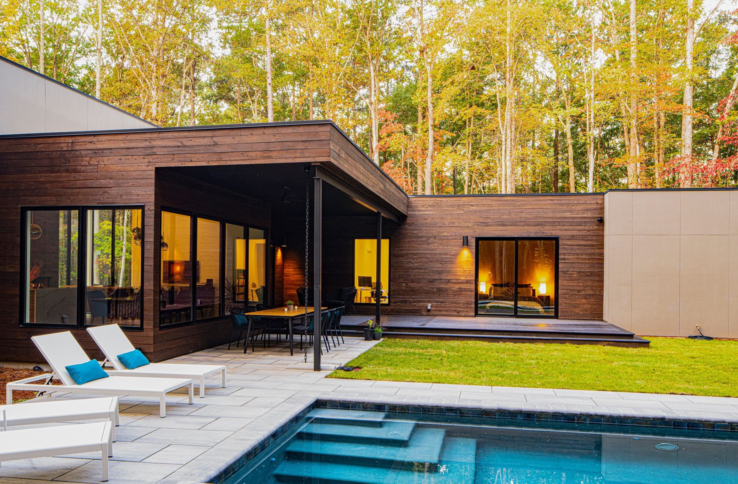
The result is a single-story, L-shape plan that minimizes circulation space and creates two edges of a backyard courtyard with a small lawn and a lap pool. The simple plan is oriented for natural daylight, especially in the open living area with large expanses of glass on the south and north faces.
“The big design goal was to create connectivity for flow of movement to a cultivated interior courtyard bounded on two sides – and the pool provides a third side,” he says. “On the inside corner is a porch and on two sides where the pool is, everything else is natural. It’s all fenced in for a border that’s manicured.”
His design intent was clarity for the home’s volumes. “It’s a simple program in terms of public and private spaces organized around the outdoor space,” he says. “The lawn view is on one side and the forest is on the other, and the pool is a kind of edge of the lawn – it’s in the site but not on the site.”
An approach from the road reveals the house as cars come around a curve. “There are two garages at angles with each other to create a court,” he says. “The pool creates a court at the opposite side, for an L-shaped design of exterior elements.”
It’s all about simplicity, he says. “How does the building express its relationship to the site, and how do the windows express the introduction of light, with overhangs and protection?” he asks. “The idea is to create pretty simple cubic kind of shapes to form this puzzle, and describe these relationships of living and sleeping as programmatic elements.”
But it’s a complex process.
For more, go here.
[slideshow id=2246]


