Chaste is the descriptor that best fits John Lum Architecture’s renovation of a chapel at Olivet Funeral & Cremation Services in Colma, Calif.
The walls and columns of the original 1960s structure, a midcentury modern, had been clad in aggregate stone.
Clearly, that had to go. “I thought: ‘How do we clean up and utilize these classic elements?’” Lum says. “The answer was to strip the stone away for expression of the columns for a more formal sense.”
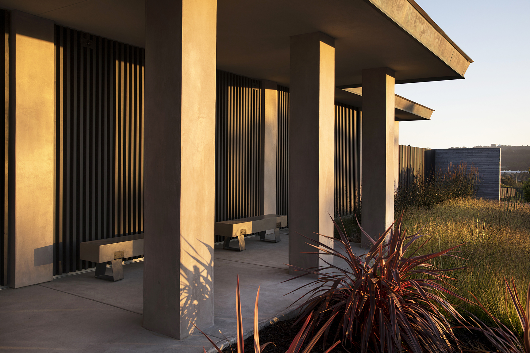
The architects maintained the building’s scale and proportion, but eliminated the ornament. “The exposed-concrete, aggregated columns were really cheesy, so we clad those in stucco for a more simplified look, and to celebrate them,” he says.
While most funeral homes tend to be bleak, windowless and nondescript, Olivet requested that their building be elevated to the concept of a celebration of life. More specifically, they wanted a space to better serve their multi-cultural community and be Californian in its feel.
That’s where the San Francisco-based architects, known for budget-minded renovations, came in. “The idea was to simplify and accentuate the building that was there and give it a more classical feel – a kind of a Zen garden feel,” he says. “And we also wanted to accentuate the 1960s feel, and respect the culture of the Bay Area.”
The architects sought to preserve as much of what existed on site as possible, and respect the solemnity of purpose. “We wanted to speak to the people using the facility,” he says. “Half are from Asian cultures, so maybe they’re Buddhist, and not Christian or Jewish.”
There was a discussion, too, of how to design a funeral chapel with natural light. “With a body, you can’t have light on it,” the architect says. “But if many of the celebrations are without a body, can we have natural light?”
So the randomly placed, aluminum-clad windows came out, replaced with modern glazing that opens out to thoughtful new surroundings. “There’s a boulevard in front, and beyond that another cemetery, and none of it was a great aspect to look out to – it was distracting,” he says. “Now you see over the wall we put there, to the mountains in the distance.”
The architects also added automated roller blinds, with filtering and blackout capacity, to provide flexibility for various types of services. Whether a body is present or not, the concept of a celebration of life is still honored.
They eliminated an asphalt parking lot out front, and maintained one at the rear of the building. “We created a drive-around in front of the wall, to the back lot,” he says. “We filled in the back of the colonnade so they can wheel bodies into the viewing room without interacting with people there, and then take the bodies out to the burial site.”
Where the former building felt as if one were entering a 1960s bank or insurance office, the chapel is now warmer and more inviting. “They wanted seriousness to it, but not have it be morose,” he says.
And they got it – with a careful, well-thought-out merger of landscape and design.
For more, go here.
[slideshow id=2294]
Photos by Paul Dyer


