The online edition of Ocean Home magazine recently ran a feature I wrote on a Hollywood Hills residence that blends contemporary and midcentury modern architecture. It’s a nod to the 1960s ranch that was taken down to make way for the new home. The owners allowed sweeping views out front and a natural granite outcropping at the rear to define their direction. A+A is pleased to re-post the feature here today:
A new home in the Hollywood Hills community of Doheny Estate is as layered and complex as the two partners who designed and built it.
Arya Martin is Persian, but went to school in Orange County, where he studied business and finance. Michael Martin is from Northern California but was educated in Germany and worked as a travel writer for U.K. magazines until he moved on to a career in interior design. He started out in Los Angeles. “I was doing my first house in Encino, and he helped me finish it when we met,” Arya says.
Before long, they were partners for life and in business, too, as designers and developers in a firm they call Studio OSKLO. Its newest project is also the Martins’ home, and sited on their half-acre lot. They’ve lived in Doheny Estates for almost two decades now, and spent three years planning and building their 8,000-square-foot home, one that backs up to a massive granite outcropping.
They knew they wanted to create a modern estate that blended contemporary and midcentury modern architecture—a nod to the 1960s ranch that had to be taken down to make way for the new house. And they let the natural landscape surrounding the home define their direction.
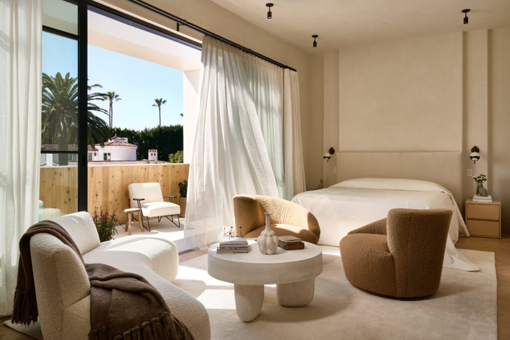
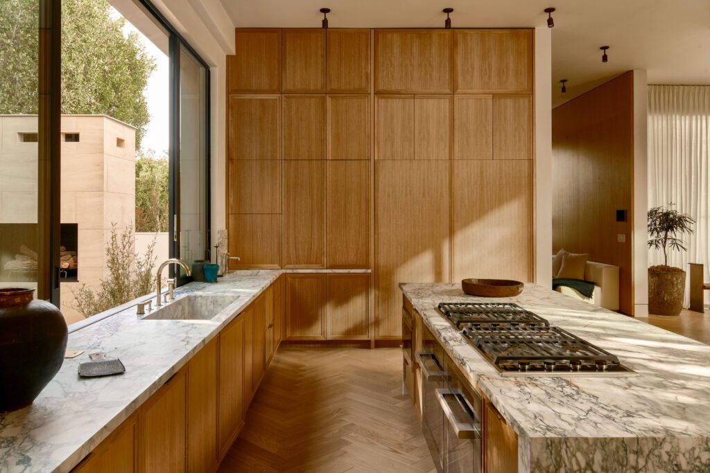
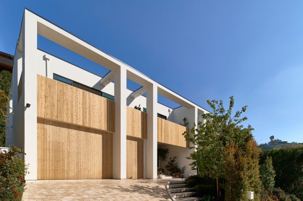
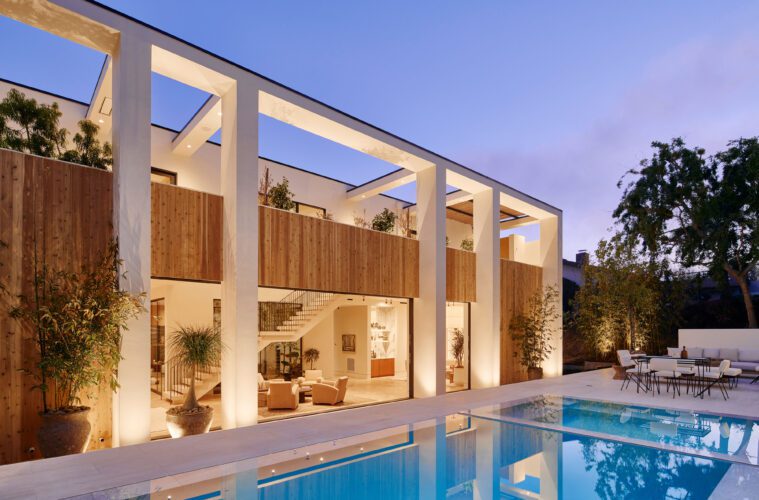
“We chose the earthy tones of the granite hillside in the rear of the property as direction for the herringbone oak floors,” Michael says. “Then we added a front and rear colonnade typical of homes found in L.A. in the 1960s and ’70s.” A four-sided symmetrical structure can feel like a box, but a wraparound colonnade and planted second-floor courtyards lent this one the ambience of a modern agora. “It makes the interior feel like it’s part of that rocky landscape,” he says.
They brought in landscape architect Joel Galarza to create a terrain that blends into the natural hillside from each side of the property, as well as the inside atrium. “The site features that upslope granite rock exposure to the rear and a higher retaining wall on the front side,” he says. “For some, those would be obstacles, but we played into it and created exaggerated privacy in front and an Aman resort-like setting in the rear.”
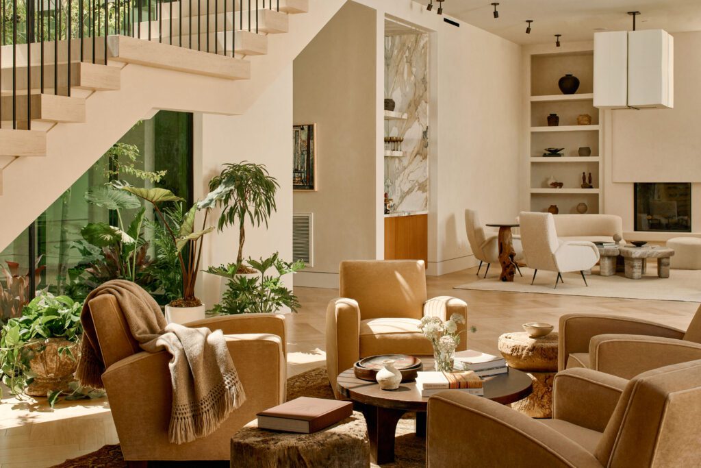
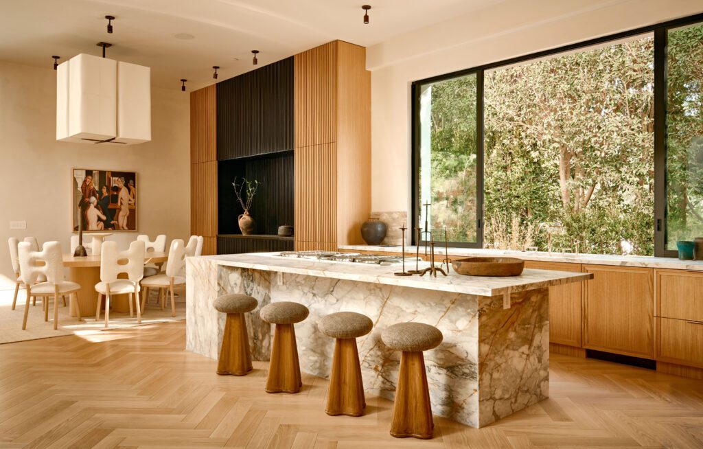
The designers used a muted white on outside walls, with creamy tones that soften the columns in sunlight. Wood paneling wraps second floor terraces for privacy. Interior plaster is a sheen-free muted white. “For the kitchen, we picked Calacatta Paonazzo because we wanted it to have a vintage feel and warm up the space,” he says. “For the bar in the living room, we used Calacatta Gold for something that has the same tone as the kitchen stone.”
They used oversized corridors around the atrium, with full-wall wood paneling of white oak, which is repeated also in the upper hallway and TV room. In public rooms, they chose tight groupings of furniture to create a cozier ambiance for evening talks and small cocktail parties.
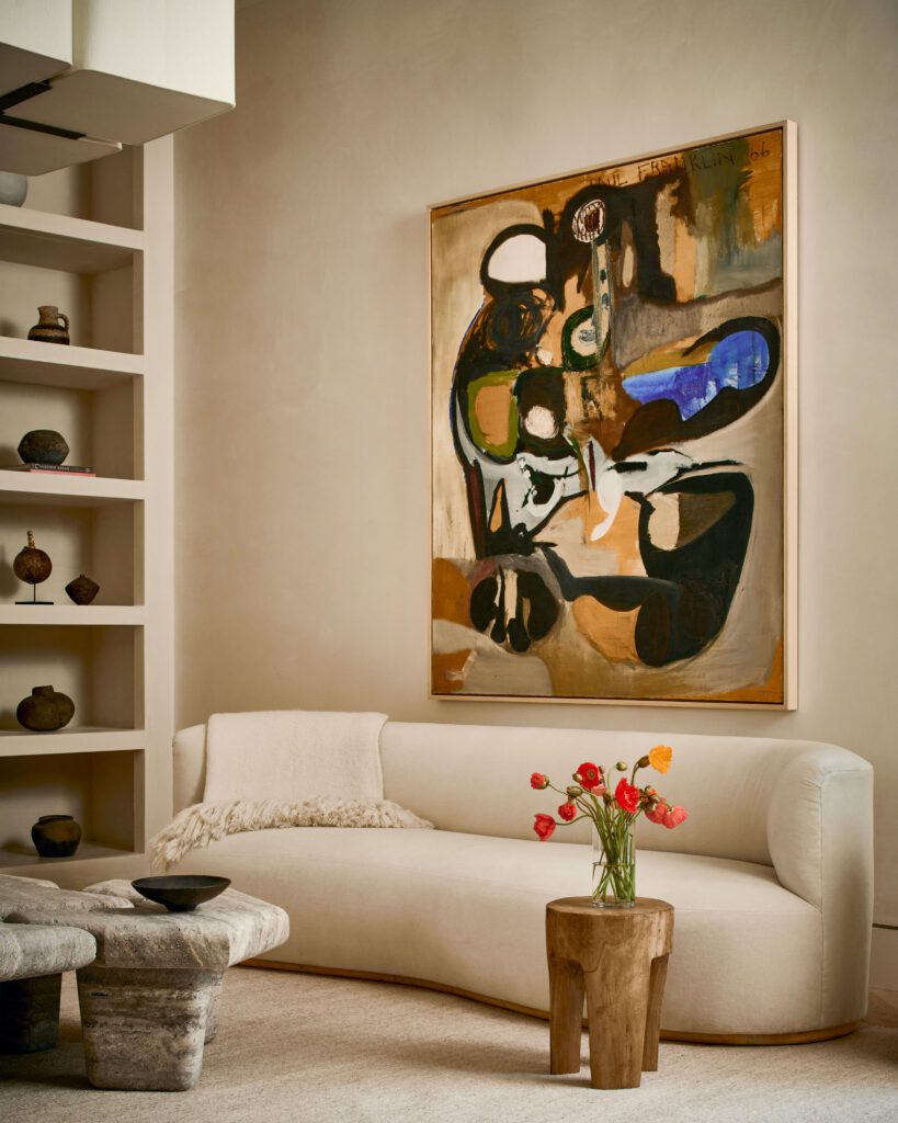
All the interior furnishings were custom designed by the two partners, and the art came from their own collections. “So much of our personalities are reflected in the interior, like the carpets brought from Iran by Arya’s family,” Michael says. “We used collectibles, found in cities like Madrid, Sao Paolo, and Marrakesh, that express our love of travel and art.”
The home may be in the Hollywood Hills, but it’s chock-full of Japanese antiquarian accents. Antiques were sourced from local shops and stores in Tokyo—and even nearby flea markets. A close look reveals Japanese pottery, 19th-century bronzes and clay collectibles on built-in shelves and tabletops. But their tastes favor works that can only be called eclectic. One of the pair’s favored pieces is a 1960s bronze bust on a pedestal up in the second-floor hallway.
The dining room features artwork believed to be by Polish painter Tamara de Lempicka. “The living room features our Studio OSKLO travertine coffee table of solid stone,” he says. “It’s one of our favorite pieces, and available at 1stDibs.”
Sure, it’s a highly personal, peel-back-the-onion approach to architecture, landscape, and interior design. But it’s clean and crisp—and for these two, it works like a charm.
For more, go here.


