Never ones to shrink from a challenge, Jon Gentry and Aimée O’Carroll of Seattle’s GO’C Studio took on Brandon & Sarah Ebel’s assignment con gusto.
Brandon owns a record label. Sarah’s a New York Times best-selling author. They’ve got a big family – and they needed a big house.
“This is a home for a combined family, like the Brady Bunch, with three kids each,” Gentry says of the residence he calls the Sound House. “They wanted six individual bedrooms for the six kids, plus a communal space for them.”
They had an enviable lot in Seattle’s Magnolia neighborhood. It’s an elevated peninsula northwest of downtown, with 270-degree views across Puget Sound to downtown, the Cascades to the east, the Olympics to the west – and Mt. Rainier in the distance.
The 5,500-square-foot home replaced another built in the 1920s, on a one-and-a-half-acre lot. A series of gardens and paths were reworked to form a dining terrace and pool nestled into a steep slope.
“We were not allowed to build huge portions because of environmental considerations.” O’Carroll says. “There was a plateau where the old house was and it was about how to maximize what we had.”
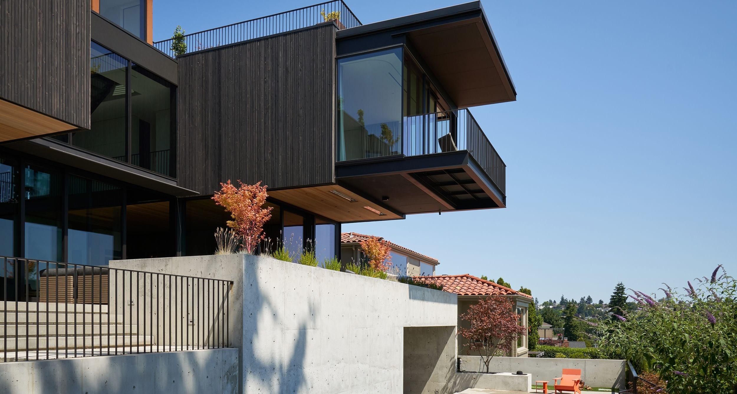
The north side had an existing garage abutting the sidewalk, so a large portion of that elevation is a new structure – a stained cedar box resting on the existing volume of the plaster-finished garage, paired with Corten steel on the door and roof above.
“On the north side it’s very private feeling, with shutters above to screen off the bridge,” Gentry says. “The louvers are framed in steel and clad in cedar – they’re on big hinges for opening up.”
The south side was already private so louvers weren’t needed. “It explodes with glass and doors, so we wanted to create a ‘C’ shape to harness the light and views,” he says.
Inside, their clients wanted shared space where they could enjoy being together, so on all three levels there’s plenty of livable family area. The children’s six bedrooms and communal space is on the west wing; the east wind – cantilevered into space – is for the parents.
But even the children’ six bedrooms have views down to the living room. “They hang out together and see each other from each level,” O’Carroll says. “They have their own bedrooms, but they’re small and the shared space is outside them, so the family is together throughout the house.”
And it may be big – there’s a lot of programming going on inside and out – but it’s not out of scale. “There’s a double height space in the living area, and the scale in the kitchen and dining room drops down,” she says. “The music library is an intimate space, with its walnut bookshelves.
There’s an extension of the interior spaces to the outside too. “They have nice exterior furnishings too to define those outdoor rooms,” Gentry says. “There’s an entertainment space and bar on the upper roof too.”
Neighboring homes directly adjacent are 1920s and ‘30s in style, but others are more modern. Because of the way it’s designed to cascade down, it feels like it’s in scale with those around it, and not like a huge house. “We maximized its space at the same time,” O’Carroll says. “It’s more modern, but with the material changes over three levels, it intensifies the scale and proportion.”
Inside and out, this is a home that solves two challenges at once: it emphasizes togetherness – and focuses on spectacular views.
For more, go here.
[slideshow id=2495]


