Never underestimate the designer who holds degrees in both architecture and landscape architecture.
Like Jeff Huber, principal in the South Florida Studio of Brooks + Scarpa, who’s been with the firm since 2015. He earned his architecture degree from the University of Florida and his landscape architecture degree from Florida International University.
And he puts them to very good use.
His most recent effort to integrate the two disciplines took place on a 10-acre site in Pompano Beach, Fla. There, he was tasked with creating a park pavilion and sports complex. “The intent was to put in a soccer facility and pickleball courts – to give the people sports,” he says. “We were asked also to design the field house, with offices, storage, concessions and restrooms.”
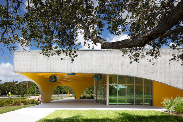
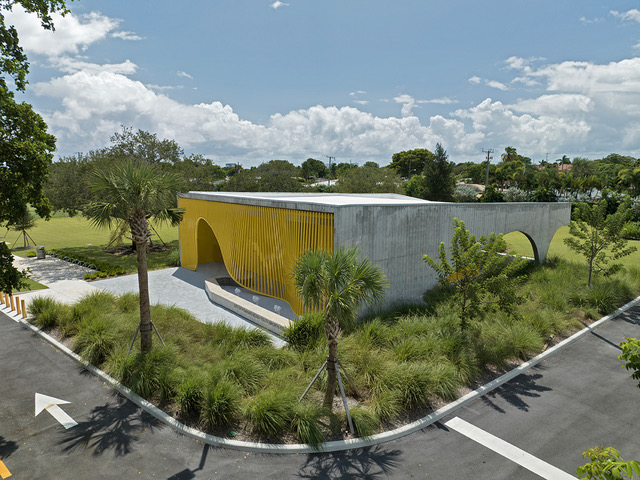
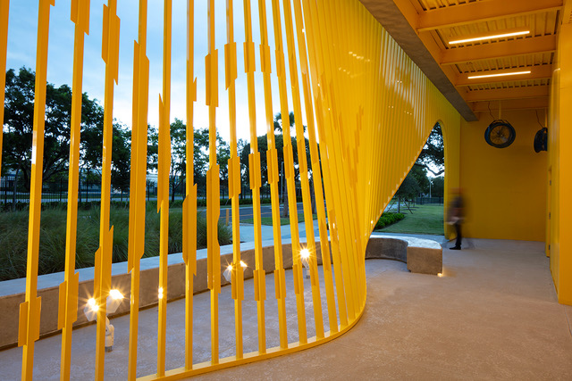
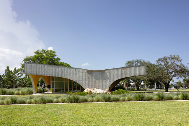
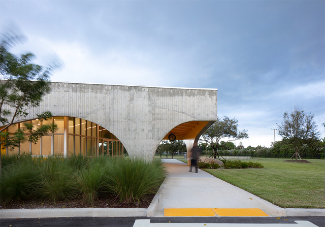
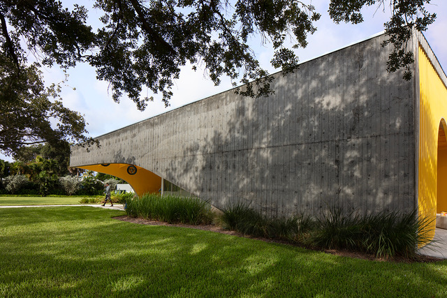
The 1,000-square-foot structure – with its 2,000-square-foot, overlapping roof – was designed as a buffer between a neighborhood to the south and a regional airport to the north. It’s located on a major southern road that leads to the airport, on a site with no existing vertical elements. “So this creates a billboard when it’s seen from the road,” he says. “There’s this large yellow screen, and that was the main intent.”
South Florida’s hot, humid environment was also a consideration. The city’s Parks and Recreation department requested that the building provide shade, so Huber designed the wraparound porch and roof. The result is a form that’s sleek and playful, but also durable and robust.
“When you look at it there’s a nice glow of yellow from the inside, but from the outside it’s curved with a shed room for a sculpture in the park,” he says.
He also created a rain garden on south side of the building, with found limestone boulders for a splash pad. Then he added native, palm-tree-like Coontie plants, with their small, shrubby flowers. “They attract endangered butterflies and dragonflies,” he says. “Part of what we did was to create habitat and ecological pest management for mosquitoes, because the dragon flies eat their larvae.”
The building serves as a fulcrum between parking lot and sports fields, since players and fans have to enter the building to get to the fields. “We made it so you go through a promenade of bioswale that delivers you to the main porch,” he says. “We wanted people to move through it.”
The material palette is fairly straightforward: concrete, aluminum tubing, metal wall panels and storefront glass. A major challenge popped up during the pandemic, when building costs skyrocketed by 27 percent. That meant a number of redesigns as the project was underway.
“We had $780,000 and no more, so we were value-engineering to protect the design,” he says. “We had to work on the fly to accommodate those costs, and get in budget and scheduled on time.”
Still, they managed to create a mini-monumental work that merges the built and natural environments in a bright and stand-up way. “The colors are vibrant and people love it,” he says. “We’re in soccer season now, so it’s heavily used and working as intended.”
So to paraphrase Shakespeare, it may be small, but it is mighty.
For more, go here.

