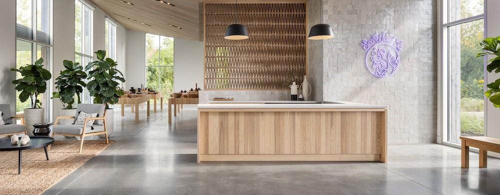
Once the Maine legislature passed a referendum legalizing adult use of Cannabis in 2018, a company known as Seaweed approached Caleb Johnson Studio in Portland.
They wanted to create a pair of retail, recreational, extraction, and cultivation facilities – one in South Portland (So Po) and the other in Marginal Way.
For branding.
“They wanted to start this brand and make it approachable – and they came to us for that,” says Patrick Boothe, director of commercial design at the studio. “They saw that we use natural materials, and how we use the landscape with clean lines and simple, expressive materials.”
The company was willing to take its risks, while looking to other states like Washington and Colorado where cannabis is already legal. And the owner was already a trusted source in Maine. “The Seaweed founder runs an organic garden,” he says. “His products are in grocery stores all around, so he’s already well known.”
These clients were asking for something Apple-esque – clean and modern, like a Bohlin Cywinski Jackson design – with a design ethos for an approachable project, not a turn-off head shop. “Also it was to be for people not quite ready to take the leap to cannabis, breaking down the barriers of intimidation,” he says. “They wanted to make a building designed for a comfortable experience and to showcase their products.”
Natural light and access to the landscape were key to the design, especially at So Po. “There’s a 17- foot expanse of glass for a view across the landscape,” he says. “You’re looking at low-lying shrubbery with a textural quality on a bit of a bluff, out to a long wetland plain for about a half mile.”
If that doesn’t relax a potential customer, the architects’ choice of materials will. Much of the natural wood inside was harvested in Maine, including white ash walls and white cedar ceilings inside, and eastern white cedar outside. The desired effect is for clients to sense that if the retailer cared enough to use beautiful, local millwork, that it would be careful to take care of its customers too.
The architects dealt carefully with a number of other human senses to help clients feel comfortable. That means visuals, to be sure, but that’s not all. There are double stud walls to keep the space quiet, and background music to soothe the spirir. The products may be aromatic, but there’s ventilation for a subtle aroma that’s part of the atmosphere.
“And touch: You’re leaning against an ash wall when you’re looking at the product,” he says. “There’s no stain, and you feel the texture of the grain that was well-built by craftspeople.”
The So Po space is 3,200 square feet, with retail taking up about two thirds of that, or 2,000 square feet. And there’s a Frank Lloyd Wright compression/expansion inside. “You approach it on the low side with its10-foot ceiling ,and then it slopes up to a tall wall of expansive glass,” he says. “That’s how we like to deal with the elements, so you don’t feel like you’re in a big hollow space.”
It’s already paying off in spades for clients, customers, and architects. The So Po location won both AIA Maine and AIA New England awards last year – both firsts for commercial spaces for the studio.
And they’re both well-deserved.
For more, go here.
[slideshow id=2431]
Photos by Trent Bell

