On a hill overlooking the town of Greenwich, Conn. is a museum that started out as a mid-19th-century stone home for a wealthy merchant named Robert Bruce.
When he died in 1909 he left the home and the surrounding property to the town, to be “a natural history, historical, and art museum for the use and benefit of the public.”
Its first exhibition was in 1912 and featured works by local artists known as the Greenwich Society of Artists, several of whom were Impressionists from the Cos Cob Art Colony. “They painted the Connecticut seaside back in the 1920s,” says Noah Marble, principal, and Washington D.C. studio director, EskewDumezRipple.
Soon afterward, the museum began leaning into natural history. “The directors were naturalists and taxidermists who’d go to South America and bring back specimens,” he says. “It was more science dominated, but now art is where everything is being pushed.”
Alas, the original building has been much-renovated and altered over the years – to the point of losing its heritage. “There are a lot of old bones in there, but it’s been brutalized,” the architect says.
So in 2013, the museum launched a national competition to add onto the existing building and create a new one. The operating committee sought a total of 40,000 square feet for permanent art and science galleries, as well as revolving art and science space.
A long list of nationally known firms was whittled down to 13, then to three finalists.
And EskewDumezRipple won the commission.
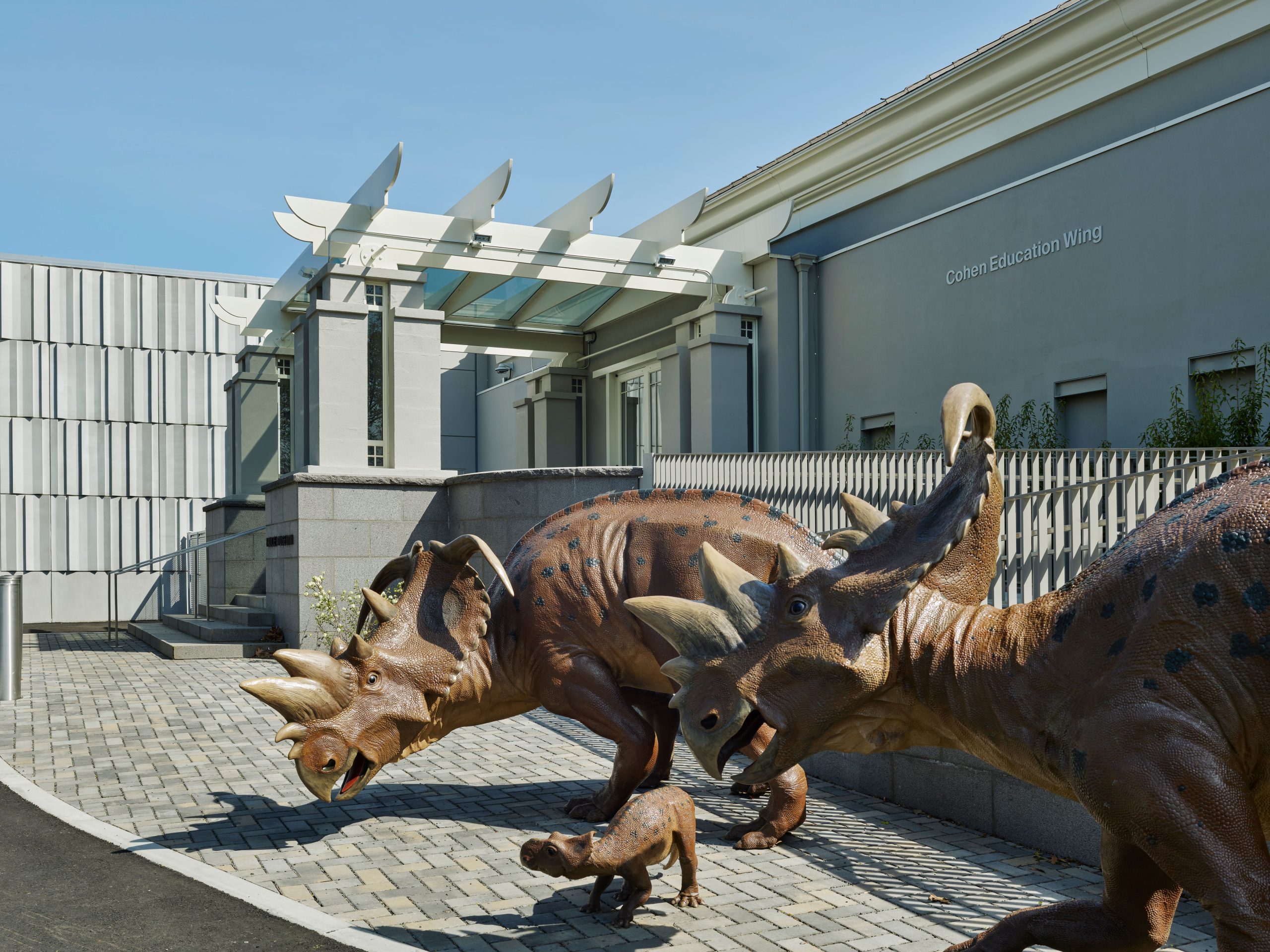
Their mission: To modernize a building that, though down at the heels, had grown to become an institution with a world class-collection that included works by Rembrandt, Rodin, Warhol and Henry Moore.
It was something of a struggle.
“There were stucco boxes in a residential style, and the systems from the 1950s were all failing,” he says. “They wanted to bring in shows from overseas but didn’t know if they’d be able to maintain the temperature and humidity.”
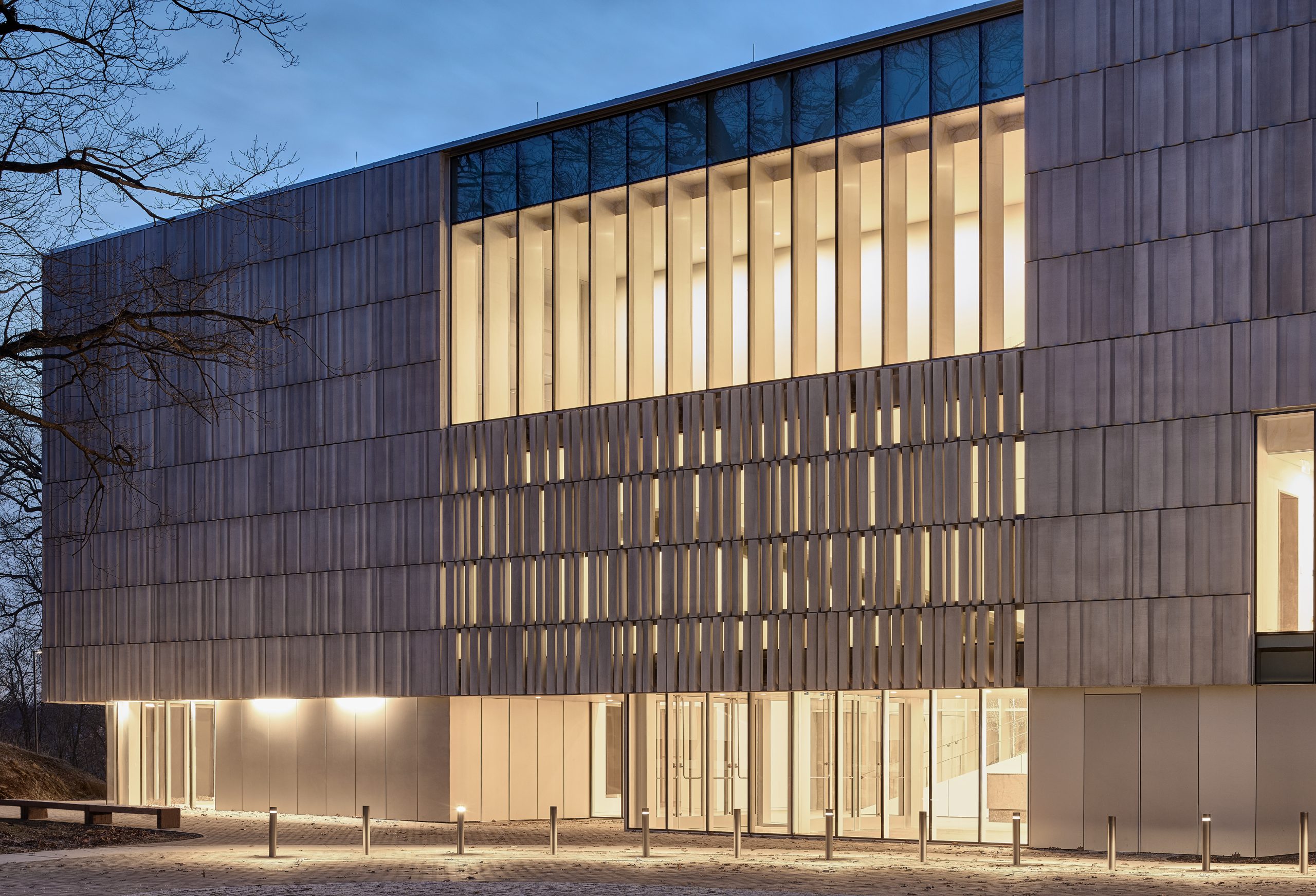
For the new building, the architects worked with the site and with landscape architects from Reed Hildebrand to move the entrance to the center – with a winding pathway. “Outside is an amazing park with enormous trees,” he says.
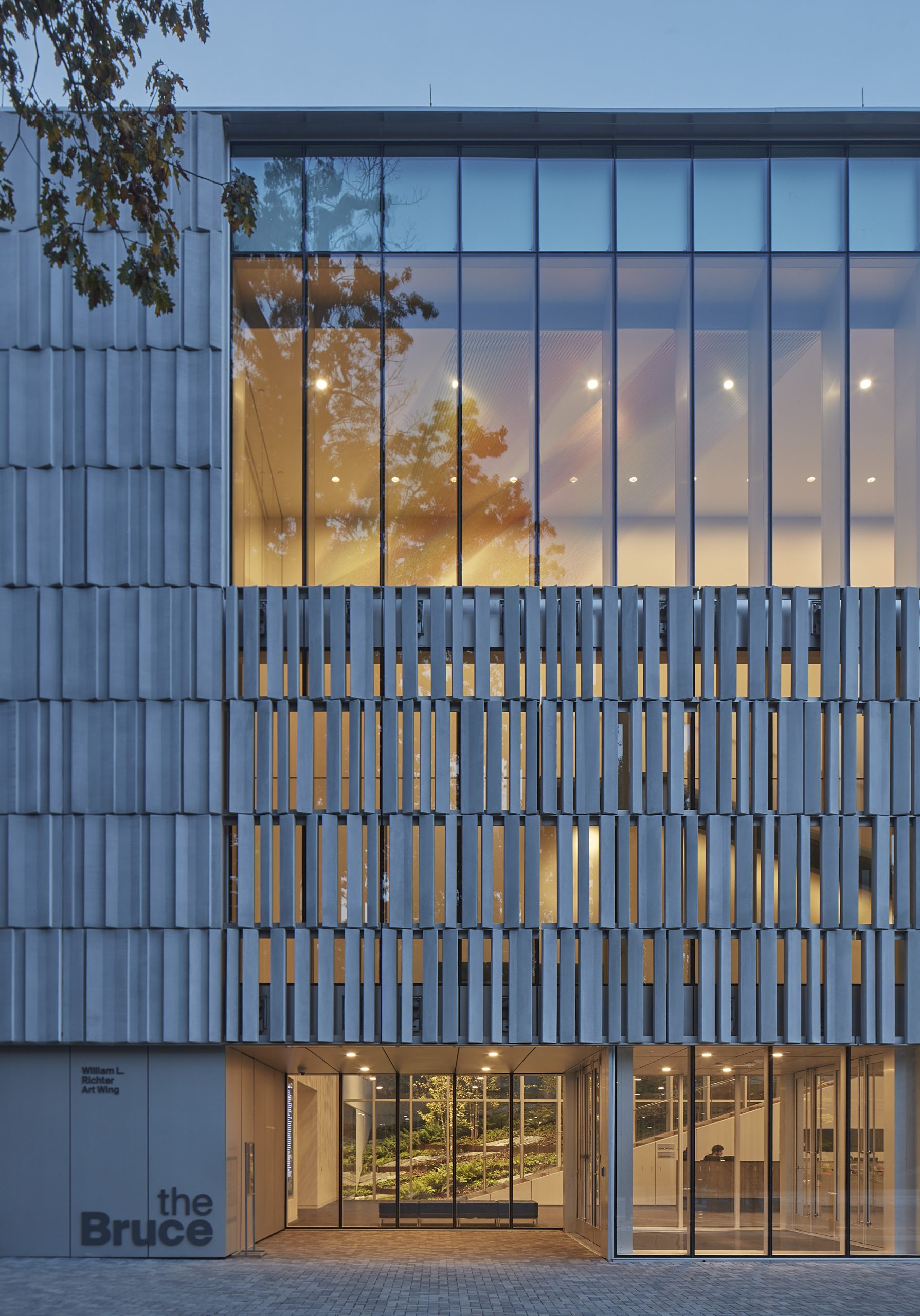
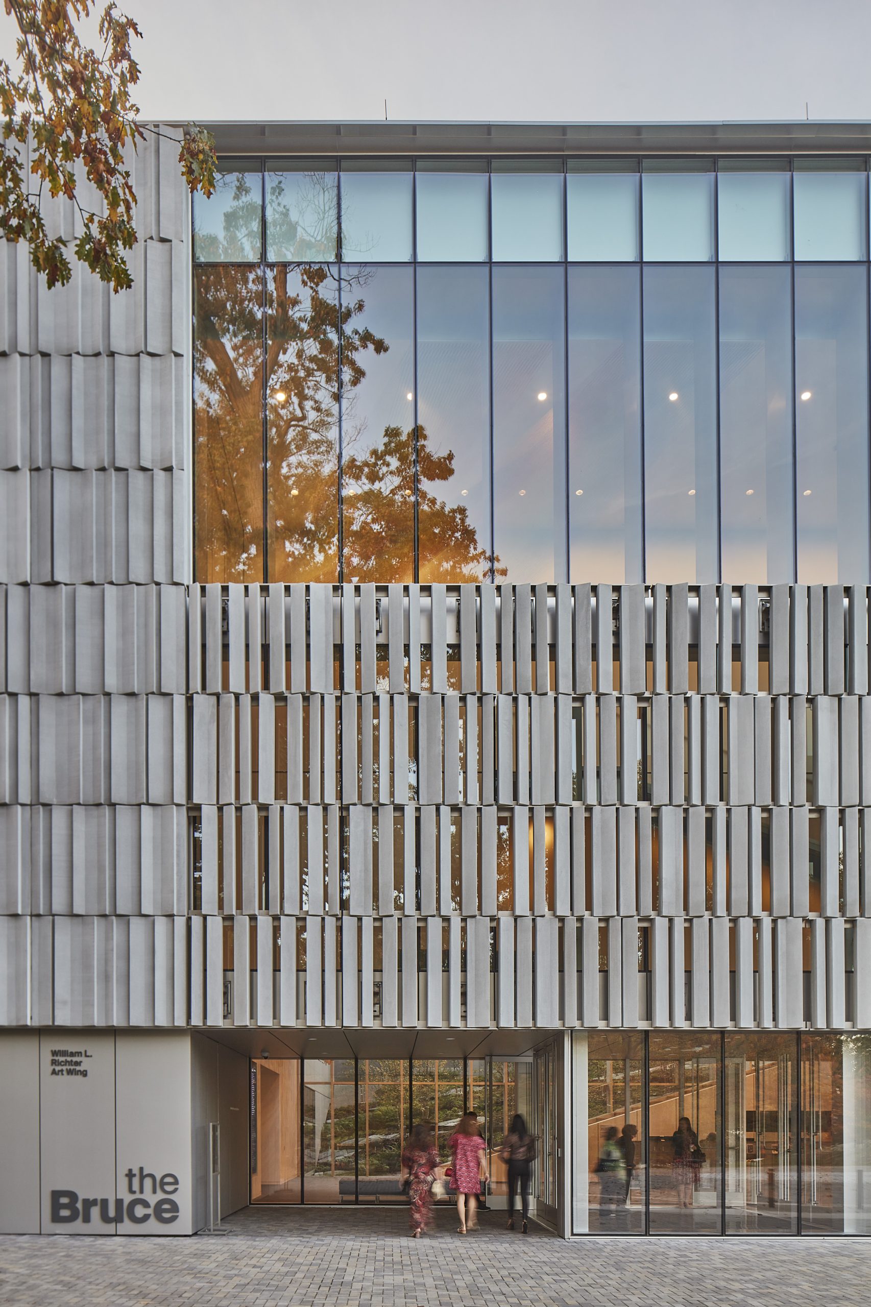
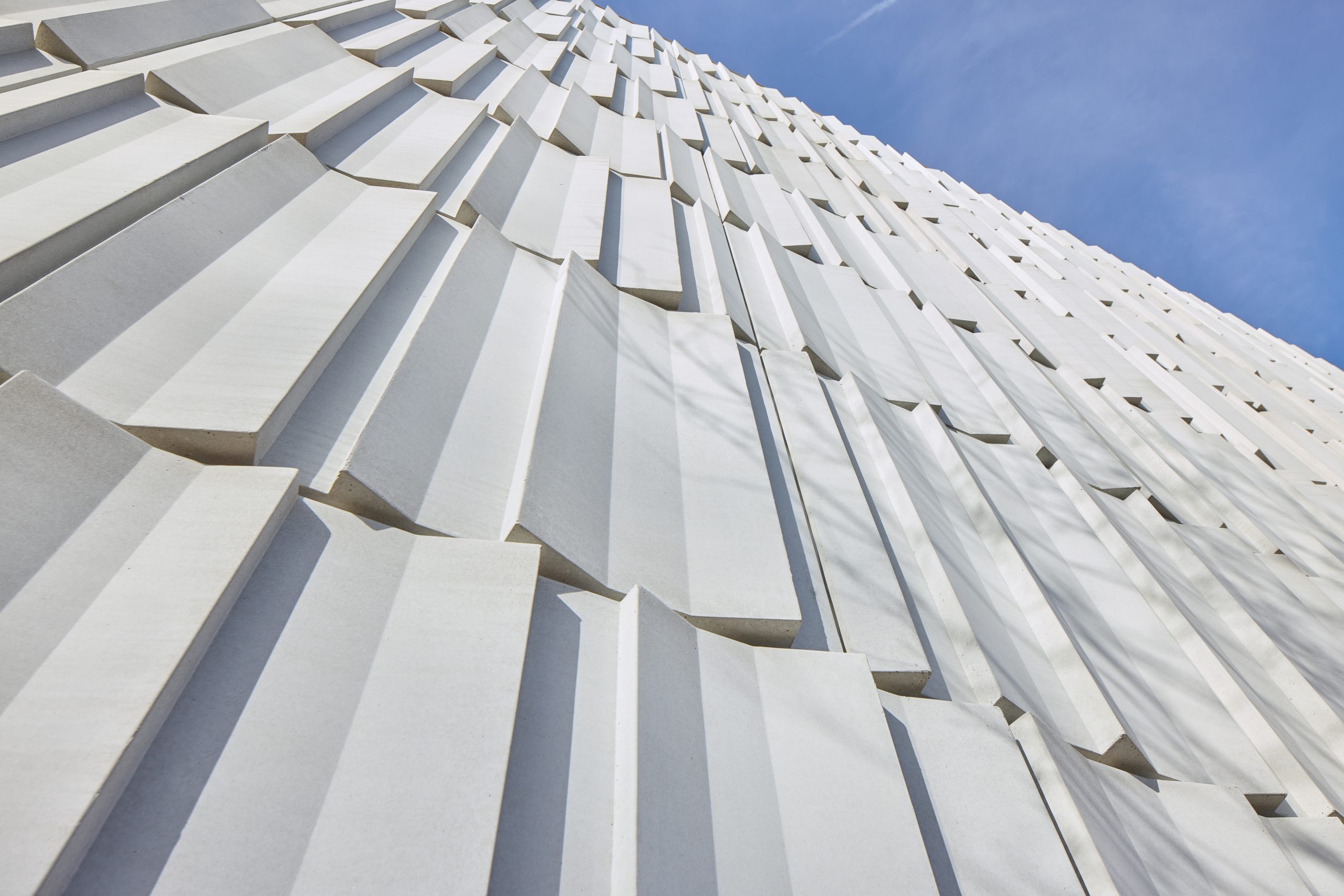
They clad the triple-height structure in custom pre-cast concrete slabs that are a work of art by themselves. “There’s a lot of repetition,” he says. “At the entry we pieced precast baguettes and attached them to a ribbon frame.”
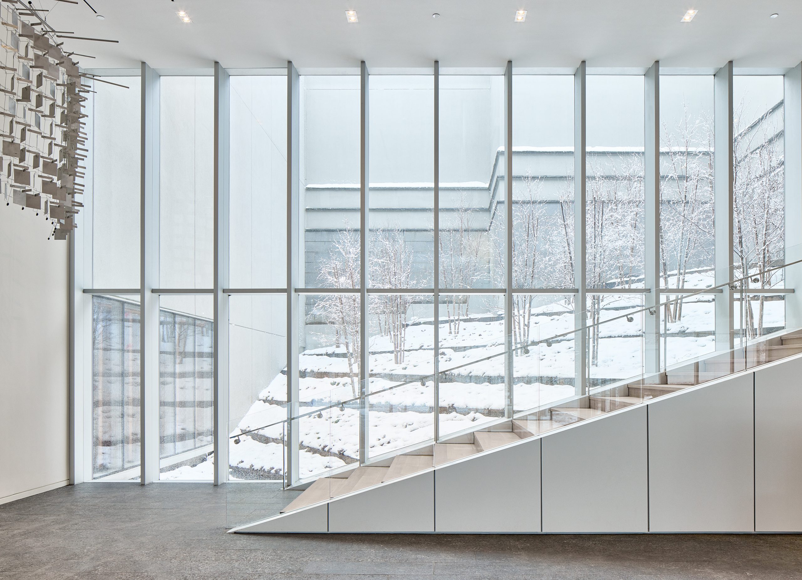
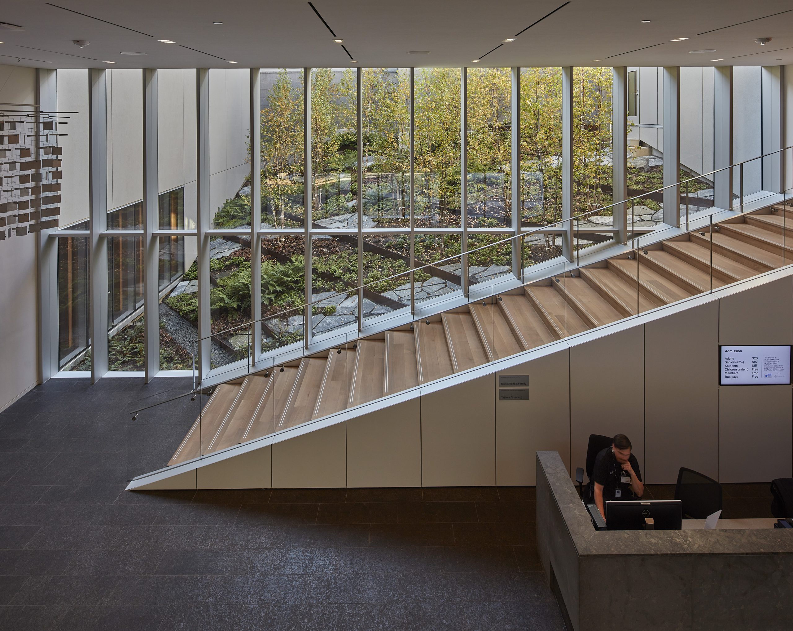
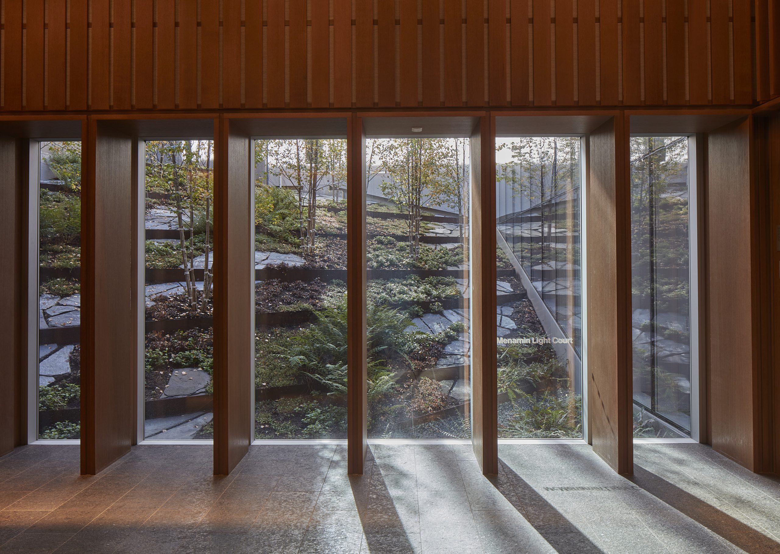
The lobby is double height, and looks out to a huge landscaped courtyard. ”Upstairs the gallery is compressed, so there’s some compression and expansion going on throughout,” he says.
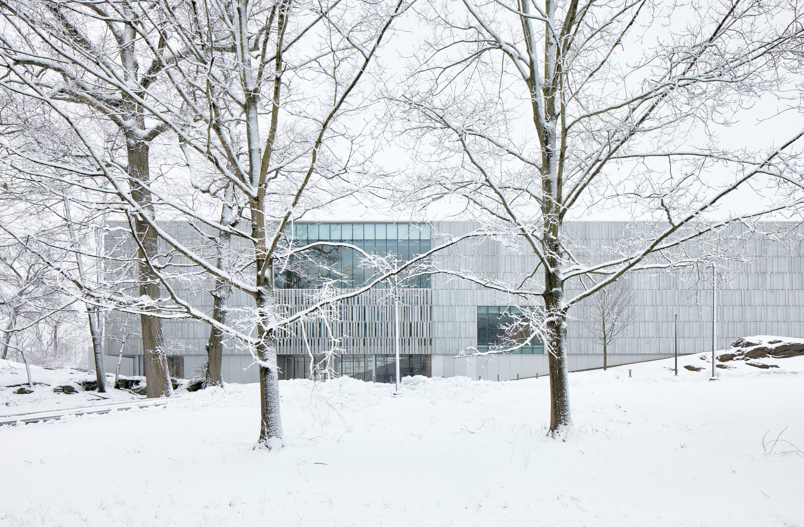
The site is not only wooded, but also adjacent to the main street of Greenwich and near the water of Long Island Sound, for one of the most urban experiences to be found in Greenwich. “We were trying to make something that felt like it belonged there,” he says.
The original building is not completely obscured either. It’s still sited up on its hill, two stories taller than the new structure. “From the adjacent park, you just see the new addition,” he says. “In the winter you see the bulk of the original building facing the town.”
Now old and new now work together in context – one that’s as world-class as the museum’s collection itself.
For more, go here.

