The home that Toby Keeton and the late Michael Kersting designed for a couple in Raleigh’s Country Club Hills looks deceptively simple.
It was anything but.
For starters, there was the site. A larger lot subdivided into two for a quicker sale, it had undergone major changes after the architects viewed it on Zillow from their office in Wilmington.
A 10-foot-deep ravine facing the road had been bulldozed in. “Michael and I were driving there and were excited about the topography for once, because we’re used to designing for flat, sandy-beach projects,” Keeton says. “We got there and it had been filled in with clay, as flat as it could be.”
It was tight lot too, even for the relatively modest program – a one-story home for two empty-nesters, plus gallery and entertaining space – that their clients required. “This is not a tremendously big house,” he says. “We filled the lot because there was not a lot of excess land.”
Where he usually dealt with homes facing the Atlantic, Kersting became nearly obsessed with how to work within an urban context. “You can’t make it with a pastoral thing off in the distance, but instead it had to be an inward experience,” Keeton says.
The pair struggled back and forth as they worked to solve the problem, passing drawings back and forth. “The major part off this was done in an afternoon sketching and figuring it out,” he says.
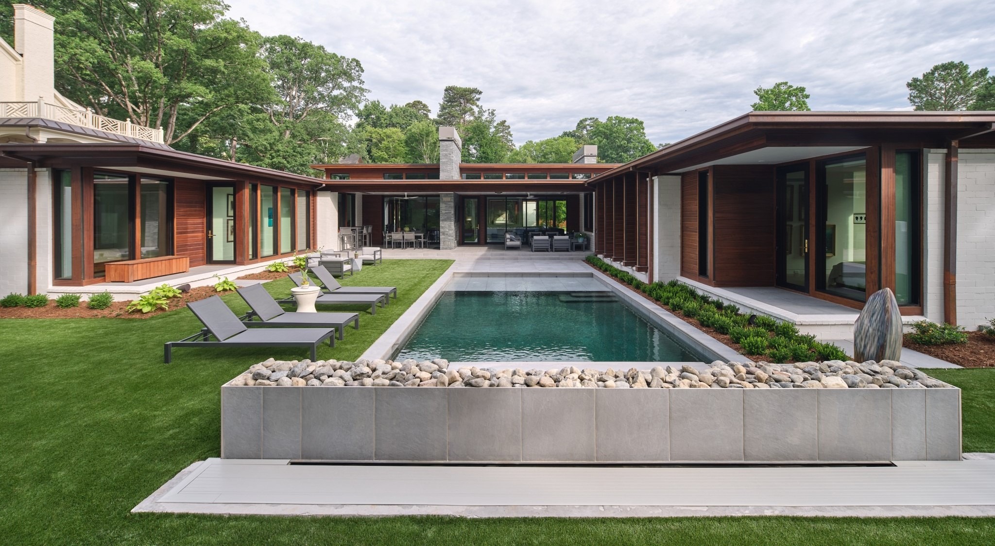
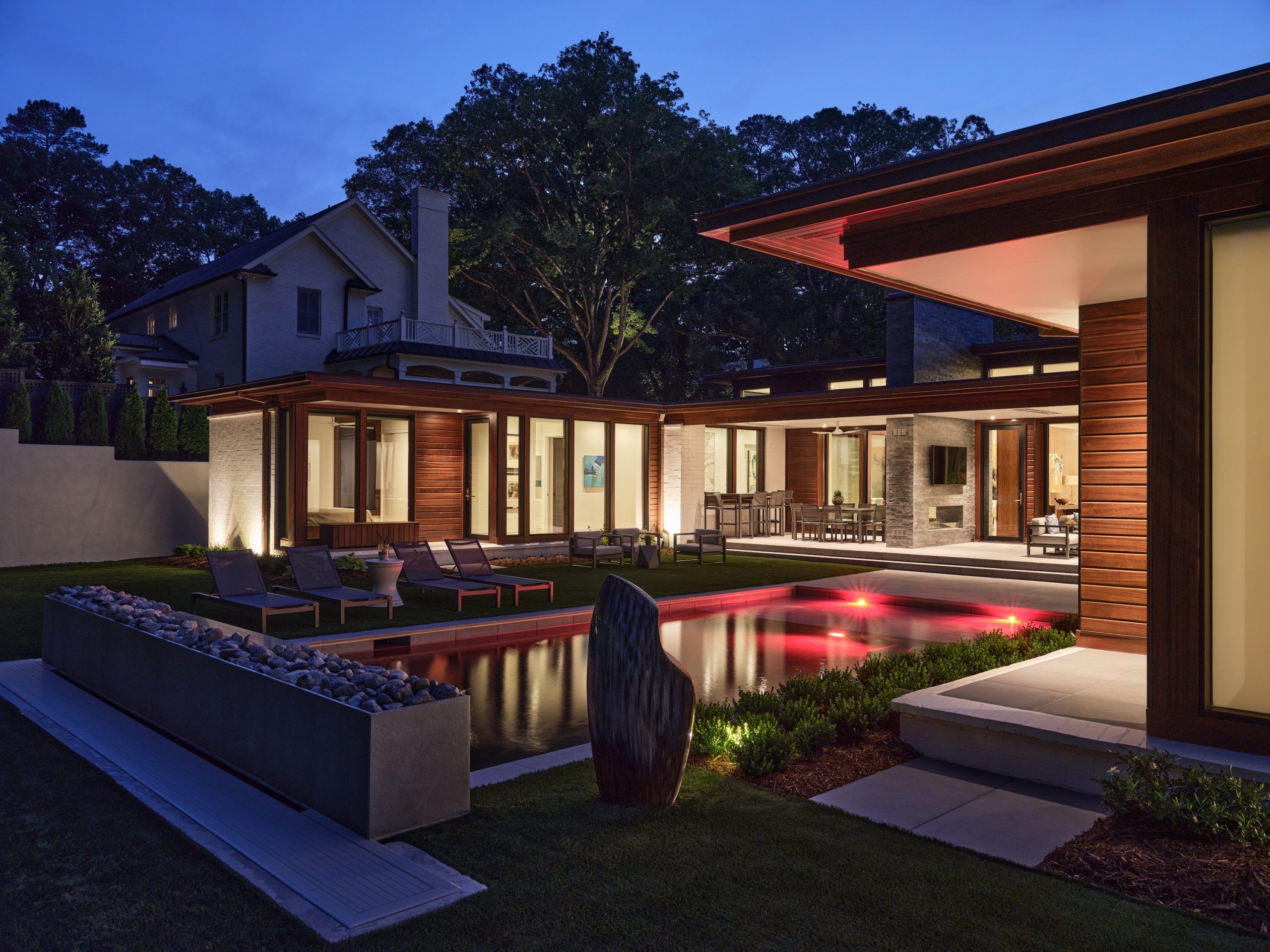
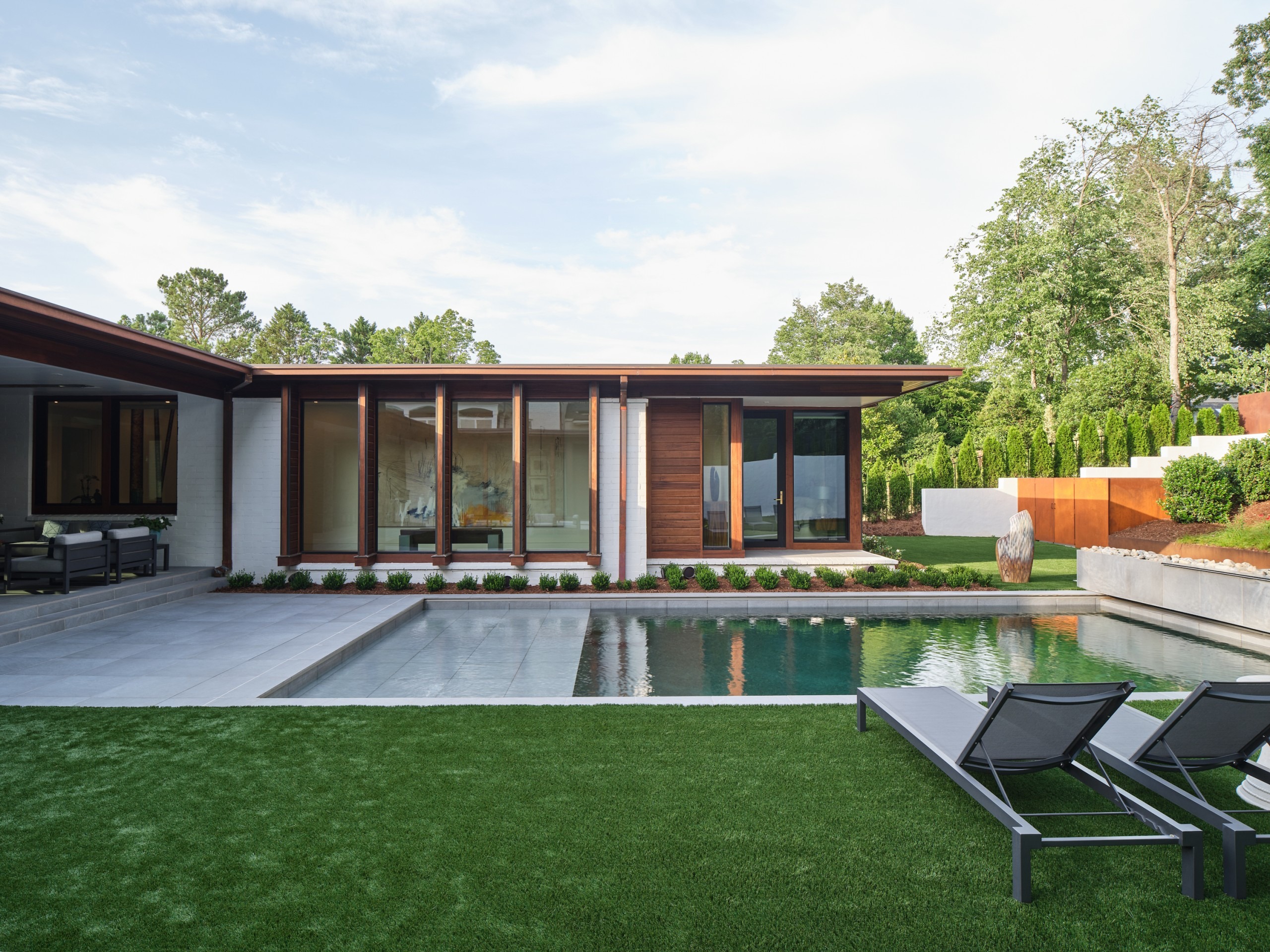
They arrived at an “H”-shaped design, with the center portion taller to allow a clerestory window to light up the gallery space – and a Frank Lloyd Wright-like expansion and contraction. “It was like Unity Temple in Chicago – we were leveraging that experience,” he says.
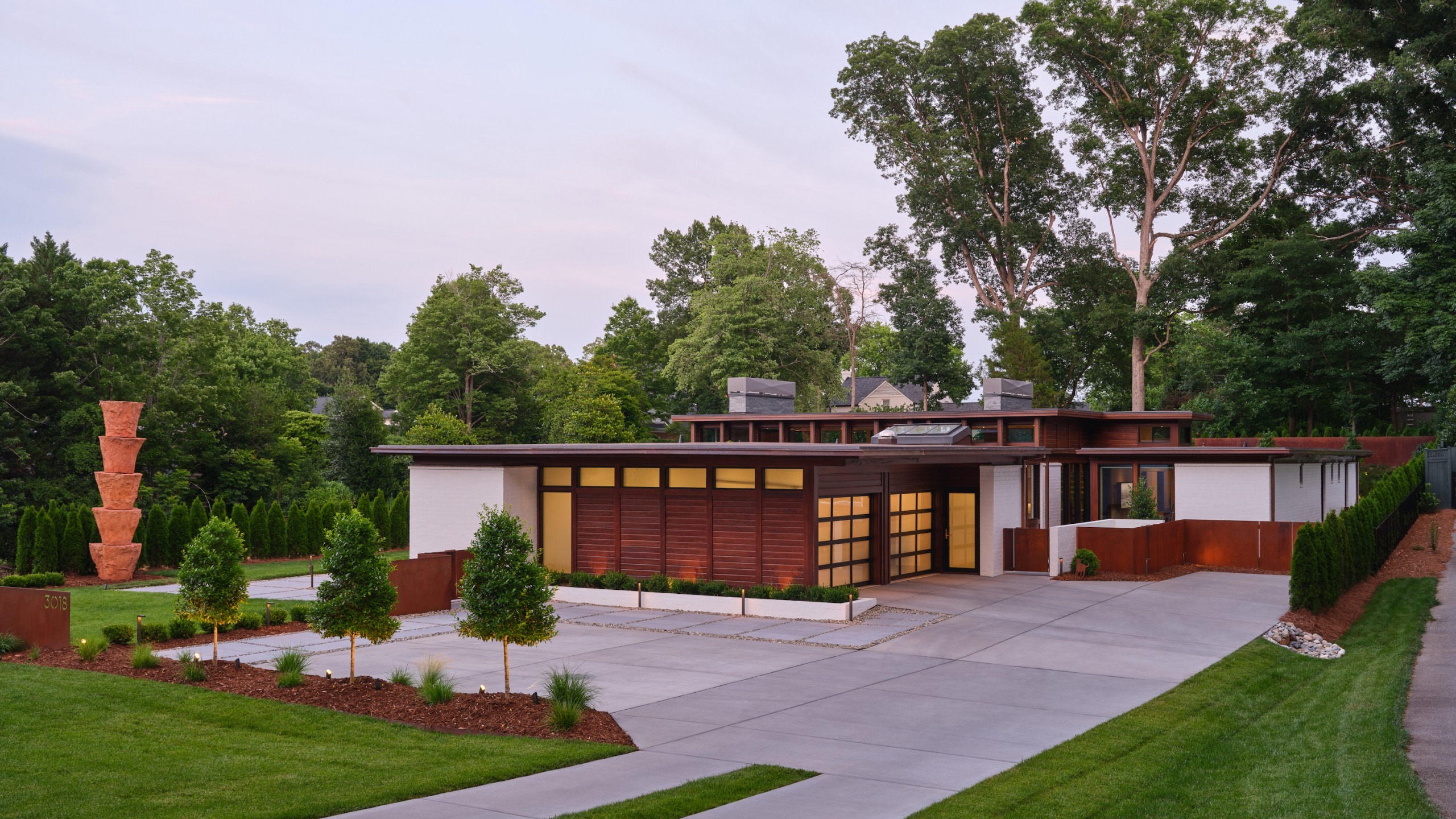
They developed a plan and a 3-D model, and invited the clients in to see it. Before they arrived, as the two architects examined it closely, Kersting burst out: “We’ve got it the wrong way.” At the last minute, he flipped the elements of the front façade.
The Robbins came in, sat down, and the architects said: “Everything you see going to be different.” The clients agreed to move forward. ‘At the end of the day, it was the right move,” he says.
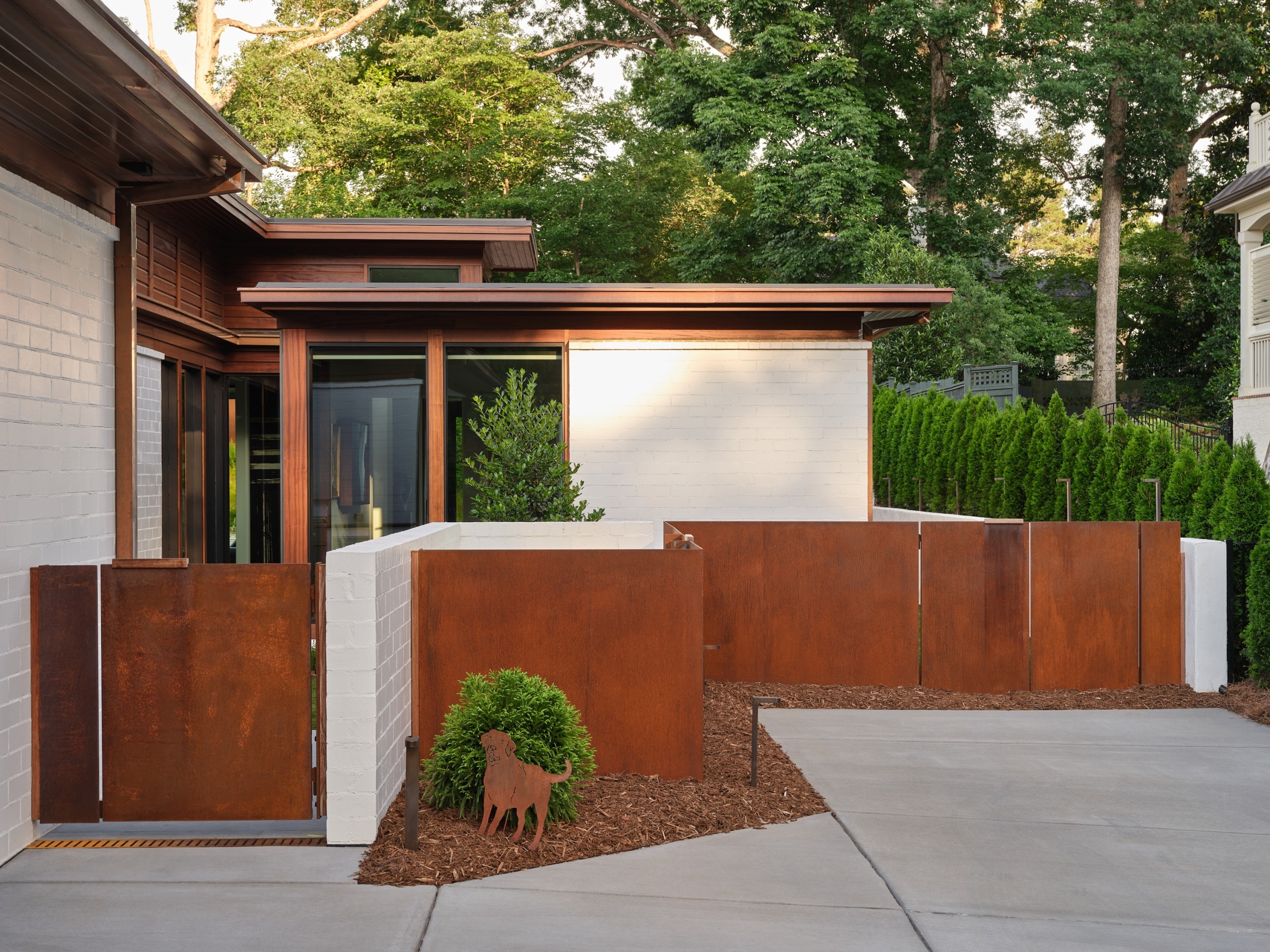
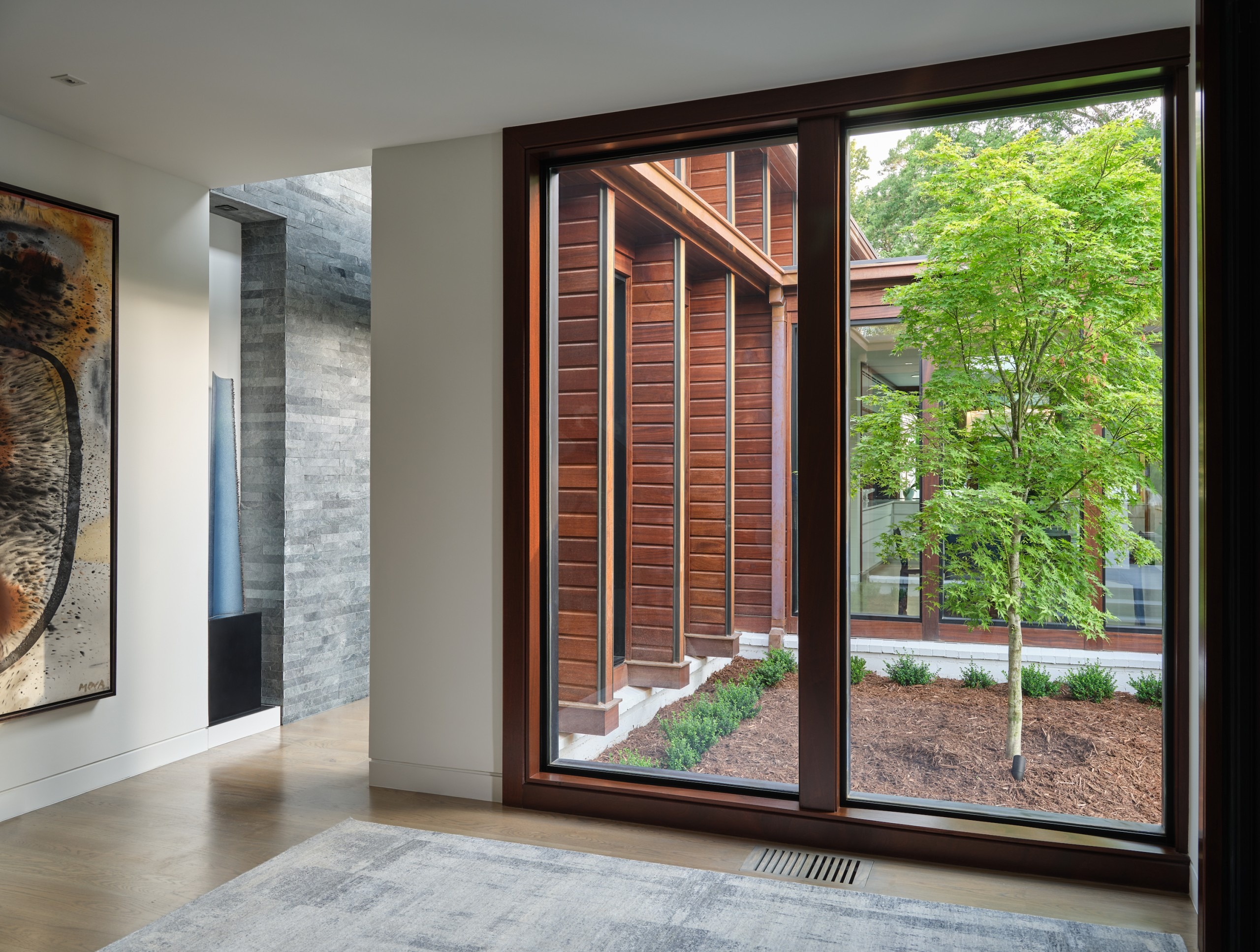
Keeton calls the exterior a composition in three parts, akin to a men’s three-piece suit, with tie and shirt. Its main cladding is white-painted, oversized brick “We looked at Phil Szostak’s work,” he says.
The shirt material is stained mahogany that’s warm, deep and natural. The tie, or accent material is copper detailing on the flashing, gutters, downspouts, and front pivot door. “It will change over time and patina,” he says. “They’ll witness it settling into its space over time.”
Inside, Kersting insisted on a four-foot grid for a human scale. “You have to understand that in Michael Kersting’s work, he really preached the idea of a proportional grid – for every project,” Keeton says. “He was a priest of the church of: ‘Give yourself a grid.’:
The first thing Kersting did was red-pencil in his four-foot-by-four-foot grid, so everything on the horizontal plan perspective adhered to it. “He was a big believer in a base structure, where you lay it down like in jazz, with a backbeat, a throughline to tie it all together, a drumbeat that does something different, and then the trumpet solo.”
It’s shorthand for defining the way spaces come together. “We’d play with it and violate it if we had a good reason,” he says. “Everything is related, and there’s a rhythm to it.”
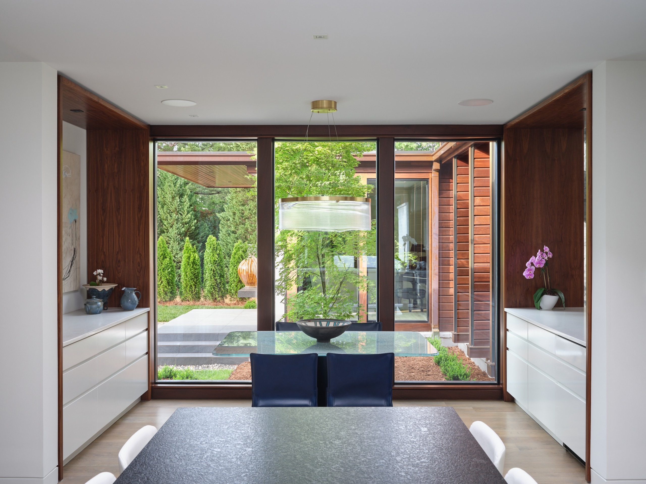
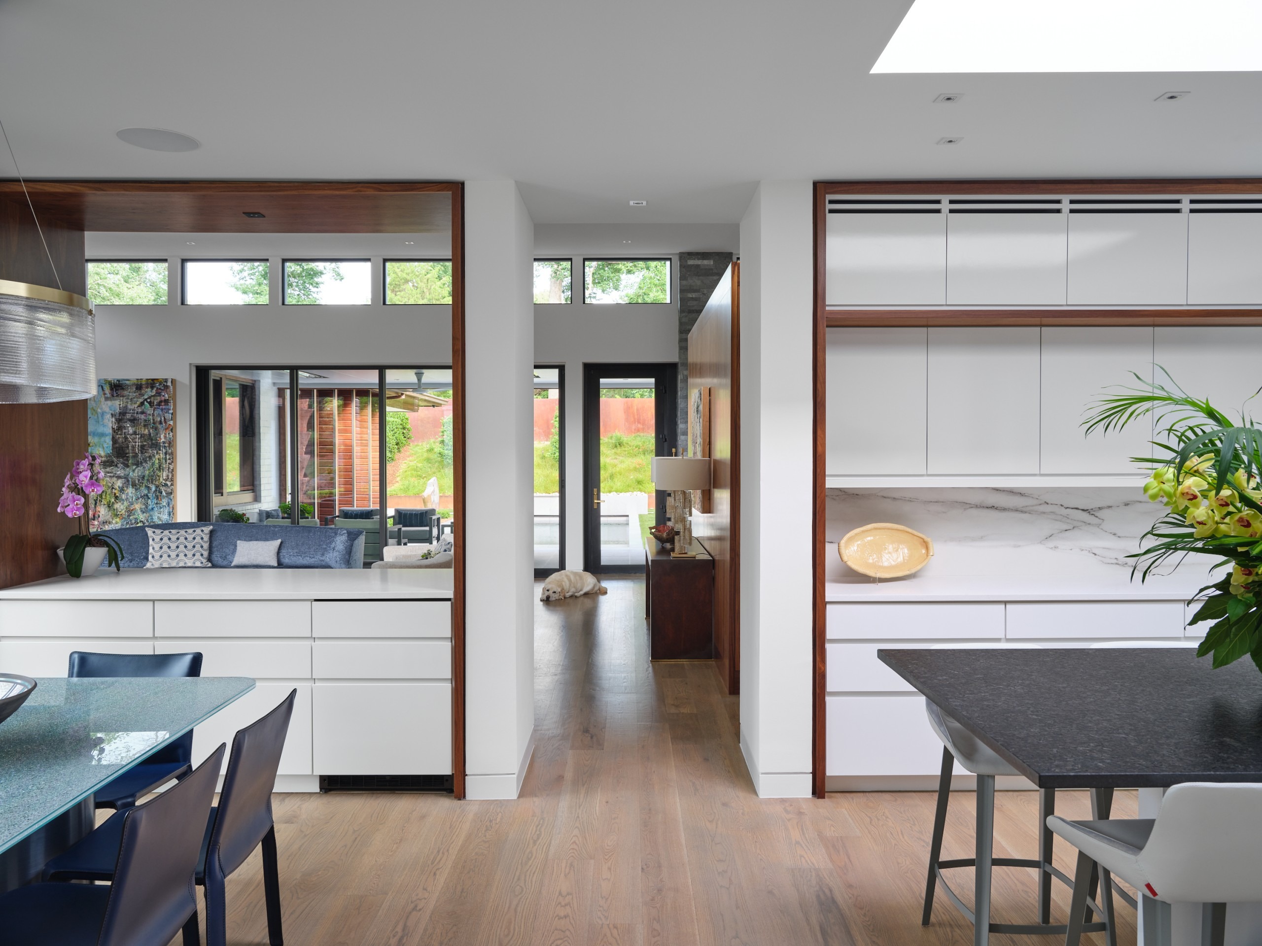
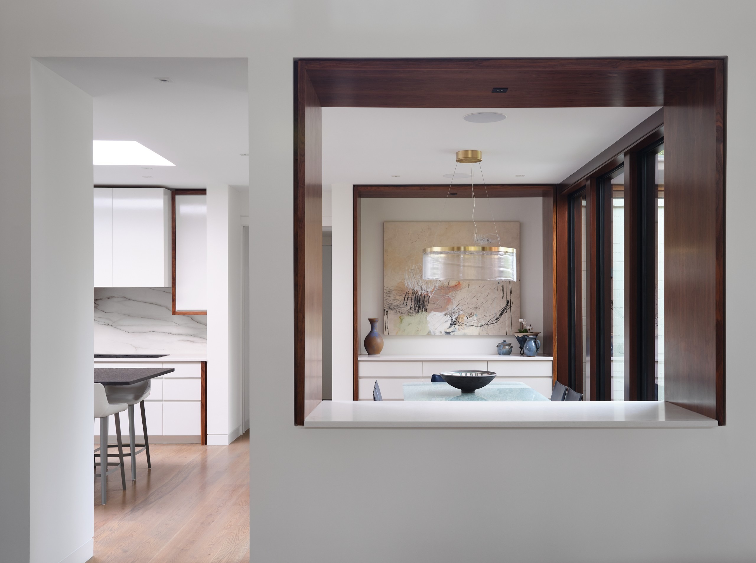
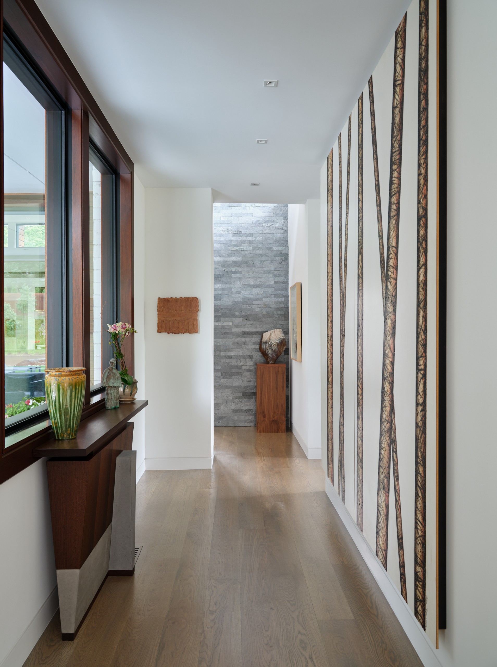
Inside there are walnut built-ins, floors of ripped-and-quartered white oak, and sheetrock for gallery walls Trim was kept to a minimum, subservient to the artwork. Bluestone tile wraps the two chimneys, and bluestone pavers line the porches.
It was Kersting’s last project – and perhaps the finest in his portfolio.
For more, go here.
Photos by Keith Isaacs

