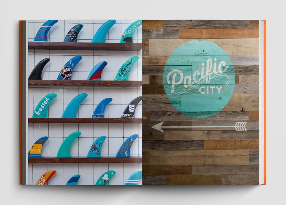
Harry Mark and Cody Clark, co-founders of RSM Design, operate at the intersection of graphic design and architecture.
They work with firms like Rem Koolhaas/OMA in L.A., Diller Scofidio + Renfro in Las Vegas, and Snohetta in El Paso, developing brand narratives within the context of culture or history or emotion.
And they’re currently collaborating with graphic design pioneer Tom Geismar of Chermayeff & Geismar – think of his logo designs for Xerox, Mobil Oil, and PBS – on a project outside of Dallas.
“Geismar did the branding, and we’re doing the signage for a master-planned community there,” Mark says. “We’re taking their two-dimensional brand and translate it into three dimensions.”
Mark’s an architect who studied at the University of Texas at Austin and Penn, while Clark’s a graphic designer who graduated from Pratt and the ArtCenter College of Design in Pasadena.
For 25 years, the pair has been exploring and developing architecture and graphics and the symbiotic relationships between the two. “We’re collaborative,” Mark says. “We come into a project and ask what binds it together as an experience.”
The RSM team of 32 architects, graphic designers, interior designers and industrial designers usually steps up and looks immediately not just to the space but to the entire experience. But they’re flexible. “Some clients might bring us in to design an interior for a food hall, or just the graphics,” Mark says “We have to be nimble that way.”
But when they collaborate with other architects, interior designers, or artists, they say it’s often hard to tell where one discipline starts and another stops. “There’s no negative experience because we want to work with the team, and not against it,” he says.
Now comes a new book that documents their process – and their philosophy and style. It’s called “Graphic Connections in Architecture: RMS Design,” and it addresses the psychology of graphic design as an essential ingredient in connecting people to place. It will likely be the first of many books on a topic that’s barely covered in the media.
“For us it’s a way to turn our company inside out and talk about methodology and design and how they work in public environment,” Clark says. “We wanted to capture the breadth of our work in a monograph, and also we’re now finding ourselves in the position of driving graphics in our industry.”
The book offered them the opportunity to focus on the end-user’s perspective, rather than just the architect’s. “Architects refer to ‘my’ building and say ‘I did this – it’s my design,’ and I question that,” Mark says. “The way the user, the worker, and the resident sees and experiences it is very different.”
After all, the first impression on any end-user is made first by signage, and then by graphics in spaces like elevators or restrooms. “It’s something the guest engages with more viscerally than the architecture itself – and it’s all in the details,” he says.
One of the book’s key messages has to do with how graphics and architecture work together – without colliding in an adversarial way – inside a space. “If it’s not working well, either the architect or the visitor has a bad experience in the building and doesn’t realize why,” he says. “Graphics act as brand touch-points where the user makes decisions.”
The book has a number of desired outcomes besides simply getting the firm’s work into more hands around the world, Clark says. And there are multiple audiences, including architects, developers, and students. “We definitely want to be able to promote our place within the industry – in a signature book,” he says. “And it’s a recruitment tool for students to educate them and create a great place to work here.”
With four offices and work on every continent – along with a rockstar list of collaborators – that shouldn’t pose a problem.
For more, go here.
[slideshow id=2322]


