For designer Kyle O’Donnell, every project is a case study.
“I don’t limit myself to one style or design,” the founder of Gramercy Design says. “I believe the project should reflect the client in built form.”
Case in point: His first client asked for a renovation of a one-bedroom condominium, to be used for entertaining and fundraising. But the space wasn’t big enough for what he needed. So O’Donnell researched the floor plan of the condo next door – and suggested they buy it.
“It wasn’t for sale, but they did it,” he says.
That project resulted in referrals, many from clients in the entertainment industry. “He exposed me to an interesting, dynamic group of people who are extremely creative and definitely not vanilla,” he says. “They’ll draw a picture on a Post-It note, send it to and assistant, and she’ll take a picture, and they’ll draw it again and send it to me.”
Most of his projects are renovations of apartments and townhouses, with a few new-builds. “We’ve had a couple of ground-up projects out in the Hamptons,” he says. “And there’s one big one in Millbrook, on a 40-acre farm’s hilltop – it’s a second home in horse country.”
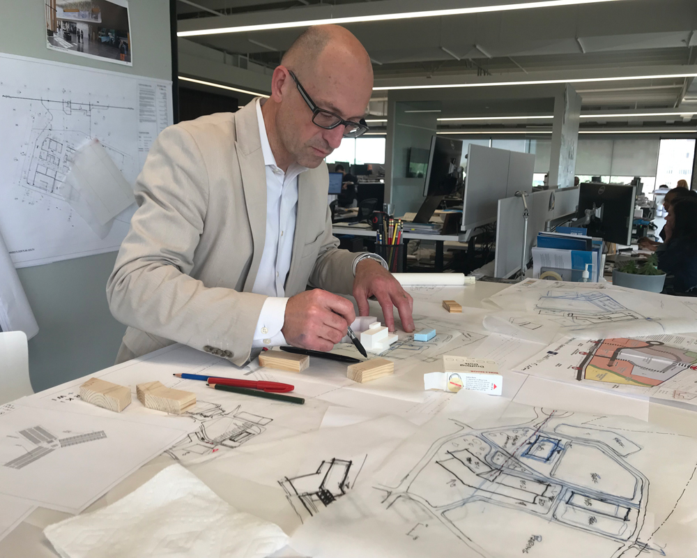
But collaboration with the client – and using the local vocabulary – drive most of his designs. “Ninety percent is sketching things out, pitching ideas, and creating dialog,” he says. “And the site and setting informs the program – I like to work within the vernacular of the setting.”
If he’s working in a prewar building in Manhattan, he’ll eschew a contemporary renovation in favor of the style of the original building. “It’ll be a nod to the intent of the original designer,” he says.
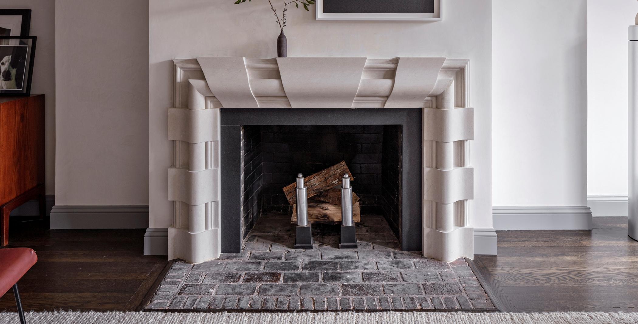
That’s certainly true of his own older apartment on the Upper West Side, one that had been restored multiple times over the years. A friend suggested modernizing it, to the extent of covering over the fireplace.
The thought practically left him speechless. “I couldn’t do it,” he says. “I did some different embellishments to reflect my personality, but basically it was a restoration.”
For another on the Upper West Side, in a 1907 building with living room, dining room, kitchen, maid’s room and two bedrooms, again he maintained the vernacular of the time. But he updated its functionality too.
“It was a small kitchen and I expanded it to include couple of small rooms and an eat-in area that would not exist in 1907,” he says. “I was reinventing what it might have looked like at the turn of the century.”
Scale and proportion are among his top priorities. “I work in a lot of interior spaces and if they’re pre-war, the ceilings are eight-and a-half-feet tall – they’re quite low,” he says. “I’ll exaggerate the vertical in some of those apartments to make the ceiling height seem taller.”
With new construction and super-tall ceilings that are 10 or 11 feet, he works to increase the amount of millwork and detail to bring them down to human scale – and places items at eye level, with lighting to bring the ceiling lower.
“In the Robie House, Frank Lloyd Wright designed a dining room table and chairs with a tall lighting pendent over the table and when only that light is on, the chairs create a room,” he says. “So it’s about the table and the people surrounding you – and I define spaces using similar techniques.”
In the end though, his work comes down to understanding who his clients are. “What I enjoy most is creating a window into how they live and use space,” he says. “We elevate a lifestyle and transform it into art.”
With an attitude like that, why wouldn’t Jimmy Fallon, Anne Hathaway, and David Harbour seek him out?
For more, go here.
[slideshow id=2434]


