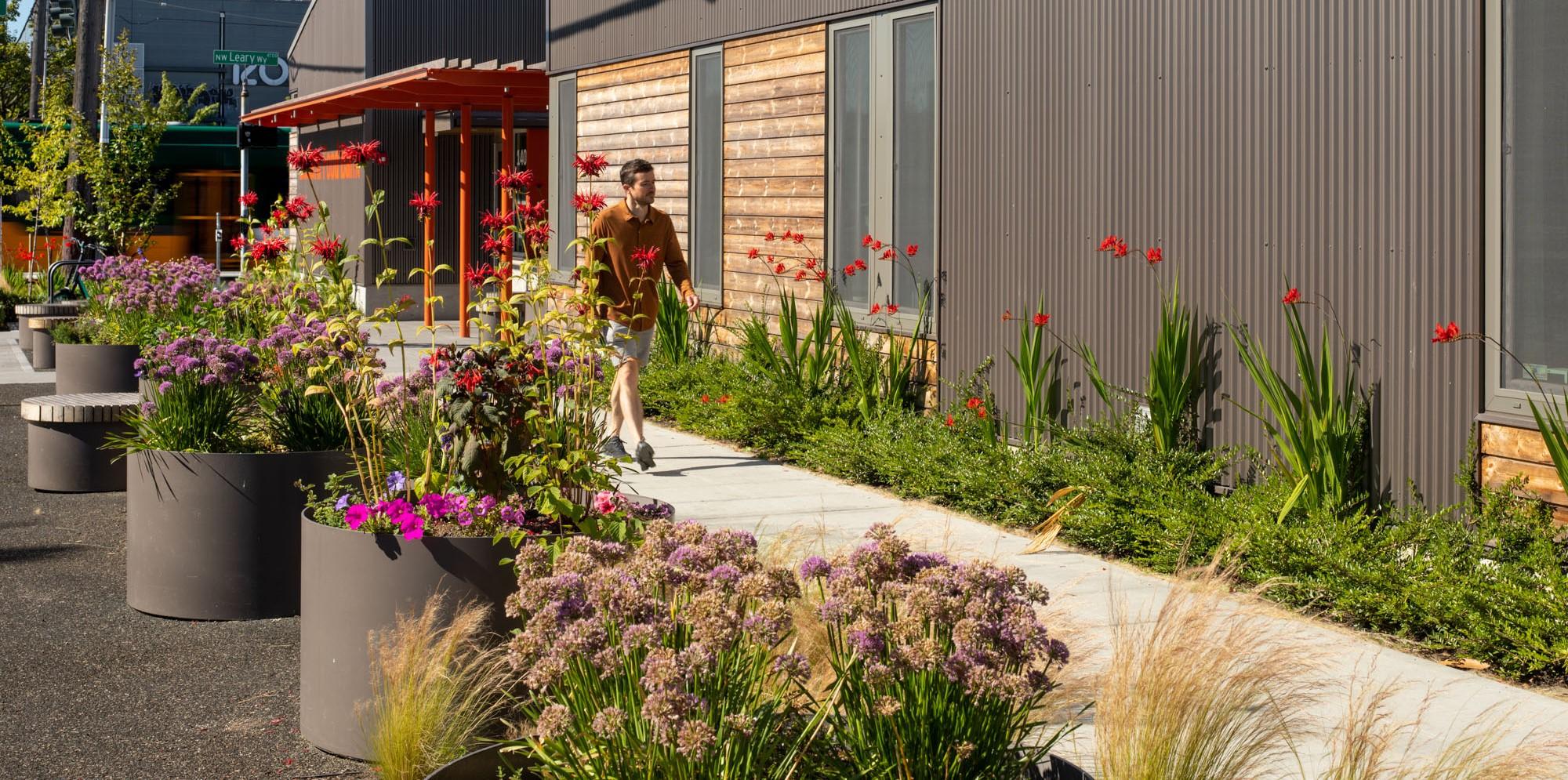
A few weeks back, the online edition of Metropolis magazine published a feature I wrote on Graham Baba Architects, who drew on retail and hospitality design to make the Ballard Food Bank in Seattle an inviting space with a café, gardens, and a resource hub. It’s an appropriate post for the holiday season:
In the Ballard neighborhood of northwest Seattle, Graham Baba Architects has designed a food bank that delivers a sense of dignity to its customers.
“When you get your groceries from a food bank, you shouldn’t be made to feel different from grocery shopping,” says Brian Jonas, partner and principal in charge for the Seattle-based firm. “It’s meant to be normalized.”
This is a food bank that offers more than groceries. Customers charge phones and refill water bottles in its welcome area, soup and sandwiches are dished up in its Kindness Café, and its resource hub offers a place to connect with staff to navigate services and get financial assistance to prevent homelessness.
Customers can pick up mail, use computers and phones to work on resumes, complete SNAP applications, or find housing. Partner agencies work out of the hub to provide services like health care, vaccines, and phones.
“We bring hope and food to our neighbors,” says Jennifer Muzia, executive director of the Ballard Food Bank. “It’s a one-stop shop.”
Jonas and his team explored the arc of the customer experience—and based their 11,000-square-foot design on it. They researched how people arrive, how they’re greeted, and how they find their way around. They added a checkout counter where volunteers bag groceries (though no money is exchanged). “We wanted it to be easy to navigate and offer a sense of belonging,” Muzia says.
The architects consider it a community space, not just a source of food for a customer base that’s doubled since the pandemic. “Food is security for a working family and the homeless, but also for the well-off on hard times— and others struggling to make ends meet,” Jonas says.
The building is divided into two volumes. One is tall and flexible and houses the warehouse space and the shopping area. The second is a scaled volume for entry, café, resource hub, and offices. “It’s about how food arrives and gets sorted and stored,” he says. “And then it’s an invitation to serve the community.”
The building’s entrance is a delicate balance of welcoming and privacy. The south facade has glazing that lets the daylight in and provides glimpses to the activity inside, but doesn’t put people on display from the street. “For some, there’s the sensitivity and shame of asking for help,” he says.
As customers approach the front door, they find edibles like onions, rosemary, and sage planted by landscape architect Jake Woland, a principal at Seattle-based Hewitt. A little farther away are native pollinating plants that feed hummingbirds, butterflies, and bees. “There’s a stigma about going to a food bank that we considered as we thought about design,” Woland says. “So it’s a beautiful garden outside, to feel like the same experience of going to a grocery store.”
At the rear, where trucks make deliveries and volunteers park their cars, Woland captures stormwater runoff in bio-retention planters for blueberries and hazelnuts. One is 60 feet long and ranges from three to 10 feet wide. A pea-patch garden allows volunteers to grow herbs, tomatoes, and peppers. “Next to an eight-foot fence are twining squash and cucumbers,” he says.
The food bank serves 6,000 customers a month, with 12,000 different connections. “There are multiple ways in one day to interact,” Muzia says. “People feel cared for and comfortable—we help them navigate the space.”
On opening day, she found a man stuffing groceries into his backpack. “He said: ‘You said you were going to create a place where we feel valued—and you did,’” she says.
That may be the ultimate compliment for a food bank and its design team.
For more, go here.
[slideshow id=2502]


