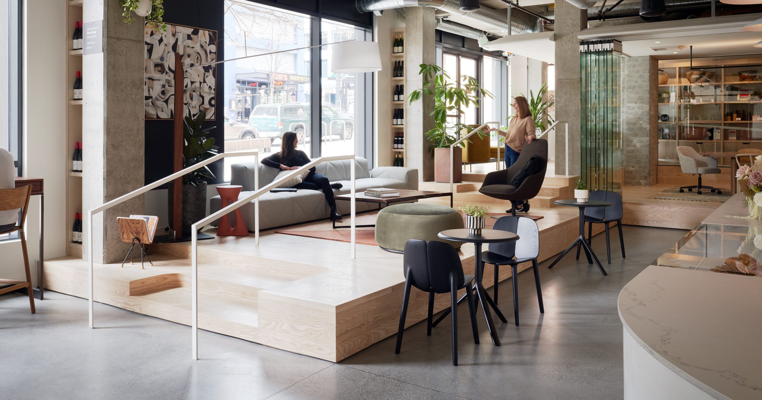
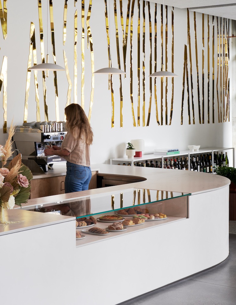
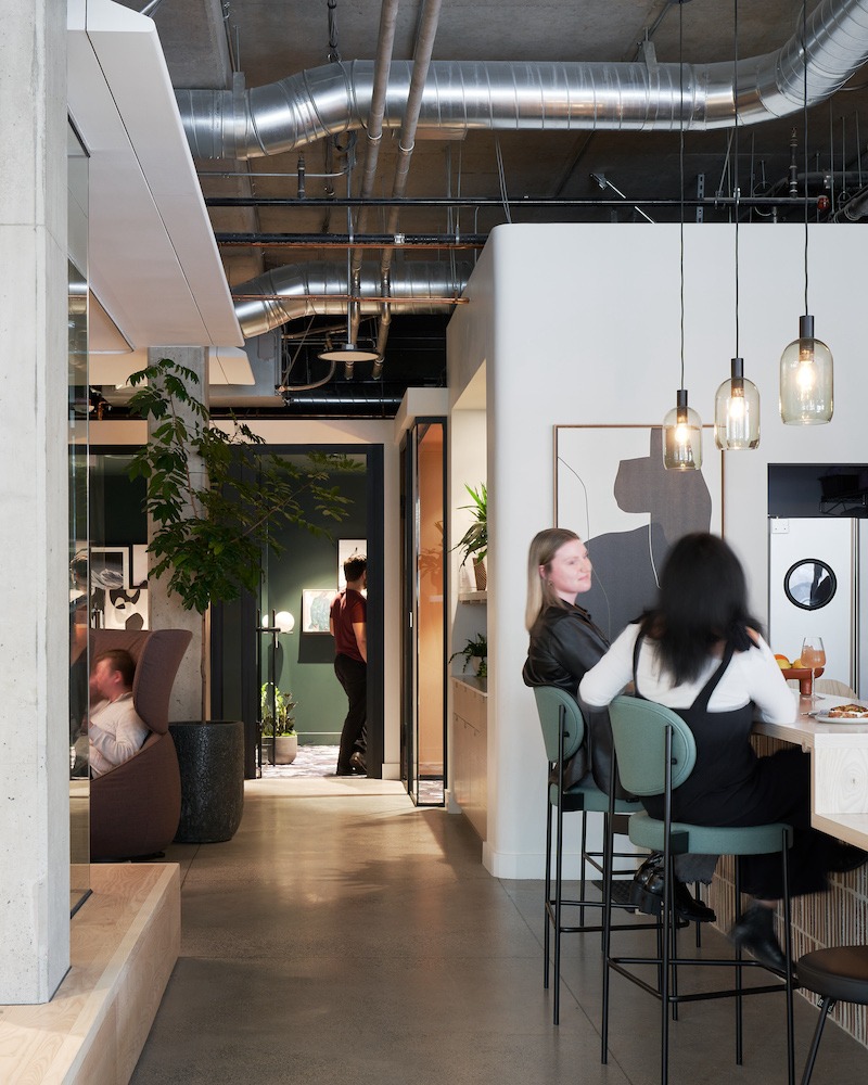
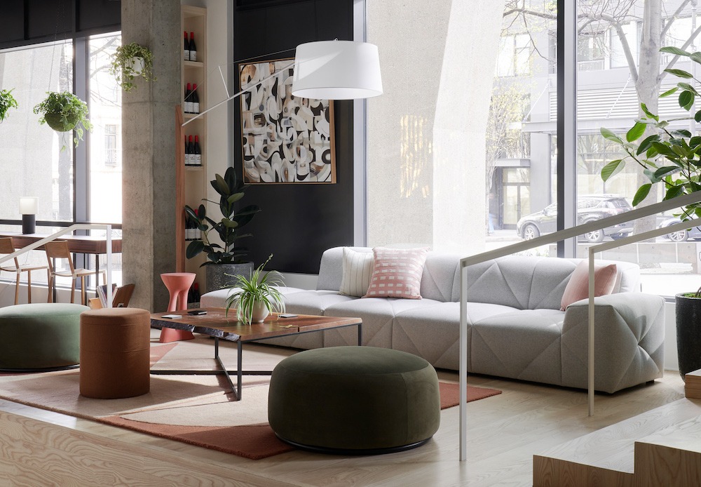
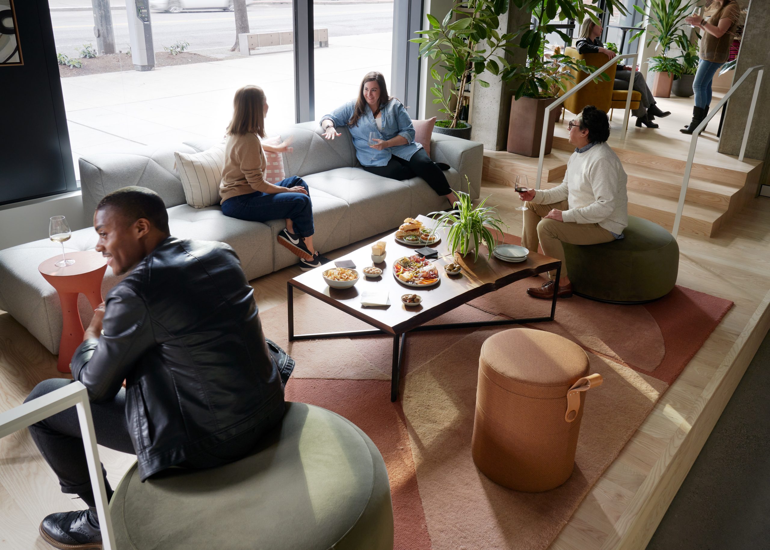
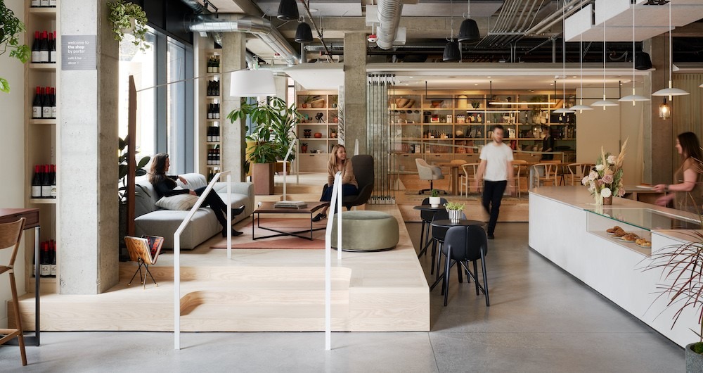
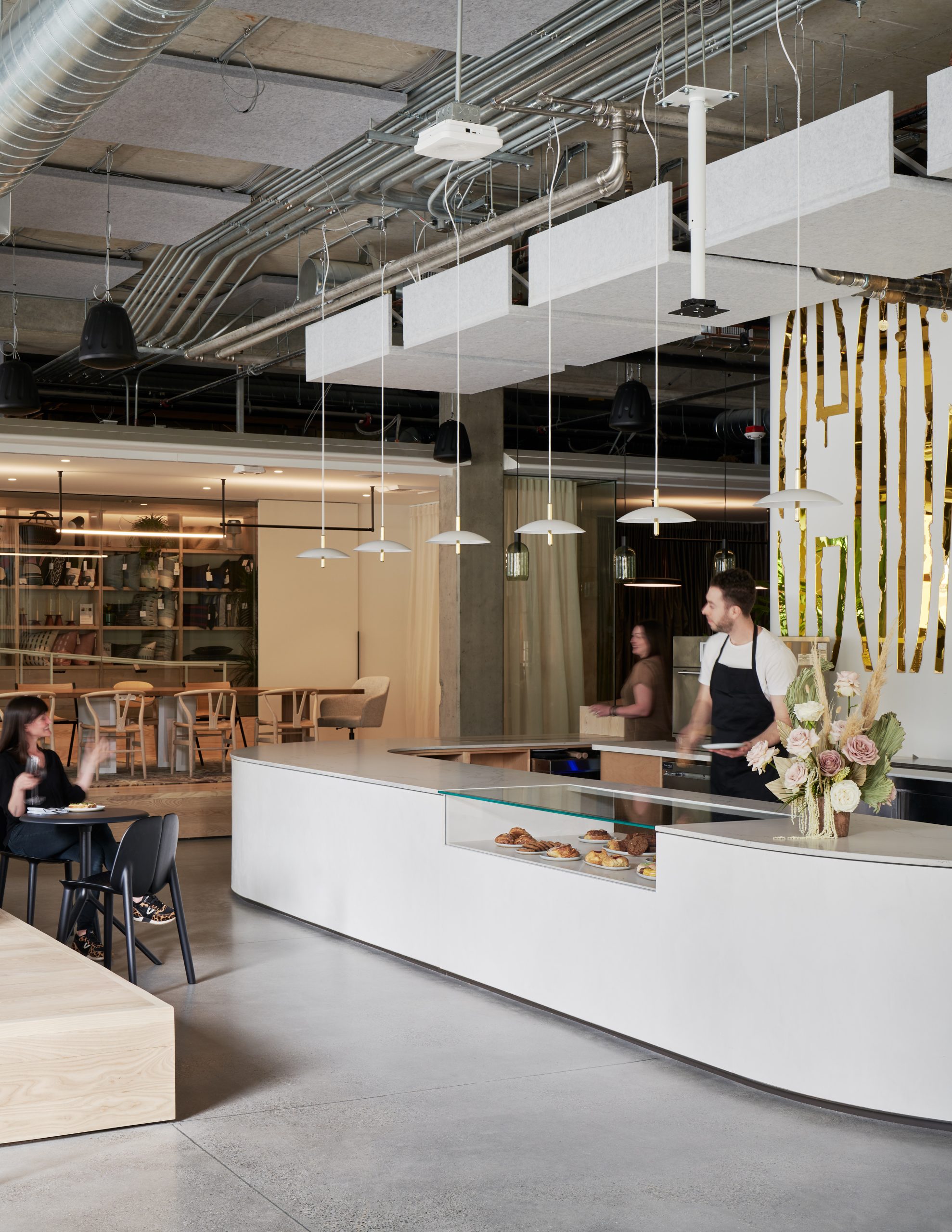
It may be part retail outlet, part café, part theater and part meeting spot, but The Shop by Porter, designed by Graham Baba Architects in Seattle, is all original.
It was conceived as a place where the design community could gather. But it turned into a place for anyone interested in the trends of the times.
Porter is the client. They’re a commercial contract furnishings business, and they wanted a showcase for their products, which are visible throughout – and for sale.
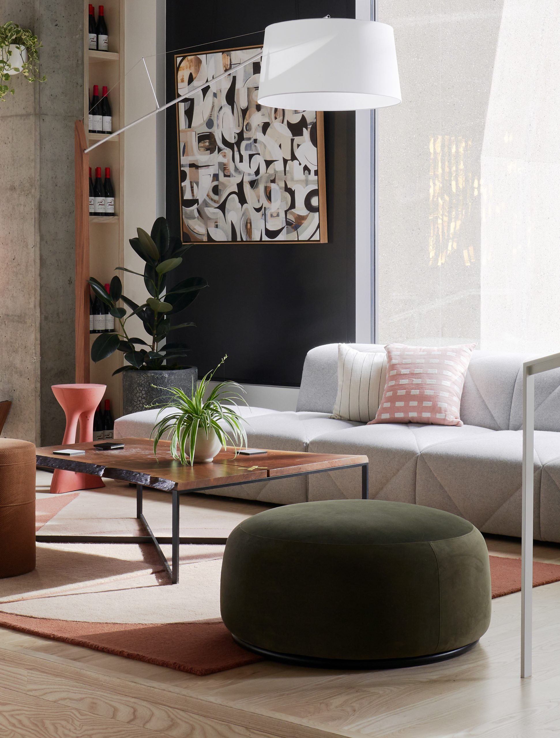
“It’s an open commercial workspace to work in or have lunch or meetings,” says Jim Graham, co-founder of the firm that bears his name. “In the end it’s retail, and everything from the basic furnishings – the table, work desk, small items as décor, floor lamps and plants – is for sale.”
The Shop by Porter supports small independent business owners and makers as a venue to introduce themselves to the market. They use it as their workspace, to foster repeat business, and for relationship building. “It’s a venue for the design community to meet and come in from New York or L.A. to talk about their ethos,” he says.
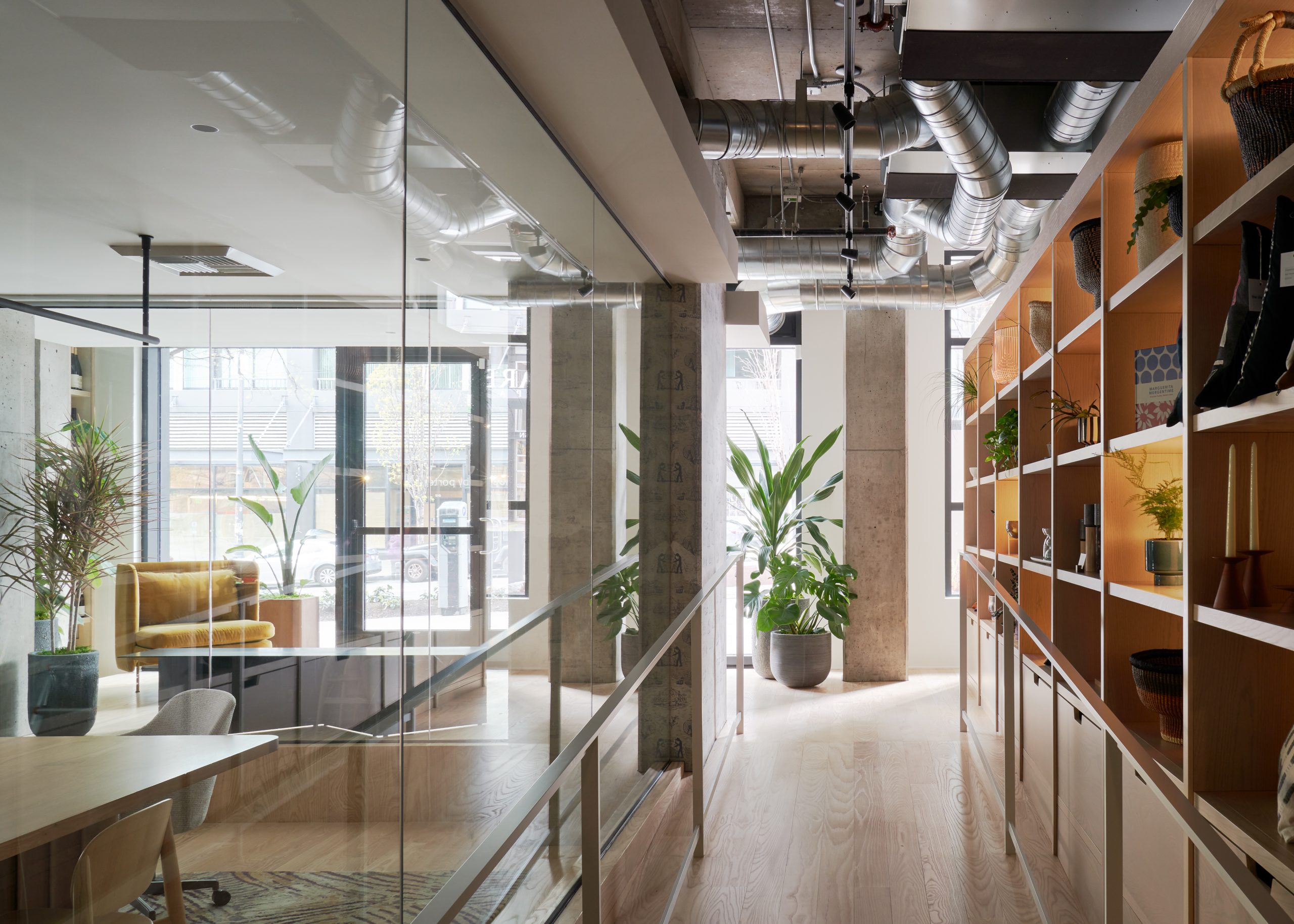
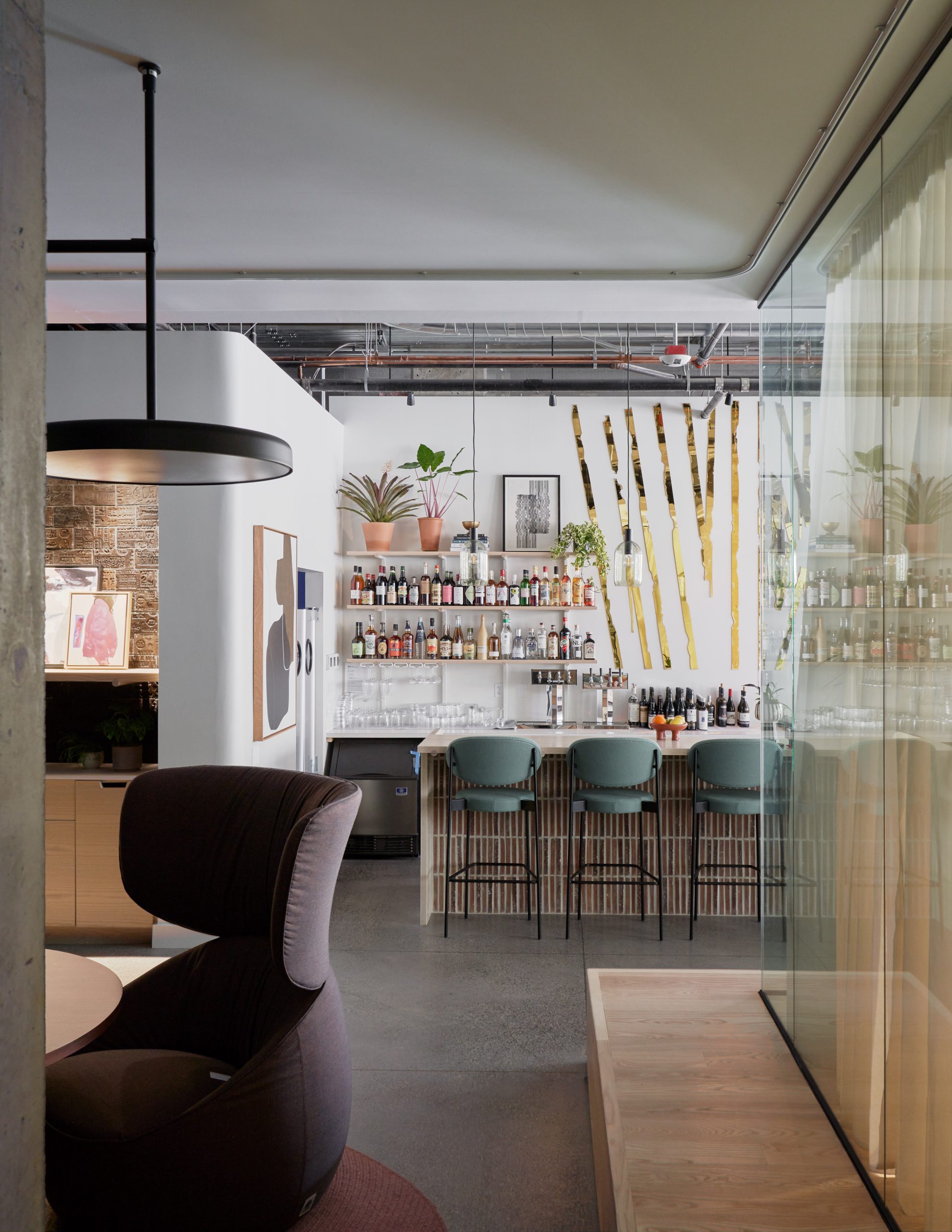
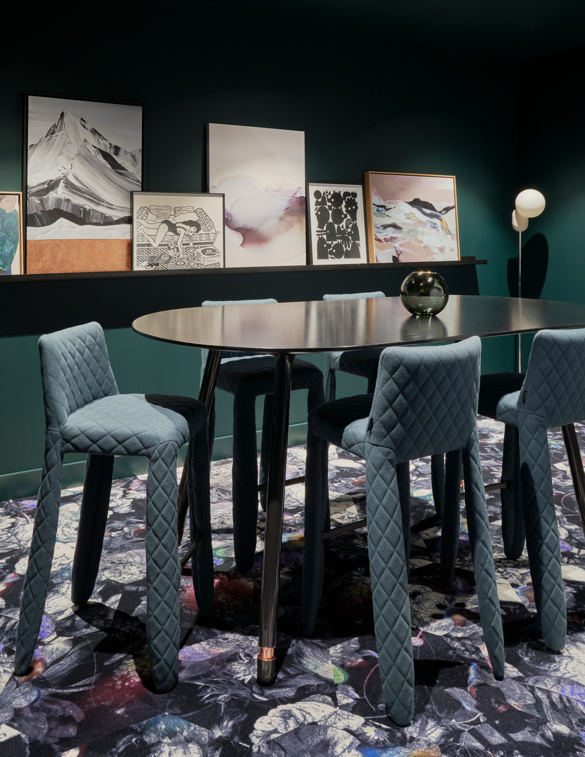
People gather for wine and a snack or maybe a breakfast meeting to discuss a project. “There’s an open conference room that’s a fishbowl – a glass box with a partition system that Porter can sell to their clients – so it’s further into that showroom concept,” he says. “You can even buy the dishware from the ceramics company they’re supporting.”
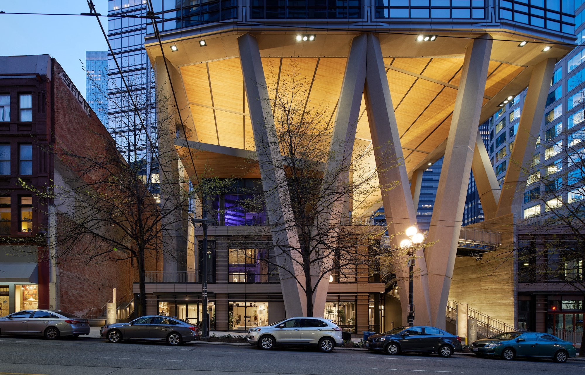
It’s located in two tenant suites, in an urban setting developed by Skanska. One is a 24-story tower, and then there’s the ground plane. It all takes up three-quarters of the block, with the tower lifting itself over the courtyard.
“Porter needed footage so we combined those two suites, and it relates to First Avenue, not the courtyard,” he says. “It wants to be community space and retail space – it didn’t need to be another restaurant.”
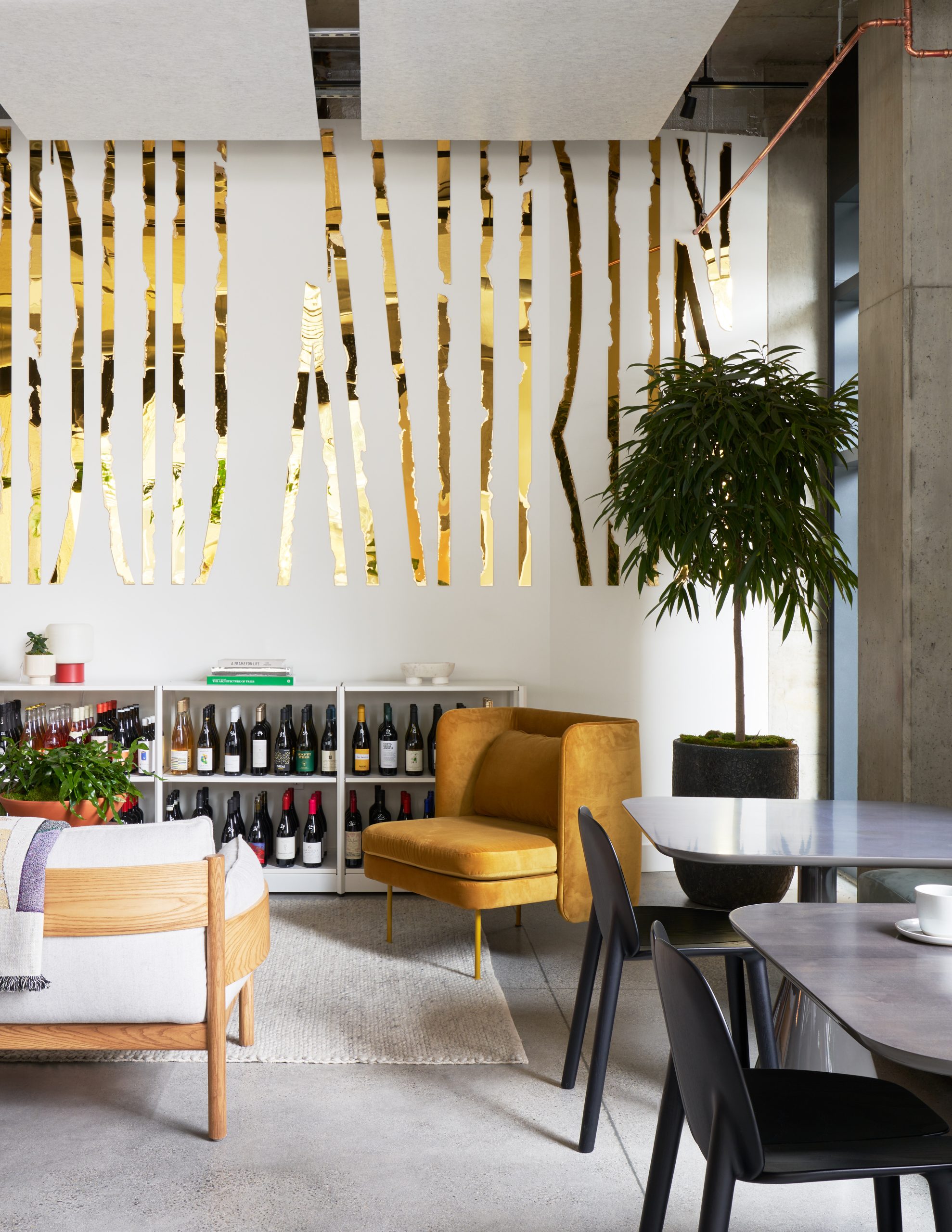
Its material palette was restrained intentionally because Porter was trying to showcase and sell items. The architects used neutral plaster finishes, with ash wood, neutral tile and some custom artwork. There’s a concrete floor and ceiling, with sound absorption felt panels on the ceiling. “They help break down the raw concrete slab of the building and form a kind of drop ceiling,” he says. “The compression makes the adjacent spaces feel taller.”
It’s been well-received by the community. Launched during the pandemic, it experienced was a slow ramp-up. “We’re hearing that surprised people come in and ask: ‘What is this?’” he says.
“And the answer is: ‘What do you think it is?’”
For more, go here.

