Ocean Home magazine’s online version recently ran a story I wrote for its print edition. It’s about a project by Connecticut-based Wadia Associates – a rethinking of a 1980s Arts& Crafts-style home on Long Island Sound. A+A is pleased to repost it today:
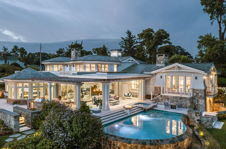
A 1980s Arts & Crafts-inspired home in Greenwich, Connecticut, has found new life in the classical vernacular.
That’s because New Canaan-based Wadia Associates advised their clients to gut the interior, rethink the flow of its space, and orient its rooms to 270-degree views of Long Island Sound. When they did, the former Shingle Style gave way to a more traditional look and feel.
It was a complete overhaul with an artisanal approach. The designers reimagined the home’s exterior by brightening its shingles with a light gray tone. Inside, they chose natural light over darker detailing, and delivered a soft touch with all-new fabrics and fixtures.
“We took away some of the Arts & Crafts influence inside and added more of a classical approach to the details,” says Saranda Berisa, Wadia’s director of interior design and decoration. “Now there’s air and breath to the home where before the molding was dark and heavy.”
The clients are a young Indian couple with three middle schoolers. They wanted to show an Eastern influence inside and outside their house, and display their collection of Indian art. “They wanted more of their heritage in the space, and with a classical backdrop it’s more conducive to their desires,” Berisa says. “They wanted to feel like they were home.”
The main architectural challenge was to rethink the “L” shape of the main living spaces, kitchen, dining area, and living room. “Functionally, the task was to open up a plan that was convoluted, so that it flows,” says Wadia architect Robert Butscher. “Now each of its three zones has its own identity.”
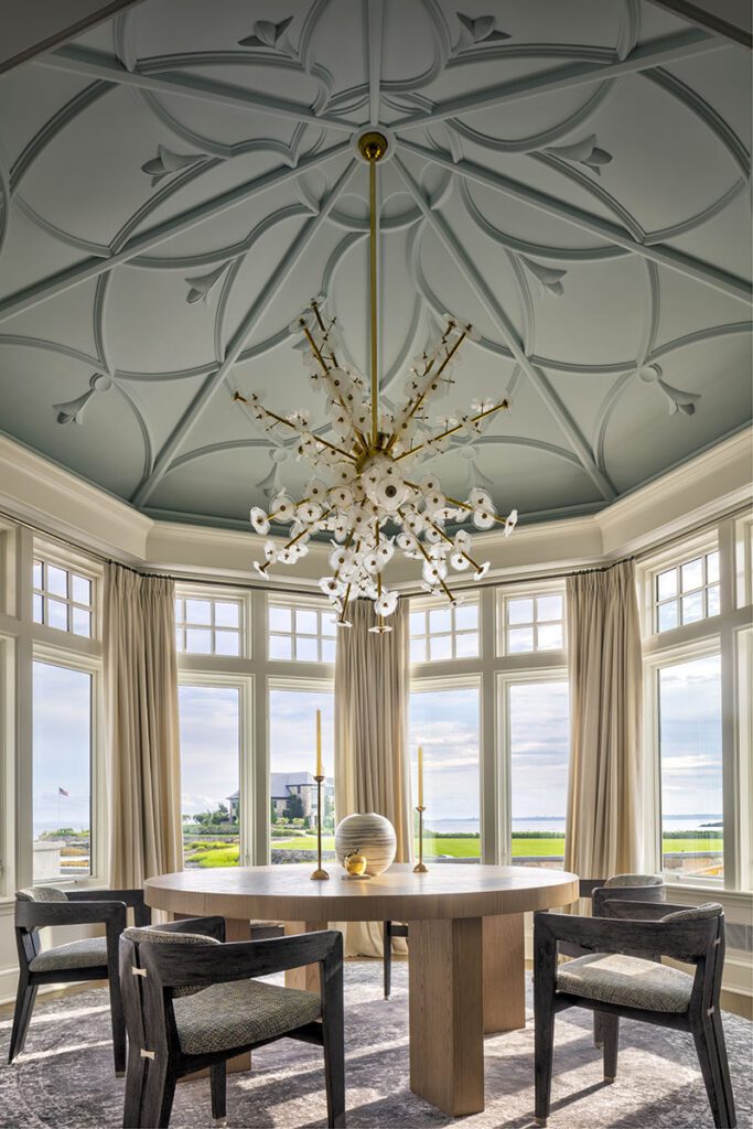
Case in point: the breakfast room, where a decorative pattern on the domed ceiling offers an Indian touch. “There are plaster moldings applied to the ceiling, and that gives it a light, delicate, geometric design that echoes more traditional Indian design in a modern way,” he says. “It’s an eight-sided pyramid.”
The kitchen features a center island countertop with colors reminiscent of the sea—blues, greens, and yellows. A surrounding all-white Glassos counter freshens it up. Kitchen cabinets alternate between walnut and dark-teal tones. “There’s a wood grain to the cabinetry, with a high-design veneer,” Berisa says.
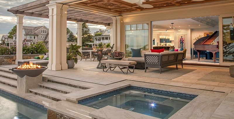
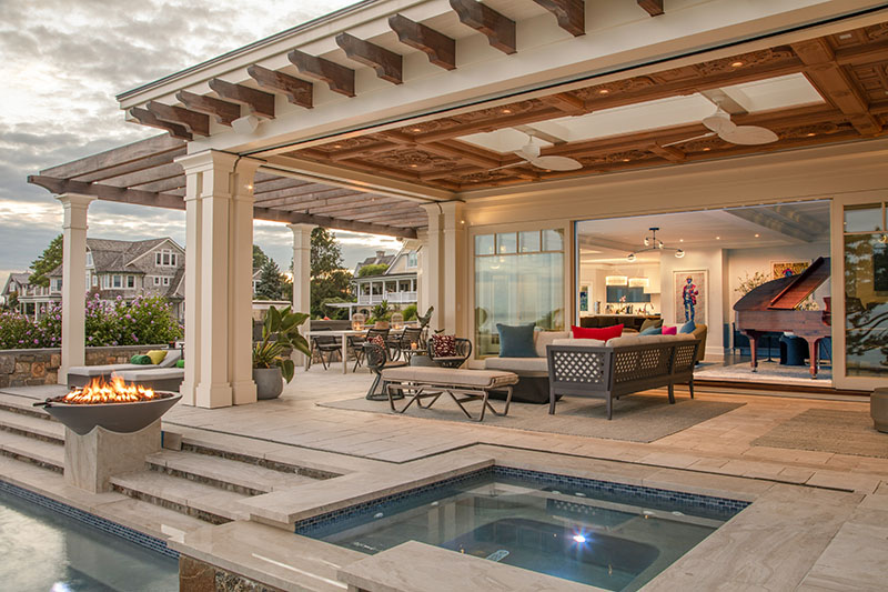
In the living area the designers added 24-foot-wide sliding windows that open up to a new porch. The addition not only doubles the indoor/outdoor living area space, but also nearly snugs up to the swimming pool, California-style. “Now it’s a space that’s open on two sides and has a very warm, sheltering feeling. It fits the balance between indoors and out,” project architect Melanie Smith says.
That sheltering feeling is enhanced by a hand-carved teak ceiling designed by a Wadia architect and then fabricated in Italy. Again, it’s a touch that emphasizes the couple’s Indian roots. “It was from an image that the clients saw on a trip while we were in the middle of construction; they came back with a photo,” she says.
The designers added a cupola over the main staircase to bring in natural light at the stairhead above, much like a skylight. Then they opened the ceilings up more. And they reshaped the fireplaces for more classical references. “The assignment was to take a good house and make it a great house,” Butscher says.
It’s functional because there were three children to consider. But it’s designed for having fun, too, since entertaining was one of the goals of the client. “It lends itself to the objective of vibrant colors, with a little bit of flair and fun,” Berisa says. “It’s a party house: They definitely like to have people come in and enjoy the fruits of their labor.”
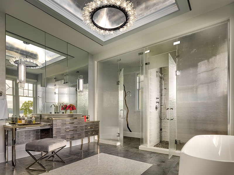
A marble entry invites guests in. There’s sparkling Venetian plaster, walls painted by an artist, plus a quartzite countertop and a mosaic floor in the bath. “We used a lot of jewel tones to pay homage to their heritage,” she says. “There’s a rich texture with wallpaper, and a lot of lush treatments in terms of plasters.”
The 9,000-square-foot house took about 18 months to complete, in the middle of the pandemic. But now, almost all of its rooms have views out to Long Island Sound, and they still manage to flow easily from one to another. “It’s breezy and fresh and doesn’t feel big either on the inside or outside,” Butscher says.
As they renovated, the architects made significant technological updates to the house. “We ended up with a fabulous, high-tech, and beautiful home, with the detailing and feeling of an intimate resort,” Smith says. “It’s lit up beautifully at night—it’s almost like a little jewel box on the sound.”
Inside, it’s also a series of high-style spaces, with drama to spare. And while its gables outside may still say Arts & Crafts, the classical makeover of this home is light, airy, and open.
For more, go here.

