We are fortunate to have engaged the design services of Raleigh architect Jacob Burke for a recent addition to our home in this area. Jacob is a graduate of the N.C. State College of Design, and one of the most gifted young architects in the state. He has worked in the prestigious Raleigh offices of Frank Harmon and Victor Vines, and recently joined Arrowhead Designs/Arrowhead Building in Raleigh as a partner. When asked about the firm’s work, he sent me images of two of its recent residential projects, and contact information for Jesse White, also a partner in the firm. We interviewed Jesse about those projects via email earlier this week, one of which we published yesterday, and the second, today.
Louis Cherry Architecture was the design architect for this project, which was delivered by Arrowhead as contractor during a design-bid-build process. Arrowhead also brought in its landscape team for this addition, at mid-construction.
Some background on the project?
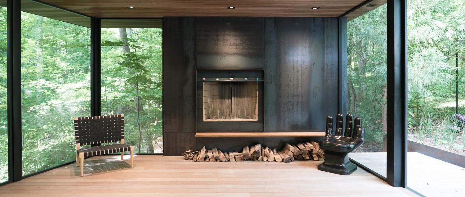
Cedar Drive was an addition to a 1960s midcentury house. The program request was for a screened porch that didn’t look or feel like a screened porch.
The client?
They are an interior designer and an art museum director. Cedar Drive has been transformed into a mid-century modern gem and showcase for modern art. The clients have strong taste and preferences, drawing on decades of experience in art and architecture.
Your assignment?
It was to execute a design by Louis Cherry Architecture for a screened porch addition that doesn’t look or feel like a screened porch.
Your intent?
It was to make the most comfortable room on the property. The space flows effortlessly from the existing home and creates an intimate courtyard off of the primary bedroom. The screened porch is comfortable for all seasons, with plenty of shade and airflow in the summertime, and a large, feature fireplace for the winter. The retractable screens work exceptionally well to optimize functionality and aesthetics. The material palette is bold and luxurious, with thermally modified poplar ceilings, hot rolled steel walls, and Ipe decking. The courtyard features oversized Corten planters and natural stone and moss.
How did the site drive the design?
The existing form of the home featured a low-pitch, shallow gable roof that did not lend itself readily to an addition. Additionally, the sight sloped aggressively away from the home, offering great opportunities for a newly built space to be perched in the tree canopy. Cherry’s design sought to capture the uninterrupted tree line views that line the property.
The Material palette?
It’s thermally modified poplar ceilings (slatted), hot rolled steel walls, Ipe decking, Corten planters, natural stone, moss and stainless steel railing.
The scale and proportion?
The addition did not want to tower over the existing home, which features a low-pitch, shallow roofline. A flat roof was adopted to minimize the overall height, and the non-rectilinear floor plan was driven by the site setbacks imposed on the property. The addition maximized the space that was available for building, and optimized the viewsheds to the rear.
The context?
It’s in a subdivision, nestled in a forest with sloping terrain, close to downtown Chapel Hill.
For more, go here.
[slideshow id=2459]

