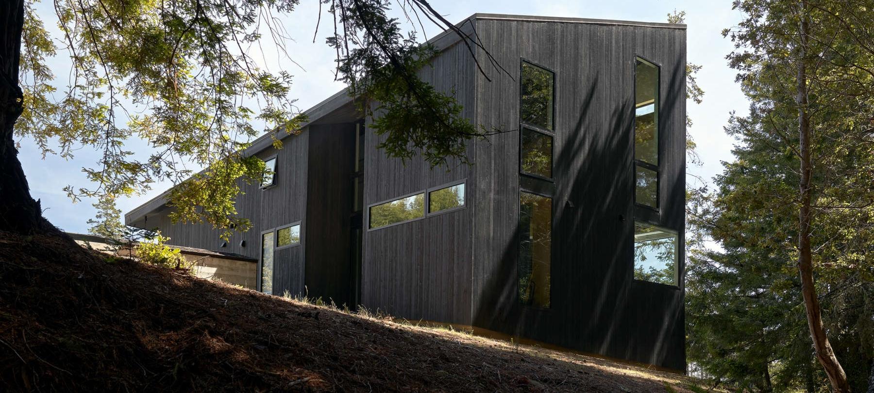
Simple geometry is the theme of a new home that a San Francisco-based couple created for themselves at Northern California’s Sea Ranch.
“There’s a diagonal gable from corner to corner so it’s a little faceted-looking,” Geoff Campen says. “It tweaks the basic geometry of the barn-style houses at Sea Ranch.”
Campen is a principal architect at Klopf Architecture. His wife, Diana Ruiz is an architectural designer with Architecture Allure. They collaborated equally on the design.
For a while, their home overlooking ocean and forest offered a welcome, full-time respite from the pandemic. But now they’re back to splitting their time between city and country.
But surely, the views from their prime, one-third-acre site at Sea Ranch must beckon for a return, full-time. “It’s not on the water, but on the eastern side of Highway 1,” he says. “It’s up the hill a bit so we have a view of the ocean, and the back side is in the woods and the rear rooms have nice vertical glass.”
At 1,600 square feet, it’s relatively small – like most single-family homes at Sea Ranch. It’s open on the first floor – with only two doors, to the powder rooms. Downstairs is the living area, a kitchen, and a studio that doubles as a guest room that can be partitioned off with a curtain. Upstairs is a loft and master suite that’s open as well.
The couple worked within design parameters set when Sea Ranch was developed back in the early sixties by architect and planner Al Boeke. “Sea Ranch has some aesthetic restrictions which we generally agree with.,” he says. “How it sits on the land is important, and also how it references other houses nearby.”
It’s a very minimal design for a house that occupies its site cleanly. “A lot of the houses here appear almost as objects on the land,” he says. “Foliage runs up to the house, so it shares the landscape, and we extended that idea with the simple geometry.”
As the home looks up the to the trees and down to the ocean, it was important that the geometry of the building match the geometry of the site. “In the front it’s low, and it’s high at the rear,” he says. “And there’s a datum line with windows for a consistent understanding of the house.”
Above them are neighbors who are fairly close, but in keeping with Sea Ranch guidelines, the new home doesn’t obstruct their view. “We had to set the house back to protect the views of the neighbors up the hill,” he says. “That’s why it’s raised – the rooflines don’t have to match but they do have to relate to others on the block.”
The material palette is as simple as the home’s geometry. The exterior is clad in dark-stained cedar that recedes into the shadows of the trees. There are concrete floors, raw steel for counters, cedar ceilings, white oak paneling and white drywall. “There are probably four or five materials used throughout,” he says.
All in all, the result is a simple response to a very grand site.
For more, go here.
[slideshow id=2412]


