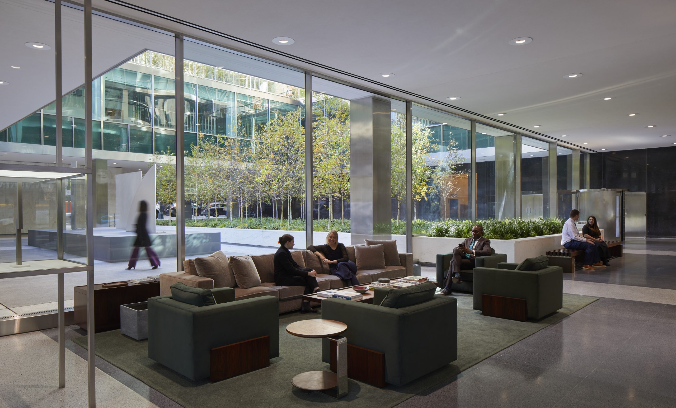
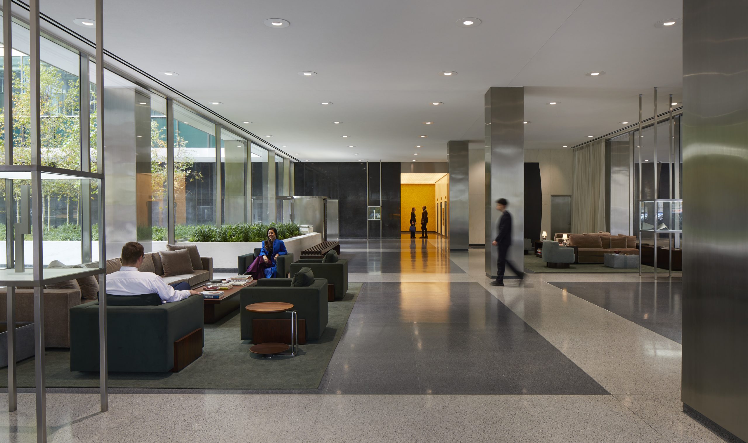
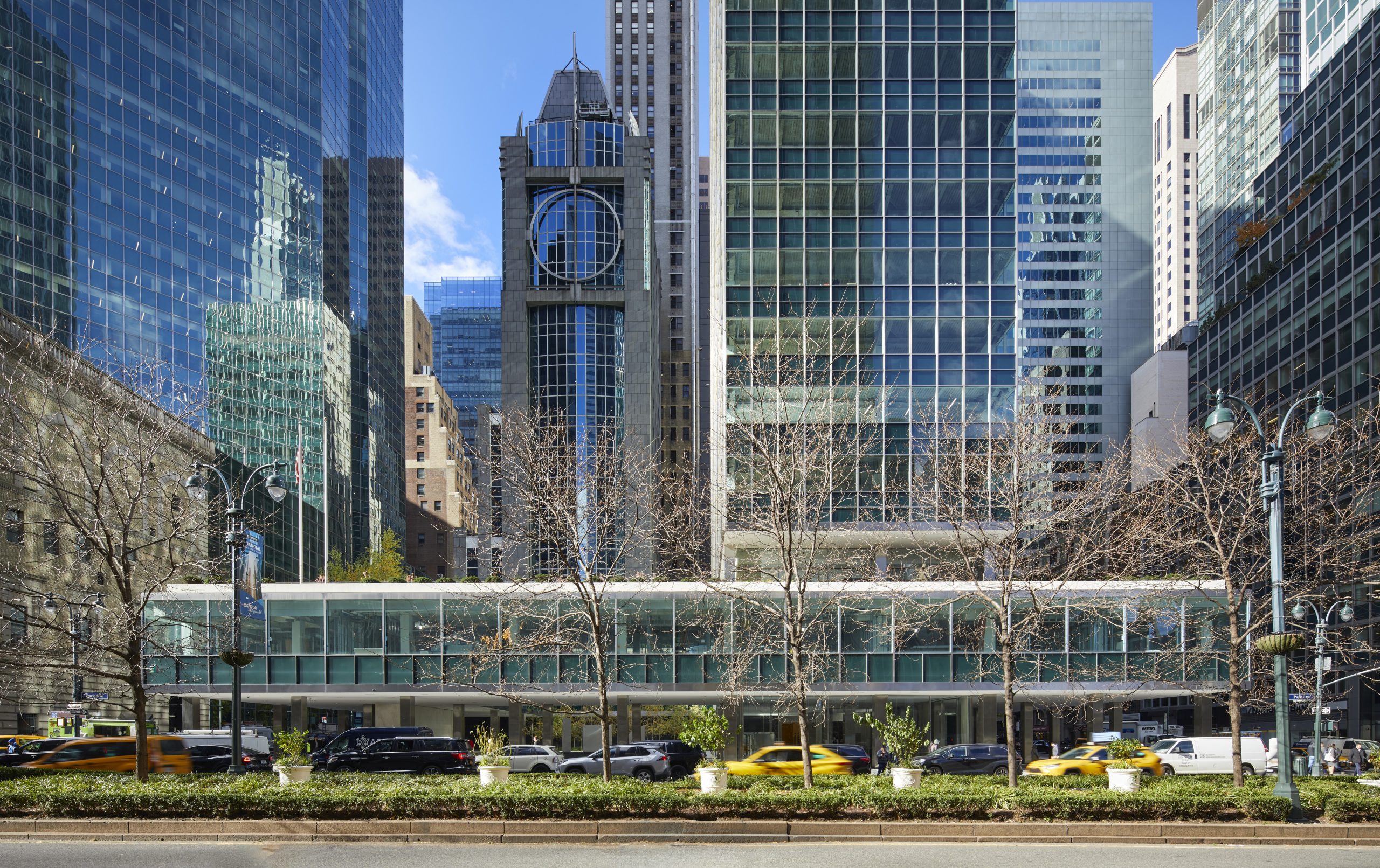
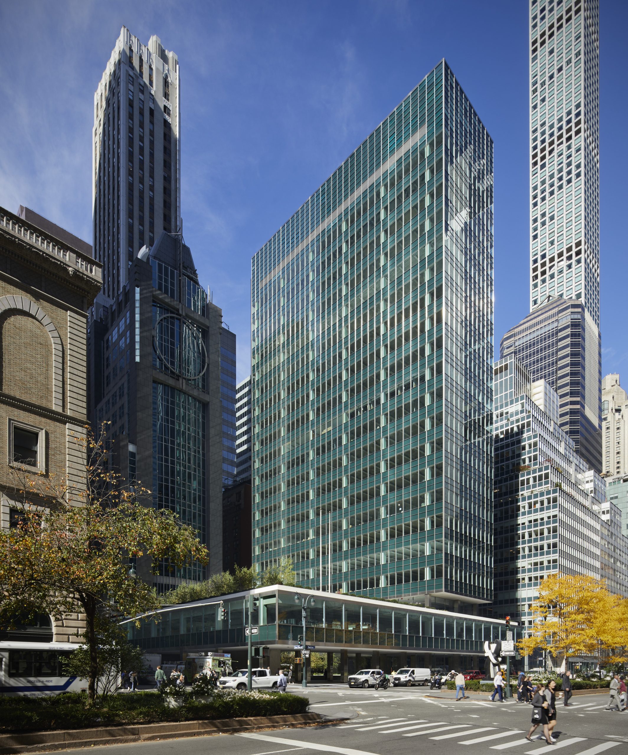
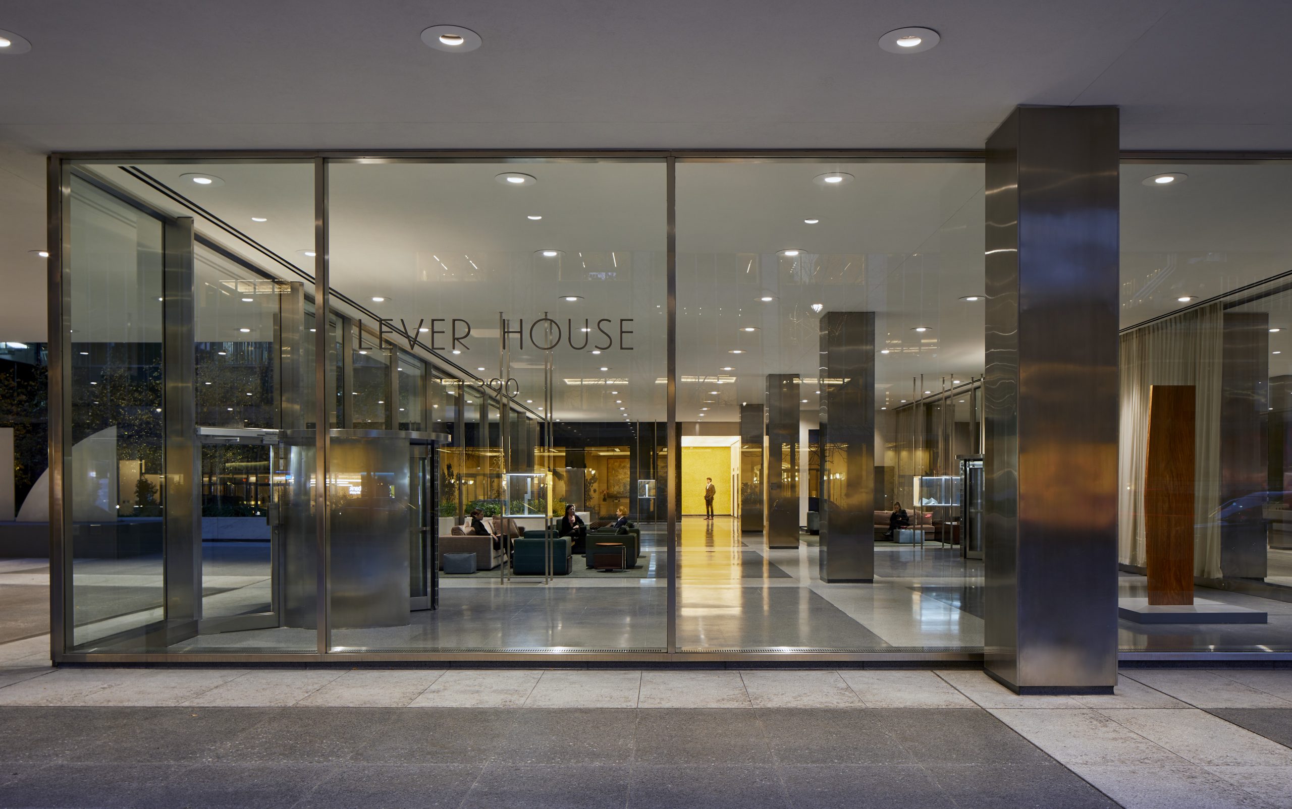
“For a long time after Lever House opened its doors, throngs of people waiting patiently in great queues in the lobby, demanded admission so insistently that the elevator system, designed to handle only Lever Brothers’ office staff of twelve hundred employees and a normal complement of visitors, was severely overtaxed. People acted as if this was the eighth wonder of the world…“
– “House of Glass,” Lewis Mumford, The New Yorker, August 8. 1952
And for a brief and shining, Stan Getz-like moment, perhaps it was.
Credit Skidmore, Owings & Merrill for that. And though architects Gordon Bunshaft and Natalie de Blois were responsible for the design of Lever House, its central idea wasn’t a new one at the firm, says Frank Mahan, SOM principal.
“One interesting fact is that Nathaniel Owings had been sharing, almost shopping around, the idea of a curtain wall turned perpendicular to the street in New York City, where prototype buildings were being built,” he says. “So it was not entirely out of the blue, but perfected at Lever House.”
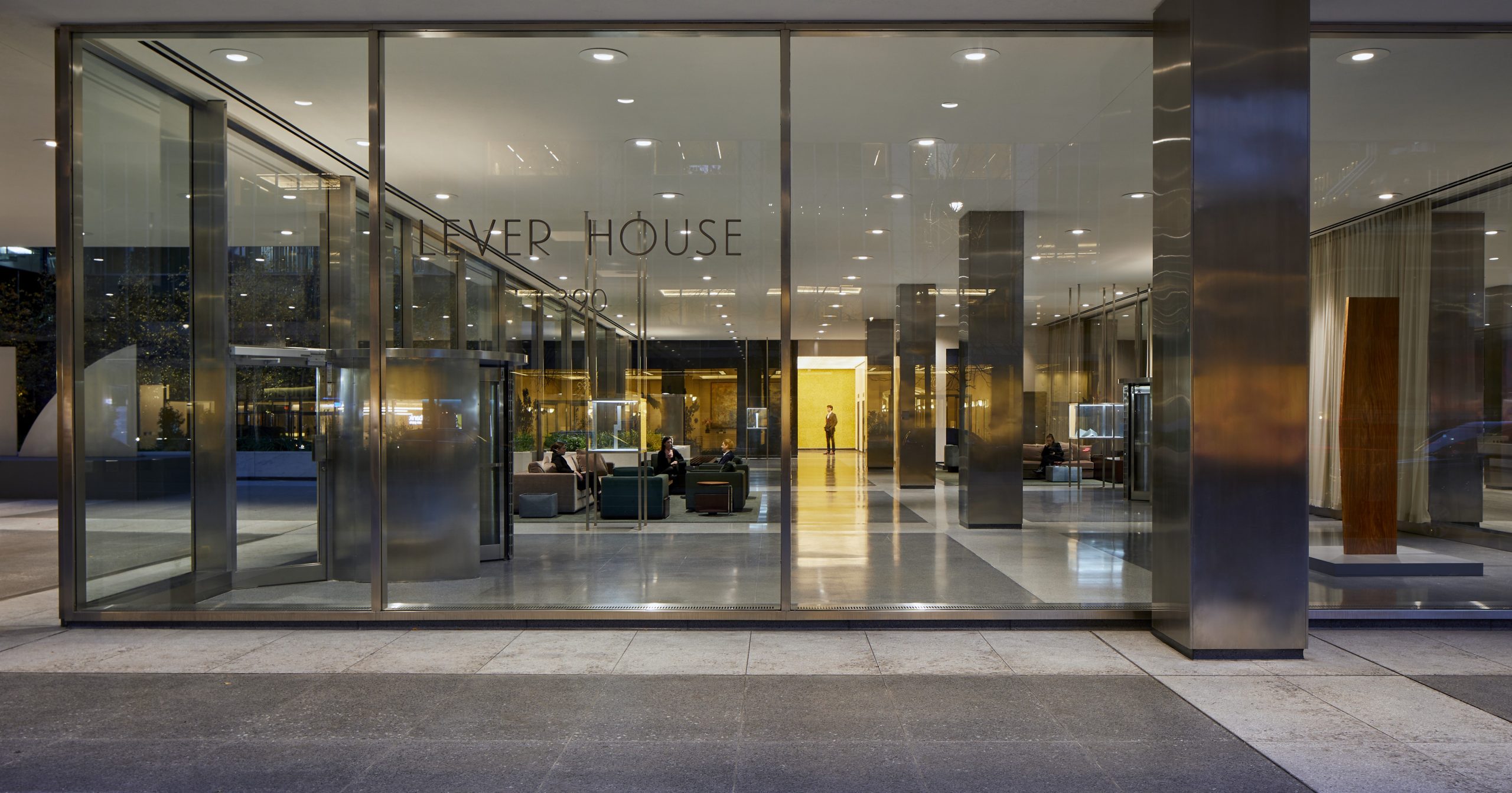
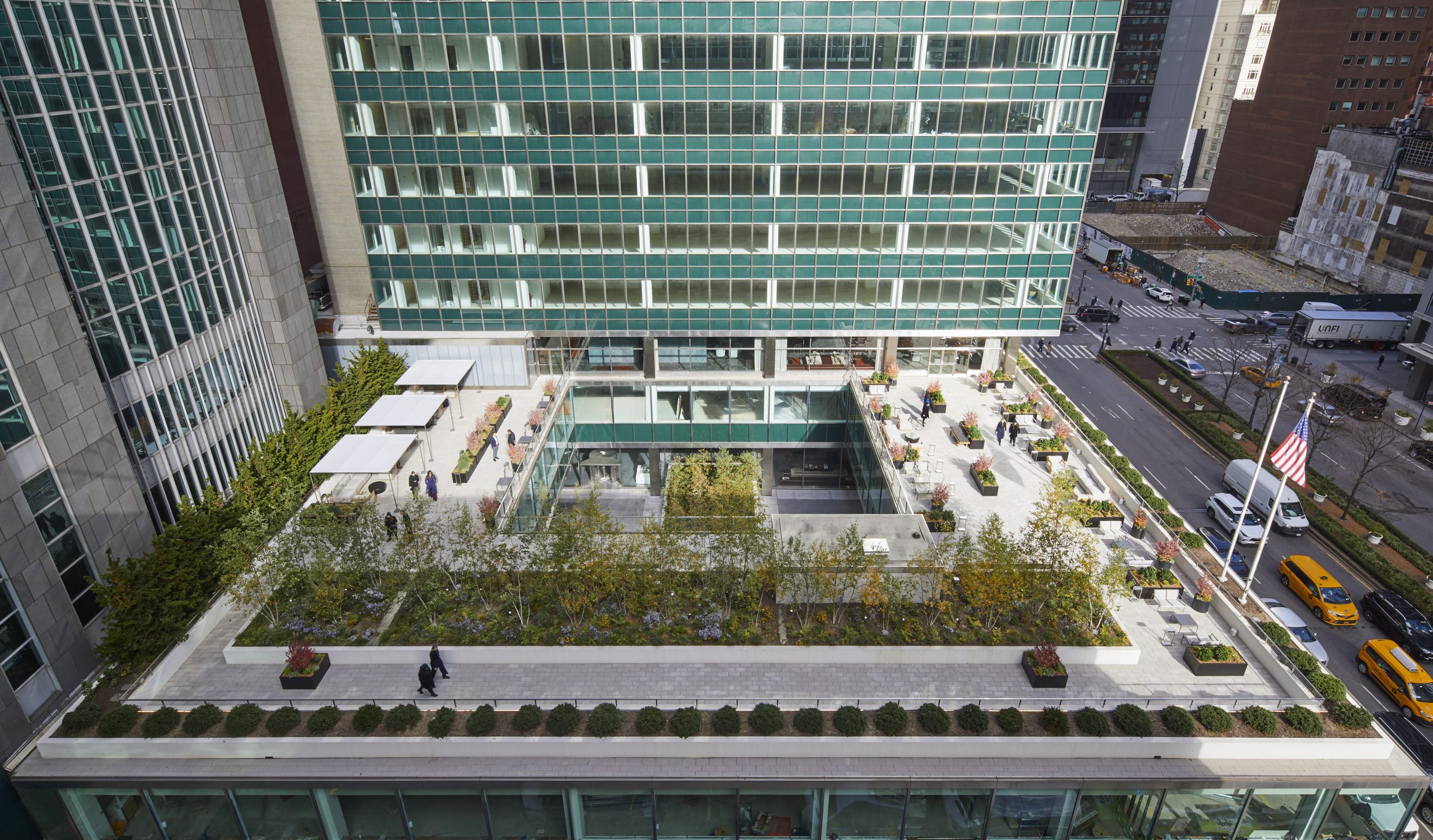
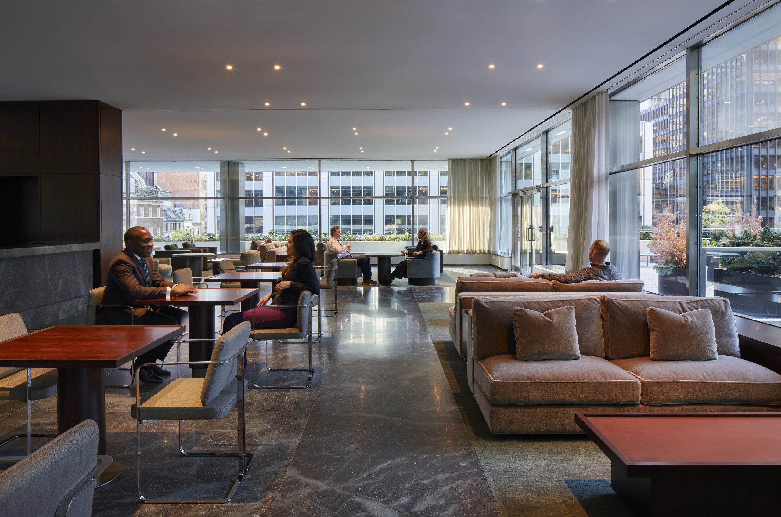
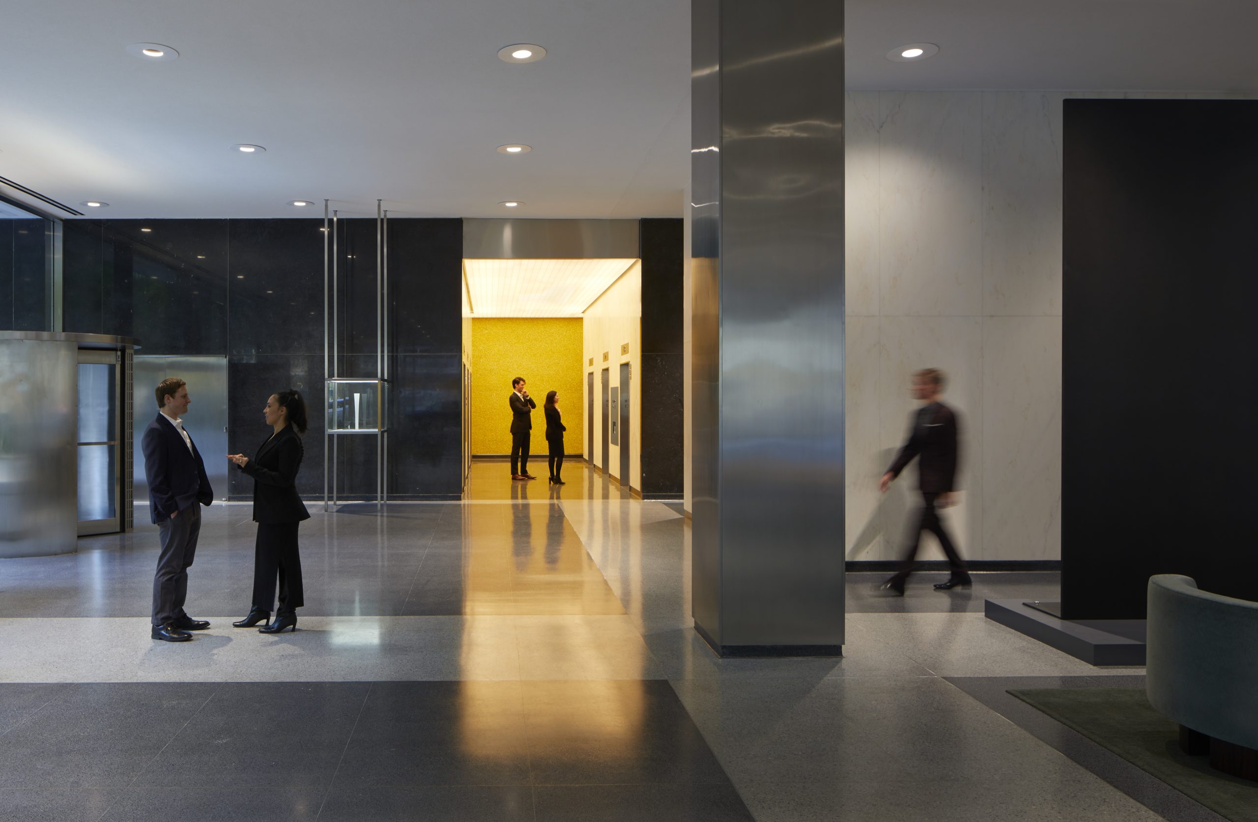
Now, a little over 70 years later, the green-glass, curtain walled, iconic building at Fifty-third and Park has been completely restored, renovated and repositioned as a multi-tenant office building. SOM’s client, developers Brookfield Properties and WatermanCLARK, purchased it in 2020 and immediately embarked on the $100 million interior reconfiguration of its 21 stories and 261,000 square feet.
With floor plates of 8,000 square feet, the set-back Lever House tower is not huge. But that’s what makes it so appealing in a mecca where every square inch adds value. “It doesn’t use all its available space on site – there was a conscious decision by Lever only to build what was needed for the company at the time,” he says. “It’s a small building with a lot of air around it.”
Unilever was the original client, and as it turns out, its president was no stranger to good design – or SOM. “Charles Luckman was trained as an architect and went to Unilever and then returned to architecture,” he says. “He hired SOM because they’d never done an office building before – and he knew it would come out great.”
SOM had retained all the original drawings in its archives and used them in the restoration process. “We could see the details and the specs and the materials, then sample the originals – what was actually done and how that material fared over time and also how that material was failing,” he says.
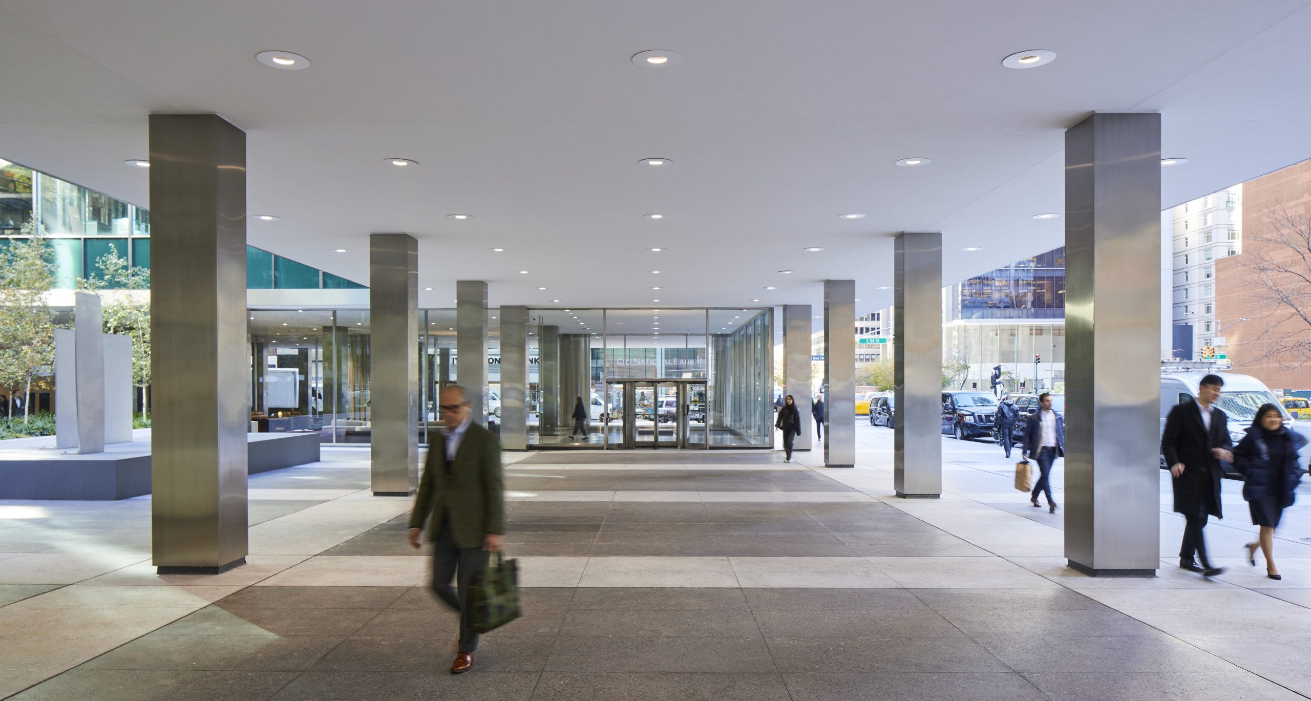
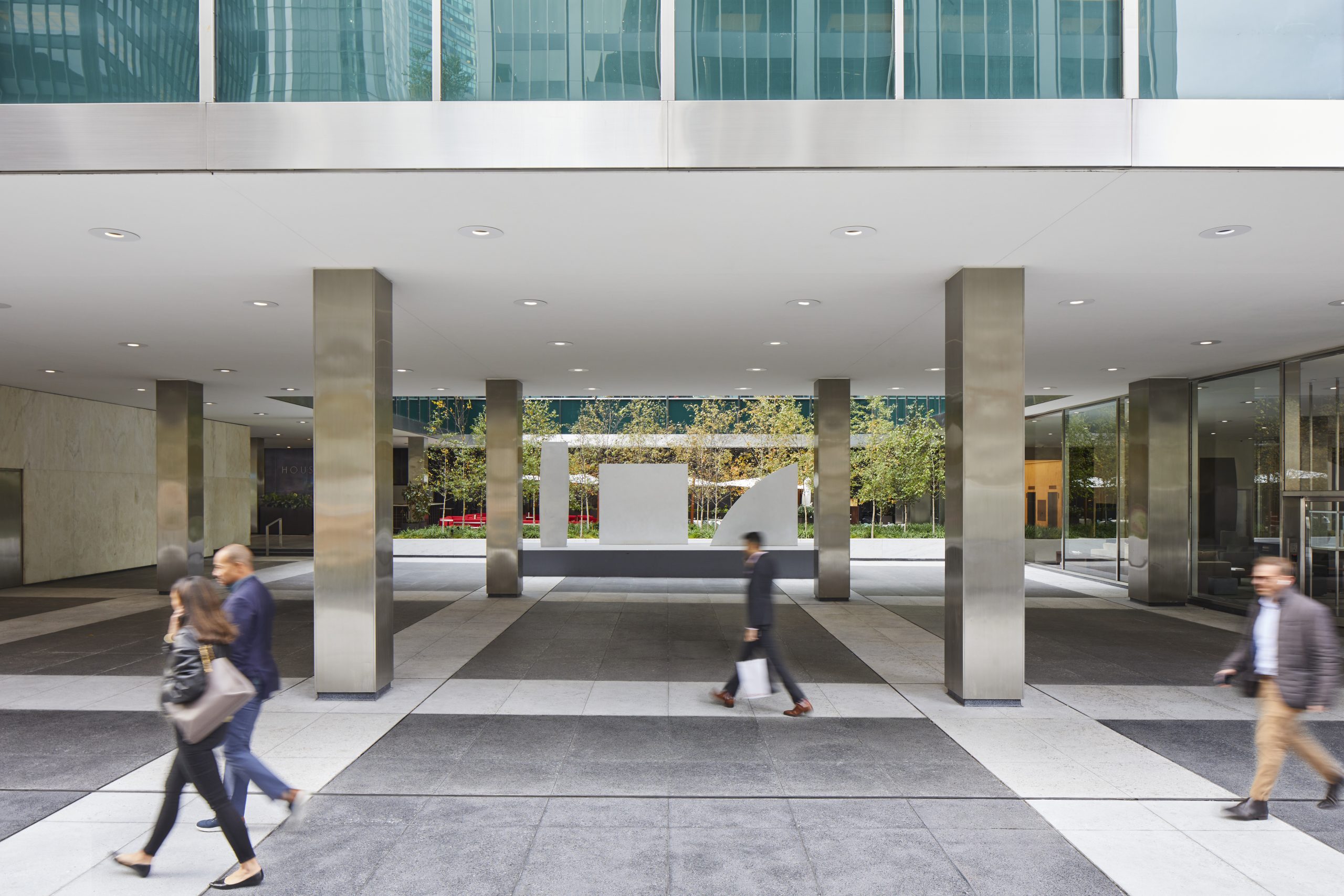
For example, its exterior paving is the same material, but composed in a different mixture and application for the original aesthetic, enhanced for performance and longevity.
Its vertical curtain wall had been restored by SOM in 2001, so Mahan’s team completed the restoration with horizontal spaces like the plaza, lobby and third-floor terrace and mechanical systems. “It needed an extensive restoration skillset,” he says.
Landscape design and plantings are by Reed Hilderbrand. At the plaza level are single-stem birches, then multi-stems on the third floor terrace, all paired with flowering and herbaceous vegetation, shrubs and flowers.
“At the rear of the plaza level is a black limestone, an overscale reveal for the entire project,” he says. “The white birches will be very beautiful against it and punctuate the black limestone.”
In a time that’s as least as turbulent as the one in which it was built, Lever House continues to offer the “implicit symbol of hope for a peaceful world,” as Mumford wrote in 1952.
Beauty, function and longevity are one thing. But hope – and from architects, no less – is something else altogether.
For more, go here.

