Michie Cao is on a mission.
She’s a former UCLA architecture student who’s now in graduate school at the School of Visual Arts in New York.
And she’s combined what she’s learned at both schools to make architecture easier to understand for the rest of us.
With posters. And a smaller set of prints.
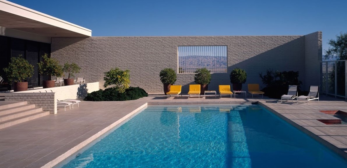
Each depicts a fairly well-known building – Mies’s Farnsworth House, Wright’s Fallingwater and Le Corbusier’s Villa Savoye, for example – and comes with an explanatory note card written in plain English instead of professional jargon.
“They’re all the buildings I studied in architecture school at UCLA,” she says. “It was a very hard subject – very intimidating, and I remember talking to friends and family about architecture and they couldn’t understand it easily.”
Now that she’s studying interaction design and how to bridge the digital and physical worlds, she’s applied that knowledge to making architecture easily comprehendible.
“It’s like with flash cards,” she says. “They’re small, bite-sized pieces of information.”
Printed on 130 lb. Strathmore cover stock, the cards are five by seven inches, and come 10 to the pack. The posters will be printed on an offset press, and will be 18 by 24 inches.
To raise $3,000 for printing and packaging costs, she launched a Kickstarter campaign 13 days ago. A week into it, things did not look promising.
“During the first half, I couldn’t even raise $1,000, and I was very nervous,” she says. “Then once the word got out, I got a lot of feedback – and people liked it.”
Hundreds of backers liked it enough to commit more than $10,000 to her campaign. So she’s bumped the press run for the posters up a bit – from 100 to 150
“Even now I’m shocked,” she says. “I can’t fathom the idea.”
For anyone interested in either the print pack or the poster, her kickstarter campaign is still live today.
But the time to kick up a donation is now – it turns into a pumpkin precisely at 10:41 PDT tonight.
To contribute, go here.
[slideshow id=1175]

