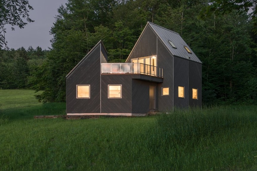
A desire to fit into the context of the Vermont countryside drove the design of a 1,000 square-foot cabin on 65 acres, 20 miles north of Dartmouth, N.H.
The cabin was designed in 2017 by Jaffer Kolb and Ivi Diamantopoulou of New Affiliates, a New York-based firm. It’s a weekend getaway and salon of sorts for the two designers, plus Kolb and his sister, their partners, his mother and Diamantopoulou.
“It’s a group of intellectuals using this house in different ways,” Diamantopoulou says. “There are writers, musicians, designers and painters – and everybody collaborates with everybody else.”
New Affiliates looked to the native vernacular for their cabin’s inspiration – to the clustered volumes of 19th-century agrarian sheds, similar in form and added over time. “They’re like little ‘Monopoly’ houses, all linked together,” Kolb says.
The two 2013 alums of the Princeton Graduate School of Architecture wanted to engage that local typology. They toured the countryside to exercise their due diligence. But they also looked for inspiration in a book called “Big House, Little House, Back House, Barn,” a 1984 celebration of the early, organic farmstead designs in New England.
It wasn’t just the architectural language that the pair wanted to emulate. They also looked to the state of Vermont’s sophisticated conservation ethic for building on unused land. “Land is either in current use or out of current use – so we paid to take it out of current use,” Kolb says. “Reforestation is a very serious concern for the state, so that people don’t come in buy 65 acres, clear it and build houses. There’s a kind of ethical politics in this state – it’s really moving and important.”
They also respected their neighbors. For years, a local farmer had been raising hay on the field where they built, harvesting four batches annually from May through September. “We don’t need all that land, and he’s been there for generations,” Kolb says. “He maintains it, clears it out after windstorms and provides a service to us – he plows our driveway when it snows. It’s a micro-economy and we didn’t want to disrupt it.”
The cabin’s living area and studio are two volumes linked at a central entry. There’s a 340 square-foot basement for storage and systems; above that is the ground-level kitchen and living area. A 280-square-foot, double-height studio is located in an angled volume. There’s a queen bed in a second-level bedroom, and two sofa beds – one upstairs and another in the studio. “We don’t mind piling up,” Kolb says.
And it’s toasty, even in winter. There’s under-floor radiant heat that’s’ rarely used for a number of reasons. First, a Vermont Castings wood-burning stove does yeoman’s work of heating the entire house. And seven-inch-thick walls, packed with rigid-foam and spray insulation, along with triple-pane, European windows, help keep it warm. “With solar during the day, the heating bills are really small,” says Kolb.
Diamantopoulou credits builder Coltere Savidge with that. “He’s spent his entire life building houses in Vermont, and knows how to make them clean and tight,” she says. “We were here in January, when it was negative 26 degrees. That’s not unusual.”
Kolb’s mother, radiologist Sughra Raza, agrees: “It’s a protective feeling – I’ve been there when it was minus four degrees, with bluster and snow, and there was not a draft in the house,” she says. “It feels incredibly cozy and warm.”
She says that the cabin’s functionality was certainly important, but the aesthetic was too – that part of the designers’ assignment was to make it interesting with a lot of natural light. “The kids and I like making things – I make jewelry and paint, and the kids make furniture,” she says. “So light is super-important, and the studio is where I can make a mess – we all wanted that, so a big chunk of the cabin is a studio.”
That natural light streams into the interiors in different and innovative ways. Because it’s Vermont, large glass walls don’t make a lot of sense, because of energy consumption. So the pair of designers chose to frame views – in unexpected ways. “We really didn’t want to go with floor-to-ceiling windows, and to get away from the modern aesthetic – to try something new,” Kolb says. “So wherever you’re looking, it’s a framed view.”
From the studio to the west are a field and the Green Mountain Range beyond. From the kitchen are framed views of the forest. And from the hall are three separate views of trees: tops, trunks and roots. “What’s nice about the architecture here is that it creates these little clipped frames, and there’s something powerful in that,” he says. “It’s like a mediating device and a way to see nature.”
In context, of course.
For more, go here.
[slideshow id=1898]


