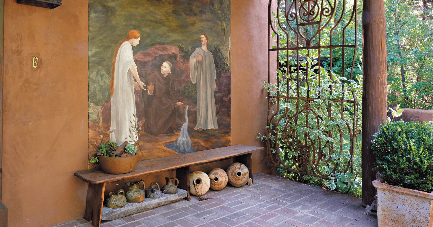
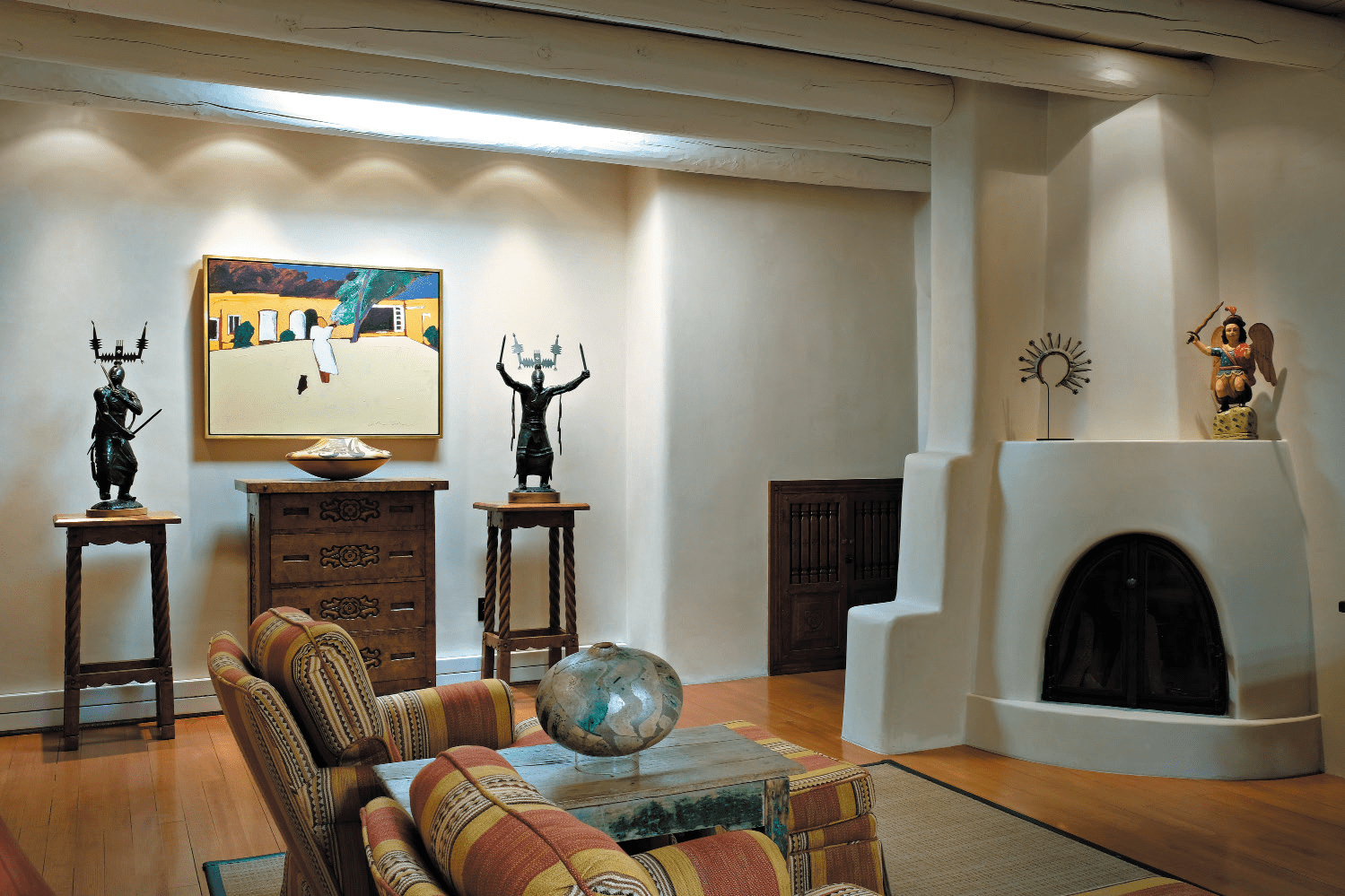
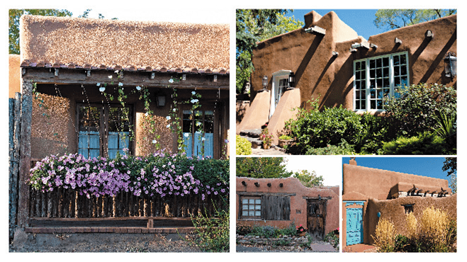
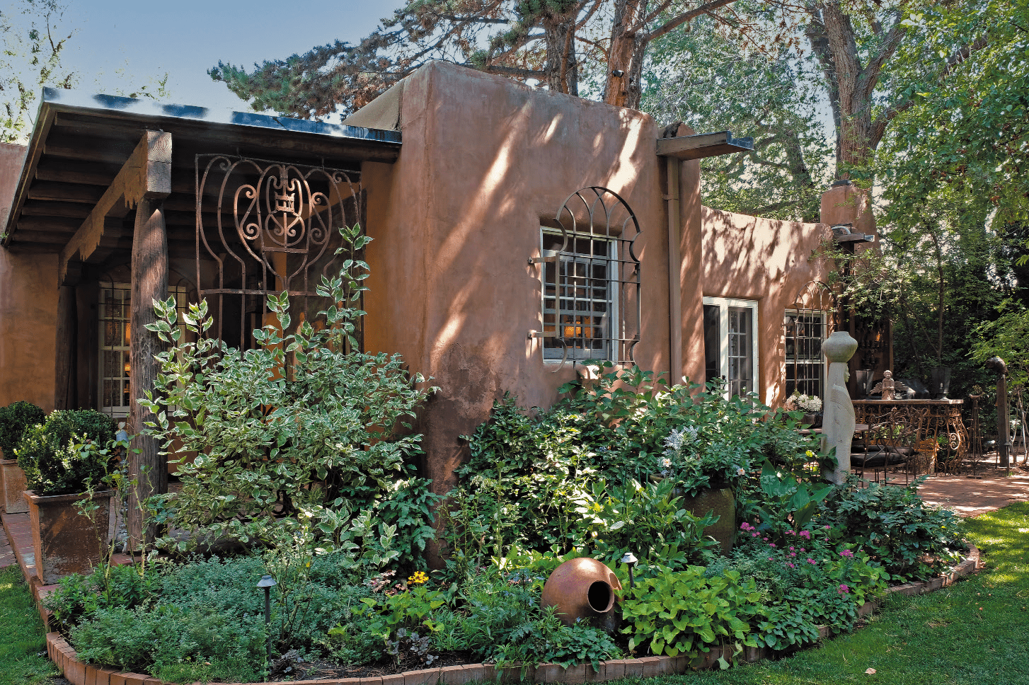
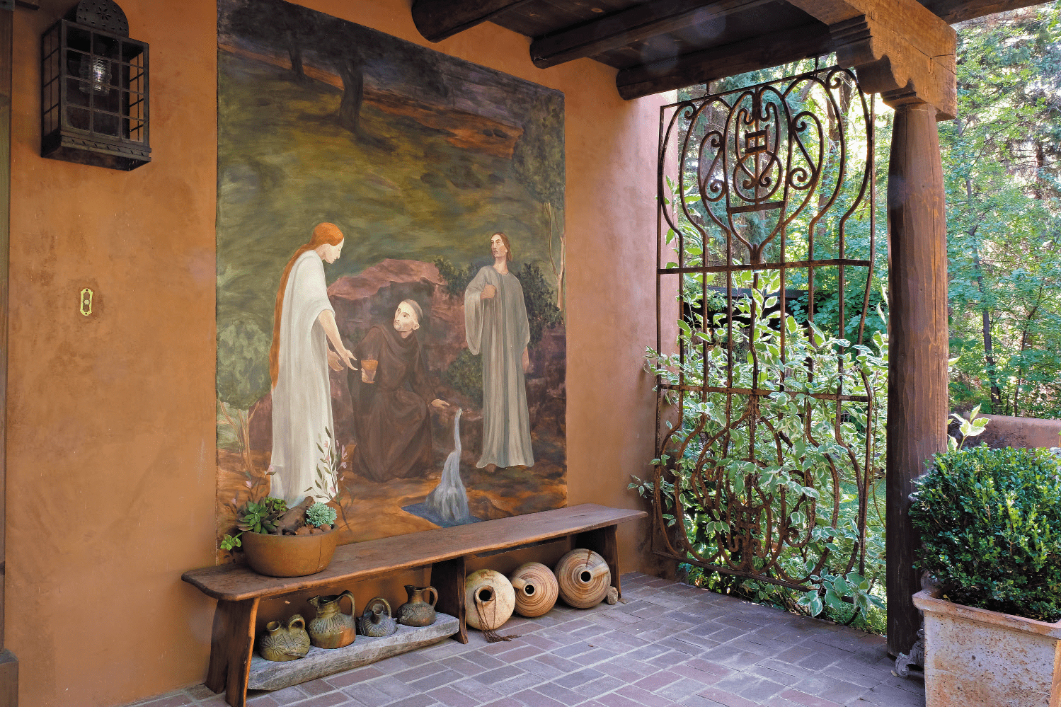
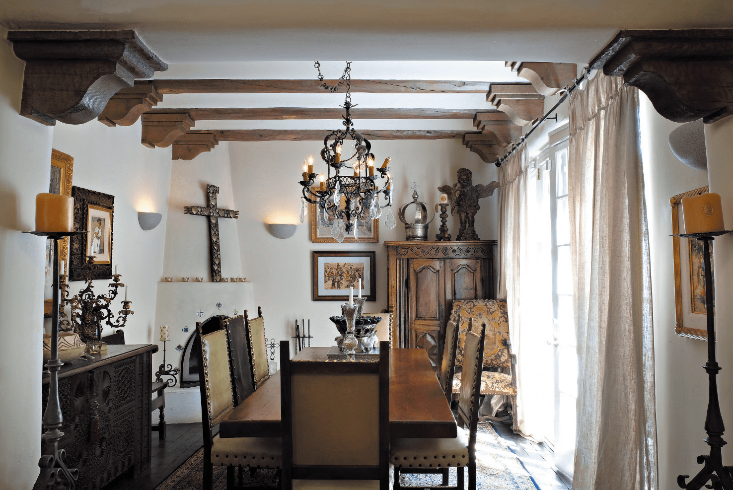
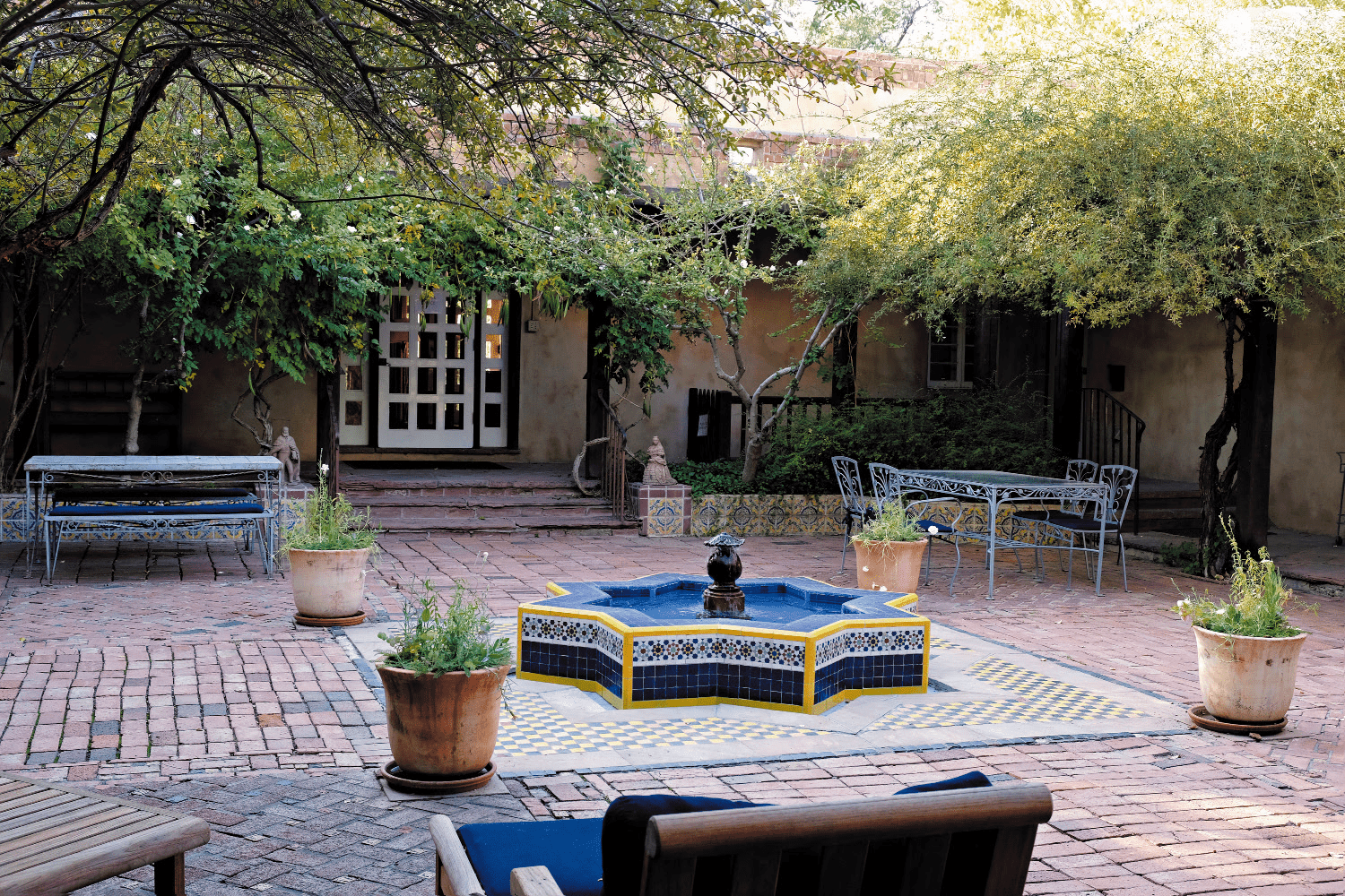
Santa Fe may be known as the Greenwich Village of the American West, but it’s also a prime spot to witness the evolution of Pueblo, Mexican/Spanish, and American design.
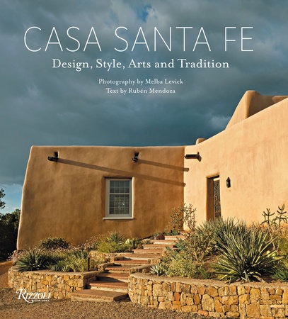
That’s the prime thesis of a new book from Rizzoli, with photographs from Melba Levick and words from Ruben Mendoza, called Casa Santa Fe: Design, Style, Arts and Tradition.
They’re both veterans of the architecture, art, and design publishing world. Levick’s a Los Angeles-based photographer with more than 60 books to her name. Mendoza is co-editor and author of several books, including The Spanish Style House.
Over a long career he spent a great deal of time in Mexico, traveling by train, bus, and thumb to see every accessible pre-Columbian site. “There was the archeology, the study of ancient architecture,” he says. “It was the juxtaposition of one civilization over another, over years.”
When he entered Mexico’s back country, he’d come across Spanish Colonial Catholic churches, built by the same indigenous people who’d built earlier Pueblo structures. “Then there was the Mexican diaspora – with layers of Spanish and Mexican influence coming into America,” he says.
Santa Fe’s architectural legacy follows a similar evolutionary pattern – and Levick and Mendoza wanted to document it. “All three cultures come together there, including Pueblo, Spanish/Mexican, and the white man/pioneers,” Levick says
“The Spanish are central,” adds Mendoza. “We recognize the architectural history of the traditions of Pueblo, and of Hispanic influence on form.”
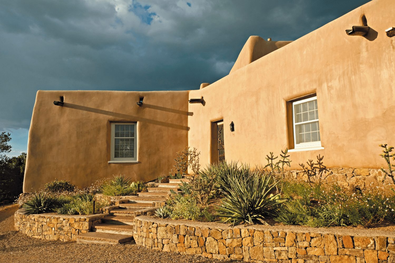
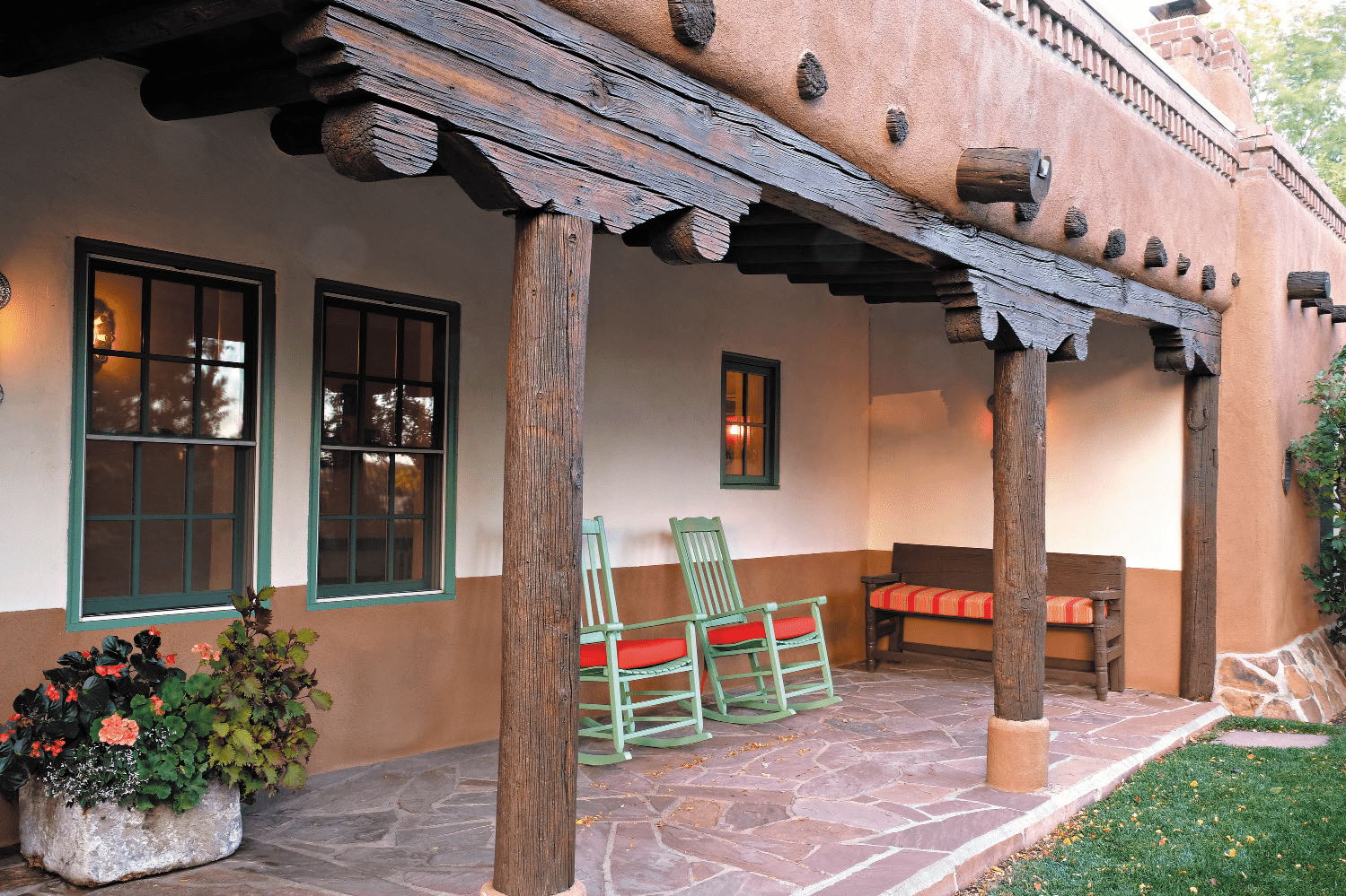
There are massive adobe walls stone built in a one-to-three ratio – one stone wall with three clay layers, covered in stucco. Most are one story with a flat roof, but some are two. “They’re cool on the interior because they’re three to five feet thick,” he says.
After the arrival of American in 1821, fired brick and wood were added to the adobe, which actually allowed for its preservation. After the Mexican war from 1846 to 1848, Americans were introducing New England and Greek Revival touches. Lintels over doors were carved like capstones to look like the Parthenon.
“In the 1840s, there are very clearly Eastern elements from American manufacturers, like the sheet metal roof and dormers,” he says. “In the 1870s, the Santa Fe railroad comes through and there’s brick and milled lumber in and glass windows, where they used to just have shutters.”
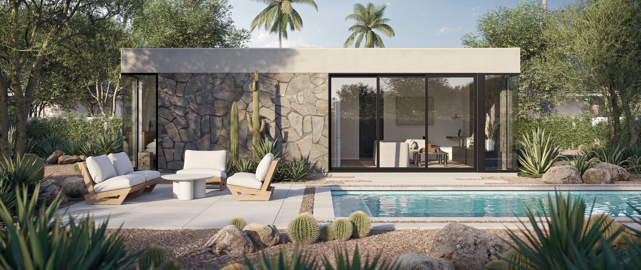
Then there’s the color palette. “It’s the color of the earth with bricks made from clay and adobe colors, and gardens with succulents, cactus, and desert plants,” Levick says. “Colors appear in what people are wearing too, in a kind of harmony. It’s so beautiful – it’s homogeneous.”
There’s a sustainability angle to the ancient adobe buildings as well. “From an architectural standpoint they’re organic – they’re literally one with the earth,” Mendoza says. “Many could be construed as green buildings because once they melt away they return to the earth.”
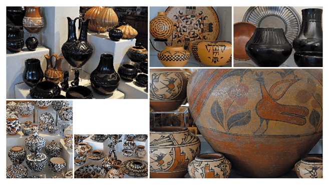
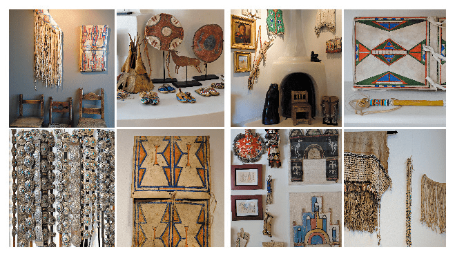
Mendoza and Levick have documented it all, along with ceramics, works of art, cabinetry and weaving. More than a coffee table book, Casa Santa Fe is a sourcebook for architects and interior designers seeking to expand their vocabulary of Southwestern style and design.
“The text is really rich – It goes very deep and the introduction is informative,” Levick says. “If you’re interested in history you will be happy.”
But the photography and the book’s layout sets a high bar too. “There are small chapters on ceramics, gardens, and weaving,” Levick says. “Then there are big chapters for big spreads.”
And at 288 pages, it’s enough to keep a designer intrigued for days on end, if not weeks.
For more, go here.

