Ben Waechther, principal in the architecture firm that bears his name, believes in the concept of experiential clarity.
Whether a project is open or enclosed, it’s a belief that certain places, new or old, cities or villages, have their own strong sense of identity and place.
The idea is to identify it and unpack it.
“We look at a space – confined or expansive, and ask what it’s like to be in free-form spaces, or contained with four corners, and think about it in a precise way,” he says. “A meadow has a sense of that, and formally you open up to the space, frame the sky as a ceiling, the trees as the walls, and the meadow as the floor,” he says.
He founded his firm in 2007, after graduating in 1995 from the University of Oregon, where several of his professors who had worked for Louis Kahn introduced Ben to Kahn’s design approach – of incorporating materials, spatial order, natural light, and mechanical systems into legible, eloquent architecture.
None of that was lost on him. After working at a number of firms, including the Renzo Piano Building Workshop, he set out on his own. His firm now employs 12 people.
All are laser-focused on experiential clarity. Its newest iteration is in Dundee, Oregon, where Italian-born, Canadian-raised Giorgio Furioso purchased a 9.7-acre winery with vineyards called Crumbling Rock. The oldest vineyard in the Red Hills, it had a 35-year-old, very mature vineyard and a winery building – a simple metal industrial shed.
“It was a fairly tight property, all planted with vineyard, and there was a house on the property and a production shed, Waechther says. “He wanted to develop a new brand and hired a winemaker and purchased the property and started making wine in the old facility.”
The architect looked for opportunities with the mature vineyard and a spectacular view from the production shed, downhill over the property to the west.
Furioso’s primary goal was to build a tasting room, and add barrel storage space. Already outside were production areas for delivery, bottling, trucks and a crush pad. “He didn’t necessarily want to redo the interior of the winery space,” the architect says. “But he wanted a new identity for the property.”
The challenge was that there wasn’t a lot of space to expand, because of the productive vineyards. Furioso wanted to keep production where it was, and not demolish the existing shed – but keep the space in that and keep it functioning during construction.
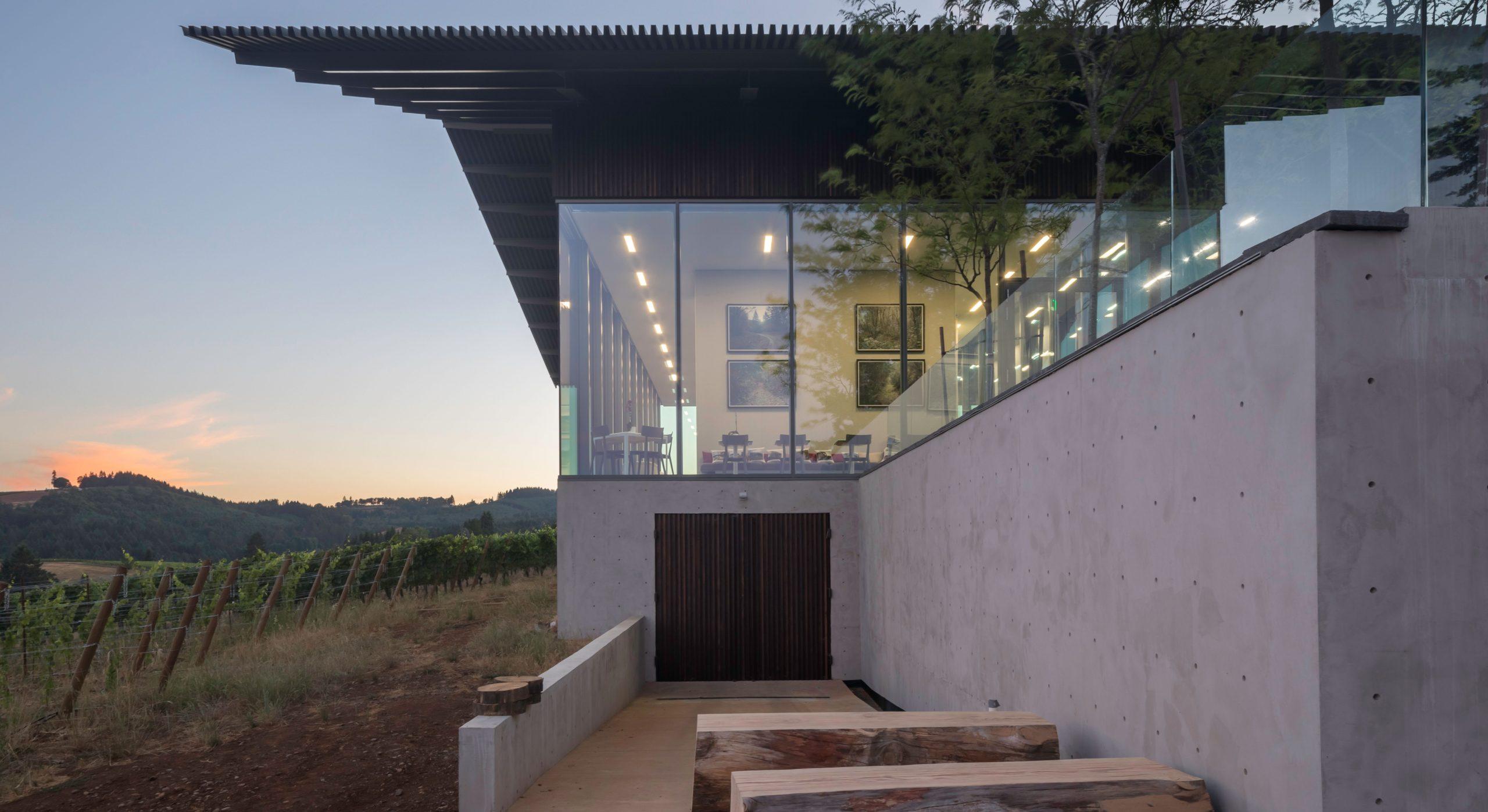
The new tasting room and winery are actually a remodel because of the space constraints. It essentially encapsulated the old production facility. “To the vineyard side we kept the crush pad location and added a tasting room on the down side,” he says. “And we reclad the entire structure with a charred cedar siding that’s board and batten, two inches by two inches with two-inch spaces, so it’s a new wrapper.”
The tasting room now has a 14-foot ceiling with a floor-to-ceiling curtain wall around all of it. Above is a large metal roof that cantilevers out 14 feet on the tasting room side. On the east side, a box roof cantilevers out to where gutters aren’t necessary. Below the new tasting room is where the barrel storage is.
“The tasting room is unusual – usually it’s separate – but for better or worse, this tasting room and winery are all mixed together,” he says. “They’re immersed in the vineyard on two sides, and production on the other two sides.”
Adjacent to it all is a 5,200-square-foot piazza, a mixed-use open space used for hospitality, seating, and special events. During the fall harvest season it’s also used for grape delivery, crushing fruit, and bottling trucks. “At the piazza there’s a ramp that connects the piazza to the barrel storage below,” he says. “It’s angled and shallow enough to allow a forklift to navigate up to the piazza.”
Because there was no place for mechanical systems, the architects placed them on the street side, screening them with two-by-two charred cedar battens. “It’s a screening volume that’s opaque during the day, but opens and breathes,” he says. “At night it’s lit up like a lantern.”
From the road, the entire structure is simple, impactful and iconic. Inside, the tasting room is really at the heart of it all. “The 14-foot ceiling being in that space is an experiential idea – you’re immersed in the vineyard and the winery production,” he says. “At one moment you experience all of that.”
It all gives visitors an understanding of the winemaking process, and it resonates with people. “But they don’t know it’s built on the bones of the original,” says Keith Alnwick, the firm’s research and development director.
No matter. What’s important is that they undergo a moment or two of experiential clarity.
For more, go here.
[slideshow id=2504]


