Is it possible for a power company’s substation for electrical switchgear to be functional, green, and sexy?
Well, yes – if its look, feel, and fenestration is placed in the capable hands of San Francisco’s TEF Design.
The 35-person firm has been in business for 25 year, a group of generalists who work on everything from small projects to a four-story building at Stanford. “We’re of the size that sometimes teams with other architects,” says Paul Cooper, a principal at TEF. “And we have a long history of doing work with the City of San Francisco and California.”
Their idiosyncratic Larkin Street Substation for LG&E is an addition to an existing building. TEF had started out doing small projects for the power company, then interviewed to upgrade Larkin. “They needed space for new equipment and were very interested in being net zero,” he says. “And they wanted to be green to give back to the urban landscape.”
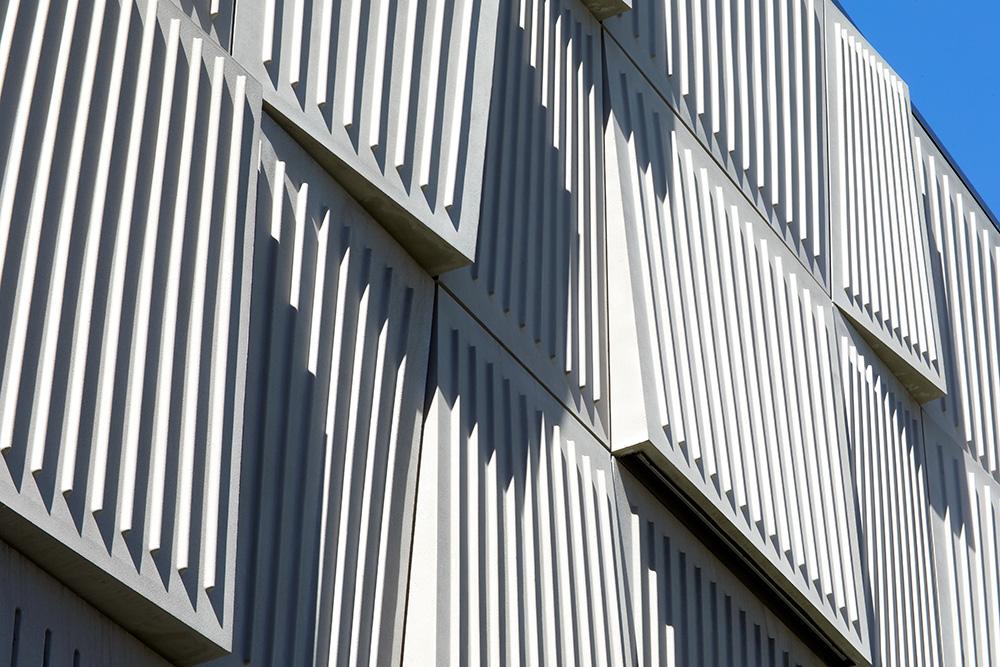
Basically, deadpans Cooper, the architects created a blank façade. But in fact, it’s much more than that. It’s lyrical and rhythmic with a green wall reminiscent of Paley Park in Midtown Manhattan – and diagonal louvers that recall the vertical shutters seen across downtown Istanbul.
Then Cooper waxed a little more poetically about the façade. “They supply power and we tried to create interest rather than create a blank wall,” he says. “They use natural ventilation in their buildings, so we louvered the wall to create a natural flow with no artificial coolant,” he says.
Its cladding is composed in gypsum reinforced fiberglass panels, with a pattern inspired by LG&E’s map of the power grid. And it changes visually, moment to moment. “As the day goes on the shadows turn strange, and at night the LED lights create a glow,” he says.
It’s pretty much surrounded by commercial dowagers of years gone by, mostly four stories and less, built in the 1920s and ‘30s. The building it’s attached to is composed of 1960s concrete and aggregate. There’s an eight-story, wooden residential building, and across the street, a commercial four-story structure. “It’s a mishmash,” Cooper says of the neighborhood.
But now It’s got Taylor Swift, front and center.
For more, go here.
[slideshow id=2507]


