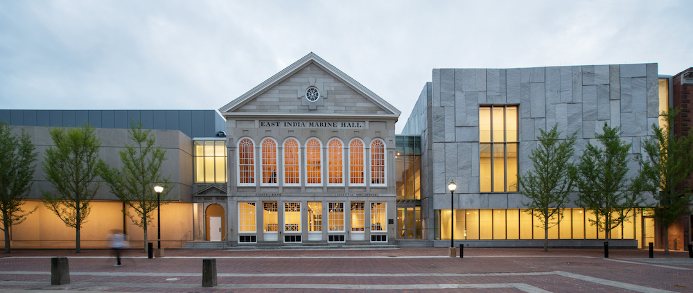
Richard Olcott, design partner with Ennead Architects, was recently charged with designing an addition to the widely respected Peabody Essex Museum in Salem, Mass. His team’s challenge, he says, was to create contemporary architecture in one of the oldest cities in America, one filled with a very tightly regulated preservation commission. The challenge may have been great , but the results are exquisite. A+A recently interviewed him via email:
Tell us about the client:
The Peabody Essex Museum is one of the nation’s oldest and largest institutions. It is truly a museum of everything. It is not just art. It’s history, it’s geography, it’s ethnography. They’re an architecture museum as well. They own over 22 historic structures in the town. They have the 200-year-old Chinese House, Yin Yu Tang, which is beautiful.
The collection is unbelievable, stemming from the museum’s roots as a “cabinet of curiosities.” It’s both encyclopedic and highly unusual, spanning everything from stuffed penguins to Dutch Old Masters. The museum is very beloved within the community and is a popular tourist destination.
Your assignment?
Essentially, our charge was to extend an existing museum sequence that goes through a complex of seven buildings from seven different time periods, and to clarify that sequence into something more legible, while adding a new building and garden as an extension of the sequence. In fact, it becomes a loop. You can walk through the building without retracing your steps.
The intent of your design?
From our earliest conversations with the museum, it was clear that the emphasis should be as much about creating spaces for the work on view, as about the quality of the visitor experience. They were interested in serendipity – a space that allowed for discovery and surprise and would unfold unexpectedly as you moved through it – something you could not completely anticipate. Within this framework, we wanted to create places of repose where one can take a break, and to bring in a lot of natural light.
What about you collaboration with Nelson Byrd Woltz Landscape Architects?
The collaboration was particularly important because we needed to remove a very popular garden in order to build the new building. So, there was a strong impetus to give something back to the community to replace what had been taken away, and to do it in a way that was bigger and better. You follow the sequence from the building, through the atrium, to the outdoor rooms of the garden. The urban garden is the destination at the end of the sequence – it’s the payoff. There is a very strong connection, even demarcated in the floor, linking the inside and the outside. The materials further that connection. The garden uses the same granite, the same brick.
The inspiration for your design?
The inspiration was simple, to make an interior street, which is very much what the Safdie building did. The Safdie building actually replaced a historic street that went from Essex Street to Charter Street. We took a likeminded approach in order to create a feeling as if you are almost outdoors, following a pedestrian path that takes you to the garden.
In addition to what we were adding, we were also judiciously removing things, which in this site requires some surgical precision. We pulled away from the original landmark building East India Marine Hall, so that you could see its side wall for the first time in 150 years. To do that we had to remove two or three unfortunate additions. There was also a lot of restoration involved. It was not just about removing some of the less than successful buildings, but about restoring the historic building and then adding the contemporary new wing. It’s all of that together.
Materials chosen, and why?
As an architectural response, we used the same materials as the original building. The local granite is a beautiful stone that has been used for hundreds of years. It’s the historic building material of Salem and it makes a nice connection between past and future – traditional material used in a contemporary way. Beyond granite, we used brick, stone, plaster and glass, and wood for the floors. All are materials of the historic city, reinterpreted.
How did the site drive the design?
It’s certainly a very tight, constricted site. It’s also a historic street, on the museum side, with buildings going back to the 19th century. The massing is similar to the other buildings on the street. We wanted to be very deferential to the landmark East India Marine Hall (EIMH). It’s ultimately an urban infill project in a very sensitive location, so as not to overwhelm the historic low scale of the original street.
The new addition pulls away from EIMH and creates a new urban space between them. By pulling away from the old building and touching it as lightly as possible, you can read its beautiful, historic form clearer than you ever have been able to in the last 100 years.
For more, go here.
[slideshow id=2096]


